Hey everyone! It gives me great pleasure to share with you all that I have had the honor of displaying my work recently both online as well as offline with a couple of eminent art galleries in my country, India. Also deeply humbled to have been bestowed with awards by these galleries and extremely privileged to have had a chance to showcase my work under their names. My sincere gratitude to both galleries for providing me with the platform to display my work. Thank you very much Manikarnika Art Gallery, Jhansi, Uttar Pradesh (India) and Dys Art Gallery, Visakhapatnam, Andhra Pradesh (India)!
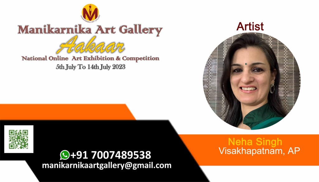
The online exhibit conducted by Manikarnika Art Gallery was titled “Aakar” National Online Art Exhibition and Competition (5 July – 14 July 2023) wherein I had sent two entries which were exhibited on their social media handles, namely Facebook and Instagram. (Follow these link to view the exhibit) –
It was this exhibit that brought me the honor of the Gold Award and I was conferred with a Gold medal as well as a Certificate. I am thankful to the gallery and the jury members for considering my work worthy of this bestowal. A few snippets from this exhibit:
The posterfor the online exhibit and competition
The AwardThe honour
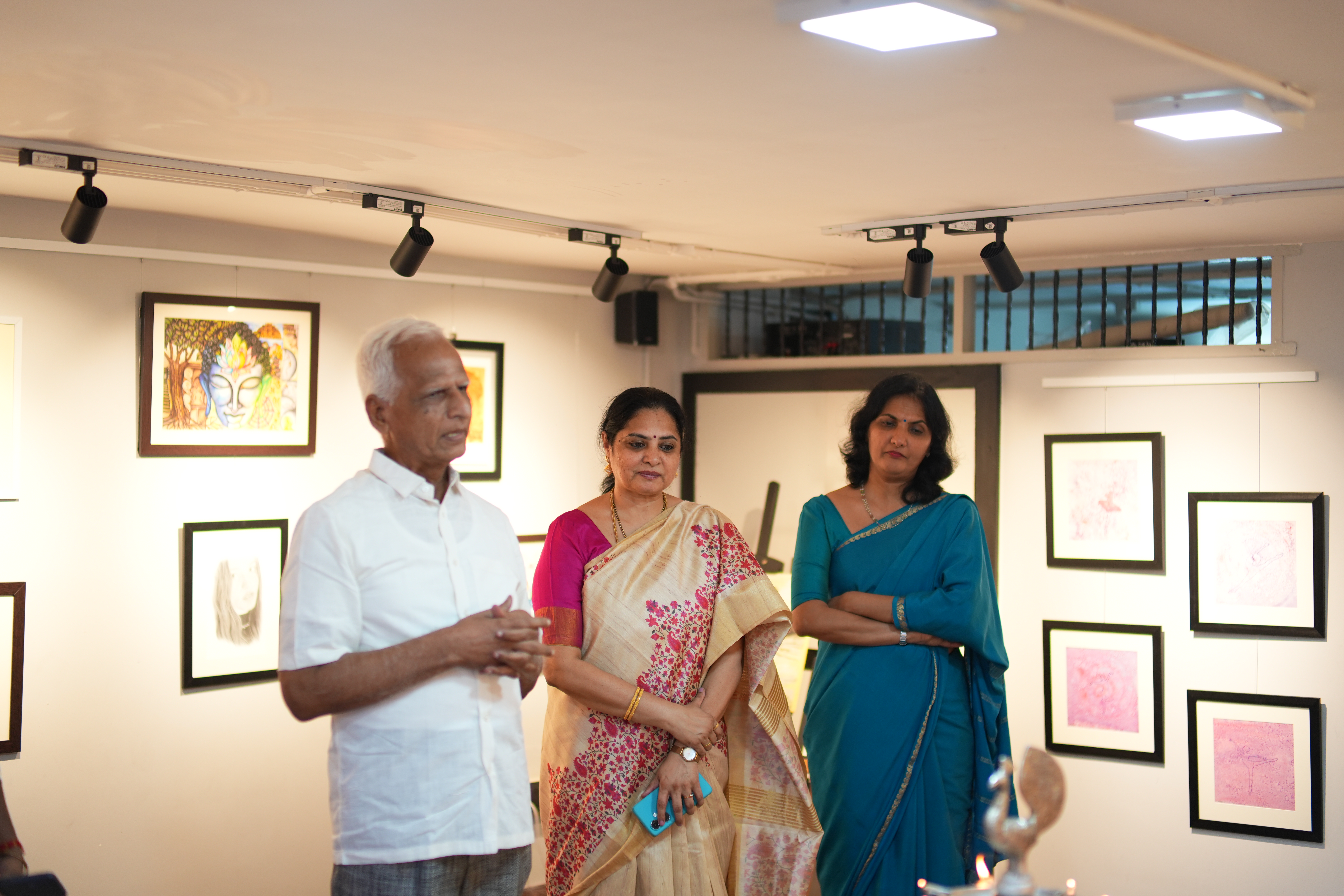
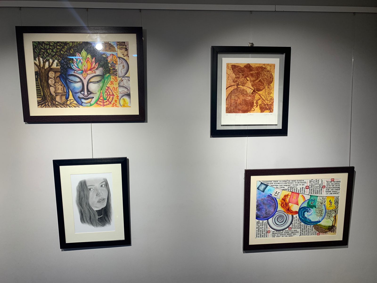
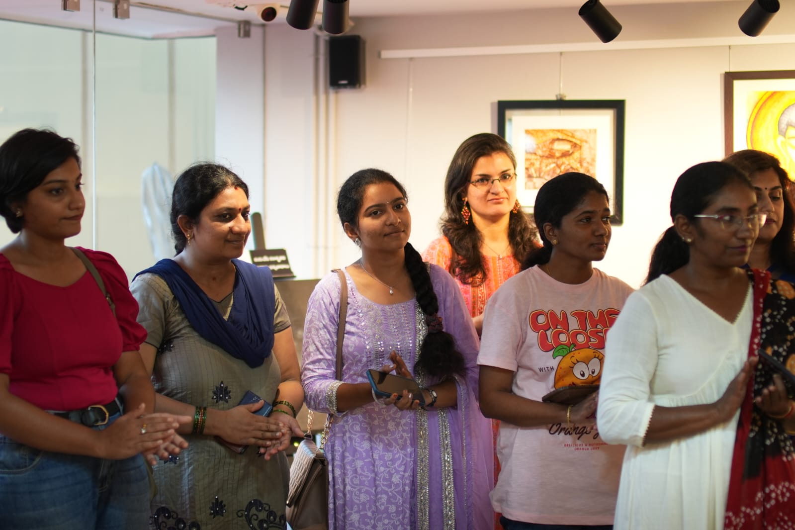
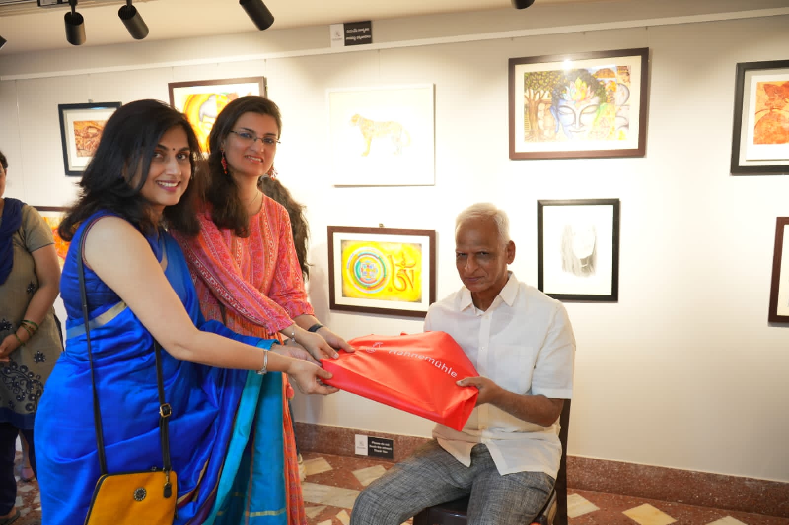
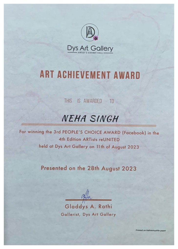
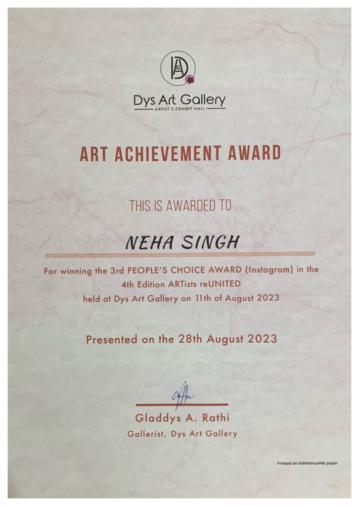
The second exhibition I was part of was an offline Group Show conducted by Dys Art Gallery in my city Visakhapatnam. The exhibition was titled ARTists reUNITED 4th Edition 2023(11 August – 20 August 2023) and a total of 17 extremely talented artists displayed some outstanding masterpieces at the gallery. I had displayed 5 artworks as part of this show. (Follow these link to view the exhibit) –
It was an amazing experience to interact with like-minded people in the field of art and exchange ideas with them. This exhibit was also extremely special for me as it conferred me with the honors of 3rd People’s choice Award on Instagram as well as on Facebook. Once again, my sincere gratitude to the gallerists for this honor. Sharing a few memorable moments from the show:
The AwardsThe Feedback
Extremely grateful to both the galleries, the jury and the gallerists for all their support and encouragement.
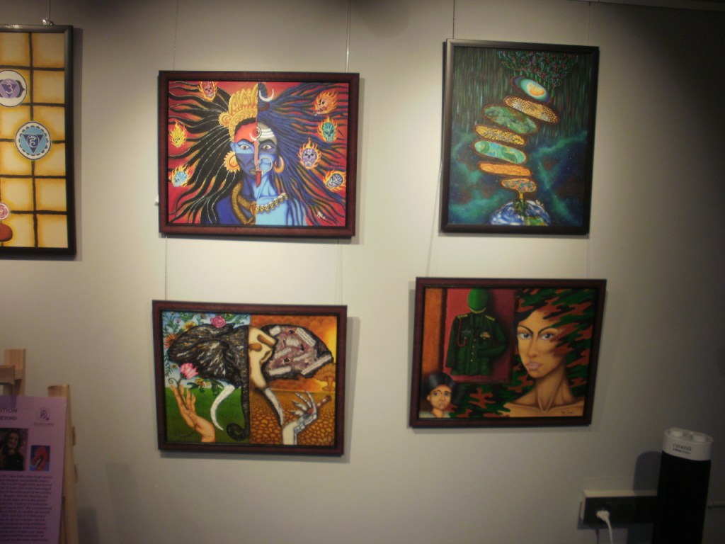
Today’s post brings the final artwork of my Buddha Sutra series which its titled, “Tashi Tagye – The Eight Signs of Auspiciousness.” This watercolor artwork depicts the eight auspicious symbols of Buddhism. These auspicious signs (called “Ashtamangala” in Sanskrit), are termed “Tashi Tagye” in Tibetan and are associated with different parts of the Buddha’s body. They also symbolize auspicious subjects and enlightened qualities.
These symbols, as illustrated in the artwork above and corresponding to the respective body parts of the Buddha as well as the qualities are:
Parasol – This represents the Buddha’s enigmatic head and signifies the many umbrellas, parasols and canopies offered to the Buddha by countless celestial and human kings which were blessed by the Buddha as symbols of protection from suffering, destructive forces and illness. The parasol represents the various aspects of the Buddha’s teachings which give peaceful solace from suffering. The dome of the parasol symbolizes wisdom and the hanging skirt represents compassion. It also represents protection of the practice of dharma.
The Golden Fishes – These represent the Buddha’s compassionate and clairvoyant eyes and symbolize fearlessness and freedom as they have complete freedom of movement in the water, taking on the bold, vast and dangerous oceans fearlessly. Thus, they symbolize the agility and swiftness of the Buddha’s enlightened mind. They represent the penetrating as well as transcendental wisdom of the Buddha.
The Lotus – This represents the Buddha’s tongue which is free from flaws of speech and is endowed with eloquence and the profound taste of the dharma. Just as the lotus is not sullied by muddy waters but thrives in them, the Buddha also thrives in the imperfect world unaffected by it. Thus, it symbolizes purity, immaculate existence and enlightenment.
The Treasure Vase – This represents the Buddha’s throat, which is considered an infinite treasury of wisdom and enlightenment. It is a reminder of the many positive aspects gained through the practice of the dharma. It also symbolizes the spiritual qualities of the Buddha as a container of nectar for immortality.
The Wheel Of Dharma – This represents the Buddha’s feet as well as his vast knowledge and understanding of the dharma. It is a metaphor for his spiritual teachings which he used to teach his disciples and subdue negative forces. The 8 spokes of the wheel represent the noble eightfold path. The hub of the wheel symbolizes moral discipline and the rim, meditative concentration. It is believed that an understanding of the cycle of life wheel stop the wheel from turning.
The Victory Banner – This represents the Buddha’s body and symbolizes the victory of positive virtues over negative ones and the invincibility of an enlightened being. It represents Buddha’s victory over the four “maras,” or hindrances in the path of enlightenment. These hindrances are pride, desire, disturbing emotions and the fear of death. It is a reminder of victory over lust and temptations and represents strength and solidarity in the practice of dharma.
The Conch – This represents the deep, melodious and pervasive voice of the Buddha and symbolizes the sound of the dharma which awakens sentient beings from the slumber of ignorance. It convinces them towards the path of noble and virtuous deeds. It also symbolizes fearlessness and resounding victory and is a call to focus while the teachings of dharma are present.
The Endless Knot – This represents the profound and mystical nature of the Buddha’s heart and mind. Its intertwining structure symbolizes the interdependence and interpenetration of reality and the complex and intricate nature of all phenomena. It indicates the immutable and adamantine state of enlightenment and the infinite connectivity of all things. It is a reminder how the life of all things intertwines, the continuity of harmony and the practice of dharma. It also symbolizes Buddha’s endless vision and compassion.
These 8 auspicious symbols can be drawn individually, in pairs, in fours or as a group of eight. When illustrated a group of eight traditionally, only seven items excluding the treasure vase are drawn as these seven form the shape of the vase. However, my artwork does not follow this norm and depicts all eight as individual entities. They have been enhanced further with their names written in Tibetan script calligraphy as well as prayer flags displaying Buddhist prayers.
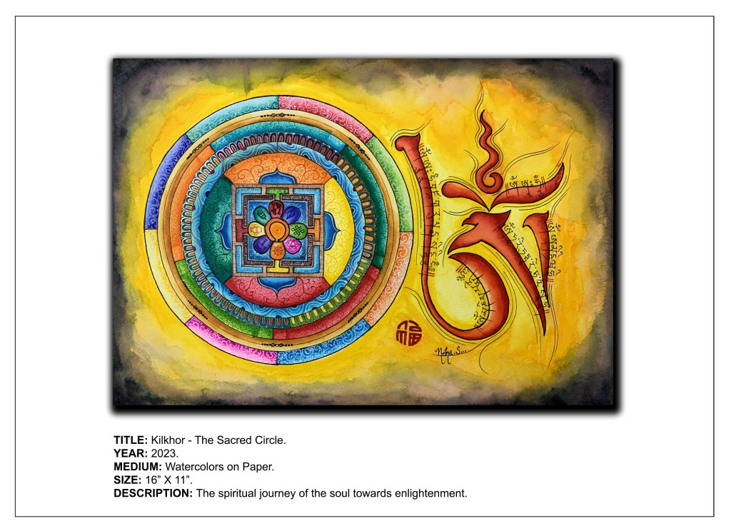
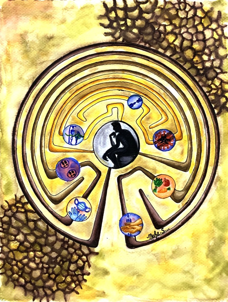
The artwork in today’s post is titled “Kilkhor – The Sacred Circle” and takes inspiration from the Tibetan Mandala and Thangka paintings. The Tibetan word for mandala is “Kilkhor,” which means “center of the circle with exterior walls and surrounding environment.”
The artwork
Mandalas are two- or three-dimensional ritual objects found in Tibetan Buddhist and other religious traditions. They are seen as objects for meditation, assisting in spiritual development. They represent the universe, and all the symbols represent one’s spiritual journey, from birth through life to death, interconnecting all living things. This spiritual journey is portrayed in the mandala through the various layers, starting form the outside to the innermost core, which in turn represents the ultimate destination of every soul – enlightenment.
In this artwork, the mandala that has been illustrated serves as a tool for gaining wisdom and compassion by guiding individuals along the path of enlightenment. It is a cosmic diagram or geometric pattern representing the various layers of worldly vices and weaknesses that one needs to overcome and the virtues that one needs to adopt and practice in order to attain the final goal of Nirvana. These 8 layers, starting from the outside and moving inwards in concentric circles are:
The eight vicissitudes (Outermost/1st layer) – Pleasure, pain, loss, gain, blame, praise, fame and disrepute.
The six roots of the mind (2nd layer) – Love, delusion, wisdom, hatred, generosity and greed.
The five precepts (3rd layer) – Lust, False/harsh speech, intoxicants, killing and stealing.
The five hinderances (4th layer) – Anger, sloth, restlessness, doubt and desire.
The three kinds of suffering (5th layer) – Suffering of conditionality, suffering of change and suffering of pain.
The four noble truths (6th layer) – The truth of existence of suffering, the cause of suffering, the cessation of suffering and the path leading to the cessation of suffering.
The Noble Eightfold Path (7th layer) – Right view, right thought, right speech, right action, right livelihood, right effort, right mindfulness and right concentration. This layer also represents the eight auspicious symbols associated with Buddhism, namely – the conch, endless knot, pair of golden fish, lotus, parasol, vase of jewels, Dharmachakra and victory banner.
The Zen Circle (Innermost/8th layer) – This is the circle of enlightenment, the final destination for peace and mindfulness.
Each layer is divided symmetrically into equal portions representing each of the respective qualities or elements associated with it. Traditional motifs employed in Thangka paintings and Tibetan mandalas have been used to illustrate them in different colours. The calligraphic script next to the mandala is a stylized version of the Tibetan alphabet for “Om”, which has been further accentuated with some common Buddhist mantras also in Tibetan script.
This mandala symbolizes every individual’s endeavor to overcome all the worldly attachments (represented in the first five layers), realizing and accepting the four noble truths (represented in the sixth layer) and finally adopting the eight noble virtues (in the seventh layer) through the power of meditation and detachment in order to transcend metaphysically into the pure state of awakening (the eighth and innermost layer).
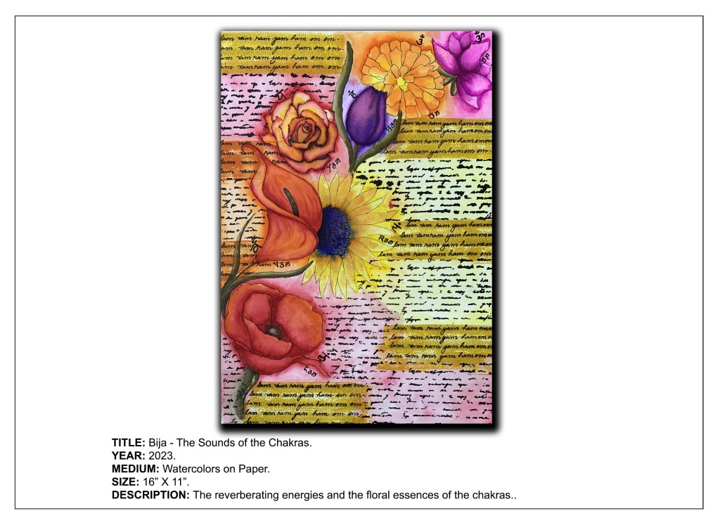
Greetings from The Art Dungeon! Today’s post brings a new artwork for all my followers and subscribers. This one is called “Bija – The Sounds of the Chakras” and is the eighth edition in my ongoing “Buddha Sutra” Series.
This painting is a portrayal of the 7 “Bija mantras,” one corresponding to each of the 7 “chakras” or energy centers in the human body. The word “Bija” in Sanskrit literally means seed and is used metaphorically for the origin or starting point of all creation. In Buddhism, the term “Bija mantras”is used for mystical “seed syllables” contained within mantras. These are one syllable sounds which have no literal meaning, but connect to spiritual principles or energies. It is believed that these seeds could stimulate physical, emotional, and spiritual growth and metamorphosis.
The 7 Bija mantras, which have been hand-printed in the artwork, when chanted while meditating, help in awakening their corresponding chakras and balancing their energies. The 7 chakras themselves have been illustrated by their respective floral essences. The mantras and the flowers for the respective chakras are:
Muladhara (Root Chakra) – LAM; Poppy flower.
Svadisthana (Sacral Chakra) – VAM; Calla Lily.
Manipura (Solar Plexus Chakra) – RAM; Sunflower.
Anahata (Heart Chakra) – YAM; Rose.
Visuddha (Throat Chakra) – HAM; Tulip.
Ajna (Third Eye Chakra) – OM; Marigold.
Sahasrara (Crown Chakra) – OM; Lotus.
Each chakra is connected symbolically to their respective flowers, either due to the colour of the flower in direct correspondence to the colour of the chakra itself or by the structure of the flower in relation to the role and purpose of the chakra. In other words, while the color of the flower depicted in the artwork may not match that of its corresponding chakra, it will still be connected to it in terms of its characteristics relative to the chakra.
It is said that the Bija mantras, when said out loud, activate the dormant power of the associated chakras and resonate with their energy, which purifies and harmonizes the body and mind, thus connecting us to cosmic energies, strengthening our spiritual powers and bringing on a state of awareness.
Hey fellow art enthusiasts! As promised, here I am with the outcome of the little snippet I shared in last week’s post!! So, are you all ready for the big reveal? Here it is!
This is it!
The final artwork
This watercolor artwork is called Bo Tree – The Emblem of Enlightenment. It is a representation of the Bodhi Tree (Ficus religiosa), under which Siddharth Gautam, who later became known as the Buddha, is said to have attained enlightenment or Buddhahood.
The Bodhi Tree is a principal religious symbol in Buddhism due to its prominence in the Buddha’s discovery of enlightenment, or total peace and happiness in the form of Nirvana, or the greater reality. “Bodhi” means awareness and Bodhi tree means the tree under which Buddha becomes fully aware of the noble truth of the universe.
Essentially the ‘tree of awakening,’ also known as the Bo Tree, in Pali it is known as the “bodhirukkha,” in Sanskrit the “bodhivṛkṣa” and to botanists as Ficus religiosa. Given its close association with the attainment of Buddhahood, the tree has great symbolic significance.
This tree as depicted in the artwork represents the supreme knowledge acquired by the Buddha during his tireless meditation. It conveys the teachings and sermons he preached and passed on to his disciples and followers. These teachings are illustrated in the artwork in the Pali script and represented as scribbles in the canopy of the tree. The tree reflects the capacity of every human being to follow in the footsteps of the Buddha in achieving the ultimate spiritual goal by letting go of the finite self through meditation and self-discipline. The heart-shaped leaves of the Bodhi tree symbolize peace and happiness developing in one’s heart during the journey towards Nirvana.
The Bodhi tree is the DNA of Buddha’s teachings, an emblem of peace and a reminder of the eventual prospect of enlightenment that lies within us all.
Hey folks! This week it’s going to be a short and sweet post. Working on a new project, albeit part of my ongoing “Buddha Sutra” series. Here’s a small snippet of what I am working on currently. Take a guess as to what it could be!
Do share what you think it is in the comments section below. Would love to hear your ideas. And yes! Look out for the final artwork which will be up soon!!
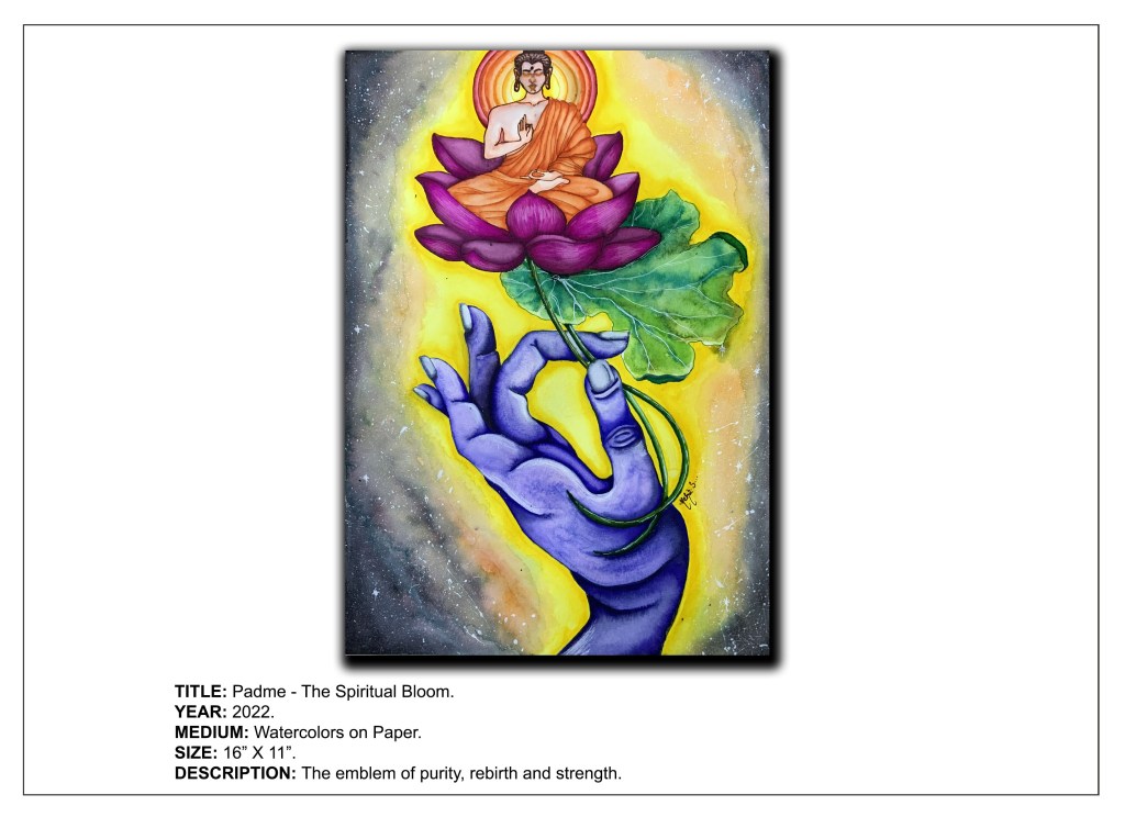
“Just like the lotus we too have the ability to rise from the mud, bloom out of the darkness and radiate into the world.”
The lotus is one of the most revered and sacred symbols of Buddhism. It is this holy symbol that is the subject of today’s artwork tilted, “Padme – The Spiritual Bloom.”
The lotus represents spiritual awakening, purity, and rebirth as the act of emerging from muddy water symbolizes rising above the challenges and adversities of life and moving towards the light of wisdom. It also represents nonattachment, as it is rooted in mud (attachment and desire) but its flowers blossom on long stalks untarnished by the mud below (detachment).
Another important aspect of the lotus is that when it blossoms, it simultaneously plants a seed, representing the Buddhist concept of cause and effect, whereby the flower is symbolic of the cause and the seed-pod the effect.
The lotus serves as a reminder that all beings can attain enlightenment. Just as the blossom rises from the depths of murky ponds and lakes to bloom immaculately above the water’s surface, so can the human mind develop the virtues of the Buddha and transcend desire and attachment to reveal its essentially pure nature. It symbolizes the blooming of the soul from the filth of the physical world, eventually flourishing in the bright sunshine of enlightenment and attaining nirvana.
There are a variety of colors of the lotus associated with Buddhism. The pink lotus is the supreme one and is the true lotus of Buddha. It is for this reason that the Buddha in this artwork is depicted seated on a pink lotus, which indicates His enlightened and divine status.
All symbolism associated with the lotus points towards finding spiritual meaning in life. We all are like lotus blooms in the universal pond, striving to realize our true potential.
“There are no enlightened beings, only enlightened actions.”
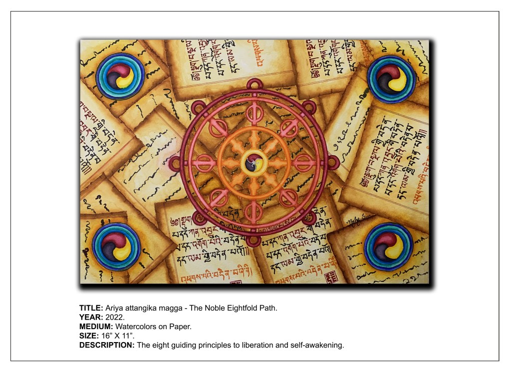
Buddhism revolves around the principle of Dharma and encompasses various traditions, beliefs and practices of Lord Buddha. Buddha gave his first sermon in Sarnath to Kaundinya and four other scholars. In Isipatana of Sarnath, he preached about Dhammacakkappavattana Sutta, which includes Four Noble Truths and Noble Eightfold Path.
It is these fundamental doctrines of Buddhism that have been displayed in the artwork shown below, the title of the artwork being, “Ariya atthangika magga” – The Noble Eightfold Path. The Noble Eightfold Path is one of the principal teachings of Buddhism and is the fourth truth of the Four Noble Truths and regarded by Buddha as the medium to attain Enlightenment.
This artwork depicts the Noble Eightfold Path through the Dharma Wheel (Dharma Chakra), with its eight spokes representing the eight elements of the path, namely – right view, right resolve, right speech, right conduct, right livelihood, right effort, right mindfulness, and right concentration (or “samadhi”).
The four circles in the corners represent the Four Noble Truths, namely – The existence of suffering, its cause, its cessation and the path leading to its end. The path alluded to in the fourth truth is the Eightfold Path, which ultimately leads to enlightenment or Nirvana. This path is also depicted textually in the form of Tibetan manuscripts in the background of the artwork.
The Noble Eightfold Path is all about ending the suffering of life and achievement of self-awakening. It enables us to overcome the “I” and attain harmony with the world around us. Being always awake and aware, is fundamental to a good life.
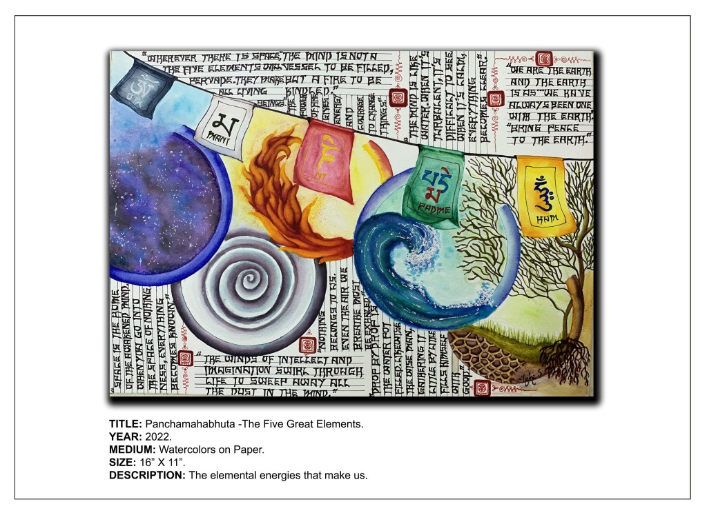
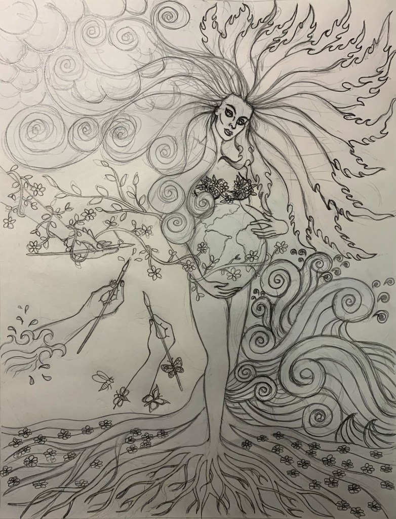
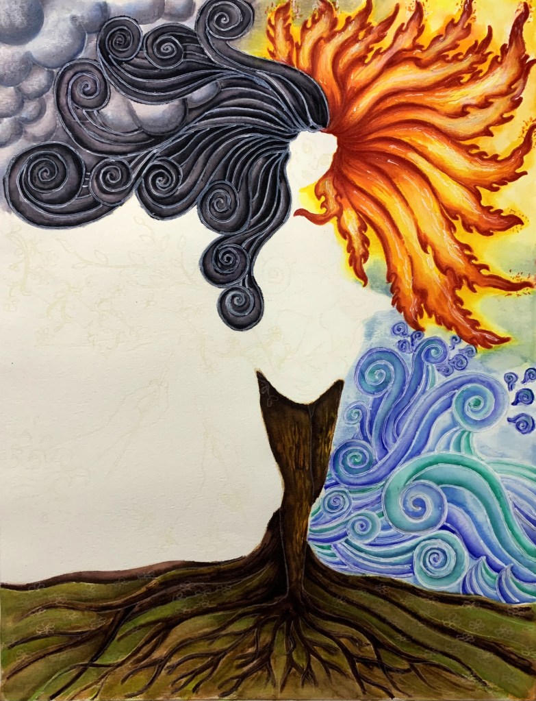
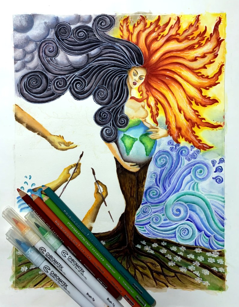
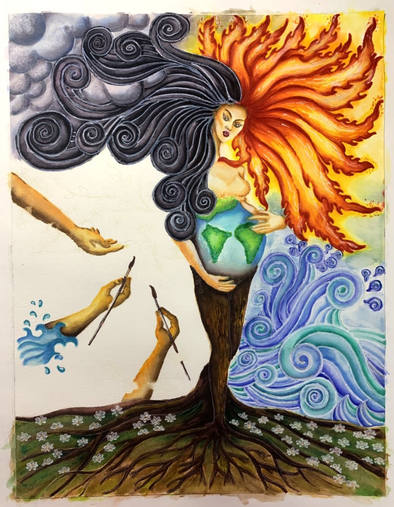
Earth, water, fire, air, and space are the five elemental energies that reside inside each one of us. It is these five elements that form the basis of this week’s watercolor artwork called Panchamahabhuta – The Five Great Elements. As in the title, these five elements are called “Panchamahabhuta” in Sanskrit and compose not only the universe, but the human body and mind.
The artwork
Each element represents a force of nature as well as a potential and quality of the human mind. The mind’s ability to serve as the ground for all experience is the quality of earth; its continuity and adaptability is water; its clarity and capacity to perceive is fire; its continuous movement is air and its unlimited emptiness is space.
These elements have been visually illustrated in the artwork along with corresponding text written in stylized calligraphy. Each element has also been represented as a Sanskrit syllable on prayer flags in synonymous colors.
We can discover our true potential by exploring and navigating through the terrain of these five elements that we are composed of. We can heal ourselves by acknowledging, aligning and connecting with these fundamental energies, thereby leading our lives with wisdom and grace.
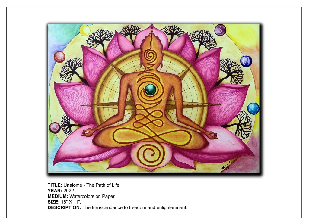
The Unalome is both a Buddhist and a Hindu spiritual symbol. It represents the path to freedom or enlightenment, or in simpler terms, your life’s path. The sign consists of three parts: the spiral, the swirl, and the dots at the end.
The spirals represent the twists and turns in life.With these ups and downs and unexpected encounters, one becomes more and more aware. The spiral represents the state before one spiritually awakens. After the spiral comes the swirl, which gets smaller and smaller and turns into a straight line. When you are aware of your thoughts, you have more focus and clarity and the road becomes less winding. The straight line is the moment of enlightenment or peace and harmony. When one gets out of the swirl, he or she suddenly see everything very clearly. Like a straight line. The road is pure, that’s where one is free and reaches enlightenment. The dots represent death, or the moment we fade into nothing. They also represent the uncertainty of life.
The lotus flower symbolizes how we can overcome all the obstacles on our journey to enlightenment and flourish. The Buddha is shown seated on a Lotus flower with a compass forming His halo. This symbolizes the path navigated by the compass of meditation towards freedom and enlightenment which can be achieved by harmonizing the 7 chakras depicted in the artwork. The trees represent growth and progress thereafter.
The Buddhist Unalome is a visual metaphor for the journey towards enlightenment. It inspires us to carve out our own path, which is unique to each one of us. Even though the journey as well as the path is uniquely different for each one of us, ultimately, the destination is the same – liberation.
“A disciplined mind brings happiness.” – Gautam Buddha.
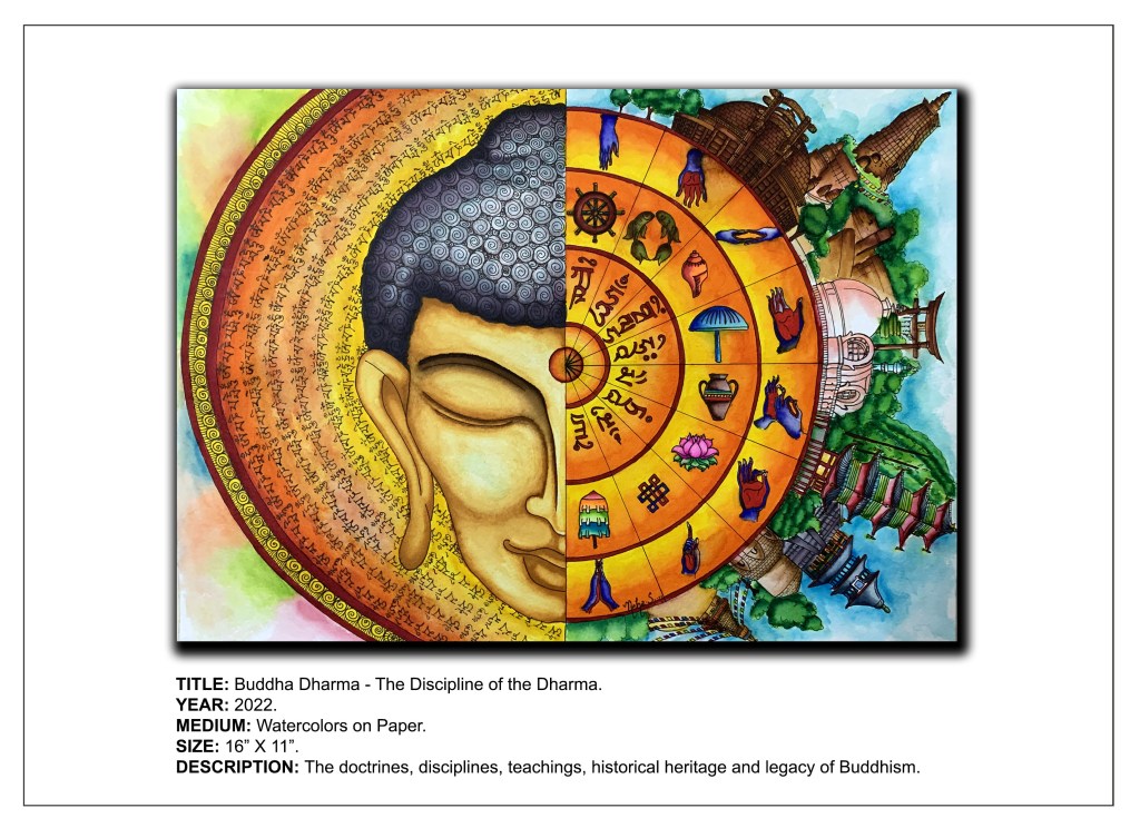
Reviving my blog and my art after a prolonged creative block. Today’s post is about my artwork titled Buddha Dharma – The Discipline of the Buddha, which is a sequel to the story of the Buddha and a continuation of my “Buddha Sutra” Series. Here’s an image of the artwork I have created:
Over his lifetime, the Buddha preached a wide range of teachings that were collectively known as the Dharma or Buddhadharma. This watercolor artwork depicts not only the doctrines, disciplines, and teachings of Dharma but also the historical heritage and legacy associated with it.Dharma has been symbolized in the painting by the powerful Sanskrit mantra – “Om Mani Padme Hum.” This mantra,within whichevery one of the Buddha’s teachings is believed to reside, has been illustrated in the halo surrounding the Buddha’s face on the left as well as inside the “Dharma Chakra” or Dharma Wheel on the right. Also depicted within the Dharma wheel is the “Ashtamangala” or the Eight Auspicious Symbols in Buddhism. These symbols, which are also teaching tools, include: the conch, endless knot, pair of golden fish, lotus, parasol, vase of jewels, Dharmachakra and victory banner. The various hand mudras associated with Buddhism have also been depicted within the Dharma Wheel.
The historical heritage of Buddhism has been illustrated in the form of Buddhist monuments of the likes of the Sanchi Stupa, the Mahaparinirvana Temple, the Mahabodhi temple, the Dhamekh Stupa, the Vishwa Shanti Stupa and some other monestaries and temples.
The Buddha’s teachings encompass the nature of the mind, the true nature of reality in the form of the existence and acknowledgement of suffering, the path to ending suffering, and finally the possibility of achieving nirvana through meditation and detachment.
“It is better to conquer yourself than to win a thousand battles. Then the victory is yours. It cannot be taken from you, not by angels or by demons, heaven or hell.”
The Buddha introduced into the world a philosophy which helped mankind navigate through his suffering. The life he led and the experiences that made him confront suffering also guided him to his final destination – the attainment of enlightenment. Buddha symbolizes a path to liberation and detachment from the triviality of the material world.
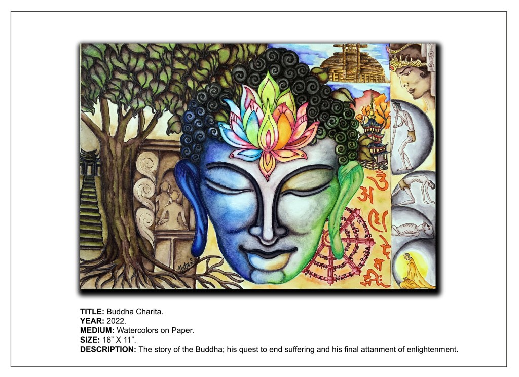
The most well-known historical account about the Buddha is the story of his life. It is this divine narrative that has become the inspiration for my latest artwork titled “Buddha Charita”, which is also the culmination of my new series – “Buddha Sutra”. Here’s an image of the artwork I have created:
This watercolor artwork is a visual narrative linking several events in the life of the Buddha from his days as Prince Siddhartha Gautama, his confrontation with suffering, his quest for a path towards the cessation of this suffering and his final liberation in the form of his “awakening”.
The first embodiment of the Buddha as the royal Prince Siddhartha has been represented in the right-hand corner of the artwork by an image of him, resplendent with royalty. This is followed by the next stage in his life, where he comes across the sight of a decrepit old man, a sick man, and a corpse which have all been portrayed one below the other in the artwork. These sights changed the perspective of the prince and opened his eyes to all the suffering that accompanies life. Also depicted in the painting, is the image of an ascetic that Gautama encountered, who had learned to seek out spiritual solace in the midst of these worldly miseries and sorrows. Determined to find the same enlightenment, Gautama turned towards the path of renunciation.
After exploring asceticism, or restraint from all physical needs and desires, he discovered meditation and used the practice as a path toward enlightenment. This led to the third stage in the life of Siddhartha, which is displayed in the artwork as the central image of the Buddha, “the awakened one”. The tree on the extreme left of the painting represents the sacredBodhi tree or the fig tree (Ficus religiosa) under which the Buddha meditated and finally reached the highest state of enlightenment or “nirvana,” which simply means “awakening”.
In addition to the figurative representation of the Buddha himself, his teachings have also been represented in the artwork through iconographic symbols of the likes of the Lotus flower and the Dharma Wheel. Other icons displayed in the artwork include various Buddhist monuments like pagodas and stupas, specifically the Sanchi Stupa, which is considered to be the most sacred monument of Buddhism, as it represents and displays various Buddhist ideals.
Through this artwork, I wish to honour Buddha’s life, for it is a reminder of the basic Buddhist principles that form the stepping stones to a higher spiritual level.It is these principles that serve as a source of strength in the grief-stricken world. It is my attempt to convey the philosophy of Buddha by reflecting on his life’s experiences and pledging to practice inward reflection to overcome sorrows, just as he did.
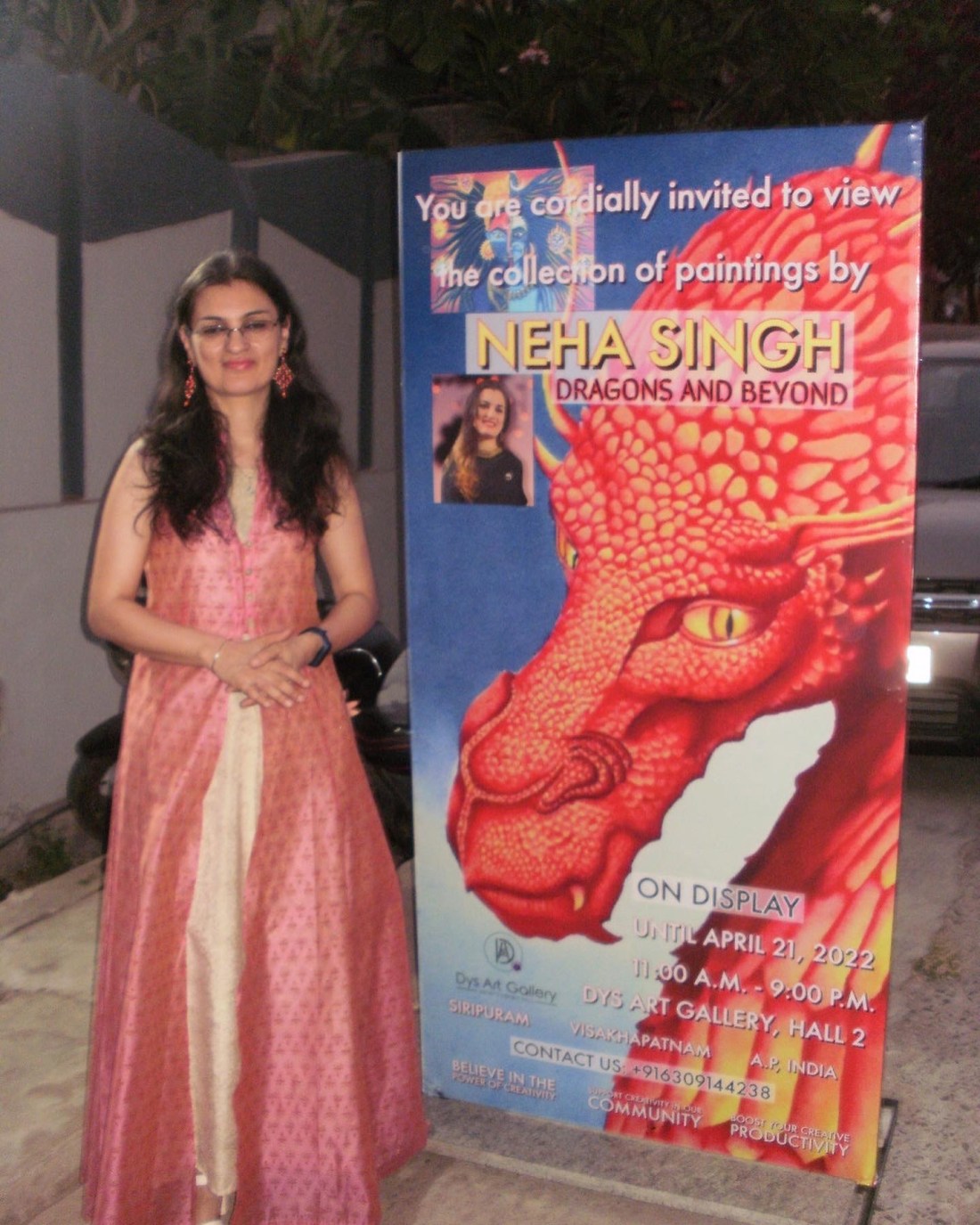
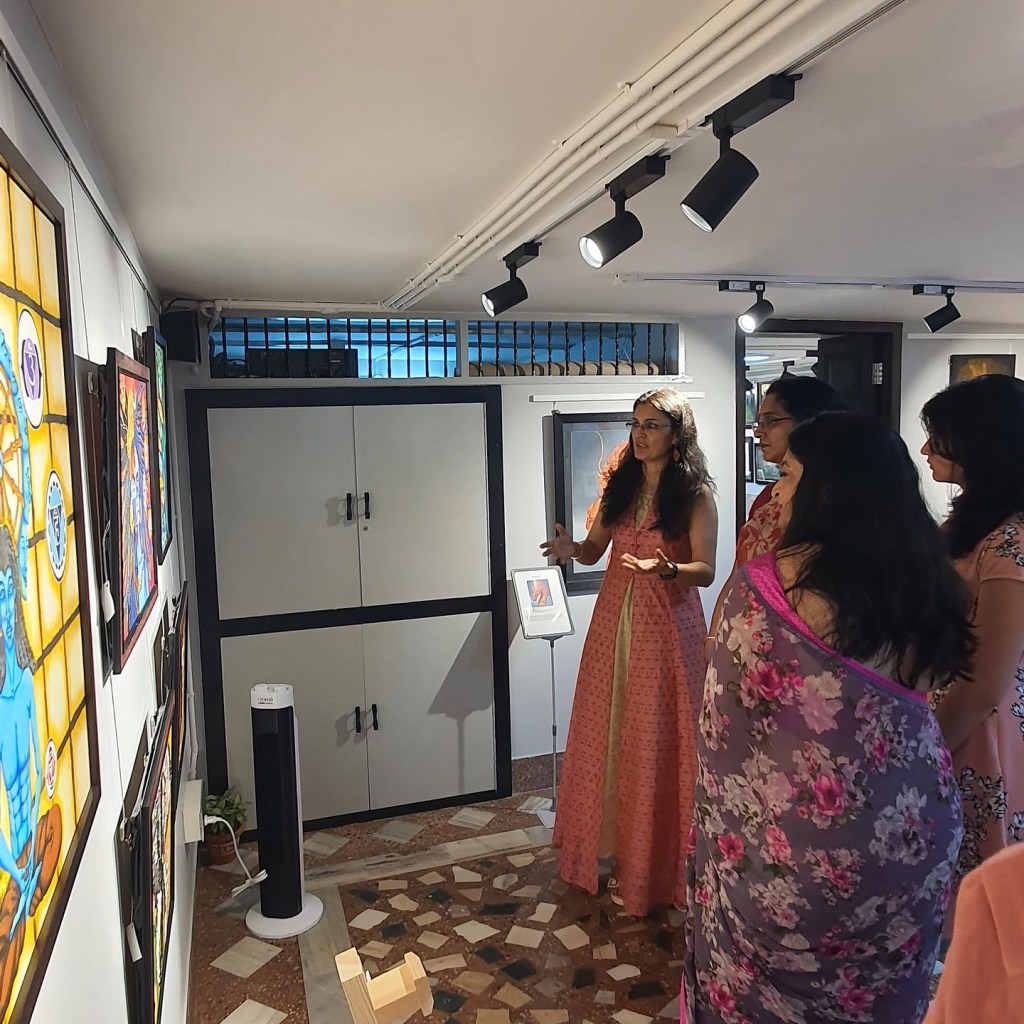
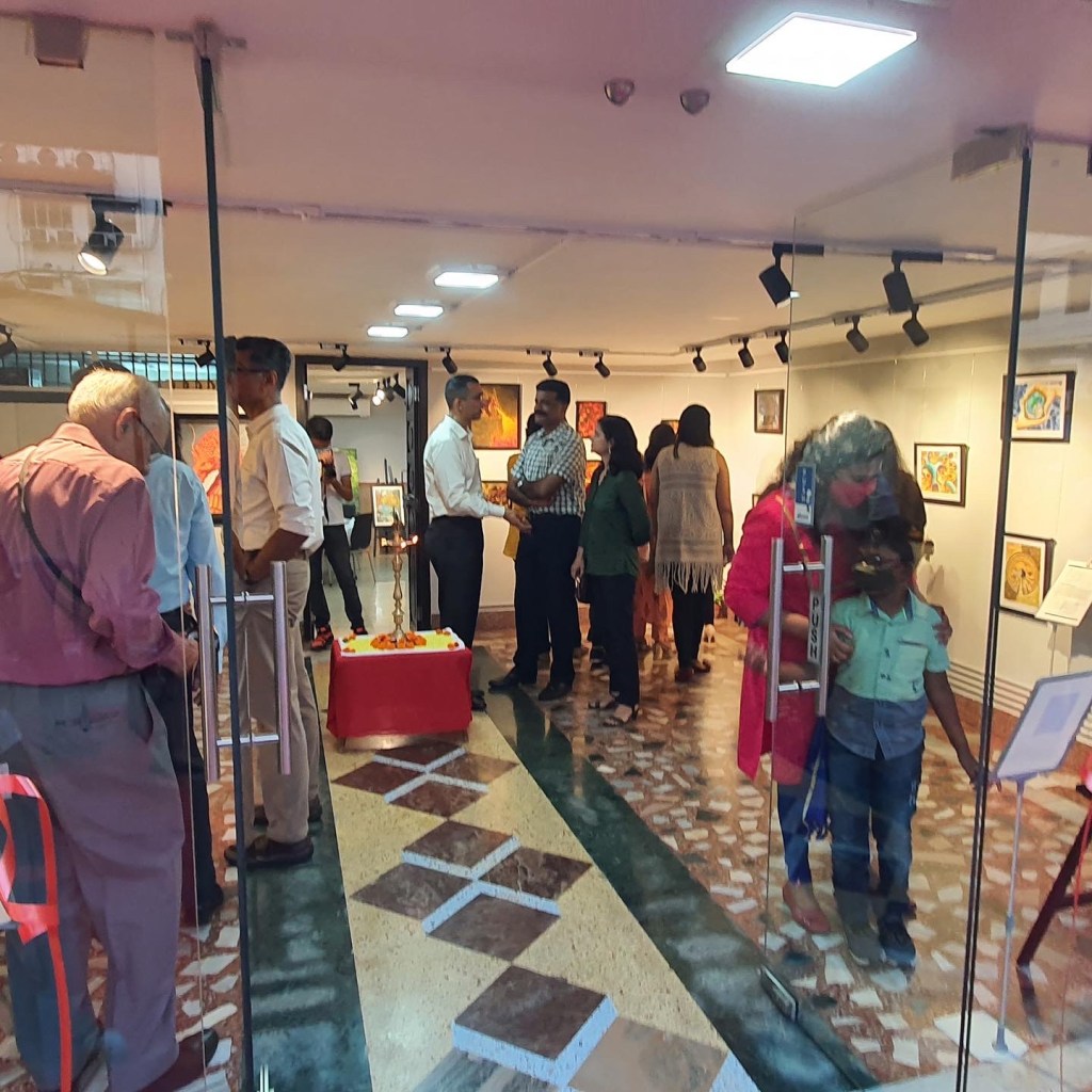
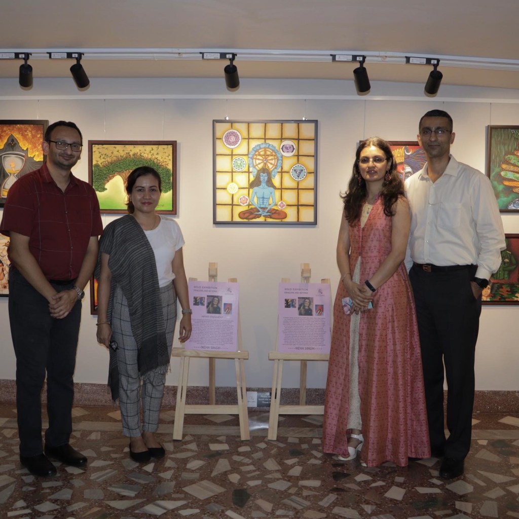
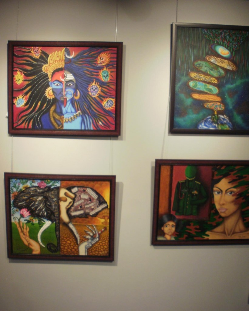
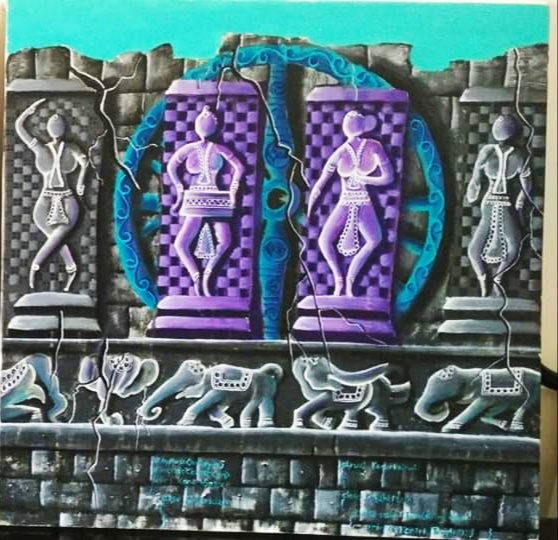
I know I have been off the radar for a long time but I have a valid reason for that! The last few months have been extremely busy and exhilarating ones for me and I am super excited to share with you all that I recently had the pleasure of holding my very first solo art exhibition!
It was an incredibly challenging yet invigorating experience for me and nothing I have ever done before can match the thrill of seeing a gallery full of my work. Seeing my pieces on display in a radiant, well-lit space gave me a feeling of elation like none other. I never imagined it would feel so out of the world!
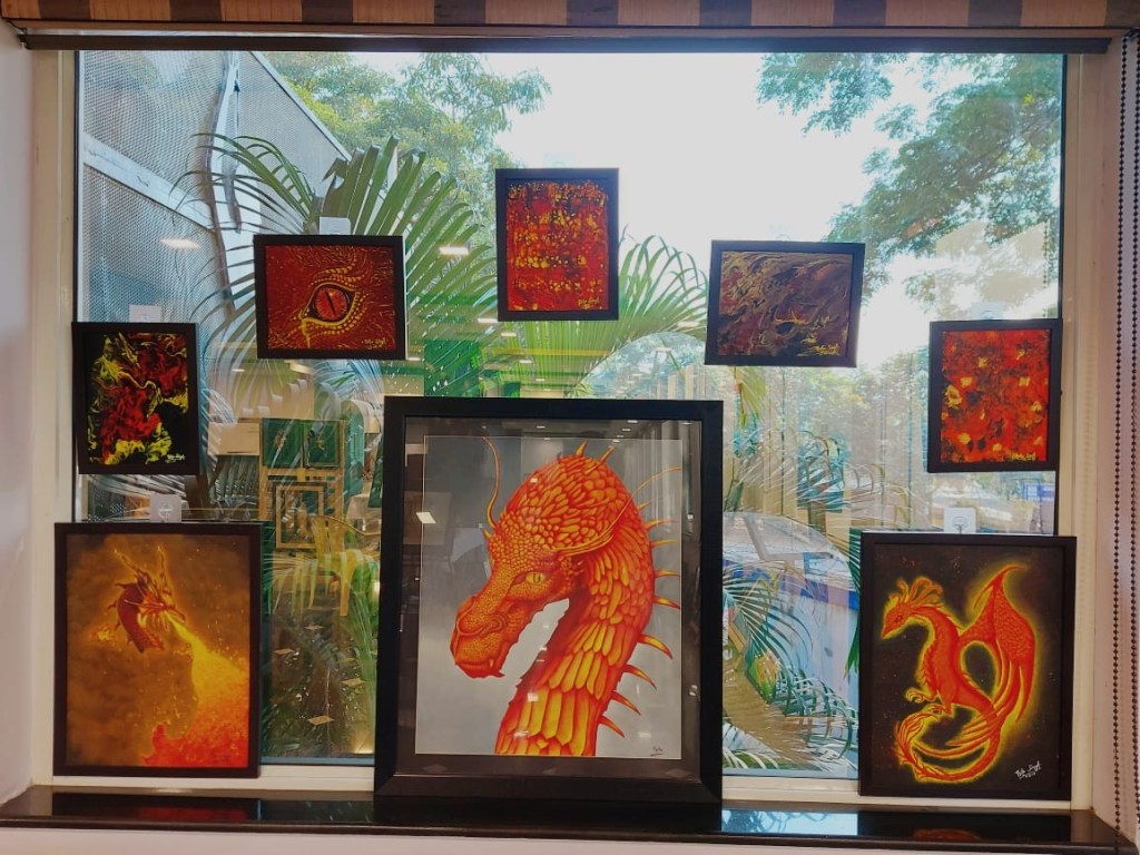
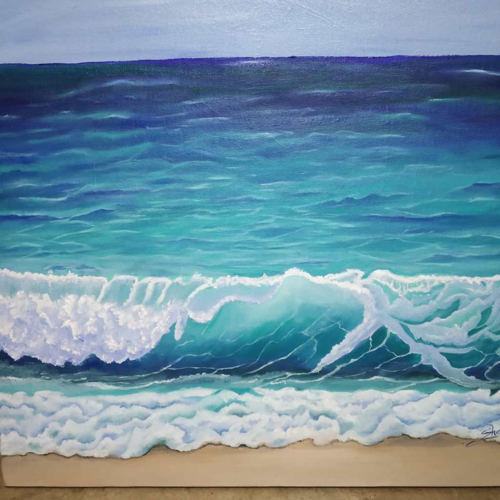
My artworks were on display at Dys Art Gallery, Siripuram Junction in Visakhapatnam from 15 April to 21 April 2022. The exhibit titled “Dragons and Beyond” was launched on the 15th of April 2022 and showcased a collection of 26 original works in all, which have been inspired by various muses, including my all-time favorite, the dragon.
Many of the artworks on display are works from earlier years while others are more recent as I wanted to put up a good mix from the past as well as the present. Most of my works belong to the genre of conceptual art and constitute my way of expressing not just what I feel and believe in, but also sharing the joy and pleasure I get from painting.
As mentioned earlier, the exhibit featured 26 original works for display as well as sale, ranging from small-scale paintings to medium sized ones. I had showcased three different series, namely the Dragon Series, the Navrasas series and the Lockdown Saga series.
Each piece in the collection has its own story to tell and a message to convey. It is my sincere endeavor and attempt not only to emote through my work, but also to send out a social message through my art. I hope my viewers can feel through my paintings what I feel and comprehend the deeper meaning behind each and every piece every time they look at one.
I also had the honor and privilege of being featured in the newspaper, The Hindu, along with my work. Sharing an image of the article and a few snapshots of the collection as well as the show.
The last few months leading up to this solo show have been a roller coaster ride, one full of mixed emotions and ups and downs, but in all, it has been a fabulous learning experience in terms of fine-tuning my creative process and growing as an artist. This was a life-time opportunity for me, a golden one at that and has been a long time coming. In fact, it’s been a life-long dream, and to see my dream becoming a reality is absolutely thrilling! I am grateful to the gallerists, Ms. Gladys Rathi and Mr. Krishna Rathi for providing me with this opportunity and special thanks to my dear husband for discovering this place..couldn’t have done it without you!
Hey folks! Here I am again with my next post about yet another magazine cover artwork that I have had the distinct pleasure and honor of creating. So, without further ado, let’s get started!
The artwork I am sharing today is based on the theme “Honoring the Past, Treasuring the Present and Shaping the Future.” Conceptualizing an artwork around this thought has been quite a challenge for me as not only is this subject extremely profound, but is also a challenging one in itself.
Here are a few snapshots of the original artwork that I created in accordance with the above theme as well as the magazine’s cover page showcasing it. Also including a small write up explaining the concept, that was published in the magazine.
The original artwork
The cover pageThe write up
When I started working on this concept, I was in quite a fix and it seemed like a herculean task to be able to justify a theme as complex as this one. It was my good fortune when I came across this quote – “Past is experience, Present is Experiment and Future is Expectation. Use your experience in your experiments to achieve your expectations.” This motivational mantra became the basis of my artwork and helped me in conceiving the idea behind it.
It is my belief that the past is a treasure trove of wisdom and experience that has been left behind by our ancestors and elders. I have tried to reaffirm this through the silhouette of the old woman, thereby symbolizing our ancestry. I have illustrated the legacy that they have bestowed upon us in the form of their age-old ways of simplistic and holistic living. It is this past heritage that we need to honor by imbibing it in our present-day lifestyle.
The present that we live in today is work in progress and a reservoir of everything from the past. It is this reservoir that I have portrayed in the artwork as an amalgamation of our values, customs, traditions as well as our environment and ecosystem. I have also personified the present through a younger woman’s silhouette who is seen nestling the future – our world – in her arms, at the same time honoring her forebearers by seeking their blessings. The baby in her arms symbolizes our future world which will be shaped by our coming generations.
So this is how I have approached the theme and tried to express it as best as I could through my artwork. I believe that what we have today is what we need to cherish and conserve as it is as valuable as our past. For it is this past and the present working hand in hand that will mold the future for the world to come.
Hey all! I know I have been MIA for quite some time but I’m back now with a new post about my most recent artwork. This too has been long overdue, as I allowed procrastination to get the better of me, but finally, I have succeeded in completing it!
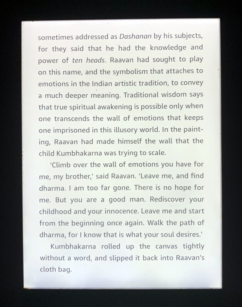
In one of my previous posts, I had talked about how a book can become the source of inspiration for my art, in particular the third book of the Ram Chandra Series – Raavan: Enemy of Aryavarta, by the Indian author Amish Tripathi. This work of fiction chronicles the life of Ravan and portrays him as an artist among other things. One of the excerpts from the book describes a painting made by him that is not only a character sketch of himself but also a logically befitting description of the concept of “dharma” or the “righteous path”. (Click on the following link to read this post – https://theartdungeon.blog/2021/06/06/inspiration-calling/).
The beautiful artwork created by Ravan and described in this excerpt was not just a vivid description of Ravan’s psyche, but also a profound portrayal of his struggle to attain the right direction through the “moral compass” called dharma.
This one-of-a-kind piece of art became my muse purely because of the distinctive way in which it brings out the true essence of Ravan. I was so enamored by his narrative that I couldn’t wait to interpret it in my own way and create my very own version onto my canvas. Finally, I managed to do that and here I present to you, my acrylic painting titled “Moksha”.
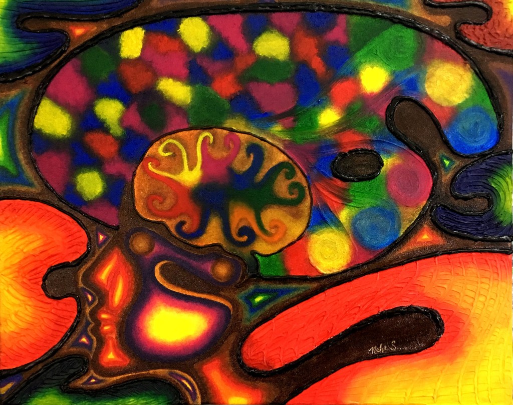
In the book, Ravan describes a painting created by him that depicts his struggle to attain enlightenment. I have attempted to depict his mental turmoil and his desperate attempts to scale the wall of the Nine emotions or the Navrasas that hold him down. The ten heads in my artwork correspond to the ten heads of Ravan himself. Out of these, 9 represent the Navrasas, one for each emotion, whereas the tenth head is the state of spiritual awakening that Ravan is striving to achieve.
I have further attempted to add on to the concept by depicting the 7 chakras or the main energy centers that control our body. My endeavor is to reaffirm that one can only transcend the wall of emotions by opening up all the chakras, allowing energy to flow freely, thereby harmonizing the body, mind as well as the spirit. It is only this equilibrium that can help one attain physical, emotional and spiritual “moksha” – which was not just the “righteous path” being pursued by Ravan, but also the “dharma” attained by the Buddha.
Hope you all like my approach towards Ravan and his “moksha!”
Hello everyone! This post is extremely special as the artwork I am sharing today is the culmination of my Navrasa Series of works. For the uninitiated, Navrasas are the 9 emotions that form the foundation of Indian classical dance and music, theatre, art and literature, essentially the traditional Indian performing arts. These are the basic emotions, moods or sentiments that figure in the daily lives of every human being. (Click on the following link to learn more about these 9 emotions and the concept of Navrasas – https://theartdungeon.blog/2019/09/21/the-art-of-emotions/)
Coming to the emotion I am covering today, that is, Vibhatsa Rasa. The word “Vibhatsa” is a Sanskrit word that means “disgust” and is traditionally represented by the color blue in Indian art and literature. It is a feeling of Disgust or dissatisfaction with oneself and others. Vulgar, uncivilized, and perverted actions, using bad words and manners, and showing bad intentions to others are all manifestations of the Vibhatsa Rasa. All creative arts, dance and theatre to fine arts and literature and poetry are replete with imagery that pertains to Vibhatsa.
In today’s post, I am sharing my depiction of the Vibhatsa rasa through my artwork titled Vibhatsa – The Web of Disgust. This painting is an expression of how much a woman detests being considered as an object of gratification by the society and is disgusted by its countless atrocities. She loathes the unending discrimination and is sickened by the web of deceit and immorality that has been spun around her by the social order. She is so outraged by the incessant delinquency of the world around her that she is absolutely repulsed by it, just like the spindly gossamer of a spider that clings to the skin until it evokes a feeling if disgust. The medium I have used to create this artwork is oil paints and the color palette mainly consists of warm earthy tones of the likes of cream, off-white, browns etc. This of course is a deviation from the traditional color of blue that has been designated to the emotion in question, but I have always been one to break the norm. Here’s an image of the artwork followed by links to a couple of videos displaying the making of the artwork and some behind the scenes snippets:
As is visible in the painting, it depicts disgust through the lacy spindles of a spider’s web which portrays within itself the various atrocities and injustices that the feminine gender endures. Apart from this, I have also used symbolism in the form of the eye and the eye ball to represent the objectification of the fairer sex and the claw-like hands to signify the society preying on her.
When it comes to a subject like emotions, their portrayal and in turn their interpretation becomes a matter of perspective, not just for the artist but for the viewers as well. What may seem positive to the artist may be perceived as negative by his audience or vice versa. Moreover, it also depends on the mindset of the person, hence emotions in art are a totally subjective prospect.
Vibhatsa being a negative emotion in itself ideally comes across negatively in art but it has been my sincere attempt to bring it out as positively as possible through this painting. I intend it to be thought provoking and serve as an eye opener to the society with an aim to bring in the winds of change. I hope that this message emanates loud and clear through this artwork and is interpreted positively rather than negatively.
DISCLAIMER – All the information, data and imagery in this blog post is for informational and educational purpose only. Some images and data may have been taken from the links included below and I give full credit to these websites/pages, thereby in no way claiming them to be my own. Other data is based on my personal experiences and opinions.
Ever got inspired by a book you have recently read to create art? I am sure we all have, but ever felt inspired enough by art mentioned in the same book?
Read on if you want to know more!
We all wonder where artists get all their inspiration from. Well, as is true for all creative fields, when it comes to finding inspiration, sky is the limit. One good source of inspiration though for most artists is books. I firmly believe that it’s very important for every artist to delve into books as not only do they light up that creative spark in them, but also help keep it burning. The key to making good art consistently lies in extracting the right amount of inspiration from the literary sources at hand. So don’t just read books, let them spur your imagination and awaken the artistic streak!
Being an avid reader myself, I am on a constant mission for artistic revelation in whatever I read. It doesn’t matter what genre it belongs to, as long as it creates ripples in my imagination and brews up a creative storm, it works for me.
As an artist, there are times when I hit a dead end and it is in such periods of creative drought that I turn to books to jump start my imagination. Moreover, books help me evolve and develop my artistic skills in new and different ways. Books are like that breath of fresh air that helps me tide over my creative hypoxia. Besides, reading is my second most favorite activity next to art!
It was during one such recent literary sojourns that I came across inspiration for my artistic endeavors. I have just finished reading the third book in the fast-selling Ram Chandra Series by the Indian author Amish Tripathi – Raavan: Enemy of Aryavarta. This book is part of an ongoing mythological-fiction series about the life of Lord Ram, Lady Sita, and Ravan and the third book chronicles the life of Ravan in particular.
Through this book, the author has not only presented Ravan as the darkest villain in Indian literature by reinventing his evil, but has also put forth deep-rooted philosophies through his portrayal as an artist. One such excerpt from the book describes a painting made by Ravan that is not only a character sketch of himself but also a logically befitting portrayal of the concept of “dharma” or the “righteous path”. Here’s the excerpt I am talking about:
What inspired me the most in this excerpt was the beautiful artwork created by Ravan. I felt it was the most innovative and intelligent description of Ravan as the ten headed demon, encompassing all his greys and whites in the form of the nine emotions (navrasas), which also symbolize the emotions that control us during various phases of our lives. It is also a profound portrayal of our struggle to attain the right direction through the “moral compass” called dharma.
The artwork has been so beautifully described by the author that I can literally picturize it in my mind. I am so inspired by this imagery that I have added it to my wish list and I can’t wait to create my own version of this beautifully explained philosophy onto my canvas! Will share the final outcome here whenever I get down to doing it so, watch out for it!
Disclaimer – All the information, data and imagery in this blog post is for informational purpose only. Though the images included in this post have been quoted from the book title provided below, I give full credit to the original author, Amish Tripathi for this creation in its entirety, thereby in no way claiming it to be my own. Other data is based solely on my personal experience and opinions.
Sources and Credits –
Raavan: Enemy of Aryavarta (Book 3 of the Ram Chandra Series by Amish Tripathi).
Hey folks! After a really long hiatus, I’m back with another post. Apologies for being M.I.A! Will try not to disappear for too long in future!!
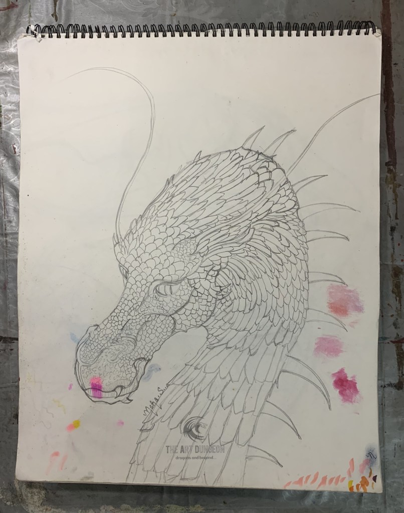
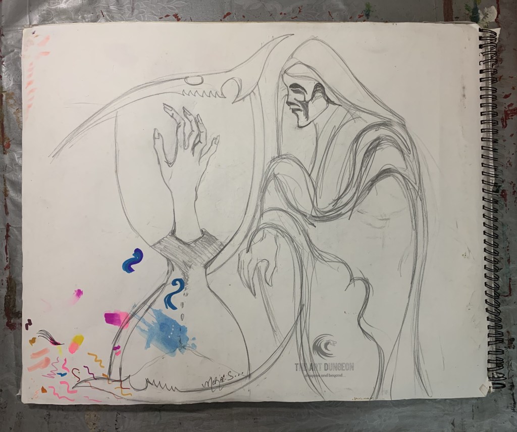
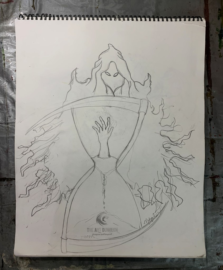
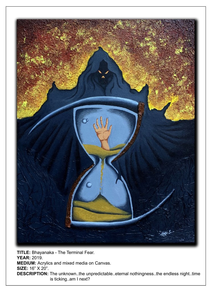
Today’s post is a continuation of my Navrasa series of paintings, where I am depicting each of the “rasas” (i.e., emotions or sentiments) through my art. Just to recap, in Indian philosophy, there are nine rasas, hence the title Navrasa, where “nav” means nine. Till now, I have depicted 7 of these emotions – “Shringar” (beauty), “Shanta” (peace), “Hasya” (happiness), “Veer” (bravery), “Karuna” (compassion), “Raudra” (anger) and “Bhayanaka” (fear).
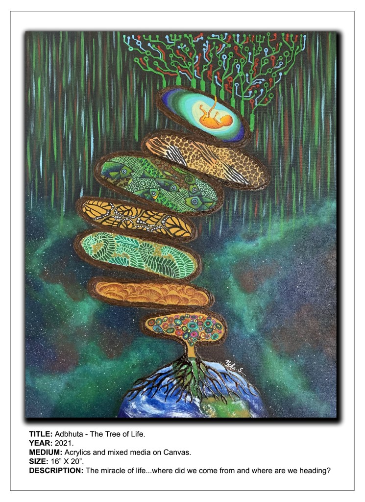
The emotion portrayed in the artwork featured here today is the “Adbhuta rasa” or the emotion of curiosity, astonishment and wonder. To understand this sentiment better, let’s delve a little deeper into it.
Adbhuta rasa deals with wonder. It is the sentiment of mystery, astonishment and curiosity. The feeling of wonder comes when one recognizes one’s own ignorance. Since Adbhuta rasa depicts the feeling of wonder, it is also referred to as the “marvelous sentiment”. The predominant color of Adbhuta rasa is yellow which also evokes the same emotion of the human mind. According to Indian philosophy, the element of wonder or astonishment is aroused when one experiences the unimaginable or the unexplainable like seeing heavenly beings, gaining one’s desired object, or seeing a flying chariot or a magic show, etc.
Coming to my artwork. I call this one Adbhuta – The Tree of Life. As is evident from the title, this painting depicts the aesthetics of the feeling of amazement and wonder about the most miraculous aspect of life – the creation of life itself. Here’s an image of my artwork along with a small video of its making:
Adbhuta – The Tree of Life
The evolution of the portrait of evolution….
From the dawn of civilization, human beings have tried to understand everything about the birth of life. It’s this element of mystery surrounding the miracle of life that arouses our curiosity and consequently evokes a feeling of amazement. It makes us wonder and ask ourselves the most basic questions – Where do we come from and Where are we going?
Life has come a long way from miniscule single cells to the human frame. Isn’t it simply amazing how diverse it is, from the tiny microscopic organisms to the fungi and algae, plants, insects, birds, marine life, reptiles, amphibians, animals and finally the most advanced form – us, the humans? Most of us wonder how it all happened. Was there really a big bang that gave birth to life or was it divine intervention? Hence the first question – Where do we come from? No matter what one believes in, be it God or the theory of evolution, both are equally amazing and wonderous.
That brings us to the next question – Where are we going? What’s next in this amazing chain of existence? With so must advancement in science and technology, what is it that the future holds for the human race and more importantly life itself? Are we going to see an amalgamation of artificial intelligence with organic intelligence and end up with a new species? Super humans, androids or will it be a hybrid of both – humanoids? Makes you wonder, doesn’t it?
I have made use of the most basic unit or building block of organic life – the DNA double helix to represent the tree of life. It is this seed of life that has germinated and established its roots on the surface of our planet, eventually developing into the tree of life.
I have attempted to symbolically depict each stage in this story of the evolution of life with the help of basic imagery for each respective stage. For instance, I have rendered the algae and fungi in the form of mushrooms, insect life as butterfly wings whereas aquatic life is a collage of skin textures and patterns of the likes of a snake, crocodile, frog, turtle, lizard, fish, etc. Similarly, animal life is symbolized by tiger and zebra stripes, leopard and cheetah spots, giraffe spots, etc. A human fetus was my obvious choice for representing us homo sapiens.
The background of the painting displays the vast universe towards the lower part and the digital world in the form of the circuitry on a motherboard in the upper part of the painting. Both seem to be merging into each other, hence my attempt to depict the gradually fading boundaries between the material world and the virtual one.
I felt that just the use of the conventional color designated to the emotion of wonder, i.e., yellow, does not do justice to a concept as diverse as life . So, I have extended my color palette to various other hues of the color spectrum.
The primary medium I have employed for the painting is acrylic paints, blending it with modelling paste wherever required in order to impart a 3D effect, specifically the wood-like texture for the DNA double helix tree, the roots spreading out on planet earth and the circuit board. Apart from this, I have also used alcohol markers, micro tip pens and gel pens for the finer details of the painting.
This one has been a huge challenge for me as it’s not easy depicting an emotion as profound as wonder. It is something that we feel and express on a daily basis and it knows no bounds. Anything and everything can become a cause of wonder for the human mind. So, the question I asked myself while working this one out was what is the greatest wonder for the human race and this is the concept I came up with. I hope it appeals to your element of wonder as well. Looking forward to your inputs and comments!
“She is clothed in strength and dignity and she laughs without fear of the future” – Proverbs 31:25
It’s that special time of the year again – 8th of March! As International Women’s Day (IWD) kicks off globally to celebrate the social, economic, cultural and political achievements of women, all of us are gearing to pay tribute to the spirit and elegance of womanhood in our very own personal ways.
Every year IWD serves as a reminder about how women, not just in the world of art, but in all walks of life, are balancing the scales between work and home. With so many pressures on the work as well as home fronts and so much to fit into a limited time frame, this day is a recognition of how well women have stood their ground in this male-dominated world.
Although this year has been no less lacking in recognizing the efforts of “womankind” to overcome the biggest hurdle in their path – gender inequality, what makes it extra special is the theme this time – #ChooseToChallenge. What this means is that in a world predominantly populated by men, women can choose to defy the stereotypes, pledge to challenge the status quo and call out for gender equality.
Women are the largest reservoir of talent in the world and specifically in the art world, IWD is a day not just to acknowledge this talent, but also recognize women who are making a global impact. It is about identifying, nurturing and celebrating talent.
Today’s post is about my artwork titled “Saluting Womanhood… #ChooseTo Challenge” which is my tribute to women’s achievements worldwide, as well as my pledge towards gender equality across the globe.It celebrates the tremendous efforts of women all over the world towards creating a gender equal future, especially in the present day COVID-19 ridden world.
My tribute to Womanhood (Soundtrack Credits – She’s Always A Woman by Billy Joel)
The artwork:Saluting Womanhood… #ChooseToChallenge
Through this artwork, I wish to send out the message that every woman has the right to define her life by the choices she makes, be it the clothes she wears or the stereotypes she breaks. So why not choose a gender equal world? She can choose to challenge and call out gender bias and inequality and be part of the collective endeavor towards creating an inclusive world.
I have used a combination of watercolors and acrylics to integrate the classic symbol of the female gender (♀), the number “8” which represents the day IWD is celebrated and the hand gesture that is symbolic of #ChooseToChallenge along with the silhouettes of a woman’s face in my artwork. The color palette mostly consists of warm tones like yellow, orange and red with a splash of the cooler blues and vibrant pinks for the faces.
I have rendered the female symbol, the number 8 and the hand gesture in black acrylic paint while the faces and the background of the artwork are done using watercolors. What’s special about this artwork is that the hand gesture is not painted on with a brush, but is the actual imprint of my hand. In a way, it asserts my pledge towards #ChooseToChallenge.
I believe that an equal world is an enabled world and in order to achieve this we all must choose to seek out and challenge gender stereotypes. From challenge comes change, so let’s all choose to challenge.
Hoping that my artwork will inspire others like me to #ChooseToChallenge something, be it the workload at the home front or their rightful place at work. What would you choose to challenge?
Credits –
Soundtrack used for video – She’s Always A Woman by Billy Joel.
There’s nothing more thrilling than the idea of having an artwork custom made just for you. Most people like to indulge in it as they feel it makes it that much more special. This process of creating one-of-a-kind and exclusive artworks is what we call Bespoke Art.
Bespoke art is a totally unique concept which may refer to anything commissioned to particular specifications, or tailored to the customs, tastes, and usage of an individual customer. So, what makes it different from “customized” art? Customized art means that an off-the-shelf piece is slightly altered and “personalized” to individual requirements. In other words, bespoke art is completely exclusive and original, whereas customized art is the edited version. Though both terms are better applied to the world of fashion and apparel, but now they are very often being used in the art world as well.
I have had the recent good fortune of creating both bespoke as well as customized art, the former as the cover page of a coffee table book and the latter in the form of a personalized rendition of a pre-existing piece.
The coffee table book was titled “Reflections from the Bay of Bengal” and my brief was to create an artwork for the cover page that mirrored exactly these words. I was specifically told to include a lighthouse, dolphins and a mermaid by my client, setting them all against the backdrop of the setting sun. The color palette was also specified, that is, coral hues. Keeping all these in mind, I have created the following artwork with acrylics as the cover page of the coffee table book:
The coffee table book cover created by me
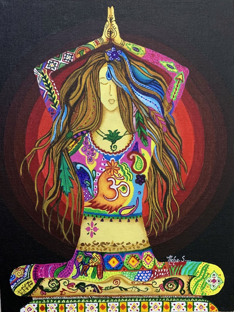
The custom-made piece I have created is an altered rendition of an original creation titled Soulaya Transcending by an Iranian artist called Fariba Farsad, who is now settled in Texas, USA. An interior designer by trade, student and seeker of spirituality, and core shamanism, her Bohemian Gypsy Soul and her love for nature and vibrant colors made there way out of her heart onto the canvas.
It was one such piece of hers that I was requested to render in a specific manner by a client who found the image extremely empowering. The original image was that of a woman in a yoga pose set against a white background. But my client wished to enhance her power further by placing her against a black backdrop and adding a radiant glow around her.
What inspired me the most about this piece was the harmonious mix of colors and motifs employed by the original artist. For me, it represented calmness, focus, balance and equilibrium and filled me up with positive vibes the moment I set my eyes on it. I am in total awe of Fariba Farsad for her creative genius and give her full credit for producing such an ingenious piece of art, for it has reaffirmed my belief that every woman needs to tap into her inner “goddess” to realize her true potential.
My version of this divine feminine form, resplendent with her red halo as requested by my client is displayed below. This is my attempt to further emphasize the elegance and confidence that is being exuded by the original creation. (NOTE – I give full credit to Fariba Farsad for the original artwork that I have only used as a reference for creating a new version as per the requirements of my client. In no way do I claim the original piece to be my own creation.)
My custom-made piece
I hope you found both pieces pleasing to your eyes. Do share your comments and reviews about them below!
Are people showing interest in your work and keen on customizing some of it to their personal requirements? If yes, then its high time you seriously consider taking up Commissions. Receiving requests to create commission art is the ultimate compliment for any artist.
But what does commission art mean? It is the act of requesting the creation of a piece, often on behalf of another. Artwork may be commissioned by private individuals, by the government, or businesses. Commissions can very often resemble endorsement or sponsorship as well.
If the thought of getting involved with a paid project is giving you cold feet then this post is just what you need. Here are some tips that will help streamline your commission process and help you build up a reputation as a professional artist:
Set a pricing methodology
There are two common methods for pricing art:
By the hour – Number of hours worked x hourly rate.
Your hourly rate depends on your experience and skill level. You can add the cost of the supplies to this later on.
By size – Cost per square inch x no. of square inches in painting.
This method requires a set cost per painted square inch, which is determined by the quality of the supplies used as well as the degree of detailing in your work.
A few extra pointers while pricing your work:
When commissioning, a piece in specific dimensions, using specific materials and perhaps even specific subject matter, price by the hour.
If you are not particularly comfortable or skilled at drawing/painting the subject at hand, consider lowering your price to keep things fair.
If the work is urgent and demands long hours or weekends, consider raising your prices.
2. Time management
As a professional artist, time management and good organizational skills become absolutely imperative. As a general rule, I never set a definitive due date just in case I am unable to finish on time. I always tell my clients that the painting is going to take me at least a couple of days longer than the estimated timeline but make it a point to finish before D-day.
3.Provide information to prospective clients
Share information about your creative process and any terms or conditions connected to how you sell your work. Some important information you should definitely include is:
Ask questions and get a clear understanding of what you’re being requested to create. For instance, what art style do they like, what color scheme to use and what area of their house/work place will the piece be adorning.
Do you need anything specific from the customer in terms of high-resolution images, etc.?
Your mode(s) for accepting payment (bank transfer, card payment, etc.).
What percentage/portion of the total cost you will take as advance payment before getting started (this should be non – refundable so that if your clients back out, it pays for your invested time, labor, and art materials.)
Whether you undertake shipping (if yes then what will be your shipping terms/costs?)
4.Be prompt in responding
If a prospective client inquires about commissioning a piece, make sure you respond as quickly as possible or you may end up losing the opportunity altogether. Once you have started working on the commission, maintain an open channel of communication throughout in order to keep your client updated about your progress.This will prevent any confusion or misunderstandings.Also, don’t hesitate in turning down prospective clients if you feel that what they’re asking for is against your moral compass or beliefs.
My Commissioning Process
I have had the recent pleasure of successfully finishing a commissioned painting for a new set of clients, a lovely couple. Here’s what I made for them:
Recently commissioned
This project was a challenging venture as not only were the clients my patrons, but also good friends. Sharing the experience of my commissioning process while it’s still fresh in my mind:
The concept briefing –
My first meeting with my clients, an impressionable husband and wife duo with a profound interest but limited knowledge in art, was to discuss the subject matter and conceive the entire project. I was commissioned by them to paint a Vietnamese riverscape, taking reference from an image of a similar scene. They showed me a photo of the painting that they wanted me to customize for them and later on shared with me a high-resolution image of the same for reference purposes.
Here are some questions I asked them to understand what they had in mind, along with their answers:
What is it that they want? Do they want an exact replica of the original or a custom-made version? – They wanted more or less the same thing but on a larger scale (a 2ft by 3ft canvas to be exact).
What color scheme would they like? Do they want to retain the same colors as the original or make some changes? – They preferred to stick to the same color palette, only brighter.
What size and surface would they like their painting to be? – As mentioned above, 2ft by 3 ft on a canvas.
What medium would they want me to use? – They left this to my discretion owing to their limited knowledge of art, so I decided to go with oil paints as I felt these would be best for the subject matter in question here.
The artistic process –
The next step was to explain to them about my artistic process. I gave them a rough idea of how I would go about working on the painting, starting from the initial sketch, the painting process and then the final touch up and finishing stage which includes varnishing the final artwork once it was totally dry. I assured them that I would keep sending regular updates in the form of photos on completion of each stage, so that any editing or adjustments could be made as and when required.
The framing –
I gave my clients the choice of either taking the canvas unframed or along with a frame. I made it clear to them that in the latter case, the cost of framing would be added to the price of the artwork. Since they were in the same city as me and were picking up the artwork personally, they told me to take care of the framing as well.
The costing and terms of payment –
I decided to price this commission by size as not only did it involve increasing the dimensions, but also including the cost of framing. In terms of the payment, I quoted an advance of 1/3 of the total cost of the commission, which would be non-refundable as it would cover the time, labor and materials I would invest into the entire project. Since there wasn’t going to be any shipping involved, I did not include this cost.
Estimated time for completion –
As mentioned earlier, when it comes to the timeline, I always give an estimate of a day or two extra from the anticipated time of completion so as to take care of any eventualities. I this case, I had to include not just this, but also the drying time (being an oil painting), varnishing (and drying thereafter) as well as framing time.
Please Note – Unlike in my case, if you are not well-acquainted with the clients or haven’t worked with them before, I would advise you to put down all of the above points in writing and sign a contract so that there are no misunderstandings later on. If you do decide to go ahead with a formal contract, don’t forget to mention that you as the artist will retain the copyright to all works commissioned by you, including all reproduction rights and no artwork may be reproduced or altered without your written consent.
I hope you found this post helpful and wish you loads of luck in all your artistic endeavors! Do leave me a comment below if you have inputs or wish to share your own experiences with commissions. Would love to hear about it!
Howdy art lovers! In my last post, I had delved into the nitty gritties of showcasing art, specifically at exhibitions and art shows. It gives me great pleasure to share with you all today my very own and personal experiences related to the art exhibits that I have had the good fortune of being part of.
Even though they were small community exhibits organized within our fraternity, for me they were nothing less than any renowned art show set up by reputed galleries or curators, for the learning associated with these helped me grow as an artist. Moreover, they provided me with the much-needed exposure as well as recognition, not just within my fraternity but beyond!
So, without further ado, let’s plunge right into it!
As I mentioned earlier, two of the exhibits were local community shows, where some of the many talented artists of the fraternity I belong to got together and put up their work on display. Both proved to be great morale boosters for me as not only did I manage to sell some of my work, but also got some custom orders! Here are a few snippets from these exhibits:
My exhibits
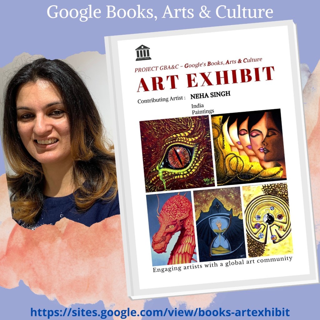
The next opportunity that I have had the distinct honor of being a part of is an Online Solo Art Exhibit organized by Google Books Art and Culture, wherein my artwork was approved for global publishing as a Solo Online Exhibiton the prestigious Google Books.
Artist’s Art & Photography solo online Exhibits are published globally on Google Books for lifelong and can be downloaded by Google’s billions of readers for free access on Google Play Books, Google Books Library and Google Android Play Store across the globe in 149 countries. Art Exhibit Google Book is strictly online and no print or hard copy (pdf) is allowed due to copyright protection.
As an artist, publishing my art on the Google Books, Arts & Culture platform carries agreat deal of professional weightage and mileage as it helps me share and promote it not just directly to art connoisseurs, collectors, art galleries, museums and prospective art buyers but also onto social media.
Since Google is the world’s largest search engine, publishing my art exhibit on Google’s various platforms, especially Books, has a distinct advantage as my work is indexed by Google itself, which helps in SEO (search engine optimization) and gives me a mileage in getting higher ranks in online search results and better discoverability on social media, thus connecting me with genuine art lovers across the globe and reach out to prospective buyers and art galleries.
One worry I always have when sharing my artwork on online social media platforms or online sites/galleries is that there is no copyright protection and my art can be downloaded or shared illegally. However, Google Books offers all Artists protection under their own copyrights and the book is globally DRM protected for illegal sharing and downloading.
Another advantage is that my artwork is archived in the Google Books Library and helps reach billions of Google’s readers & subscribers across the globe in 149 countries thus connecting me with a global audience! Here are the links to my very own ebook art exhibit with google books:
Have you been creating a lot of art lately? Well how about showing it to the world now! One of the best ways to do so is by showcasing your work in art exhibitions as these are the stepping stones of every artist’s career growth. Whether professional or amateur, every artist should take part in art exhibitions. Not only are they a great platform to showcase your work and reach out to potential buyers, but also a means of getting recognition among like-minded artists, peers, patrons and industry experts, thus making some valuable new acquaintances.
However, many people are apprehensive about entering art exhibitions usually due to lack of confidence. But let me assure you, there are exhibitions for all skill levels.
If you are just starting out as an artist you may not want to enter the large scale national portrait exhibitions, but there is no reason you should not enter your local exhibitions which cater to budding and emerging artists like you!
Getting selected by an art gallery means a lot of work needs to be done before you can proudly flaunt your art. This article will hopefully not just inspire you to enter art exhibitions but also help you understand what exactly is involved. So let’s get right into it!
Why should you enter art exhibitions?
If you are interested in selling your art, this is how you expose it to people who are interested in buying art and have a sizable budget.
You get to meet other artists and art patrons. Some of the artists you meet may become your inspiration in future.
You are forced to put your best foot forward with your work. If you are finding yourself producing mediocre work, then signing up to art exhibitions may motivate you to put in your best.
You will stop procrastinating in order to meet exhibition deadlines.
The chance to win awards can really boost your art career.
What are your options for exhibiting?
The following are the various options available to put your art on display:
Solo shows – Whether physical or online, putting on a solo show will give you full control over everything. On the flipside, it will cost you that much more. One alternative to this is to have a show in collaboration with other artists. In case you decide to go in for a solo show, ensure you have enough work to display, not just in terms of quantities, but also a well-curated range.
Commercial gallery –Working with galleries can be a daunting task but the advantages include publicity, help with installation costs, and potential future exhibitions. Galleries often present open calls for exhibitions or representation. While these are great opportunities to get your work seen, they can also turn out to be costly so it’s best to avoid applying to every single opportunity, especially if it involves a submission fee. So take only those openings into serious consideration that are relevant to you.Group shows, craft fairs etc. Another way to give exposure to your art is to participate in craft fairs or group shows.
Group shows – These can be a great option if you feel you only have a small selection of works to exhibit. The other benefit is that you’ll be able to divide tasks among a group of people so that there are fewer burdens on one individual. Being part of a group can also widen your network. However, a downside of group shows can be disagreements, especially on the decision making level, if the participants don’t see eye to eye or don’t share similar artistic interests. So make sure you work with like-minded artists whose work can be linked to yours. When it comes to a group exhibit, uniformity is the key.
How much will it cost?
Whether putting up a solo or a group show, it’s a good idea to work out a budget plan. The following aspects need to be taken into consideration:
Hiring of exhibit space.
Entertaining costs (drinks, eats, etc.)
Advertising.
Transportation costs.
Marketing (posters, flyers, website, etc.)
Installation costs.
Printing (CVs, press releases, artist statements, business cards, etc.)
Some of these costs can be taken care of if you can manage to get your show sponsored by local companies, etc.
How do you advertise your show?
Spreading the word about your upcoming show is as important as the show itself. Here are a few ways to advertise your exhibition:
Social media forums like Twitter, Facebook, Tumblr or even your own blog are a great way to get the word out.
Try and get your event listed on popular art events sites.
Send “save the date” emails to your mailing list well before the exhibition and then another reminder mail a couple of days before the event.
Flyers and posters are a great advertising tool in local area locations like cafes, community centers, etc.
Last but not the least, word of mouth. Nothing better than coming straight from the horse’s mouth!
What is the standard procedure to enter an art exhibition?
There will be a call to entry providing the set of requirements for the exhibition and the deadlines.
You will be asked to submit your most recent artworks, (usually, ones that have been completed within a year of the exhibition).
The finalists will be announced on a preset date.
If selected as a finalist, you will need to prepare your artworks for the exhibition and deliver them to the exhibition within the provided time frame.
There will be an opening night which you can choose to attend. Although you are not required to attend the exhibition in person, but it is recommended you do so.
Any sales of your artworks will be handled by the exhibition and you will receive your sale proceeds (minus a commission taken by the organizer).
If your artworks do not sell, then you will need to collect them at a certain time and place.
Preparing Your Art for the Exhibition
Selecting an art gallery and confirming an art exhibit is only the first step of a much longer process. Although there are a lot of things that the art gallery handles for you, your personal involvement is of utmost importance as you know your art the best, hence you need to be a part of every decision that is being made about it. Here’s what all you need to look at:
Select pieces that are consistent in either concept or themeand bring out your signature style and ideas the best.
Click high quality images of these for promotional purposes like catalogues, prints, etc.
Pay special attention to giving final touch ups if required by any of your artworks before displaying as well as the framing if the gallery demands so.
Another important aspect is the Certificate of Authenticity, which is required for sales.
If you are not framing your artworks, you will need to consider how you will display them. In case of stretched canvases, a common practice is to extend the painting over the edges to give it a feeling of continuity. Or you could just paint the edges a flat white or black.
Decide how you want your artworks to be hanged.
Varnish your artworks if you feel the need, although this is not a mandatory requirement.
Transportation
Ensure your pieces are packed securely to prevent damage during transportation. Dispatch them well in time so that in case of any damage, the gallery will have enough time to repair them.
Preparing your Personal Information
You will need to provide the following details along with your artworks:
Personal details.
Artist statement and artist profile/CV.
Prices of the artworks.
Names, medium and dimensions of the artworks.
Your artist statement and artist CV will need to be sent to the gallery for publishing in their catalogues or to be displayed along with your works. Update your CV with all your latest accomplishments. Make sure that your artist statement goes well with the selected works.
Being part of an art exhibition is not just about selling art. It is also a great opportunity to see your work through the eyes of your viewers. However, art is very subjective so be prepared to receive all sorts of opinions, some positive and others negative. The trick is to take the criticism positively and learn from it. This will help you evolve and grow as an artist. Your artistic talent does not need the validation of sales.
I hope this post provides you a better insight into what is involved in entering art exhibitions and inspires you to do so yourself. Please feel free to share any thoughts or tips of your own in the comment section below.
Art competitions can provide some great opportunities to artists irrespective of whether they win or not. Not only do they give exposure and present a chance to showcase your work at exhibitions, but also prove to be an excellent morale booster for your art career. This in turn will increase your self-confidence as well as help you evolve and grow as an artist.
Generally, the selected or shortlisted artists receive recognition, sizeable rewards and some great opportunities to exhibit, promote and/or sell their work. Several competitions often double up as art exhibits where artworks are up for sale, thereby providing artists with a shot at earning money in addition to possibly winning a prize.
The jury in an art competition is usually composed of prominent and well-known personalities from the art world, with considerable amount of experience and a good sense of the current market. This makes art competitions a great means of networking. Prizes are appropriately chosen so as to benefit artists, be it in the form of an opportunity to participate in an exhibition, a cash prize or promotional opportunities.
Winning an art competition is a great achievement as it is another feather that artists can add in their cap and therefore their CV. However, just entering the competition is big in itself as it provides you with recognition as well as a platform to prove yourself and your skill as an artist.
Moreover, entering art competitions can help in proving to yourself that you can be serious about your art. It shows that you are willing to put effort into it, and you think that your art deserves to be recognized more widely.
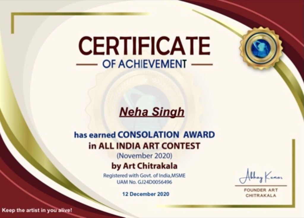
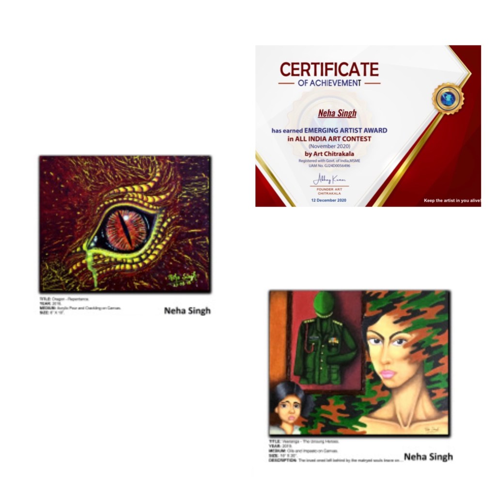
I consider art competitions integral to my artistic journey, as they help me get the much needed exposure and recognition, which are more important to me than the monetary gains which come in the form of rewards or prizes. It is one such art competition which I entered recently that has given me the much required boost in confidence. The competition was organized by Art Chitrakala, an organization registered with the Government of India. It provides a platform to artists from all over India to showcase, promote as well as sell their art. They organize monthly contests at “All India National Level” wherein the selected winners get an opportunity to get featured on their page and sell their work.
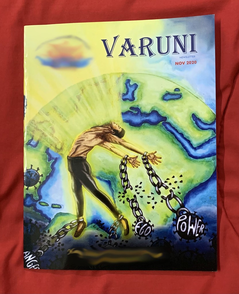
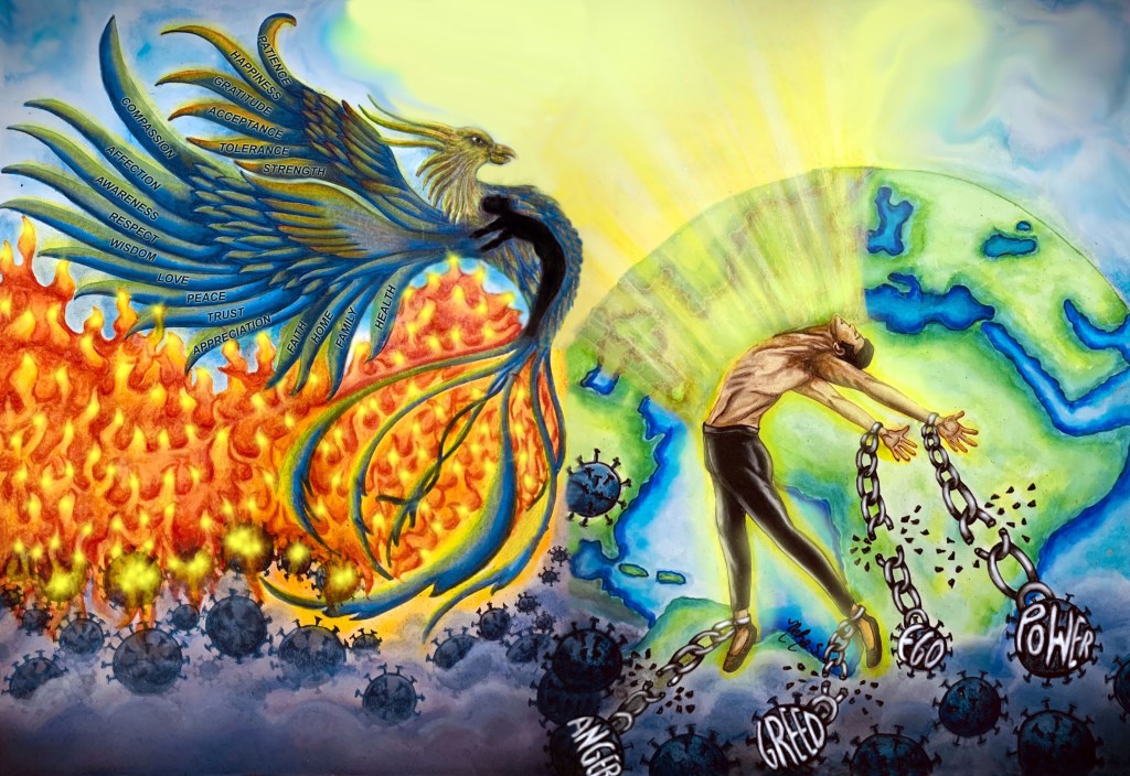
It was an honor and a privilege for me to be able to send my entries for the November 2020 art contest organized by Art Chitrakala, wherein a minimum of 1 and a maximum of 5 artworks had to be sent. I am absolutely thrilled to share with you all that one out the five pieces that I had entered, one was selected for a Consolation Prize! I was also greatly honored to receive the Emerging Artist Award, being one among the 250 winners from all over the country. Here are snapshots of the shortlisted artworks and the respective certificates:
It has been an extremely overwhelming and humbling experience for me to be bestowed upon with these rewards, being my very first. To see my work displayed on the pages of The Art Chitrakala website has helped endorse my faith in myself as an artist. I have been making art for just about ten years now and this has invoked mixed emotions of satisfaction, joy, accomplishment, and personal honor.
More than the cash prize and the awards, it is the recognition that counts, making the entire experience ever so memorable. This one will always hold a special place in my heart and I’m thankful to Art Chitrakala for providing me with this platform. Winning in this competition has fueled my passion further and inspired me to work harder.
What themes and subjects sell the most in art? Which mediums and genres sell best? What sizes of paintings sell more – smaller or larger ones? These are some important questions that every artist should be asking when he decides to put his work up for sale.
I like to be sure of what will sell in the art market, even though my personal favorites are conceptual paintings which are a mix of realism as well as abstract art. For me, the true meaning behind what I paint takes precedence over the monetary gains I can obtain from it. However, when it comes to the cash inflow, I make sure I brush up my knowledge about the current art trends.
Today’s post is my endeavor to share with you all my own little nuggets regarding what needs to be considered when selling art. This information is based on my personal experiences hence should not be considered as a benchmark for improving sales.
What are the Best-selling Themes and Subjects in Art?
Ifyour favorite subject happens to be among the popular ones, you’re in for luck. Keep in mind that you will sell more if you focus on your strengths rather than painting mediocre versions of something that’s not really your cup of tea. Even though one may not be making art solely to sell it, it may end up happening that way. For instance, an artist located in a tourist set up may find himself painting local scenery and landscapes as they will sell easily, thereby helping him pay his bills. But this doesn’t stop him from painting what he likes to, in his signature style. Here is a list of some popular themes and subjects that do well commercially in the art market:
Local scenes, landscapes and seascapes (modern, impressionistic or semi-abstract) – Landscape painting is the most popular and common subject for art owing to its versatile nature. Not only do people love looking at a picturesque and scenic panorama, but also like to invest in the visual representation of one, so as to keep reliving its spectacular beauty. Moreover a landscape works well in any type of decor or ambience. So what types of landscapes sell best? Many artists like to depict their local scenery in the form of landmarks, historical events or heritage sites that are exclusively characteristic of their area. Seascapes, harbors, and beach scenes all sell particularly well, probably because of their association with holidays, vacations, and relaxation.
Abstract paintings –Most people buy art with the aim to match it with their décor. Abstract art fulfils this requirement hence sells well. An abstract painting can simply be interpreted as a colour, texture, or shape, which helps maintain a certain level of uniformity with the home decoration. Besides this, abstraction has a nonrepresentational or symbolic approach, so its interpretation becomes subject to each individual viewer, thus making it easier to sell.
Paintings of dogs, cats and wildlife – People love owning paintings of dogs as much as they love their dogs as a painting of a dog invokes feelings of intimacy and affection, while paintings of wildlife suggest untamed, uninhibited nature. Perhaps for these reasons such paintings do well in the art market.
Figure studies and nudes – Whether it is abstract or impressionistic portraits or figure studies, people enjoy looking at images of humans. Although the trend is shifting towards attired rather than bare bodies, there will probably always be a market for nudes.
What sells better – Original Art or Prints?
It has been noticed that prints usually sell better than original works, probably because they are less expensive. And of course many prints are sold as decorative items, as they can be mixed and matched with different colour schemes. Limited-edition prints are more popular than open-edition ones as art buyers somehow seem to find the idea of a controlled supply quite appealing. When an artist put a limit on how many prints he or she will make, it attracts buyers as they feel they are killing two birds with one stone – investing in something that is almost original but less expensive than the original, yet “exclusive” and not entirely mass-produced.
What Medium of Art Sells Best?
Ideally, the following 7 mediums of art sell better than others:
Offset-litho prints (original as well as limited-edition).
Giclée prints (original as well as limited-edition).
Oil and acrylic paintings.
Watercolors.
Artists’ original prints (e.g. etchings and engravings).
What Size Painting Sells the Best?
The general consensus among most artists is that it is commercially more viable to work on smaller canvases than larger ones as the former are generally priced lower than the latter, so not only do they appeal to buyers for monetary reasons, but also because they take up less space and demand less of an aesthetic instinct. Having said that, it is equally important to take into consideration that the earnings from a large number of smaller paintings might be equal to those obtained from a fewer larger paintings. Hence, most commercially successful artists work with a range of sizes to appeal to a wider audience.
Some artists purposefully create a range of small paintings with a common theme or style as they feel it will encourage buyers to pick up the entire series. Another advantage of working on a smaller scale is that the paintings require less storage space and are easier for the artist to accommodate even if they don’t sell right away.
What is your Target Market?
Target market is a very important factor to be considered when selling art. In order to successfully target a particular buying community, artists need to focus on marketing as well to certain extent. Here are some points to consider depending on the type of buyer you are targeting:
If you are selling through a gallery, your art needs to cater to the likes and requirements of its patrons. Highly priced works are best suited for galleries and least for museums and private collectors.
Private and commercial buyers usually use art as décor for offices etc, whereas interior decorators and designers will have specific artistic requirements.
The pricing of your work will depend on the disposable income as well as the budget of the buyer in question.
Home décor primarily depends on low priced copies or prints of originals and thus constitutes the largest market for art.
Art can be propagated through product development in various formats like, mugs, postcards, calendars, etc., which is a pretty lucrative market in itself.
My Experiences with Sales
I have realized that I can generate better sales for my art when it is displayed in a physical space like a gallery rather than an online virtual space. The reason behind this could be that my viewers get to experience my work at close quarters, hence are able to appreciate it much more for various elements, especially colors and textures. Moreover, they get a better understanding of the medium, technique and the surface I have used to create the artwork. Most of my paintings are texture-laden and this aspect comes through best when viewed in person. So if you want to emphasize and highlight the USP of your work, an art show or gallery display would be the best option.
I have also realized that keeping myself abreast with the latest art trends goes a long way as it keeps me updated with what is selling currently in the art market, thereby giving me better returns for my work. When it comes to selling my art, I take the practical approach and paint what’s in demand. But that doesn’t stop me from painting what I like so both go hand and hand for me. The trick is to strike equilibrium between both. In conclusion, I would like to say that success in any commercially aimed artistic undertaking can depend on a combination of all these factors.After all, selling art is no less than any business endeavor , so if you want to make money, treat it like one!
Ever wondered what those caricatures of cows with the scenic backdrop of a farm you see on the milk cartons in the supermarket are? Are they a form of art or illustration? Its images like these that lead us to the age old question – what is the difference between fine art and illustration?This dilemma has been haunting not just artists, but also non artists for centuries.
If you go by the classic definitions, an illustration is a visualization or a depiction, such as a drawing, sketch, painting, photograph, or any other kind of printed version of things seen, remembered or imagined, created by an artist using a graphical representation. It explains, visually represents, or just decorates a written text, which may or may not be of a literary or commercial nature.
On the other hand, fine art is just art for art’s sake. Simply put, an idea, concept or thought brought to life on paper or canvas. In other words, art is the idea itself whereas an illustration is a depiction or explanation of an idea or a story.
Historically, book illustration and magazine/newspaper illustrations have been the predominant forms of this type of visual art, although illustrators have also used their graphic skills in the fields of poster art, advertisements, comic books, animation art, greeting cardsand cartoon-strips.
Most illustrative drawings were done in pen-and-ink, charcoal, or metal point, after which they were replicated using a variety of print processes including: woodcuts, engraving, etching, lithography, photography and halftone engraving, among others.
Today, there are five main types of illustrations: educational “information graphics” (eg. scientific textbooks); literary (eg. children’s books); fantasy games and books; media (magazines, periodicals, newspapers); and commercial (advertising posters, point of sale, product packaging). Many of these illustrations are designed and created using computer graphics software such as Adobe Illustrator, Photoshop, and CorelDraw, as well as Wacom tablets. The traditional methods like watercolors, pastels, casein, egg tempera, wood engraving, linoleum cuts, and pen and ink are also employed even today.
There is an ongoing debate on whether illustration should be categorized as a fine art, an applied art – or even a decorative art. However, looking back in time, one will find innumerable illustrative masterpieces thereby leaving no doubt that this visual art form deserves a place alongside other fine arts like painting and sculpture.
As we glance through the history of art, we realize that during the first 30,000 years of art, artists were able to earn a decent living working for kings, priests, pharaohs and popes and commissioned art for temple walls and public spaces. It adorned palaces and royal tombs and the homes of aristocrats. Then monarchs began to disappear and Popes stopped commissioning new art. The birth of capitalism gave rise to a new commercial class that became the new patrons of art.
The talented artists who once painted the ceiling of the Sistine Chapel adapted themselves to their new clientele by adopting two distinct business models. The first produced what we now call “fine” or “gallery” art for the private collections of the rich and corporate class. The second one evolved thanks to the newly invented printing press, wherein instead of selling a painting to a wealthy patron, artists made multiple copies of a piece and sold them for smaller amounts to larger numbers of (less-wealthy) buyers.
Here are a few visuals that show the evolution of art into the field of illustration through time:
It is this technological development that brought about revolutionary changes in the history of illustration, eventually leading to the creation of the twin pillars of modern day illustration:
The ability to create and distribute quality reproductions of an artwork to large audiences.
The ability to collect marginal, proportional payments for that art from large audiences.
These two developments created potential opportunities for talented artists. They became the core economic model for illustration, and the key distinction between modern illustration and fine art. Thanks to these developments, the talented masters of art who were once unaffordable under the old business model of art now became accessible to the general public.
One cannot deny the fact that because of its wider audience, illustration is often broader than fine art. But does that mean the commercial angle affects the quality and character of art? In my opinion, broader appeal to a popular audience does not diminish the greatness or quality of art.
I firmly believe that there is a very thin line distinguishing art from illustration and this distinction has nothing to do with the artist’s skill or the quality of the work. It is equally easy to find examples of illustration that are superior to “fine” art and vice versa. I feel that the narrative/decorative divide helps us to categorize a piece either as “art” or as “illustration” and every artist is free to exploit this aspect to his or her discretion.
While fine art visually presents an idea as it is in its purest form, an illustration is a form of visual communication or representation which defines a given piece of text. The writing as well as the illustration together explains the concept or idea. This marriage between art and typography can be seen all around us in various forms like packaging of consumer products, children’s’ books, assembly and installation instructions for furniture, electronics etc., and my favorite form of illustration – road maps. Even postcards are a form of illustration! Or would you consider them fine art?
So I leave you to ponder on this and decide for yourself what you would like to put under the category of illustration and what you consider as fine art. Personally for me, any form of communicative expression is art, be it illustrative or not, for every drawing or doodle is a window to a deeper abyss that holds the true message or meaning behind the work and also expresses the artist’s personal beliefs.
DISCLAIMER – All the information, data and imagery in this blog post is for informational and educational purpose only. Some images and data may have been taken from the links included below and I give full credit to these websites/pages, thereby in no way claiming them to be my own. Other data is based on my personal experiences and opinions.
Greetings to all Art Dungeon followers! I have great news!! It gives me great pleasure to share with you all that my artwork titled “et ressurectionis”, that I had shared in one of the earlier posts (https://theartdungeon.blog/2020/10/04/et-ressurectionis/ ), has made it to the cover page of a magazine! How cool is that!!
Here are a few snapshots of the magazine’s with the artwork that extends from the front cover to the back cover as one continuous piece. Also including the original painting and a small write up explaining it that was published in the magazine.
The front and back of the magazine
The front cover
The write up
The original artwork
Do click on the link above to know more about the concept, medium and techniques behind the artwork!
Hey folks! In continuation with last week’s post titled Work of Art in Progress (https://theartdungeon.blog/2020/10/18/work-of-art-in-progress/), today I will be sharing with you all the completed artwork. I have titled this piece “Painting Nature in its True Colors”.
I have already covered the thought process behind the artwork in detail last week, but just to recap, this painting is based on the theme “Nurturing Nature for a Better Future” and is intended to be the cover page of a magazine. It is my attempt to depict how Mother Nature, like all mothers, keeps showering us and our planet earth with her blessings in abundance and nourishes us unconditionally. But if we don’t look after her, she will eventually get drained out and will have very little or almost nothing to offer to our future generations as well as our planet. Hence, we need to nurture and heal her by painting her with a colorful palette of clean, green lands, water and air, for the future of her child that is, planet earth, depends on it. To delve deeper into the concept behind the artwork, please click on the link above.
The finished artworktitled “Painting Nature in its True Colors“
In today’s post, I am going to talk about the technicalities of this artwork. Let’s start with the medium. I have used watercolors, specifically watercolor brush pens for the entire piece, along with a bit of prismacolor pencils here and there, just to enhance those highlights and shadows. I have also made use of a white gel pen to accentuate the lines of the hair locks of Mother Nature that symbolize the wind as well the waves of the sea. The blossoms scattered on the mossy green landscape have also been rendered using the same while gel pen. Apart from this the fiery flame-like locks representing fire too have a touch of white in the form of highlights.
Coming to the technique, I have employed the classic watercolor trick of “wet 0n wet”, wherein the area to be painted is dampened with a wet brush first followed by the application of paint. Most of the painting is done using this technique, but at some places, especially the finer details, I resorted to first applying the color on the dry surface and then going over it with a wet brush.
Greetings from The Art Dungeon! I have been toying with the idea of sharing a work in progress for a long time, but procrastination has always got the better of me. So here I am, finally getting down to it and what could be better than the piece I am working on presently?
Today, I am going to share with you all, the evolutionary process of the artwork I am working on currently. As mentioned earlier, it’s work in progress so bear in mind that I am yet to finish this piece. I believe that the journey is as important as the destination hence it becomes imperative that I give you all a sneak peek into my process. So let’s dive right into it!
This artwork, which is still untitled, is meant to be the cover page of a magazine with the underlying theme, “Nurturing Nature for a Better Future.” I have depicted a personified version of Mother Nature, endowed with all of her classical elements – air (or wind), fire, water, earth and aether (or space) which also explain the complexity of life all around us. These elements are essential for the survival of all living beings and therefore should be respected and protected from any abuse.
Here’s a slide show of images showing my creative process:
Not done yet….
Me at work (Yup! I’m a leftie!!)
I have represented air and fire in the form of the flowing locks of the female form of Mother Nature. The tree bark-like hind limbs, its roots and the vegetation adorning the figure symbolize the earth or land. Water is represented by the surging waves of the sea next to the land and the backdrop of the artwork forms aether or space.
These elements, which form the basis of all living life and matter, are blessings that Mother Nature bestows upon the one and only habitable place we have in the universe – planet earth, depicted in my artwork as the offspring in her womb. Not only does she nourish and nurture our planet, she cares for us as well, thus making us all her children.
The earth in the womb of Mother Nature symbolizes our future and only if we take care of the mother, can we have a healthy and happy future. Nature is like a refillable prescription that keeps providing to us in abundance and adequacy, just like a mother does to her child. But if we don’t look after her, she will eventually get drained out, consequently affecting our future generations as well as the future of our planet. Hence, we need to nurture and heal her with all that we can for a better tomorrow.
So how do we do it? All we need to do is replenish our planet with greenery, crystal clear waters and clean air. I have depicted this in the form of three human hands representing vegetation, water and wildlife respectively. It is with our very own hands that we can paint our beloved planet with these colors of Mother Nature and make it a better place to live in. For it is air that moves us, fire that transforms us and water that shapes us. Let’s nurture nature for a better future.
Like I said before, this artwork is still in the making and this post is meant to be an insight into the creative process behind it. My next post will hopefully feature the finished piece where I will delve into the technique and medium I have used. Should also have a title for the artwork by then but am open to suggestions, so do share your ideas in the comments sections below! Cheers and watch out for more!!
Hey folks! After a hiatus of two weeks, I am resurfacing with a new post! Finally got a chance to get back to the drawing board after a long long time, so the artwork I am sharing in today’s post not only serves as a comeback to my blog but also to my art!
“et ressurectionis”
I call this one “et ressurectionis”, which is Latin for resurrection. This artwork is once again inspired by the present Covid-ridden scenario that our world is relentlessly fighting day and night. It has been almost a year since we have been in the clutches of this dreaded virus. While we continue our attempts at understanding this miniscule yet powerful entity, it in turn has taught us a lot of valuable lessons, not just physical ones, but also on a spiritual level.
Thanks to the corona virus, mankind has been restrained to the confines of his four-walled dwellings like never before. This alone time, or “Me time” as I like to call it, has given him the opportunity to contemplate and retrospect on what he was, what he has become and what he should actually be. It has given him a chance to delve into the depths of his psyche and confront the real pandemic that has been plaguing mankind for centuries – his own vices, namely anger, violence, greed and his lust for power as well as wealth. Not only is he fighting a deadly biological contagion, but also an intangible one, that is far bigger a threat to the existence of the human race that the organic pathogen itself.
This artwork is a representation of man working towards his long impending goal – to break free from the shackles of his own vices and emerge renewed and victorious not just from the pandemic, but also himself. The blue phoenix in this painting is a personification of mankind reborn after it succeeds in purging the pathosis that’s decomposing his humanity along with the physiological affliction that’s wearing him out physically, for a blue phoenix is a symbol of rebirth, a return to being, and a new spiritual path.
The phoenix teaches us not just to let go of our old self and our limiting self concepts, but also inspires us to embrace and accept the new us that is abound with all the goodness in the form of virtues that have been listed on the feathers of the phoenix in this artwork.
In times of doubt and confusion, the blue phoenix symbolizes strength, transformation and renewal. For only from the ashes of who we were, can we rise up to become who we are to be. That is how we are rediscovering ourselves as we get past COVID-19.
The marriage between religion and art has always been one full of turmoil. There are several instances from the past as well as the present when the most artistic imagery depicting religion has been considered disrespectful or derogatory to the faith in question or has managed to create a scandal. Many artists indulging in religious art are grossly misunderstood when all they want to do is express themselves.
This compels me to ask the inevitable question – should artists mix art and religion and if they do, should they be left uninhibited, free to explore the realms of religion through their art or should they be sensitive towards matters of faith?
Art has the capability to illustrate and express religious beliefs, customs and values through iconography and body postures. Religious paintings are personal expressions of an artist about religious themes and principles as seen through his eyes. Moreover, aided by their aesthetic skill, artists have improved our understanding of religion. They have succeeded in bringing history to life with their clever manipulation of colors, textures and styles thereby expanding our horizon about past events. Until recently, religion and art were symbiotic, with aspects of the former making up the subject matter of the latter.
Religious art serves decorative as well as reflective purposes and its main objective is to assert a moral message of the religion it represents. Not only does it tell the story of a religion as told in its holy scriptures, but also provides an insight into the varying lifestyles of different religious groups. It helps in keeping religious traditions alive and visualizing religious events from the past. Religious paintings can idealize and glorify a religion and possess the power to make believers out of non believers.
In my understanding, the harmony between art and religion ceases to exist if it is communalized. When religious art becomes a vehicle for propaganda and serves the selfish motives of fundamentalists and right wing zealots, it loses its aesthetic appeal, leading to criticism and subsequent demand for curbs on artistic expression. The line between expression of and regard for religious beliefs is an extremely thin one. An artist needs to take care that his portrayal of religion through his work doesn’t hurt anyone’s religious faith and ideology. In order to do so, every artist needs to be open-minded and think beyond religion and politics so that his art spreads positivity.
I am also of the firm belief that if the artist is expected to revere and respect the religious sentiments of people, they in turn too need to view his art with an unprejudiced mind. If art is to achieve its purpose, mutual understanding between its creator and viewer is the key. While trying to be sensitive towards the religious sentiments of his audience, the artist shouldn’t end up curbing his artistic expression for it is he who gives visual narrative to religion and god.
In my opinion, one must first appreciate religious art solely for its creative genius before cross analyzing its objective. While each viewer will have his or her own perspective and draw his or her own inferences from it, they must also make an attempt to see it through the artist’s eyes, without being judgmental. Religious art is the external expression of the artist’s personal vision. What the artist depicts is a rendition of his own belief and faith and a projection of the world around him from his point of view, without any intention of offending others. I believe he deserves to be appreciated for his shear artistic genius, regardless of the subject matter.
I am convinced that as an artist, while I should have the liberty to portray religion through my work, I also need to practice self constraint to some extent so that my work doesn’t hurt anybody’s religious sentiments.
What’s do you think? Do you think artists should be given the luxury to explore religion as they wish? Or should they restrain from mixing the two? I leave this post open to you all and would love to hear your point of view so do share your opinion in the comments sections below. If I get enough feedback, my next post will hopefully be a compilation of all the views I get. So fire away!!
Since time in memoriam, art has been mankind’s favorite creative activity and we have indulged in it with the help of innumerable tools, techniques, and mediums. Most of the basic art supplies we use today have revolutionized the art world to such an extent that it’s impossible to fathom what art would be like without them. But have you ever wondered how and when they came into existence?? Here’s a history of art materials that I consider to be the backbone of the art world.
Pencil
This basic tool that makes it possible for us to give form and shape to our creative thoughts came into being due to the discovery of an unusually pure deposit of graphiteinEnglandin1564. It’s this graphite that makes up the writing part of a pencil which is commonly referred to as the “lead”. The name graphite originates from the Greek word graphein, which means “to write.” Artists’ pencils come in a wide range of hardness, depending on how much clay is used to bind the graphite.
Easel
Easels are believed to have existed as early as ancient Egypt. The first written record of an easel was by Pliny the Elderin the1st century. In the 13th century easel painting became more popular than wall painting.
Pen
The earliest versions of pens were the brush pens used by the Chinese for writing (1st millennium BC), reed pens used by the Egyptians (circa 300 BC) and quill pensor pens made of bird feathers(7th century or earlier). Then came the metallic pens and ones with metallic nibs in the mid-19th century which didn’t have a reservoir of ink in them, and had to be dipped in inkwells. Thereafter, fountain pens, which don’t have to be dipped in ink constantly, were developed in 1884. Ballpoint pens were invented in the 1930s or 40s, and soft-tipped pens became commercially available only by the 1960s. Most pen-and-ink drawings done before the 20th century were produced with reeds or quills. Some famous artists that favored pens were Pablo Picasso, Henri Matisse, Rembrandt, and Vincent van Gogh.
Paintbrush
Paintbrushes are one of the earliest art supplies known to have been used as early as the Paleolithic Period. Evidence of this can be seen in caves in Spain and France and in early Egyptian tombs. Paintbrushes have been made of animal fibers such as hog bristles or horsehair, and more modern brushes are made of nylon fibers, polyethylene, or even wire.
Oil paints
Until quite recently it was believed that oil painting had originated in Europe in the 11th century. In 2008 it was discovered that oil paints extracted from natural sources were used in cave paintings in Afghanistan in the7th century (around 650AD). But it was also discovered and popularized by painters in 15th century Netherlands.By the end of the 16th century oil paints replaced tempera and become the medium of choice for several artists in Europe, especially Italy. Some of the world’s most famous paintings like the Mona Lisa have been created using oil paints.
Crayon
The basic components of a crayon—wax with pigment—can be traced back thousands of years to Ancient Egypt and Greecebut the earliest forms of crayons, i.e., chalk and pastels were known as early as the 16th century. Wax-based crayons were probably developed sometime in the 19th century. The good old Crayolas used in school were invented in 1902.
The Paint Palette
In the early medieval times, artists would put their pigments into several bowls, eventually ending up mixing paints and having lots of dishes to wash. This led to the development of the artist’s palette.
One of the oldest known depictions of the palette—a small wooden disc with blotches of paint on top, appears in De Mulieribus Claris, a 1374 collection of famous women’s biographies by Italian scholar Giovanni Boccaccio. One of them is a palette in the shape of a nine-pointed star held by a female painter as she works on a Madonna and Child composition.
By the 16th century, the kidney bean-shaped palette with a hole for the thumb emerged, as seen in an engraved portrait of Flemish painterHans Bol. Rectangular palettes were also used among Flemish painters such as Dirck Jacobsz, who included one in a 1550 portrait, as did Dutch Mannerist painter Joachim Wtewael in a self-portrait from 1601. It eventually reached other parts of Europe by the mid-17th century as is evident fromArtemisia Gentileschi’sSelf-Portrait as the Allegory of Painting from the 1630s and Diego Velázquez’sseminal 1656-group portraitLas Meninas. Little has changed about the classic artist’s palette since, other than the introduction of materials like plastic, acrylic, and safety glass in place of wood.
Canvas
Canvas was originally introduced in 14th-century Italy as a more affordable alternative to wood panel. However, it took centuries to catch on because most Renaissance art was made for and funded by wealthy families who preferred lavish panel paintings. Works on canvas were considered less significant and reserved for secular paintings to be hung in private summer properties. By the 16th century, Italian artists and their patrons started to realize that wood is prone to decay, and canvas became the ideal surface for painting. The best quality canvases came from Venice and eventually spread to Northern Europe, where they slowly overtook the panel tradition. Staunch panelistPeter Paul Rubens’ first experiment on canvas, Wolf and FoxHunt(c. 1616), helped popularize it in his native Flanders, and by the 18th century it became the de facto surface for painting.
The Paint Tube
American portrait painter John Goffe Rand single-handedly revolutionized art with his invention of the paint tube. Rand was frustrated with the shelf life of his oil paints, often finding them dried up before they were even used. At that time, there were only two options available for storing paint – in fragile glass jars or syringes, which were dangerous to carry around, or in pig bladders, which artists would fill with pigments and seal with a string. To access the colours, artists had to poke a hole in the bladder and scrape out as much paint as possible. Since the hole couldn’t be re-sealed, whatever paint they didn’t gather went to waste.
In 1841, Rand had an epiphany: Small metal tubes would make storing paints simpler, cleaner, and handier, while increasing their longevity and portability. By March 6th, he had taken out patents on these “metallic collapsible tubes,” and they soon became a hit. In 1904, British chemist William Winsor added a screw able cap to Rand’s tube, allowing painters to save colours for later use. Pigment experts could then produce and sell paints in bulk without fear of them drying out, thereby making the medium cheaper.
DISCLAIMER – All the information, data and imagery in this blog post is for informational and educational purpose only. Some images and data may have been taken from the links included below and I give full credit to these websites/pages, thereby in no way claiming them to be my own. Other data is based on my personal experiences and opinions.
Do you find yourself staring at the blank white canvas perched on your easel, foxed at your inability to make a mark on it? Have you been mulling over your first brush stroke not just for a day, but for weeks, months or even years? Well then, Houston, we have a situation here! Time to sound a Code Red, for what you are experiencing is the Armageddon of the art world – the dreaded artist block. It is the apocalypse that’ll devastate and annihilate your artistic progress.
But relax! No need to panic, for it can be averted. As artists, we all have had those phases in our lives when we feel utterly confused, perplexed and frustratingly stuck. This is the time when innovative ideas seem to run dry and art inspiration is sorely lacking. It’s a common dilemma that can afflict all artists at some time or the other during their artistic journeys.
What exactly is an artist block?
Also known as a creative block, it is a period when artists cannot access their creativity and/or they cannot bring themselves to create a new piece of work. They feel like they have run out of things to draw. Simply put, it is a time when artistic drive is missing.
What causes an artist block?
The most common cause is a lack of inspiration or ideas. But inspiration is not the only problem, it’s also inactivity. If you are not practicing your art regularly, you will eventually run out of inspiration. So the key is to keep working and keep the momentum going. On the other hand artist block can also happen if you are mentally or physically exhausted. So do take care of yourself and take a break when you feel like you are burning out. Sometimes just looking at the world around you and enjoying it sights and sounds can help you grow as an artist!
How do you get rid of artist block?
Whether you’re uninspired, worried your work isn’t good enough or just can’t think of anything to sketch, the creative block is for real. But you must not let it get to you. Life gives us enough inspiration to be creative at all times. It’s up to us to find it and put it to good use. There are numerous ways to come out of this dry spell of creativity. Here’s how:
1. Create something on the canvas even if it’s just a simple sketch or a splash of colors. It is these marks and textures that will inspire you.
2.Travel or just go out for a stroll to the park or beach and look at everything afresh. The little subtleties of nature will appear to you in a totally new light.
3. Visit an art museum, gallery or online art websites that showcases art genre of your interest to draw inspiration from the old masters.
4. Enter an art competitionto give you a goal to work towards and spark your creativity. Moreover, if you are selected and get to attend the art show, the works of other contestants will serve as a source of inspiration.
5. Read inspirational art quotes by the great masters of painting. It will not only inspire you but also motivate you once you get to know how they succeeding in combating their own lull periods.
6. Read art books if you are stuck with common issues like how to start a painting, what medium to use or how to fine tune your style.
7. Take a breakif you feel you are experiencing artist burnout. It’ll give you time to contemplate on your status as well as progress as an artist. If you are just stuck on a particular painting, start a new one and toggle between them to keep the creative juices flowing.
8. Use creative exercises like drawing or painting your favorite subject for a month, making ten spontaneous paintings within a time limit, or recreating a series of an old painting in new ways each time.
9. Attend an art workshop where you can explore new techniques or media. You can also ask a friend or mentor to give you a creative challenge to work on.
10. Find a muse that inspires you andtake photos of this muse. Then go through the images and sketch or paint specific aspects of the subject in detail.
11.Clean up and revamp your studio or work space. A cluttered work area hampers creativity and kills inspiration.
12.Take a timeout from email and technology and just focus on your creative practice.
13. Visit a library or bookstore and explore a topic or subject you’ve been wanting to paint.
14. Take care of your physical, emotional and spiritual needs with a good workout, a solid meal, good sleep and some meditation.
15. Maintain a journal, scrapbook or notebook of your doodling and random musings that you can refer to later for inspiration. Check out my blog post titled A Tour of My Sketchbook
16. Socialize and unwind with friends and acquaintances. It will clear your head and rejuvenate the creative center of your brain.
17. Take inspiration from other genres of art like literature, music, dance and even culinary arts for new ideas.
18. Create a Pinterest board with images that inspire you and make note of specific characteristics that appeal to you about each artwork as well ashow you can incorporate these features in your own work in your own unique style. Check out my Pinterest inspiration boardhere.
My Secret Tool
As an artist, I’ve come up with my very own fool proof solution to overcome my creative slump that seems to have worked for me each and every time, at least till now! I come up with my most creative concepts just before I hit the sack. As weird as it may sound, it’s when I close my eyes and shut my brain off to the outside world that I am able dive into the deep, dark abyss of my mind and conjure magical innovations. I also keep the notes app on my iPhone handy when I’m out on a long leisurely stroll. My best ideas come when I’m surrounded by nature because my mind is free to soar and explore new horizons. Besides these two trump cards, my trusted sketchbook and Pinterest board have always got my back, so plan B is also in place!
I consider these a form of “therapy” when I find myself in the shackles of a creative rut. You are most welcome to try them out if you are in one too. This is my troubleshooting mechanism, maybe it can be yours as well!
DISCLAIMER – All the information, data and imagery in this blog post is for informational and educational purpose only. Some images and data may have been taken from the links included below and I give full credit to these websites/pages, thereby in no way claiming them to be my own. Other data is based on my personal experiences and opinions.
After toiling for countless hours on a painting and finally completing it, we are so eager to share it with the world that we often rush through the most important part of the process – photography. Like framing, photographing your artwork is an important aspect that determines how successful you will be in getting it exhibited in galleries or selling it.
But this is easier said than done. One option is to hire a professional photographer, but what do you do if you can’t afford one? Well, why not give it a shot yourself? Bear in mind though that the photos of your work should be as high quality and professional as the artwork itself.
We often invest in a wide range of photography equipment, from simple cameras to expensive DSLRs but not all of us are skilled at photography. Most of us struggle with common issues like uneven lighting, incorrect colors, and glares and shadows. If you are still a novice at photography, a smart phone will work just as well enabling you to take professional images of your art. I myself am not a professional photographer so I make regular use of my iPhone to document my work. Here are a few tips and tricks that I use to get the best out of my phone and help me get some great shots.
Preparing for photography
Make sure your smart phone is fully charged. You will need it to take multiple shots before you get the perfect one!
If you are clicking indoors, turn off artificial lights and open the curtains to let in natural light. If you are outdoors, select a shaded area to avoid glare. A cloudy day would be ideal.
Clear any clutter in the room and around the painting to enable you to take clean and tidy photos from various angles or distances.
Set up your smart phone on a tripod (if you have one). This will avoid all those blurred clicks.
Set up your artwork on an easel, wall or flat on the floor as you deem appropriate.
Use clear tape to tape your artwork to a wall if it’s on paper.
Keep a grey cloth handy to serve as a backdrop if there’s no bare wall.
How to take a shot
Taking shots in natural light will bring out the true colors of your painting accurately. You can hang your canvas on a wall outside away from direct sunlight to avoid any reflection and take a shot holding your phone vertically. Alternately, you can place it on the floor next to an open door and stand directly over it to click. This way the light outside the door will be your natural source.
If you own a tripod, now is the time to use it. If not, just stand or sit still with your elbows against your body and take the picture. You can also try propping the camera on something solid. This will prevent your shots from getting blurred. Take several shots as some will be out of focus or blurry.
Ensure that the camera is vertical, i.e., the lens should line up with the artwork and not tilted. The key is making sure the angle of your painting and the angle of your phone are the same otherwise you will get a distorted perspective of your painting.Most phones, especially the iPhone provide the grid function in their camera settings that can help align your phone to the object being photographed.You can use it for shooting an artwork on the wall as well as one placed on the floor.
A skewed (distorted perspective) of one of my paintings
The grid function on my iPhone
How to avoid glare with Smartphone
I always make it a point to photograph my work before it’s framed. That way, I can avoid reflections formed on the glass or Plexiglas on top. Even so, sometimes the natural sheen of the artworks, especially in case of oil paintings can lead to reflections. If for some reason you have to photograph your work after framing, here are a couple of options:
Use polarizer filters, specifically the linear and circular ones. They are especially helpful in taking photos of a framed artwork as they reduce the light reflected on top. They also make the colors more vibrant. Just pick up the right ones for your smart phone lens.
Being a novice at photography, I have no clue about filters so the next best option for me is to take my shots from different angles. This requires repeated adjustments and tons of patience as I have to keep moving to different positions until the glare is no longer visible.
Another reason for a glare or a reflection is the flash of your camera whichis reflected straight back into the lens resulting in a glare so it’s best to turn off the flash.
Issues of glares and reflections
The best time to take photos outside is when it’s overcast as the cloud cover acts like a giant diffuser — like the umbrellas photographers use — so that the light is uniformly distributed and the artwork is evenly lit. If it’s not cloudy outside or you can’t find the perfect shaded spot, you can get two lights of the same power and color and place them halfway between the camera and the canvas at a 45-degree angle pointing toward the artwork (this will help eliminate shadows and reflections on the painting). This is what it should look like:
You can also use a translucent plastic bag or a white sheet as a cheap diffuser by hanging it over the light making it softer and less direct. Just make sure you don’t do this on hot lights!
Editing your photos
Most phones come with basic photo editing options but for editing finer details, you can download a photo editing app on your phone or on your computer. Some commonly used ones are Adobe Lightroom, Snapseed, Moment app, Picsart etc. While Photoshop is still the most popular, Photoshop Elements or Gimp allow basic functions such as color correction, cropping, and other minor adjustments. Here are the features that you need to correct in your image:
Correct the colors in your image if you feel they don’t match the ones in your original artwork. This can be done using “color correction,” “color balance,” “temperature,” or “tint” options on your phone. You can also adjust the brightness, contrast and saturation of your colors.
Crop the image so that your artwork fills the image and is devoid of anything distracting in the background
Resize your image if required and save it with the appropriate dimensions and resolution in jpeg format.
There are several other professional tricks that can be practiced to improve your photographs so this is just a starting point. I hope these shooting tips will be of some help and make photographing your art enjoyable!
DISCLAIMER – All the information, data and imagery in this blog post is for informational and educational purpose only. Some images and data may have been taken from the links included below and I give full credit to these websites/pages, thereby in no way claiming them to be my own. Other data is based on my personal experiences and opinions. I am nota professional photographer so the tips I have shared below are merely suggestions. Please hire a professional photographer for more professional results.
“You give but little when you give of possessions. It is when you give of yourself that you truly give.” ~ Kahlil Gibran
Creating art can not only be satisfying, but also makes us ponder and reflect about pressing issues. This is why art created to raise awareness for a cause can work wonders. It can awaken powerful and lasting emotions that consequently lead to positive action. Most artists make use of this power not just to express themselves, but also to make a statement, or contribute towards a cause.
The mere creation of an artwork aimed at creating awareness or towards a charity has a positive impact. It’s always a pleasurable experience to be associated with nonprofit organizations and other charities that are making a difference.
Artists help charities in many ways depending on their personal choices and artistic skills. One doesn’t always need to create foundations, donate big pieces of art.When it comes to painting for a cause, the sky is the limit and no contribution is too big or small. Here are a few ways through which artists can make a difference:
Collaborate with charities that share a common belief or work for a common cause. Paint murals for them to create awareness.
Create awareness through your art about current issues like environment, health care, poverty, homelessness, animals, women’s issues, peace etc.
Conduct workshops in hospitals, libraries, museums, clubs, neighborhood religious and cultural groups.
Raise funds for the charities you collaborate with by offering a percentage of proceeds from the sales of your art through an auction or raffle.
Volunteer for an art therapy workshop.This will be especially beneficial for those struggling with emotional and stress related issues.
I have personally experienced the contentment and satisfaction that comes with creating art for a cause and contributing it towards the betterment of the society.It gives me great pleasure to share with you that some of the artworks from my recent COVID-19 series are up for exhibit and sale through the online Facebook portal of the art gallery, Nero Art Hub (www.neroarthub.com). A percentage of the sales from this series will go towards charity. Here are the artworks that are on display:
Another contribution of mine is an artwork from my Navrasa series titled Veerangana – The Unsung Heroes. I contributed this towards an online exhibition to commemorate Kargil Vijay Diwas conducted by Youth For Parivarthan, a non-profit organization. The painting is my tribute to not just the fallen soldiers of the Kargil War but also their families, who live on bravely with just their memories to hold on to. Here’s the artwork followed by the links to the exhibition:
Many artists have used their talents to help create awareness for a cause or contribute towards charity. You can do it too. All you need to do is find the cause that touches your heart and inspires you enough to create something artistic. In the words of Seth Godin –
“Art is an original gift, a connection that changes the recipient, a human ability to make a difference. Art isn’t a painting or even a poem, it’s something that any of us can do. If you interact with others, you have the platform to create something new — something that changes everything. I call that art.”
Our world is currently in the grip of a nerve-racking pandemic, COVID – 19. Stress and anxiety have always affected people but with the uncontainable proliferation of this global contagion, more people than ever before seem to be falling prey to these demons. People are now not only suffering from stress related to money and work but also having to deal with the adverse effects of anxiety caused by this deadly microbe.
So how does one handle these nerves? Here’s how I do it….I use the healing power of art. For me, art is therapeutic. It helps me tide over all those anxious moments that are eating away into my mental and emotional well being. Art therapy can prove to be profoundly helpful in dealing with not just the present day stressful environment of the pandemic ridden world, but also help relieve workplace anxiety.
What is Art Therapy?
Art therapy is a form of therapy based on the belief that artistic expression has the power to heal our self-esteem and help us relax. Unlike other forms of therapy that rely on language as the foremost mode of communication, art requires something different, something unspoken.
How does it work?
Intensively focusing on an activity like creating art can relieve stress by distracting and refocusing the mind elsewhere. Art therapy can enable you to express what you feel without putting it into words and releases the anger, unhappiness or any other emotion within. You don’t necessarily need to be an artist to experience the therapeutic effects of art therapy. You can reap the emotional benefits of your artistic endeavors without having to worry about the aesthetic outcome. The mere satisfaction of creating something with your own hands will lift your spirits. Once you are done with your creation, you can look back at it and get an insight into the cause of your stress and figure out ways to avoid it.
What are the techniques involved?
Here are some suggestions that I personally found useful and interesting. Ideally, art therapy is best practiced under the guidance and support of an art therapist, so do consult one if my ideas don’t seem to help. Some of the images here are my own creations that have proved therapeutic for me in way or another. Others are purely for reference purposes.
Display your emotions on canvas
One technique is to segregate your negative emotions from the positive ones by drawing and painting them onto a canvas. All you need to do is divide a canvas into two, in one section draw and paint your negative feelings and on the other half paint and draw feelings that make you happy. This exercise will help you replace your negative sentiments with positive thoughts, thereby releasing any stress or apprehensions.
A display of my emotions on canvas
Digital Mediums
Another means of practicing art therapy is through digital mediums. All you need is an iPad or tablet, a stylus and any good drawing app like Adobe Photoshop Sketch or Autodesk Sketchbook.The best part about digital art therapy is that it’s easy to erase and start over! Another benefit of using digital medium is it increases concentration, focus as well as self-esteem, especially for children with autism.
A therapeutic digital creation of mine
· Design a postcard you don’t intend to send
Sometimes illustrating all those pent up feelings about something or someone in the form of a postcard can helps deflate the problem. Designing the postcard allows you to activate different parts of your brain and helps it to relax. Once all the negativity is out on the card, you’ll find that it has lost its power to some extent.
Therapy through postcards (Reference image)
· Cut and paste a painting to create a collage
Recreate a new artwork form a previously done painting by cutting it up and re-sticking it together in the form of a collage. This activity will motivate you to take risks and push yourself not just creatively but also in life.
Therapy through collage making (Reference image)
· Create art in the dark
Creating art in total darkness frees you from that judgmental mind of yours that compels you to self critic your work. This in turn will also relieve the stress that comes with the judgment and criticism you have to face in other aspects of your life. You will be pleasantly surprised to see sides of yourself you never thought existed when you turn the lights on!
Try Mandala and Zentangle art
Zentangle and Mandala Art can prove to be extremely relaxing and therapeutic owing to their meditative qualities. Both encourage deliberate, ritual creation and allow room for human error as no erasing is allowed. The entire process can be done in about 15 minutes and can be practiced whenever you want to.
Mandala and Zentangle (Reference images)
· Color therapy
Color has the ability to affect our moods and can be used to transform our state of mind. Colors can also provide an insight into your emotional state. By cutting and pasting images with colors that symbolize your current mood (for example red or orange if you are angry) can help you figure out why you’re feeling that way and work your way out of the mood.
Color therapy (Reference image)
· Doodling
Doodling can be a very effective form of therapy as it allows your feelings and sentiments to flow out uninhibited. The possibilities are endless and ever interconnected line, mark or shape adds on to your story. It’s like you are pouring your heart out onto the paper which will eventually make you feel lighter and calmer.
One of my doodles
· Make a self portrait
Creating a self portrait of yourself from your past memories helps you recall the person you were and how you have transformed and grown with time. It makes you reminisce on your good as well as bad sides and shows you that you can change for the better.
Therapy through elf portraits (Reference image)
The best part of art therapy is that you can express yourself and vent out your sentiments without uttering a word. It can help you transform your negative energy into something positive – a piece of art. That’s why I love art. Not only is it expressive, it also heals.
DISCLAIMER – All the information, data and imagery in this blog post is for informational and educational purpose only. I have only made it available with the sole effort to stimulate creative progress and artistic enrichment. Some images and data may have been taken from the links included below and I give full credit to these websites/pages, thereby in no way claiming them to be my own. Some data is based on my personal experiences and opinions. As mentioned earlier on in the post, I am nota professional art therapist and the techniques I have shared below are merely suggestions. Do consult and practice art therapy under the guidance and support of a qualified art therapist.
One of the tools that’s always helped me plan out my artworks is a ‘mood board’. In fact before I discovered mind mapping, creating a mood board was a precursor to each of my paintings. Being a Fashion Design graduate I remember using mood boards a lot for various projects at my design college and it’s this practice that I have carried forward to my art as well.
But do artists really use mood boards? Yes! They aren’t “mood boards” per say, but more like collages of pictures and or small objects created to express the “mood,” of a concept or theme.A typical mood board is an amalgamation of images, fonts, colors, and textures defining the theme of the work. It comes in many forms and might even be called something different depending on the industry that you’re in.
How does it help?
A mood board is a visual means for artists to keep track of what inspires them thereby keeping their creative thoughts and ideas aligned. In art the possibilities are endless, so having a gentle way to keep you aligned can be a big help. This can be done in sketchbooks too, but they are often forgotten in a bag or abandoned in some shelf, but a mood board is a big visual that can’t be overlooked once it has been put up on display in your studio. If you feel stuck, you have a tangible object to come back to and rekindle your ideas, perhaps see what’s missing or where you were stuck and figure out a way to move on.
How to begin…
There is no hard and fast rule for starting your mood board but here’s how I do it. I like to begin with images and lots of them! It can be anything that expresses the idea or theme I intend working with. Then comes the writing, which helps put my thoughts into words – essentially keywords that pop up in my mind about the concept behind my idea.
So how is it different from a Mind Map?
The thing about a mind map is that it’s more words than pictures. You start with a single word that describes your idea. Then you keep adding more words or phrases in the form of branches and sub branches. Keep following this spider web of branches and you will keep pushing your ideas further. This can be challenging, but being more specific will help your ideas. Some people do add images to their mind maps but as I said, it’s more about words. On the other hand, a mood board is primarily visual and images doing most of the talking.
What should you put on it?
Almost anything, but here are some examples:
Images from magazines – All those colorful and ‘artistic’ visuals and adverts from fashion magazines work well for backgrounds. Travel magazines can be a good source of interesting textures and shapes.
Fabric strips – Though this applies more for design projects, for an artist they can be a good source of colors and textures.
Colour swatches – Either from paint sample charts, or paint your own. Although I am personally not in favor of this as I feel it restricts an artist’s color range, so I like to leave this one out.
Images of other artists’ work – What is it about them that inspires you and how can you incorporate this inspiration into your own work?
Photos from your sketchbook.
Even though it’s a mood board, I do throw in a few words here and there just to add on to the visuals. If you are creating a mood board by hand you can cut out letters from magazines, use a stamp, print using your favorite font on your computer or just write by hand. If it’s a digital mood board then get innovative with all those lovely fonts on your computer!
Where should you display it?
I like to place my mood somewhere close to my painting so that it’s readily available for me to draw inspiration from. Ideally it should be somewhere near your work table in your studio or better still, take a photo with your phone and use it as your screensaver!
How to go about it….
· Come up with an idea – Go through any ideas you may have in your mind. Browse through your sketchbooks and pictures on your phone for inspiration. Look up books and search Google to ignite that spark.
· Research – Whether you’re making a physical mood board or a digital one do your research online or at a library, to collect as much material as possible.
· Organize your thoughts and material – Spread out all your material and organize it systematically so that everything falls into place in accordance with your idea or concept. Get rid of anything that doesn’t fit in.
· Put it all together – Once you are sure of your layout and placement, stick everything in place (in case of a physical mood board).
· Use a mood board app for creating a digital mood board – GoMoodboard is one of the most popular online mood board apps. With no account required, simply click and drag images onto your project to create a mood board.
Here’s a mood board for a painting that I am going to be starting soon – based on Adbhuta rasa (the emotion of wonder). I used Adobe Photoshop to do this one. It’s not an exact blueprint for the painting, but just a representation of the concept and ideas I wish to express through the final artwork. I had shared a mind map for this very artwork in an earlier post. Do check it out as well to see the difference!
I have a confession to make. I have never been the type to maintain a proper sketchbook. More or less all my sketches are done directly on the canvas or the paper that will eventually end up being the final artwork. But lately I have realized thatsketchbooks are a great way for artists to practice and fine tune their art. The sketches and doodles you create in your sketchbook are essentially the seeds of your creative thoughts and ideas that will ultimately sprout and grow into your masterpieces.
The alliance between an artist and his or her sketchbook can take a number of forms — a daily log of inspiration, a blueprint for an upcoming artwork, or an outlet for expressing his or her thoughts. No matter what form it takes, it will have a definitive impact on the artist’s creative process. This creative process plays an important role in an artist’s attempts to successfully execute a concept. Essentially, your sketchbook can be your verbal and or visual medium of expression.
Benefits of a Sketchbook
Maintaining a sketchbook has a lot of benefits.If you ever feel uninspired or want to track your progress, you can glance back at your old sketchbooks to see how you have evolved. You can also refer to them to determine your style. It can help you preserve your ideas for posterity. It is a handy way of recording all your observations and learning from real life. Keeping a sketchbook is a great way to explore new avenues and venture into seemingly unchartered territories. Being a storehouse of inspiration, sketchbooks keep motivating us to hone our skills every time we glance through them. The more we practice the better results we get and the further we move along in our creative journey.
How to get the most out of your Sketchbook
Log the date every time you start working in a sketchbook so that you can monitor your progress. This can be extremely motivating especially when you have an artist’s block.
Carry a compact sketchbook whenever you are out and about so that you can document your ideas as soon as you come across something that inspires you. Sometimes great ideas are easily forgotten once the inspiration is out of sight. So having them safely recorded in your sketchbook makes them available for the future.
There is a sketchbook for every medium, whether it is oils, watercolors, gouache, pencil, pen and ink or mixed media. All you need to do is get hold of the right one.
Jot down notes and self critic yourwork about the subject, concept and technique for the artwork at hand. This will contribute greatly to your growth as an artist.
Don’t try to be perfect. Your sketchbook is a place for you to explore and learn.It’s your personal space where you are free to mess around. After all, great art comes out of a mess! Just relax and enjoy the process!
I have come to realize that a sketchbook is even more important than the final piece as it displays all the work you have put in to get to where you are today. It also made me realize that sometimes working directly onto the canvas doesn’t necessarily get you the outcome you expect.
Since this realization has dawned upon me, I have tried to make a conscious effort to fill up that sketchbook of mine that has been lying in a state of neglect for years. There was a time when I used to sketch in it before I got down to working on my canvas but over time I seem to have overlooked this step. These simple pencil sketches they made me aware of my evolution as an artist and thus motivated me to pick up the habit once again.
So now it will be my constant endeavor to document my ideas first and foremost in my precious sketchbook before I execute them onto the canvas or the final surface. I may even go one step ahead and explore new techniques and mediums within the sketchbook itself. Even though my sketchbook is still work in progress and my personal space, I wouldn’t mind giving you all a peek into it. So here are a few glimpses of some scribblings and doodles from the past. Hope you enjoy them!
Last week I had published a post about mind mapping. This one is an extension of that, wherein I have delved into the intriguing world of mind maps and attempted to organize the whirlwind of ideas storming my brain into something meaningful.
The mind map displayed in this post is a precursor to my next painting which is part of my long pending Navrasa Series covering the 9 basic human emotions (refer to previous posts to view the series). The emotion I will be depicting next is called “Adbhuta Rasa” which in simpler terms means “wonder” and “amazement.” This one has been a huge challenge for me as it’s not easy depicting an emotion as profound as wonder. It is something that we feel and express on a daily basis and it knows no bounds. Anything and everything can become a cause of wonder for the human mind. So the question I asked myself while working this one out was what is the greatest wonder for the human race?
Without going too much into detail about the concept behind this artwork, here’s a draft of my thoughts and ideas that I have plotted graphically using an online mind mapping app called Ayoa (https://app.ayoa.com/). So let my mind map do the talking!(Click on the link below the image to view the map in detail)
My mind map for “Adbhuta Rasa” (Wonder) – Click on link below to view in detail
Having trouble organizing your artistic thoughts and ideas? Have your creative musings become a tangled mess? Want to harmonize your aesthetic reflections and transform them into your artistic expressions?
Artist and inventor, Leonardo da Vinci, said, “Everything is connected to everything else.”
Most artists commence their creative process by brainstorming possible concepts or themes for their artworks. Sometimes ideas pop up inside our heads one after the other so rapidly, that it becomes almost impossible to keep track or to retain them in our memories. At times like these, when our thoughts are in a clutter, we need to document them in a systematic and organized manner so that we can see clearly through the chaos.
When our multi-dimensional thinking triggers a tsunami of ideas and listing these down in a sequence becomes a daunting task, a Mind Map can help by rounding up, organizing and recording them graphically as well as visually.
What is a mind map?
Mind map creator Tony Buzancoined the term ‘mind map’ to refer to a diagram that has a branch or root-like structure radiating from a central image on the page, and which uses lines and colour to show relationships, groupings and connections between words, ideas and images. A mind map helps one to think out of box by ensuring that a wide range of possibilities are considered, thereby bringing clarity of thought.
A mind map is nothing but a graphic organizer that uses a diagram to visually organize ideas and concepts. The main idea or concept is placed in the center of the diagram, and then related ideas are added to it in a radial fashion. It is a visual thinking tool that structures information, helping you to better analyze, comprehend, synthesize, recall and generate new ideas. Just as in every great idea, its power lies in its simplicity.
How to make a mind map
Tony Buzan has set official guidelines for drawing a mind map on the ThinkBuzan website. These include:
Using a landscape format.
Starting with a central image in the middle of your page to represent your main concept or theme.
Using curving lines to add branches to the centre that represent secondary ideas with respect to the main concept and then connecting these to smaller branches representing topics describing and extending these ideas in detail; use single words and images.
Adding colours doodles and symbols for aesthetic and organizational purposes as well as making the mind map more effective.
Using short topic and sub topic headings. A single word or better yet, a picture or image will work best.
Varying text size, color and alignment. Vary the thickness and length of the lines to provide as many visual cues as you can to emphasize important points. Every little bit helps in engaging your brain and unlocking its creative potential.
A mind map can have different formats such as a tree diagram, spider diagram – or even just a flurry of thoughts on paper, as long as it displays the possibilities for a central concept.
SomeCreative Mind Map Ideas
Here are some interesting and innovative minds maps created by artists(click on thumbnails to view full image) :
Use a beautiful photograph to represent your central idea_Hand write more ideas on it as in this creative mind map by David Tiedemann
Use painted backdrops like watercolor effects to give an abstract feel like artist Martha Rich
Create mind maps from flowing painterly forms, as in this amazing example by artist Ward Shelley
Draw over an abstract watercolour ground, as in this artist mind map by Roberta Faulhaber
Doodle lots of pictures to illustrate ideas visually like this Curiocity map of London by Nicole Mollet
Superimpose keywords around a central image as in this one by a fine art student
Collage images, textures and surfaces together to form a story as in this one by Brittney
Use symbols, circles and dots for greater effect like Lia Perjovschi
Create a mind map online using free mind map software, a mind map app or any other digital drawing tool like this one by Leoni Wharton
Organize ideas visually in grid form like this illustration of design studio tools by Grid London
Some creative Mind Maps
Advantages of Mind Mapping
Mind mapping increases creativity and productivity by helping you come up with more unique ideas in lesser time and also improves your brain’s cognitive powers. It opens your mind while brainstorming and gets rid of hurdles posed by linear thinking. It’s a great way to sort out and link up the ideas you have brainstormed on a single page as all the data is visually available at a glance. It can even lead to the triumphant discovery of relationships between seemingly unrelated topics.
Disadvantages of Mind Mapping
Inspite of all the benefits, mind mapping has some disadvantages too. If you are a left brained or logical person, radial thinking is predominant. While brainstorming you need to be intuitive so as to allow ideas to flow freely. This is tough as logic tells them it’s not possible. Moreover, mind maps can become too complicated if not structured well, making them difficult to understand. Another setback with a mind map is that in order to comprehend it completely, active participation is required as it involves a step by step process while structuring it so it might be a little difficult for people who did not go through the process themselves to make sense of the mind map. But the good news is all these problems can be fixed!
Mind mapping is such an extensive concept that this post just about covers the tip of the iceberg. I personally find the entire idea of mind mapping extremely intriguing and would love to give it a shot for my future artworks. Hope you all are also inspired to try it out as well!
DISCLAIMER – All the information, data and imagery in this blog post is for informational and educational purpose only. While there may be copyrighted material the use of which has not always been specifically authorized by the copyright owner, I have only made it available with the sole effort to stimulate creative progress and artistic enrichment. Some images may have been taken from the links included below and I give full credit to these websites/pages, thereby in no way claiming them to be my own. I have also used these links for reference purposes and collection of data; therefore I give full credit to the respective web pages. Most of the data in this post is based on my personal experiences and opinions and I am not responsible for any material that is found in the links at the end of this post.
The 21st century is the age of digital advancement where technology has completely revolutionalized the world. This digital revolution has also penetrated the world of art and transformed the way artists think, create and innovate. The art world is no longer confined within the four walls of galleries and museums, but is chartering new territories of its own into the cyber world. Digital technology has not just opened up new avenues for artists, it has also changed the entire outlook towards art. The impact of digital technology has greatly altered activities such as painting, drawing and even sculpture. From digital painting, to illustration and even photography, it has affected how art is created as well as presented.
But what is digital art? It is the practice of creating works of art that are computer generated, scanned or drawn using a tablet or mouse. This includes digitally manipulated videos as well as photographs.
Digital illustration or computer illustration is the use of digital tools to produce images, usually through a pointing device such as a mouse. A mouse may not be very precise for drawing, so a graphics tablet is a better tool for a digital illustrator, because it allows the user to make marks that look more like the natural lines made by the human hand. Moreover, the pressure-sensitive surface, allows for faint to bold and thin to broad marks. These variations mimic traditional wet and dry media.
There are two main types of tools used for digital illustration: bitmapped (or “raster”) and vector applications. Bitmap applications are commonly called “painting” programs, such as Adobe Photoshop, while vector applications like Adobe Illustrator are called “drawing” programs.
Digital painting is an art form in which traditional painting techniques such as watercolor, oils, impasto, etc. are applied using digital tools (software) on a computer or a graphics tablet using a mouse or stylus respectively. All digital painting programs have digital brushes for traditional styles like oils, acrylics, pastels, charcoal, pen and even airbrushing.
Digital painting software such as Corel Painter, Adobe Photoshop, ArtRage, GIMP, Krita and OpenCanvas give artists a similar environment to a physical painter – a canvas, painting tools, mixing palettes, and a multitude of color options. There are various types of digital painting, including impressionism, realism, and watercolor.
Advantages of Digital Art
More efficient – Easier to get started and work quickly.
More forgiving – Nothing is permanent when you have the undo button.
More exploration – Unlimited experimental possibilities.
Easier duplication – Ideal for working with clients.
Equipment/Materials – Ease of working in an organized, mess-free environment
Instant Sharability – Because digital art is already stored on a digital device, it is easier for artists to share their work in its highest form either on websites or through social media instantly.
There are some drawbacks also of digital painting. Some argue there will always be more control for an artist holding a physical brush in their hand. Others believe the character that is unique to physically made art is missing from digital painting.
Here are some of the best drawing apps:
Adobe Illustrator Draw.
Adobe Photoshop Sketch.
ArtFlow.
MediBang Paint.
Infinite Painter.
Autodesk SketchBook.
PaperColor.
DotPict.
Procreate.
The world of digital art is like a virtual simulation of the real art world. Digital art has changed not just how artists can express their creativity, but also how the audiences experience art. It is ever changing so is still in its nascent stage, but with time it will surely grow and mature into a fully developed art form. The day is not far away when the seemingly unorganized and random digital art world paves a definitive path for itself. The future holds the defining moments for digital art.
Here are a couple of my own explorations with digital art. Still getting a hang of it but I am loving it!!
An artwork created using Autodesk Sketchbook
A digital illustration done partially on Adobe Photoshop
Heard of the phrase “Art for Art’s Sake?” It is a simple expression for the philosophy that “true” art is divorced from any didactic, moral, or utilitarian function. The basic idea is that art is by definition aesthetical and thus can have no other purpose. In addition, art’s role is not to educate or to enlighten someone. It exists just for itself.
Oscar Wilde is considered the father of aesthetics. The phrase l’art pour l’art (“art for art’s sake”) was coined by the philosopher Victor Cousin, in 1818. According to him and several other philosophers of the century, social and political themes are irrelevant and should not be used in art making unless they render the final product “beautiful”.
This approach to art was elucidated in the 19th century by the Aesthetic Movement that promoted pure beauty and aesthetic values by accentuating visual and sensual qualities of art rather than practical, socio-political, moral or narrative considerations. So art from this movement didn’t give emphasis to deeper meaning.
History and Origin
The aesthetic movement flourished in Britain in the 1870s and 1880s. In painting it was exemplified by J.M. Whistler, Albert Moore and certain works by Frederic, Lord Leighton. Japanese art and culture was an important influence, especially on Whistler and aesthetic design. Aestheticism shared certain affinities with the French Symbolist movement, fostered the Arts and Crafts Movement, and sponsored Art Nouveau. From 1875 the ideals of aestheticism were commercialized by the Liberty store in London, which later also popularized Art Nouveau.
Nocturne: Blue and Silver – Chelsea 1871 James Abbott McNeill Whistler 1834-1903 Bequeathed by Miss Rachel and Miss Jean Alexander 1972 http://www.tate.org.uk/art/work/T01571
Symphony in White, No. 2: The Little White Girl 1864 James Abbott McNeill Whistler 1834-1903 Bequeathed by Arthur Studd 1919 http://www.tate.org.uk/art/work/N03418
An Athlete Wrestling with a Python 1877 Frederic, Lord Leighton 1830-1896 Presented by the Trustees of the Chantrey Bequest 1877 http://www.tate.org.uk/art/work/N01754
The Bath of Psyche exhibited 1890 Frederic, Lord Leighton 1830-1896 Presented by the Trustees of the Chantrey Bequest 1890 http://www.tate.org.uk/art/work/N01574
Frederic, Lord Leighton
The movement began in reaction to prevailing utilitarian social philosophies and to what was perceived as the ugliness and philistinism of the industrial age. In England, the artists of the Pre-Raphaelite Brotherhood, from 1848, had sown the seeds of Aestheticism, and the work of Dante Gabriel Rossetti, Edward Burne-Jones, and Algernon Charles Swinburne exhibited it and expressed a yearning for ideal beauty through conscious medievalism. The painter James McNeill Whistler raised the movement’s ideal of the cultivation of refined sensibility to perhaps its highest point.
The roots of Aestheticism can be traced back to the 1860’s; however, it was not until the 1880’s that the movement gained noticeable popularity. The Aesthetic movement is often associated with the French term “fin de siècle,” or the “end of the century,” which refers to the closing of an existing era and implies the beginning of a new one. It is often used to describe late 19th century Britain, a time when the ideals of the Victorian Age were losing precedence and being replaced by Aesthetic values. The Aesthetic movement denounced the sober morality and middle-class values that characterized the Victorian Age and embraced beauty as the chief pursuit of both art and life.
The Aesthetic Movement provided a challenge to the Victorian public when it declared that art was divorced from any moral or narrative content. In an era when art was supposed to tell a story, the idea that a simple expression of mood or something merely beautiful to look at could be considered a work of art was radical. In its assertion that a work of art can be divorced from narrative, the ideas of the Aesthetic Movement paved the road towards Modern Art.The movement is often considered to have ended with Oscar Wilde’s trials, which began in 1895.
Modern Day Aestheticism
Although aestheticism emerged more than 150 years ago, it’s still active today and very powerful too. Every time an art movement rejects pure aesthetical approach towards art, supporters of aestheticism raise their voices, questioning the quality of such art. So, aestheticism is not some art movement that existed in history and disappeared into oblivion – it’s still alive.
There are no specific names from the world of contemporary art today that would fit into the genre of aestheticism because artists usually tend to distance themselves from this movement. Apparently majority of contemporary artists reject basic principles and ideas of aestheticism.
Still, the movement is quite vivid, particularly its intellectual side. If we take a look at the contemporary art scene, we will see that the vast majority of pieces that are popular could not be labeled as products of aestheticism. In my personal opinion there are enough artists who create art with the sole purpose of making something beautiful without any deeper meaning behind it. Here are a few of my favorite art pieces which I feel fit the bill of aesthetic art. I hope you all will appreciate them for their sheer beauty as much as I do!
DISCLAIMER – All the information, data and imagery in this blog post is for informational and educational purpose only. While there may be copyrighted material the use of which has not always been specifically authorized by the copyright owner, I have only made it available with the sole effort to stimulate creative progress and artistic enrichment. Some images may have been taken from the links included below and I give full credit to these websites/pages, thereby in no way claiming them to be my own. I have also used these links for reference purposes and collection of data; therefore I give full credit to the respective web pages. Most of the data in this post is based on my personal experiences and opinions and I am not responsible for any material that is found in the links at the end of this post.
Posting artworks online is an economical as well as appealing way for artists to spread their art far and wide. But is it safe? By putting it out there, are you not offering it to anyone and everyone to claim as their own? There have been umpteen stories about artists’ works being copied or claimed by others as their own. Copyright infringement is a reality.
But the big question is do they still own the copyright to the images once they have posted them online? The answer is yes. You own the copyright to your work as soon as you have created it. So what can you do to protect your copyright? Should you post thumbnail images only? Should you paste watermarks over them so nobody can reproduce or copy your work? Or should you attach copyright notices with each and every image? Today’s post is my attempt to answer all these questions and many more, but be warned, these are my personal inputs so if in doubt, seek legal advice.
To Watermark or Not?
Adding a small watermark to your images is a good way of sending the message that they are not up for grabs. It reminds people of the fact that they cannot use your images without your permission. When they come across your work on the internet, a watermark will point out the fact that it is not theirs. On the flipside, a watermark can have its cons too. If it’s too big or overpowering, it can ruin your work of art or at the least distract from it. So tread with caution.
What should a Watermarklook like?
A watermark can be your company’s name, your personal name, or your logo.It should be as subtle as possible. A good watermark is one that doesn’t distract from your image. If it is too big, it will cover your artwork and your friends and patrons will not be able to see it. Standard practice is to keep it fairly small, place it in the bottom right corner and keep the opacity at 50% or less.That way it is semi transparent yet visible and doesn’t distract from the image.
What should be the Size of your Images?
It is generally recommended to post small images online to prevent theft as these will become blurred when enlarged hence making it impossible to copy or reproduce. However, too small an image will not do justice to your work. At the same time, large image files also slow down your website. So the best option is to optimize your file as well as image size.
Do Watermarksreally protect?
A simple watermark placed in a corner can easily be cropped out of your image by thieves so it is not a good enough protection against piracy. However, a full image watermark, the kind that stock photography companies use to protect images can serve as protection as it subtly covers the entire image and cannot be removed without wrecking the picture itself. But this comes with a cost as it takes away from your image.
My Watermark
While I don’t watermark my images in the literal sense, I have devised a tactic that serves as a watermark in its own unique way. Since my objective was to watermark my images in my personalized style at the same time serve as a subtle reminder of my copyright and prevent theft, I thought what better option than my signature itself! So here’s what I do. I just sign my painting strategically and discreetly in such a way that my signature is placed somewhere in the middle of the artwork and not in a corner. This way, my signature serves as my watermark but since it kind of blends into the composition it is difficult to remove without spoiling the image itself. Killing two birds with one stone don’t you think? Here are images of some of my paintings with my signature as my watermark.
Whether you decide to watermark your images or not is totally your choice. Where and what kind of watermark you wish to plaster on your work is also your decision. Just keep in mind that it doesn’t spoil the images but lets people know that you own them. If you decide not to use watermarks, a copyright notice in the footer can also serve the purpose. More importantly, let your fans enjoy your work.
Ever seen a flaming halo of colors splashed across the bright blue sky? This extremely rare yet enthralling phenomenon, commonly known as a “Fire Rainbow” is neither myth nor fantasy but a marvel of nature in reality. It is an alluring arch of vibrant colors draped around a select few clouds floating around in the wild blue yonder.
But the term fire rainbow is actually a misnomer, for this luminous crown of colors adorning the pristine white tufts in the sky is not a rainbow at all. It is an optical anomaly, scientifically and more accurately termed as a Circumhorizontal Arc and is formed by the refraction of sunlight (or moonlight) on ice crystals in cirrus and cirrostratus clouds. Simply put, it’s caused by sunlight shining through tiny ice crystals suspended in the atmosphere.
Some circumhorizontal arcs
Fire rainbows are formed when the sun rises above 58 degrees in the sky and shines through the right type of cloud at a certain angle lighting up the sky with a riot of colors. When light enters the cloud’s hexagonal ice crystals vertically and leaves them horizontally, the 90 degrees change causes it to separate into the rainbow spectrum. But light needs to come through very specific crystals at a very specific angle, and that’s why this event is pretty rare.
How often a circumhorizontal arc is seen, depends on the location and the latitude of the observer. You’ll never see one at latitude greater than 55 degrees north or south – because at those latitudes, the sun simply isn’t high enough. At other latitudes the solar circumhorizontal arc is visible, for a greater or lesser time, around the summer solstice.
Today’s artwork, titled “A Symphony of Light and Ice” is inspired by this marriage between scientific rarity and artistic sensibility. This is my soft pastel rendering of the extraordinary yet exceptional marvel of nature.
My soft pastel rendering of a fire rainbow
Humans work so hard to bring beauty into this world. We can pen down epic verses and classic tales, compose melodic symphonies and paint memorable masterpieces, but none of these can ever match the beauty and splendor of the cosmos. Perhaps it’s the rarity of this optical phenomenon that makes it so beautiful. Hope you enjoyed my artwork!
In the current unprecedented times of quarantine and isolation, artists all over the world are practicing art voraciously.People who would have never imagined putting a brush to paper have also taken advantage of lockdown and resorted to artistic endeavors in order to lift their spirits. Art is proving to be the silver lining to the dark, gloomy corona virus cloud.
But what do you do when you are running out of canvas and paper during the lockdown? How do you replenish them when all but essential shopping has been forbidden? Many of us may be finding ourselves skimming through our dwindling art supplies, frantically hunting for ways and means to keep our art practice going, but little do we realize that what we need to engage with our creativity is probably tucked away somewhere in our home itself.
I’m sure many of us are sailing in the same boat so here’s a quick guide that can perhaps help replace that rapidly depleting stock of art supplies and keep the creative process going. I have compiled some tips and tricks, mostly conceived by fellow artists who deserve a special mention in this post. Thank you all for your innovative inspirations! So go ahead, browse through, pick your favorite options and innovate!!
Paints – If you think you are the only ones running out of oil or watercolor paints, join the gang! Don’t sweat….your regular house paints can serve as a good option. But don’t forget to check whether they’re oil or water based before using them.
Drawing material – Take stock of all your pencils, pens, markers, pastels, color pencils and other dry mediums that may be lying around in a state of neglect in your house. Every small bit of charcoal and chalk counts.
Paper and Canvas – If you are anticipating a shortage of drawing and painting surfaces, make do with whatever is available at that time. It doesn’t matter if it’s small pieces of paper, a tiny sketch book or discarded canvases. Expressing your creative instincts is of prime importance.
Here are some options that some of my fellow artists have come up with to nourish and nurture their creative faculties:
Unsold or discarded paintings that are nothing but dead stock can be gessoed over and reused to create brand new artworks.
BEFORE
AFTER
BEFORE
AFTER
Sheetal’s recycling of old canvases into new ones
Different types of ornately printed paper, gift wrapping paper or even wall paper have great potential for collage and mixed media effects.
Newspaper and magazine pages are an awesome replacement for plain old boring paper. The fine print can add an extra element of interest to the subject sketched or painted on top if it complements the theme of the artwork. Picasso used to add his own characters on magazine photos.
Don’t get rid of all those grocery bills, corrugated packing sheets, brown paper, crinkled craft sheets, etc. They can prove to be valuable drawing and painting surfaces.
Aditi’s artwork on brown paper
Anannya’s clever use of different surfaces to create art (click on thumbnail to view full image)
Leftover pieces and planks of wood from your carpentry projects for home improvement can serve as a good replacement for canvas.
Swati’s ingenious recycling of a waste plank of wood
Dried leaves when painted on with acrylic paints can be transformed into beautiful works of art.
Art on dried leaves by Swati
Anannya’s signature style
Aditi’s hyper realistic leaf art
More leaf art
Stones and pebbles can be used as miniature canvases and painted over with acrylic paints or markers.
A word of caution…sometimes the materials you choose may not live up to your expectations and you may not achieve the desired results. Don’t fret too much at this point. It’s all about trial and error. After all, art is an enriching and learning experience and every mistake can become a precursor to a great masterpiece. All you need to do is work your way around it and try something else. Another upside to using leftover material is that it can help open up new channels of creativity.
The key to innovative progress right now is to carefully consider what you have at the present moment and how it can be put to good use. Now’s the time to tests the limits of your creativity. Who knows? Maybe you’ll come up with something stunning with all those scraps of paper lying around in your house!
Acknowledgements and Credits –
As I had mentioned earlier, several of these ideas are the creative genius of my fellow artists. All the images featured in this post belong to these immensely talented “innovators” and I do not claim any of them as mine in any way. They deserve to be applauded for their resourcefulness and brilliance. I hereby acknowledge their skills and give them full credit for their contributions towards the enrichment of art. Thanks a ton Sheetal, Anannya, Swati and Aditi for your innovative improvisations. Cheers to your ingenuity!
The global COVID-19 pandemic has pushed the pause button for humanity and stopped the world in its tracks. It has brought all of us down on our knees, but as we struggle to cope with it, we are also slowly learning to live with it. Even though all over the world lockdowns and restrictions are being eased out progressively, it doesn’t mean that the virus is gone. Our respective governments may have granted us some relaxations, but COVID-19 hasn’t. This is a long-drawn battle and we should continue to be on the vigil and fight on till we defeat the enemy and emerge victorious.
Today I present to you “Labyrinth,” the last artwork of my Corona Series, as we embrace the “new world order” of a dangerous world in the midst of a perilous virus. This one is inspired by the most brilliant yet dangerous military formation in Indian mythology, the mythical “Chakravyuha.”
Labyrinth
To give a brief account of the Chakravyuha, it is a multi-tiered defensive formation chronicled in the Hindu epic, Mahabharata. It is believed that it was a seven-layered circular maze where each of the layers is rotating in the same or opposite direction, with strategically placed weak and strong soldiers. The warriors at each interleaving position would be in an increasingly tough position to fight. Each of the layers are presented with possible openings which are closely guarded by one of the main highly ranked warriors and his personal troops.
It is this brutal form of assault that I have adapted in my artwork as an attempt to depict all the strategies and tactics that are being implemented by us in order to keep the virus at bay. The Chakravyuha was not just an allegory or a physical labyrinthine disc, but a representation of a ferocious form of defense. This ring formation could hover across the battlefield and consume opponent soldiers from within, like a tornado or typhoon moving unhindered and destroying everything in its path.
Just like the Chakravyuha rotates on its axis as well as revolves in its trajectory, thus making it a great defensive as well as offensive mechanism, we too have devised a labyrinth of preventive and counter attacking measures that can be as impenetrable as the deadly Chakravyuha itself if implemented effectively. Each layer of this maze is our defense against the virus and their potency keeps becoming stronger as you move inwards. The innermost layer represents our ultimate defense against the virus – a vaccine. Even though we are still working on this aspect, I am sure the day is not far away when we will succeed in completing this layer of defense.
I have depicted the other six layers as our current lines of defense, namely, personal hygiene measures like washing hands, sanitization, etc., personal protective gear like gloves and masks, healthy eating to build up immunity, social distancing, quarantine/isolation and medical treatment for the infected. Together all these layers need to be set into motion, in unison, moving continuously across the COVID-19 warzone.
This spinning spiral of death can also be put into action as an offensive tactic to attack the seemingly invincible Corona virus from all sides. If we manage to enforce and carry out this plan incessantly, we stand a chance at defeating the fatal virus and ending the pandemic. All it requires is a collective effort from one and all so let us all stand together, for all of us are soldiers in this global war.
“Sometimes life seems a dark tunnel with no light at the end, but if you just keep moving forward, you will end up in a better place.”
In the current COVID-ridden times, we seem to be stuck in an endless tunnel of lockdowns and curfews. Just when we think the exit is around the corner, it seems to stretch on further at the very next turn. That’s exactly what’s happening presently, what with lockdowns being extended incessantly across the world.
The worldwide lockdown has changed our lives drastically, engulfing us in the darkness of uncertainty as we remain restricted within our four walled fortresses. People all over the world are experiencing this darkness in varying forms, be it curfew, lockdown, isolation or quarantine.
This Global Lockdown is what I bring to you as an artwork in today’s blog entry, which is inspired by and named after the very phrase – “Light at the End of the Tunnel.” Another rendering in watercolor, it is a symbolic representation of the multiple lockdowns that our world is being subjected to in order to slow down the pandemic. I have used the contour of a keyhole to depict the dark cavernous tunnel of confinement. Each keyhole silhouette represents a lockdown phase and together all the contours collectively form the tunnel that we seem to be traversing through.
Light at the End of the Tunnel
I have used the technique of perspective to illustrate the three dimensional view of a tunnel onto the two dimensional surface of a paper with an attempt to make it as natural and realistic as possible, at the same time creating an illusion of space and depth. The innermost keyhole signifies what lies beyond the tunnel – the light of hope. It’s this light that we need to see beyond the darkness of the seemingly never ending lockdowns, but to do so we have to travel all the way through the dark abyss with the faith that what lies at the end of the tunnel is the much needed relief of the confinements being eased. This light gives us hope that the end is just around the corner.
The tunnel in my artwork symbolizes our journey through these dark times, which seems as gloomy as the path itself. We find ourselves entrapped in the darkness of this murky cavern unable to navigate our way ahead through the sufferings we encounter on the way. The only way to beat this darkness and get through to the other side is to divert our thoughts towards the light of positivity, thereby asserting our faith in the fact that respite in close at hand. We need to channelize and transform the gloom into our strength and illuminate our resilience to go through with the sojourn. To find the light at the end of the tunnel, advance through the darkness knowing that nothing lasts forever and this too shall pass.
The light in my artwork also represents the hope-filled signs that this crisis will end soon. These signs include efforts of the likes of social-distancing, testing, contact tracing, isolation and quarantine which at least for now are helping us in controlling the spread, until effective treatments and vaccines can help us put the virus back in it’s box. I opted for a monochromatic grayscale color palette to render the contours of the tunnel as it represents how we view the world during the lockdown – in black and white.
In this global crisis of uncertainty and unpredictability, everything depends on the effectiveness of containment measures which can only attain their full potential when followed stringently. So let us all kindle the spark of positivity and help it guide us through to the end of the tunnel where the light awaits us. For –
There is a light at the end of the tunnel, but the way out is through.” — David Allen
As COVID-19 continues to march across the globe making every man, woman and child it comes across its prisoner, our gallant soldiers in white fight on relentlessly. Doctors, paramedics, nurses and health care workers all over the world stand their ground like a shield between us and the deadly virus. They form our front line defense in the battle against this silent and invisible enemy.
Here’s another watercolor tribute to the tireless service being rendered by these courageous warriors, who have been selflessly caring for others day and night without giving a thought to their own safety and well-being. This artwork, like an earlier one of mine titled “Gods in White Capes”, is once again a salute to their grit and determination. Their dedication towards their duty and their conviction to save each and every life they are entrusted with are not just praise worthy but also inspiring.
Battle Scars
Words cannot do justice to the rigorous toil and sweat of our medics but it becomes evidently visible when they step out of their protective armor which conceals tales of their valor. Their undiluted courage can be seen in the impressions on their faces that have been left behind by the masks they are forced to wear round the clock. It is these marks of courage that I have highlighted in my rendition of our real life superheroes.These tell-tale marks are also witness to their noble service and are a constant reminder of the hardships they are willingly putting themselves through to safeguard the ailing and heal them back to health.
These men and women knowingly choose to put their own lives in jeopardy to save lives that are on the line.At times like these, when your own survival is at risk, it is difficult to think about others but these are the people who make it look easy. We are all indebted to these soldiers who choose to serve humanity over being with their near and dear ones. Let us all remember their “Battle Scars” even after they fade away. Let them remind us to forever be grateful to these saviors for rising up to the challenge in these unprecedented times.
In today’s Covid-19 ridden world, the phrase “flattening the curve” is not just a figure of speech used to represent statistical data, but also one of the strategies we have adopted with the hope of containing the pandemic until a vaccine or effective treatment comes into existence. It is our desperate attempt to delay the spread of the infection and keep our health care services within their operational capacity. That’s why countries all over the world are tirelessly working to flatten the curve.
I don’t think I need to go into the mathematical aspect of the phrase as I am sure most of us are well versed with it by now. So in a nutshell, flattening the curve implies reducing the number of new COVID-19 cases with time. This can take the load off our healthcare system to some extent and prevent it from becoming overwhelmed. When a country has lesser new COVID-19 cases appearing with every passing day, it’s a sign that the country is flattening the curve.
It is this metaphor and its pictorial representation that inspired me to create this week’s artwork once again through my new found love for watercolors. I know it’s an extremely abstract depiction so bear with me if it doesn’t come across to you at first glance!
My artwork – Tame the Curve
I have attempted to illustrate the COVID-19 trajectory on a conventional graph with its two slopes, the steeper one signifying the exponential rise in cases against time and a flatter one which represents what we are aiming at in order to sustain our health care systems. The face within the steeper curve symbolizes the suffering humanity has to endure if we do not contain the spread of the contagion. The mask within the flatter slope embodies all the measures we need to take to counter the infection and ensure that we limit its spread within the confines that can be handled by our health care systemsand also succeed in flattening the curve.
The background of the artwork is also an abstract representation of a graph sheet that is used to plot a graph. I have used the technique of pattern doodling to create this backdrop. Now you all must be itching to know what’s the role of the sun that I have depicted here? Well this symbolizes the hope that we will beat this darkness and there is light at the end of the tunnel. Once again, I have rendered the sun using watercolors and further enhanced it through doodling.
This artwork is my personal expression of our need to do everything in our power to check the escalation of this deadly sickness. This modern day plague is like a wild predator that has been unleashed on us and is devouring our health and well being. The only way we can ensure our survival is if we can restrain this beast, terminate it and send it to its grave, before it does the same to the entire human species. It’s almost as if we need to “tame” this monster, hence the title of my artwork – Tame the Curve. So let’s all flatten the curve and save lives.
A deadly contagion has declared war on our world, afflicting us with illness and fatality. Every corner of the planet feels like a warzone as we make desperate attempts to combat the Corona virus with lockdowns, quarantine and isolation. As social distancing and staying home become the norm, we are slowly learning to acknowledge the importance of these actions in keeping us alive and kicking.
In the face of this global health crisis we are seeing endless human suffering which is changing people’s lives for the worse. Mankind is traumatized and our social fabric is torn. People are worried and scared. We need to counter this atmosphere of fear and panic by recognizing and accepting the fact that we have only each other to ensure our survival. This is not the time to indulge in skin-deep, color based prejudices and fanaticism but to unite against our common faceless enemy. This human crisis calls for global solidarity and unification.
It is this thought that has inspired me to create a watercolor rendition that I call “One World.” Through this artwork I wish to convey that we are all in the same troubled waters so all the nations of the world need to come together and unify their forces as well as resources in order to successfully tackle COVID-19. I have attempted to express this by depicting all the nations as one single cityscape under the same skyline.
One World
Even though each country is trying its level best to address this worldwide epidemic in its own way, it is too complex a predicament to be handled individually. This demands combined action from the world leaders not just to help their own country but also look out for the less developed and more vulnerable ones. Universal coordination and cooperation are the need of the hour.
COVID-19 is the Trojan horse that has insidiously infiltrated the human operating system and is slowly shutting it down. The only antidotes we have against it come in the form of lockdown, quarantine, isolation and precautionary measures of the likes of social distancing, washing hands and wearing of masks. These countermeasures are being adopted globally hence I have highlighted some of them in my artwork. As of now this is the only “antivirus” we have against the infection.
If our nations become more integrated in this battle full of uncertainties, the human race stands a chance of pulling through this dark time. So let us all come together in our fight against Corona virus even though we are miles apart. In these difficult times, Bob Marley’s legendary lyrics from “One Love” sound just right so signing off for now with a few lines from the song –
One love One heart Let’s get together and feel alright
One love One heart Give thanks and praise to the Lord and I will feel alright Let’s get together and feel alright
Let’s get together to fight this Holy Armageddon (one love) So when the Man come, there will be no no doom (one song) Have pity on those whose chances grows thinner There ain’t no hiding place from the Father of creation (sayin’)