
Whether a veteran artist, novice, art buff or a critic, if there’s one rule that applies to all who visit an art gallery or art museum, it is, DO NOT TOUCH. Unless it’s an interactive art exhibition where you are expected to touch and feel the artwork, there is generally a border line cordoning off the artworks from their viewers. But it’s hard to keep our hands off artists’ works as we humans experience the world through our sense of touch to a large extent.
It is this sense of touch that gives us an idea of textures. Rough or smooth, coarse or soft, these are some of the adjectives we use when we have to describe the texture of an object we touch.
But what exactly is texture? It can be difficult to define precisely, but it has everything to do with touch, thereby the sensation we get from a surface when we physically come into contact with it. In simpler words:
Texture is the tactile quality of the surface of an object.
Texture can also be associated with dimensionality or depth. The more a surface protrudes into the 3rd dimension or varies in its degrees of protrusion, the more pronounced the texture. It is for this reason that it is an important element of two-dimensional and three-dimensional designs and is distinguished by its perceived visual and physical properties. In the visual arts, texture is the perceived surface quality of a work of art.
More often than not, we see texture before we touch it, so it involves the sense of sight as well. The mere sight of texture in an artwork appeals and invokes that inquisitive nature in us to experience it by touching it, even though it says “hands off!” That is why texture in art is so inviting.
Broadly speaking there are two categories of texture in art, just as in life: rough and smooth. Both can be hard or soft, wet or dry, organic or synthetic, etc. and infinite gradations of roughness and smoothness are possible. Most artworks are not even meant to be touched. And even when an artwork can be touched its texture relates more to our aesthetic experience than our continued existence.
In the real world, we tend to experience texture with our sense of touch much more than with our vision. For the uninitiated, it can seem strange to frame texture in terms of visual aesthetics. In fact, when creating a 2D work of art (or a website), visual texture is purely an illusion. However, texture is a fantastic way to add emotional depth and visual variety to any design.
Nonetheless texture is an important part of our interaction with art. It is one among the seven principle artistic elements, along with line, color, shape, form, value and space. It can affect mood, evoke psychological associations, bring attention to a medium, or divert our focus toward materials used in a work. Used adeptly, texture can even challenge our perception of what is real.
Texture stimulates two different senses: sight and touch. There are four types of texture in art: actual, simulated, abstract, and invented texture.
Actual texture in an artwork has a certain physical tactile surface whereas visual texture or implied texture feels a certain way (but actually isn’t).
Tactile texture is the tactile quality of a surface, such as rough, smooth, sticky, fuzzy, soft or slick. A real texture is one you can actually feel with your hand, such as a piece of sandpaper, a wet glass, or animal fur. It also can be created by an artist by making a collage.
Real/Actual Texture
Actual texture is the physical feel an artwork has. It refers to the physical rendering or the real surface qualities we can notice by touching an object, such as paint application or three-dimensional art. From the silky texture of the paint to the rough texture of stone, artists use texture to add interest, create emphasis and expression, and add depth to their work. Visible brushstrokes and different amounts of paint will create a physical texture that can add to the expressiveness of a painting and draw attention to specific areas within it. Actual texture is a combination of how the painting looks, and how it feels on being touched. Real, tangible texture can be created through endless tactile possibilities: cutting, building, tearing or layering of materials, etc. Real or actual texture can dramatically enhance a work of art.
Many artists around the world use different items and materials to create actual texture. Some create textured pieces to be touched and experienced, such as MD Weems, who uses homemade gesso to sculpt texture into her artwork. Her textured artwork is then painted and sealed so that viewers can physically touch the artwork. The ability to touch the texture evokes multiple senses through sight and touch and allows for a deeper emotional feel.
It is possible for an artwork to contain numerous visual textures but still remain smooth to the touch. For example Realist or Illusionist works of art, which rely on the heavy use of paint and varnish, yet maintain an utterly smooth surface. In Jan Van Eyck’s painting “The Virgin of Chancellor Rolin” we can notice a great deal of texture in the clothing and robes especially, while the surface of the work remains very smooth. Vincent van Gogh is known to have used a great deal of actual texture in his paintings, noticeable in the thick application of paint in such paintings as Starry Night.
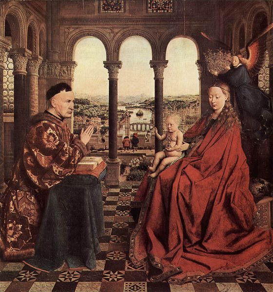
Jan van Eyck, The Virgin of Chancellor Rolin, 1435 
Vincent van Gogh, The Starry Night, 1889
Examples of Art with Actual Texture
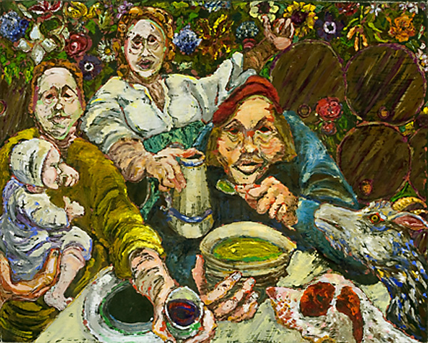
Marcia Gygli King, The Family, from The Culture Series, 2005. 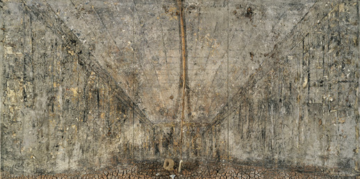
Anselm Kiefer, Aschenblume, 1983-97. 
Justin Gaffrey’s Painting. 
Justin Gaffrey’s Painting. 
Terese Agnew, Portrait of a Textile Worker, 2005.
Visual Texture/Implied Texture
Visual texture in art (also called Implied Texture) is texture that is not actually real. The artist creates the illusion of textures through manipulation of the media. It is an implied sense of texture that the artist creates through the use of various artistic elements such as line, form, shape, shading, and color. Visual texture is a visual quality of a surface. It is a result of painting or drawing of the real texture. Paint can be manipulated to give the impression of texture, while the paper surface remains smooth and flat. One artist who’s a master at creating visual textures in multiple media is Albrecht Durer.
Examples of Art with Visual Texture

Albrecht Durer, Portrait of Hieronymus Holzschuher, 1526 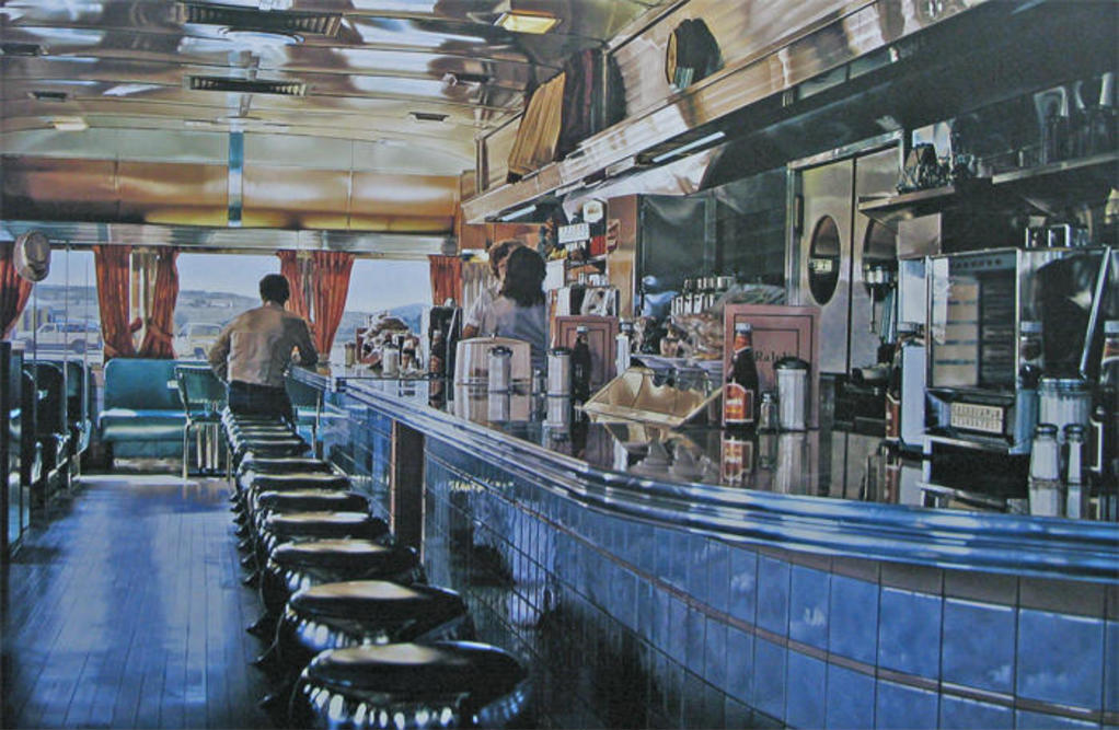
Ralph Goings, Ralph’s Diner, 1982 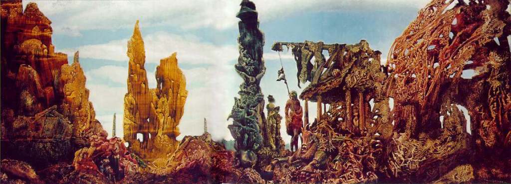
Max Ernst, Europe After Rain II, 1940-42 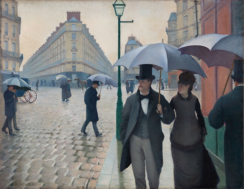
Gustave Caillebotte, Place de l’Europe on a Rainy Day, 1876-1877 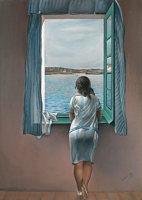
Salvador Dalí, Girl at a Window, 1925 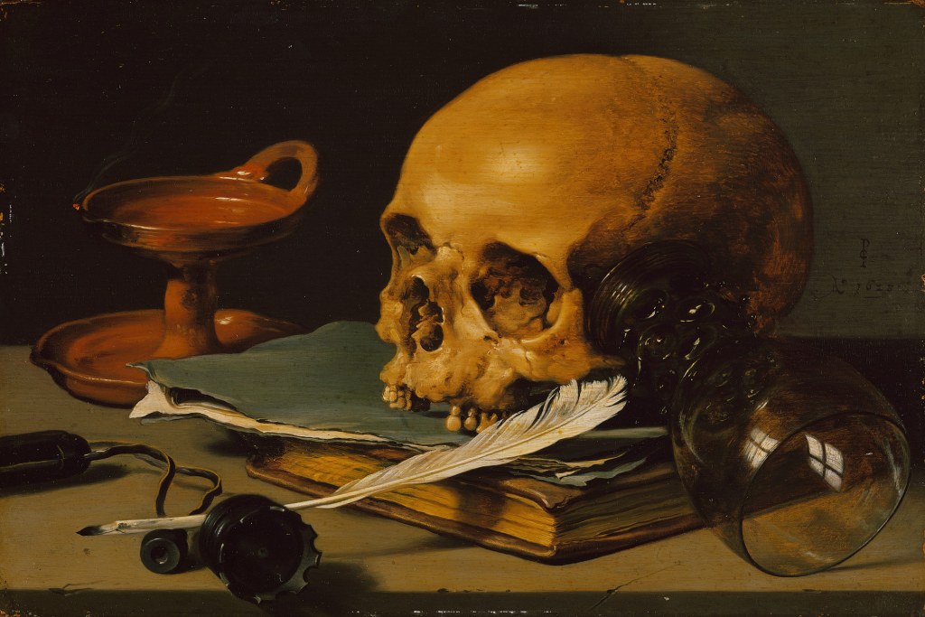
Pieter Claesz, Still Life with a Skull and a Writing Quill, 1628 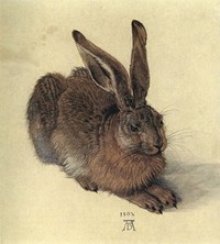
Albrecht Durer, Young Hare, 1502 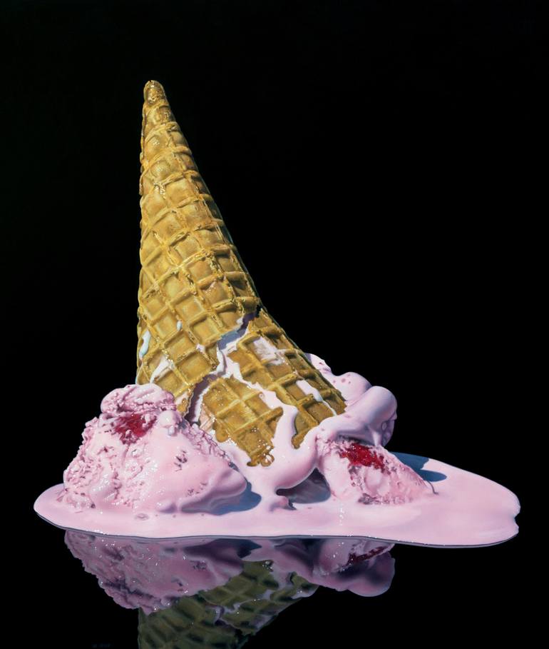
Jason de Graaf, Oil Paintings 
Teresa Elliott, Deliverance
Examples of Visual Texture in Drawing
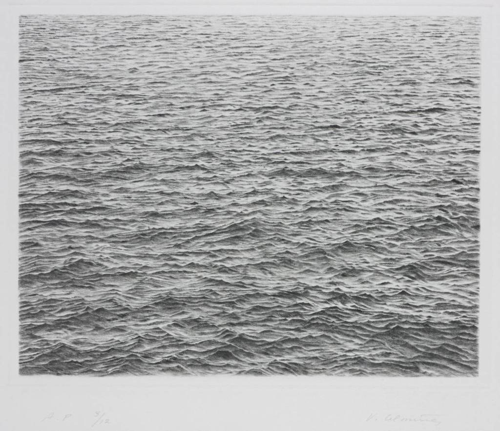
Vija Celmins, Drypoint – Ocean Surface, 1983 
Leonardo da Vinci, Portrait of a Man in Red Chalk, c. 1512 
Samuel Silva, Ballpoint Pen Drawings 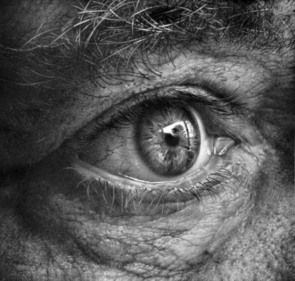
Armin Mersmann, Eye Drawings
Photographs explore both real and implied texture — the photograph contains memories of textures captured in a freeze-frame moment.
Simulated texture
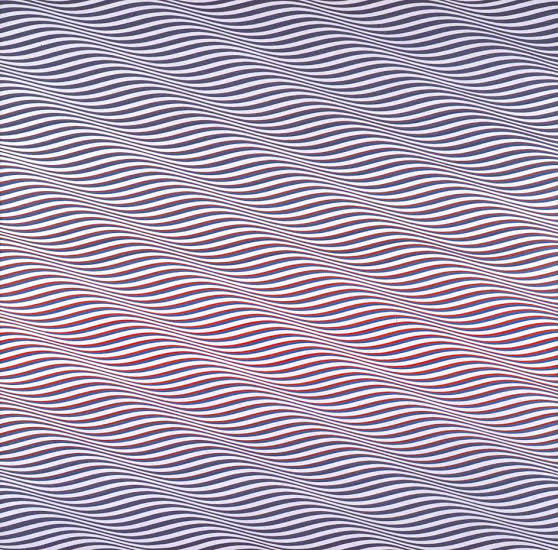
Simulated texture involves drawing the visual effect of texture without actually adding it. For instance, a texture may be made to look like something other than paint on a curve surface. An example is Cataract 3 painted in 1967 by Bridget Riley, which creates the illusion of ripples in the paper through the repetition of lines.
Texture in Digital Art
Visual texture on websites is an illusion, and there are two basic types; realistic texture and implied texture. It’s important to understand the difference between the two, because their communicative effects are dramatically dissimilar.
- Realistic Texture– These are attempts to recreate natural-looking textures in order to add realism to a page. An example of this might be a background that looks like rough stone, or perhaps some crumpled paper. Adding some realistic texture will often send a more literal message to the site visitor and can make the site feel more like a physical place. This effect isn’t necessarily positive or negative, but it’s definitely important to be aware of. But realistic textures can be difficult to execute, so they should be used carefully and sparingly.
- Implied Texture–Implied texture isn’t intended to look like anything, but it can add lots of emotional depth to a page. This type of texture is abstract and isn’t meant to be touched, similar to most decorative wallpaper or fabric with printed designs. Implied texture can even lack definition to the point that it just looks like noise, intended to add some slight visual variation beyond flat colors. Flat areas of color don’t always need texture; however, it is a good habit to add a bit of noise to gradients. This makes transitions in value look more natural with less color banding.
Layering of Textures
Contemporary fashion designers and interior decorators advise that there shouldn’t be too many patterns or textures in a single composition. However, when textures are arranged in an organized sequence of layers, rather than thrown together randomly, they can be drafted into a meaningful design. In fact, on most websites, it’s impossible to include only one texture because blocks of text typically read as textural elements. This technique of layered texture plays a different role with implied textures and realistic textures.
1. Layering Implied Textures-It’s difficult to layer textures directly on top of one another when creating implied textures, because while the results may be aesthetically pleasing, it can make the page too distracting. Implied textures work when they’re subtle and light in opacity, but exceptions are always there. However, implied textures can work very well together when they’re adjacent to one another in a composition. Textures can be combined with colors and values to create distinct content areas in a single layout.
2. Layering Realistic Textures-In real life, hardly any surface features a purely homogeneous texture, so layering realistic textures is actually much more natural than creating a solitary realistic texture. This isn’t the case when using photographs directly in a design, but when creating realistic textures artificially in an image editing program, it’s especially important to think in layers.
We can also divide textures into another category:
Natural texture
It’s the texture we find in nature and is not made by humans. For example: stones, sand, rice, etc. The rendering of real objects can be implied using texture, even when the image leans toward abstraction.
Artificial texture
It’s the texture from things made by humans. For example: a pencil, a chair, a raincoat, etc.
Impasto texture
One of the earliest ways abstract painters experimented with texture is through a process called impasto. When we say a painting is impasto, we mean the painter has applied the paint to the surface in thick layers. An impasto work is considered painterly, since it gives prominence to the physical marks made by the painter. Post-Impressionist painters like Van Gogh used impasto to create drama, and to affect the way light interacted with the surface of their images since impasto layers create shadows and highlights. Abstract Expressionist painters like Jackson Pollock use thickly layered paint to bring attention to the act of painting and to reveal the personality and individual technique of the artist.

Sunflowers by Vincent van Gogh 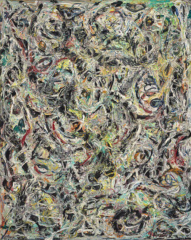
Eyes in the Heat, 1946 by Jackson Pollock
The opposite of impasto texture is flatness. Artists like Helen Frankenthaler and Kenneth Noland stained their canvases, pouring thinned paint directly onto unprimed canvases to merge the surface with the paint. Their flat textures diverted focus away from the physical gestures of the artist, encouraging the contemplation of other elements like color, surface, and space. Early abstract artists such as Kazimir Malevich also painted flat, non-painterly images. Interestingly, many of the iconic flat paintings Malevich painted, such as Black Square, have, with age, acquired textures much different than the artist intended. It is fascinating to contemplate whether the meaning viewers perceive in such works has been altered by the change in texture.
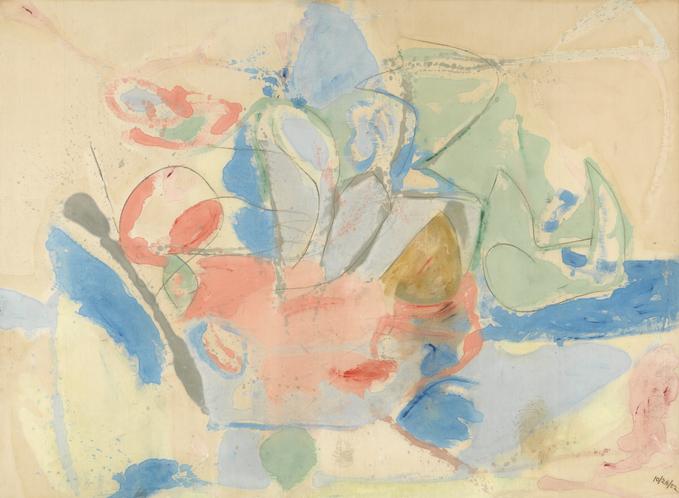
Mountains and Sea, 1952 by Helen Frankenthaler 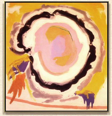
Ex Nihilo, 1958 by Kenneth Noland 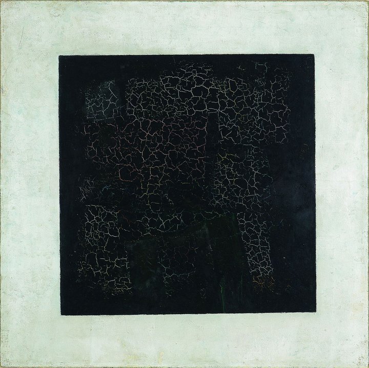
Black Square by Kazimir Malevich
Texture can have more impact through variation and relief – contrasting rough areas with smooth ones. That will make a painting far more interesting than an even, unrelieved texture going from edge to edge.Remember- creating textures is easy; it’s where and how you place them that differentiate a good painting from an ordinary one.
What are some ways that artists create texture?
Texture is the look and feel of a surface. Painters have many ways to create different textures. They use different sized and shaped brushes: everything from tiny pointed brushes to flat, wide brushes. They can also use other tools—special knives, sponges, even fingers—to put create textures on canvas. Here are some techniques that artists employ for achieving textures:
- They brush paint on in watery strokes and thick drips.
- They put paint down in short, fat dabs and long, sleek strokes.
- They twirl their brushes to make circles and curls.
- They apply paint in thick layers that stick out from the canvas.
- They put different colors on top of each other.
- They mix in sand, dirt, or other materials into the paint.
- They add white highlights to make things look shiny.
- They scratch through paint to show colors underneath.
Techniques for creating textures:
- Collage – The term collage comes from the French word “coller” meaning “glue”. It is a form of art in which various materials such as photographs and pieces of paper or fabric are arranged and glued together on a surface like paper.
- Tromp l’oeil – This meansfool the eye. It is an art technique that creates optical illusions so the painted objects appear in three dimensions. It is usually used in murals.
- Sand painting – Materials required for this technique are thick white paper, glue and sand. Apply the glue with a paintbrush creating the shapes you want. Before it dries cover the picture with sand and let it dry. Then take off the remained sand.
- Create printing textures – Materials required for this technique are thick white paper and tempera painting, a range of materials (cotton, paper, plastic, a leave, etc.) The materials are painted with any colour and pressd softly onto the paper surface.
- Create rubbings textures – Materials required for this technique are paper of varying weight and colour, soft pencil or chalk, a range of rough surfaces.
A piece of paper is placed directly onto the surface intended to take the rubbing from, and then a soft pencil is used to rub on the paper.

Collage by Picasso 
Painting using the tromp l’oeil by Pere Borrell. 1874
My experiments with Texture
When we talk of art, the first thing that comes to mind is paintings. The use of texture, along with other elements of design, can convey a variety of messages and emotions in a painting. As an artist, this is my first and foremost objective too, but that’s not it. Incorporating texture or tactile feel in my art is not only a deliberate choice designed to invoke a certain response in my audience, but also an attempt to capture the depth and dimension that goes beyond the work itself. Consequently, I aim to invoke that sense of curiosity among my viewers, thereby compelling them to find out more about the techniques I have employed in order to achieve certain textural effects.
As an artist, texture has always appealed to me and hence forms the essence of almost all of my artworks. When I look back, I find that with time, my explorations with this tactile element of art have evolved and matured, not just in terms of surfaces and mediums, but also the use of different materials and techniques. I have also been able to open my mind to conceptual application of different textural elements based on the requirement of the theme I wish to represent through my work.
Now, I shall attempt to classify my paintings into the various categories of textures I have listed above and how I have achieved them. So here they are!
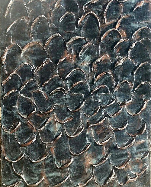
Attempts with Actual Textures – Enlisted below along with their techniques, are some of my paintings where I have tried to produce actual textures:
| S No | Painting Title | Technique used |
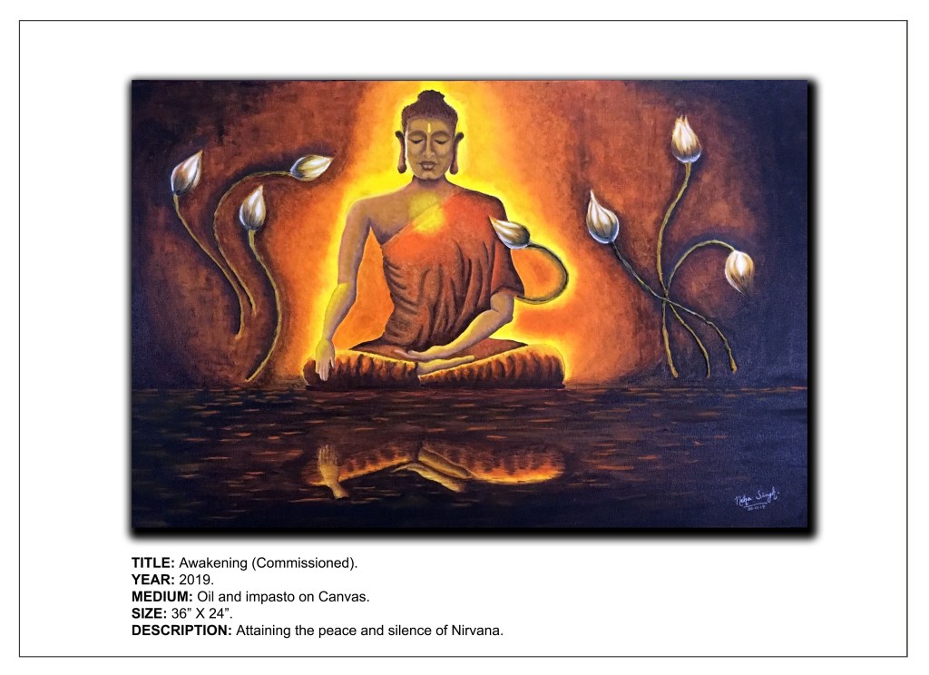
| 1 | Awakening | Impasto with modeling past for flower buds |
| 2 | Dragon-Fury | Crayon melt for the fire |
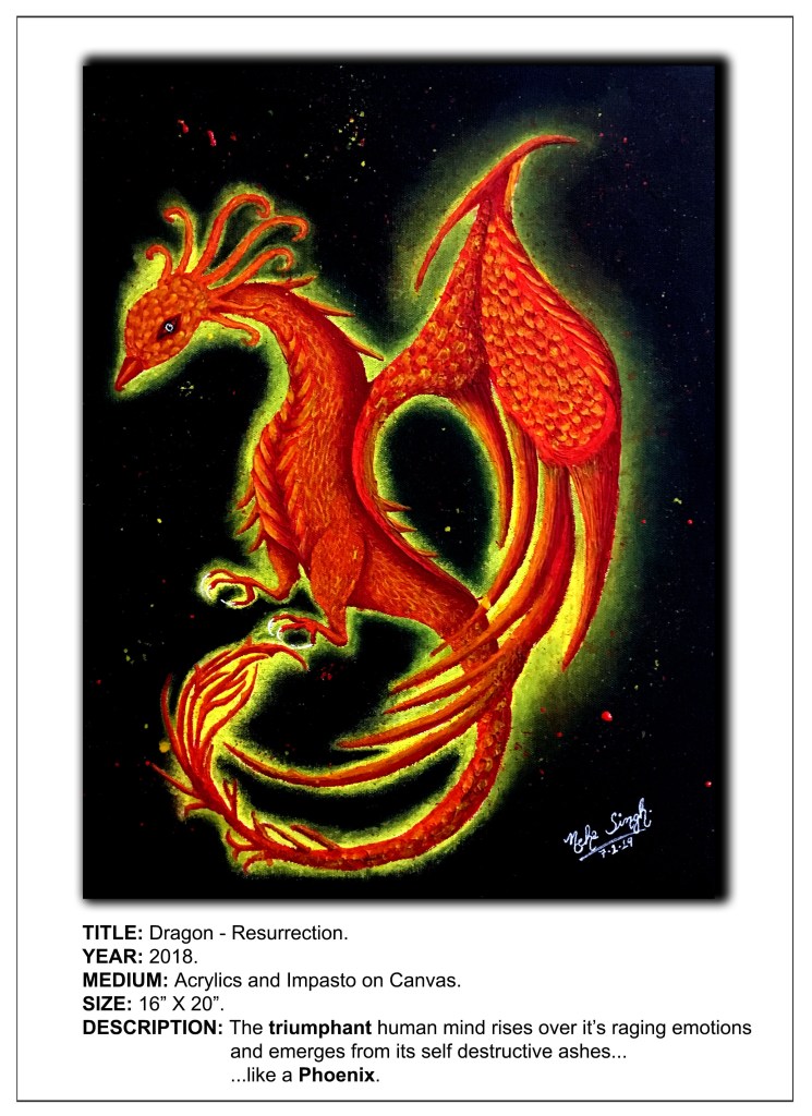
| 3 | Dragon-Resurrection | Impasto with modeling paste for scales and feathers |
| 4 | Shringar–Inner Beauty | POP for background |
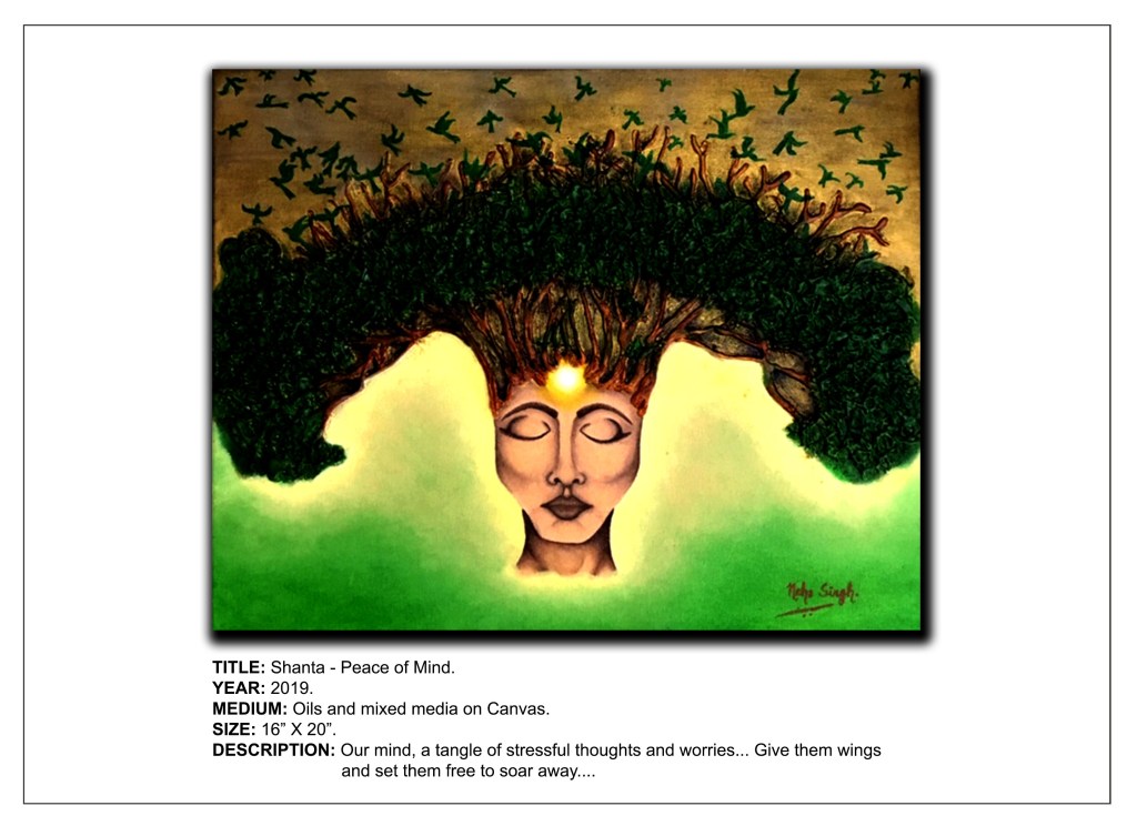
| 5 | Shanta-Peace of Mind | Hot glue gun and gesso for tree |
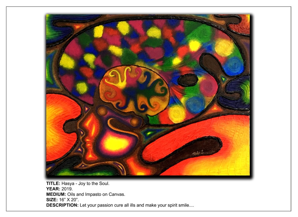
| 6 | Hasya–Joy to the Soul | Impasto, hot glue gun and gesso |
| 7 | Veer-The Unsung Heroes | Hot glue gun, gesso for picture frame |
| 8 | Karuna-A Touch of Compassion | Acrylic pour and decoupage for elephant ear, hot glue gun and gesso for flora and foliage |
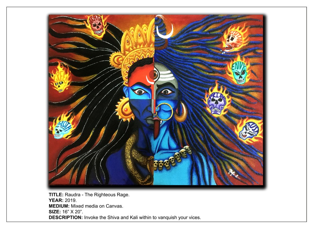
| 9 | Raudra-The Righteous Rage | Impasto with modeling paste for hair |
| 10 | Bhayanaka-The Terminal Fear | Impasto with modeling paste for flame background, decoupage with cling wrap & gesso for Grim Reaper’s cloak |


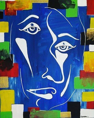
Attempts with Visual/Implied Texture – I have attempted to impart visual or implied texture in the following artworks:
| S No | Painting Title | Medium/Technique |
| 1 | Awakening | Oil paints to imply folds of Buddha’s drape and ripples & reflection in water |
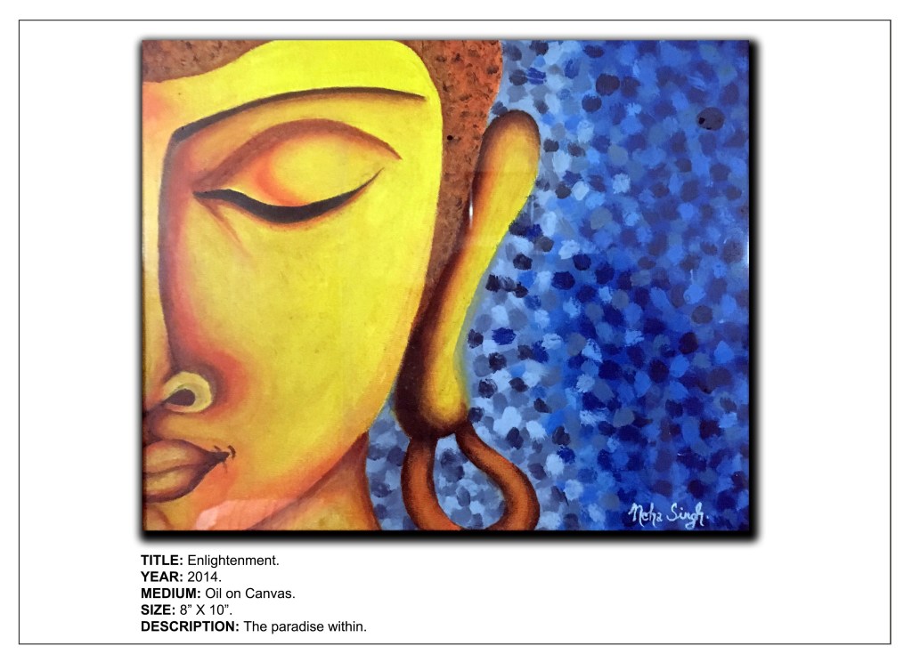
| 2 | Enlightenment | Oil paints for background texture |
| 3 | Doodle Art (All) | Pens and marker for various lines, marks & patterns |
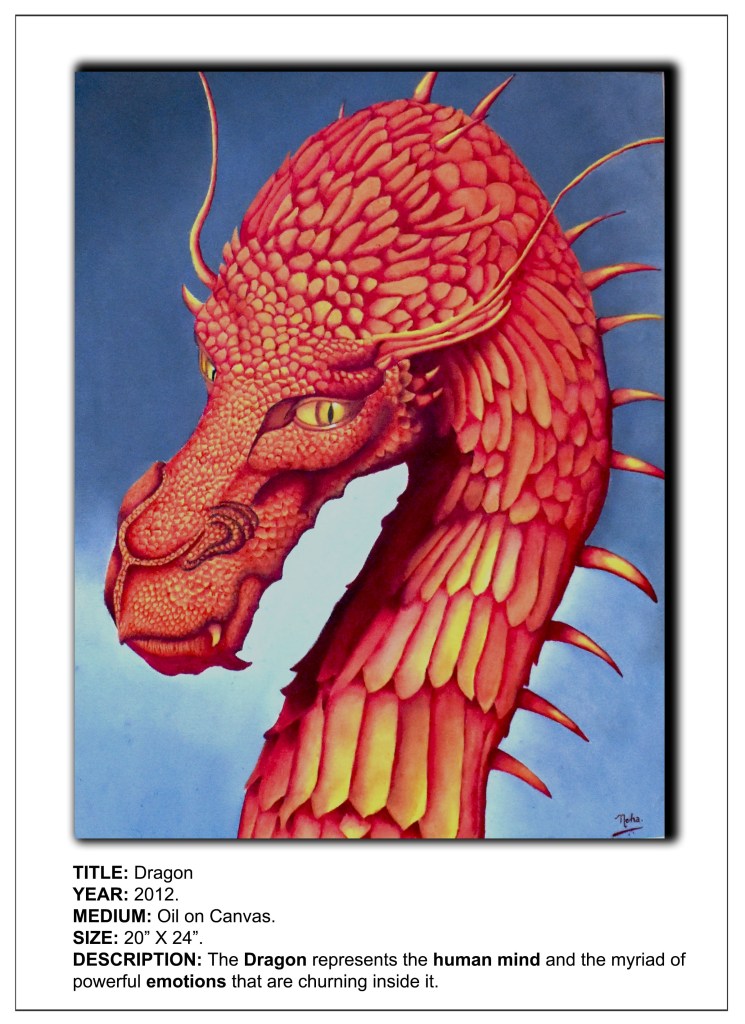
| 4 | Dragon Portraits (All 3) | Oil paints to imply scales of dragons |
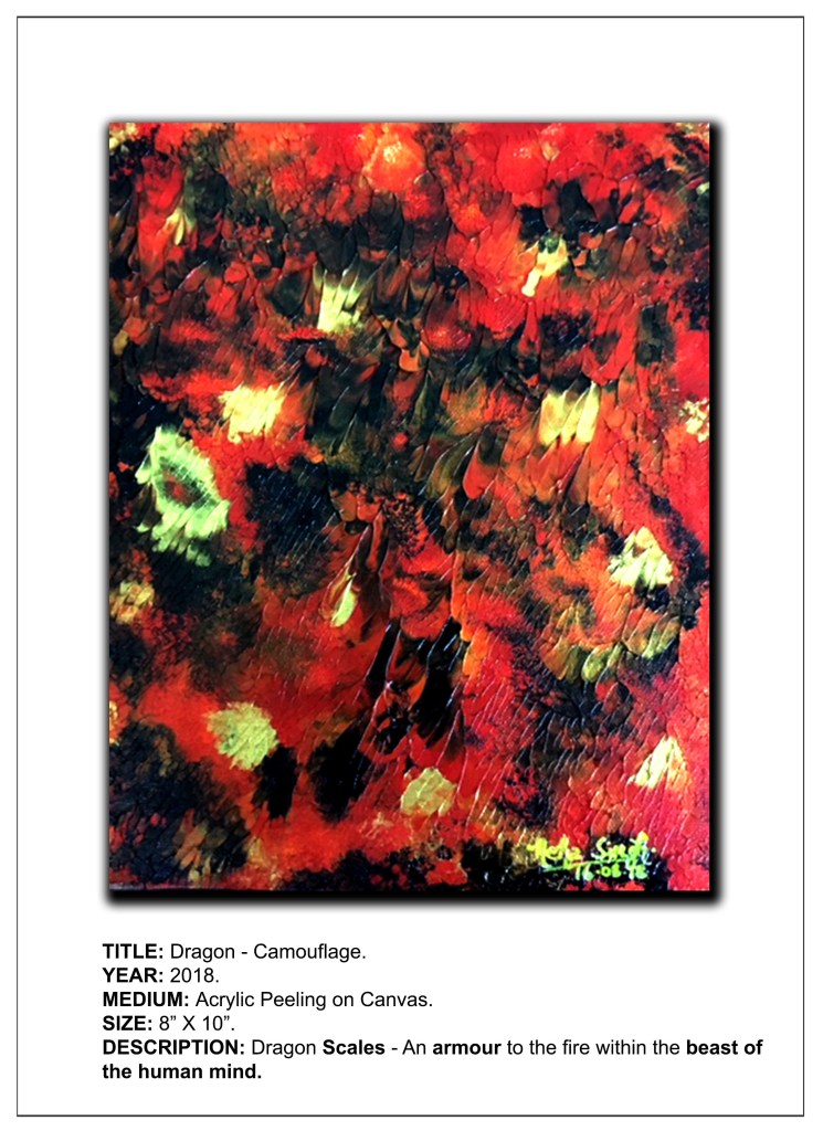
| 5 | Dragon-Camouflage | Peel Painting for dragon scales |
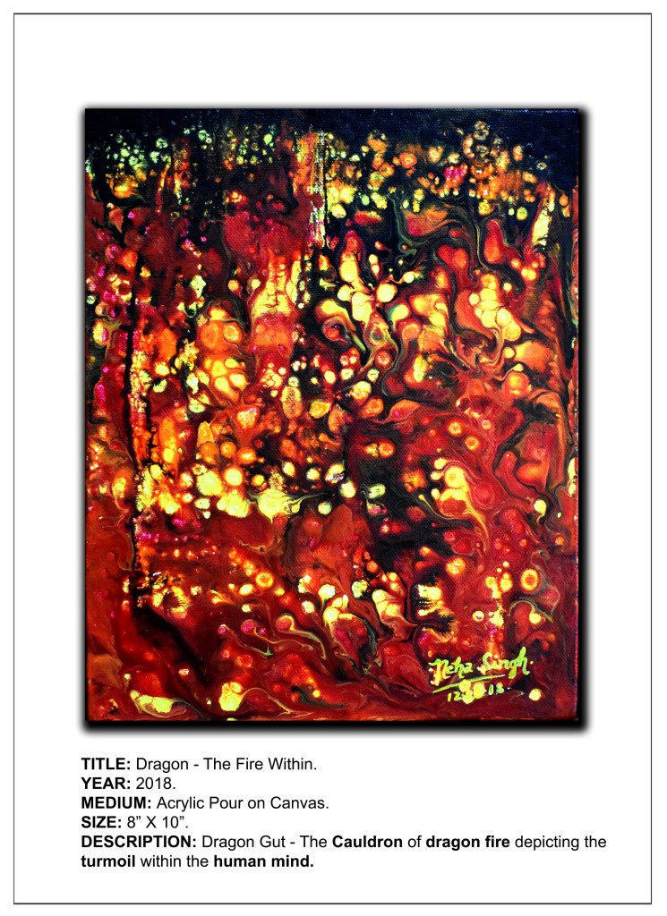
| 6 | Dragon-The Fire Within | Acrylic pour with silicone for dragon gut |
| 7 | Dragon-Wrath | Acrylic Pour for dragon fire |
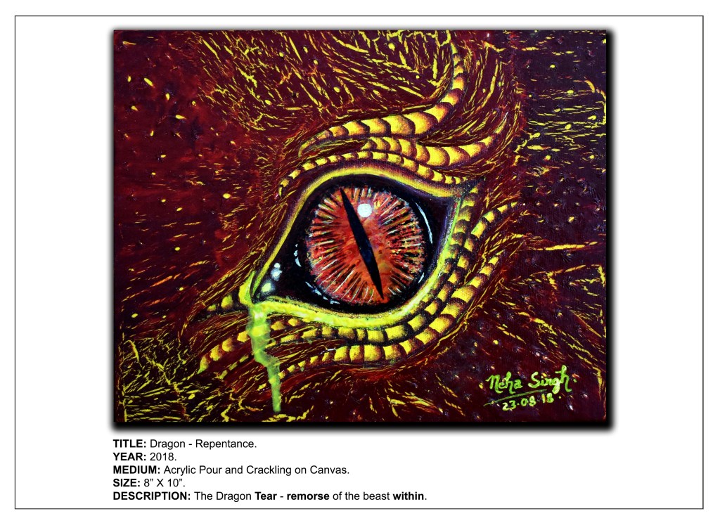
| 8 | Dragon-Repentance | Crackling effect for background, impasto and acrylic pour for eye |
| 9 | Dragon-Liberation | Acrylic Pour for wing |
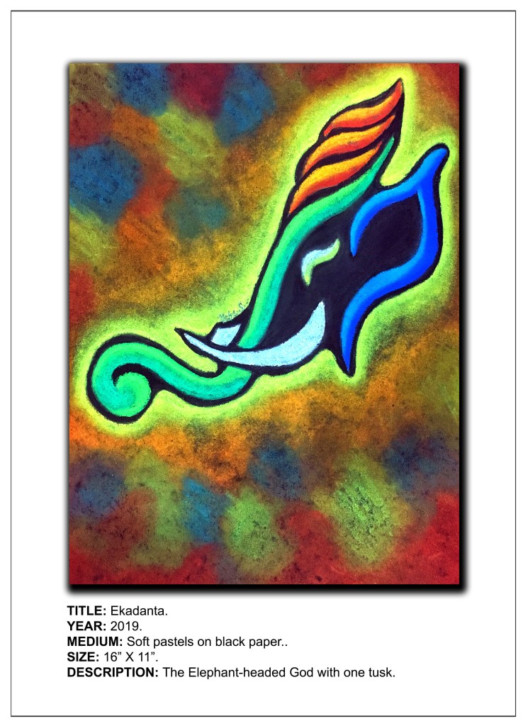
| 10 | Ekdanta | Soft pastels for Ganesha |
| 11 | Mormukutdhari | Soft pastels for peacock feather, prismacolor pencils for Krishna |
| 12 | Deep Sea Dweller | Oil paints for clouds and waves |
| 13 | The Eavesdropper | Oil paints for clouds and waves |
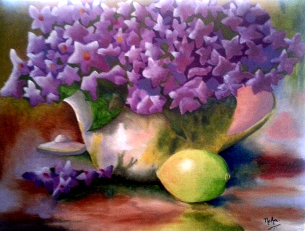
| 14 | Flora in a Pot | Oil paints for flowers, pot and background |
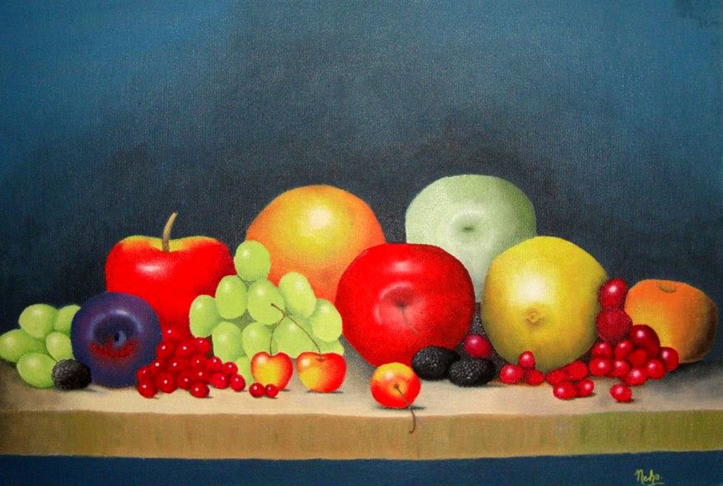
| 15 | Fruit Platter | Oil paints for textures of fruits |


Digitally Implied Texture – I have explored this category in one of my artworks titled Steel Shark wherein I have imparted a grainy texture and fluidity to the underwater seascape digitally.

It is my constant endeavor to produce a painting that excites my viewers enough to be able to emote freely. I believe that in order to get a realistic feel of a subject, an artist needs to explore and imbibe its texture into his or her creation. This can only be possible if he or she views the subject not just in two dimensions, but the third dimension as well. So I’m forever in search of tactile elements surrounding objects as I want them to come alive with my painting. I want my art to speak for itself. I want it to express my beliefs, feelings and emotions better than my words, for I truly believe in the saying, “A picture can speak a thousand words.”
DISCLAIMER – All the information, data and imagery in this blog post is for informational and educational purpose only. While there may be copyrighted material the use of which has not always been specifically authorized by the copyright owner, I have only made it available with the sole effort to stimulate creative progress and artistic enrichment. Some images may have been taken from the links included below and I give full credit to these websites/pages, thereby in no way claiming them to be my own. I have also used these links for reference purposes and collection of data; therefore I give full credit to the respective web pages. Most of the data in this post is based on my personal experiences and opinions and I am not responsible for any material that is found in the links at the end of this post.
Sources and Photo Credits –
https://www.ideelart.com/magazine/texture-in-art
https://www.nga.gov/education/teachers/lessons-activities/elements-of-art/texture.html
http://visualartspdsf.blogspot.com/2012/04/textures.html
https://artuk.org/discover/artworks/cataract-3-177152
http://marciagygliking.com/recentwork/pages/RW-4-thefamily.html
https://www.themodern.org/collection/aschenblume/1155
https://www.justingaffrey.com/
https://en.wikipedia.org/wiki/Rain,_Steam_and_Speed_%E2%80%93_The_Great_Western_Railway
https://wisconsinart.org/exhibitions/terese-agnew-portrait-of-a-textile-worker.aspx
https://www.wga.hu/html_m/d/durer/1/10/3holzsch.html
https://www.max-ernst.com/europe-after-rain.jsp
https://www.artic.edu/artworks/20684/paris-street-rainy-day
https://shop.salvador-dali.org/en/works-dali/girl-at-a-window.html
https://www.metmuseum.org/toah/works-of-art/49.107/
http://www.visual-arts-cork.com/famous-paintings/hare-durer.htm
https://www.saatchiart.com/ja5on
https://teresa-elliott.com/works/2444850/deliverance
https://www.tate.org.uk/art/artworks/celmins-drypoint-ocean-surface-ar00467
https://www.leonardodavinci.net/self-portrait.jsp
http://www.arminmersmann.com/graphite#/alps/
https://www.britannica.com/art/impasto
https://www.jackson-pollock.org/eyes-in-the-heat.jsp
http://www.frankenthalerfoundation.org/artworks/mountains-and-sea/details/all
http://www.sharecom.ca/noland/c2.html
https://www.tate.org.uk/art/artists/kazimir-malevich-1561/five-ways-look-malevichs-black-square
