A deadly contagion has declared war on our world, afflicting us with illness and fatality. Every corner of the planet feels like a warzone as we make desperate attempts to combat the Corona virus with lockdowns, quarantine and isolation. As social distancing and staying home become the norm, we are slowly learning to acknowledge the importance of these actions in keeping us alive and kicking.
In the face of this global health crisis we are seeing endless human suffering which is changing people’s lives for the worse. Mankind is traumatized and our social fabric is torn. People are worried and scared. We need to counter this atmosphere of fear and panic by recognizing and accepting the fact that we have only each other to ensure our survival. This is not the time to indulge in skin-deep, color based prejudices and fanaticism but to unite against our common faceless enemy. This human crisis calls for global solidarity and unification.
It is this thought that has inspired me to create a watercolor rendition that I call “One World.” Through this artwork I wish to convey that we are all in the same troubled waters so all the nations of the world need to come together and unify their forces as well as resources in order to successfully tackle COVID-19. I have attempted to express this by depicting all the nations as one single cityscape under the same skyline.
One World
Even though each country is trying its level best to address this worldwide epidemic in its own way, it is too complex a predicament to be handled individually. This demands combined action from the world leaders not just to help their own country but also look out for the less developed and more vulnerable ones. Universal coordination and cooperation are the need of the hour.
COVID-19 is the Trojan horse that has insidiously infiltrated the human operating system and is slowly shutting it down. The only antidotes we have against it come in the form of lockdown, quarantine, isolation and precautionary measures of the likes of social distancing, washing hands and wearing of masks. These countermeasures are being adopted globally hence I have highlighted some of them in my artwork. As of now this is the only “antivirus” we have against the infection.
If our nations become more integrated in this battle full of uncertainties, the human race stands a chance of pulling through this dark time. So let us all come together in our fight against Corona virus even though we are miles apart. In these difficult times, Bob Marley’s legendary lyrics from “One Love” sound just right so signing off for now with a few lines from the song –
One love One heart Let’s get together and feel alright
One love One heart Give thanks and praise to the Lord and I will feel alright Let’s get together and feel alright
Let’s get together to fight this Holy Armageddon (one love) So when the Man come, there will be no no doom (one song) Have pity on those whose chances grows thinner There ain’t no hiding place from the Father of creation (sayin’)
The world has been invaded by a minute yet potent entity that has ravaged the human race and brought it down to its knees. This unyielding adversary is the killer COVID-19 that has dramatically altered our lives in just a few months. Since the day this deadly pathogen declared war on humanity, we have been living in terror and what makes it worse is the fact that no-one knows when this war will end or who will be the victor or what our world will look like after it does.
The onslaught of this virulent microbe has radically changed the existing status of human civilization universally. Our hustling bustling world now looks empty and desolate. The streets are deserted, restaurants and cafes are closed for business, malls and department stores are shut and the once thriving tourist destinations are out of bounds for humanity.Countries have closed their national as well as international borders, modes of long distance travel like air and rail have been suspended indefinitely and mandatory curfews or lock-downs have been imposed on any non-essential movement.
As the menacing corona virus infiltrates every street and alley, spreading its reach far and wide, it has turned our world upside down.Countless have succumbed to it and umpteen more continue to fall prey every day. People are dying in masses, health resources are stretched beyond their limits and the very foundation of our existence is under threat. The essence of our freedom is diminishing as we are forced to go into an unnatural hibernation, for this virus seems to know no barriers.
Even so, humanity has not lost completely for thousands recover and beat the virus every day, so not all hope is lost.In this time of crisis, confinement and isolation are paramount for our wellbeing and eventual survival.‘Stay Home’, is not just the current mantra, but also the need of the hour and a new way of life in the present day scenario. For how long you ask? For as long as it takes I say.
It is this mantra that inspired me to create this watercolor artwork titled “Home Safe Home”. In the present circumstances it becomes absolutely imperative for each and every one of us to stay indoors and follow all the lock-down rules. In order to defeat this deadly virus, we need to unite not just as a community or a race but as a species and limit ourselves within the protective boundaries of our homes, for these are like impregnable fortresses that the virus cannot penetrate unless we step out and bring it in ourselves.
Our planet has provided us with so much more that her capacity that she almost has nothing more left to give. She has protected us from floods, famines, disaster and disease just like a selfless mother protects her child from all harm. She has always put us first and all we have done is drained her dry. We have used and abused her time and again for our own selfish gains without giving any thought to her well being. Maybe this is her way of mending herself or teaching us a lesson and making us mend our ways. Who knows?
My artwork titled “Home Safe Home”
Through this artwork I wish to convey that now it’s our turn to return her favors. The earth is our home, in fact the only home we have. By staying within the confines of our individual dwelling places, not only do we protect ourselves from the deadly COVID-19, but also protect our planet from us. Right now, we need to be patient and resilient and wait for the day we attain victory over this virus. Once we are liberated from its stronghold, we must remember to wipe the slate clean and make a fresh start. We need to heal our planet and make her a safe haven not just for us but for all the other beautiful living beings that reside on it. Only then will it become “Home Safe Home.”
Let’s hope that this period of confinement and self constraint takes us into the depths of our thoughts and makes us introspect on how we can make ourselves worthy of living in this safe haven.
The Corona virus is like a malignant tumor that is spreading uncontrollably across the world, slowly putting it into shutdown mode. This is an extremely distressing time in the history of mankind, especially for those who revel being out in the open.But the current situation makes it absolutely imperative for everyone to stay indoors.
Being a loner and a recluse, I have always enjoyed being with myself the most and love my solitary strolls with just nature’s sights and sounds to keep me company. Not only do these secluded reveries relieve me of my worries, but also provide me inspiration for my most beloved activity – making art. Creating something aesthetically appealing is like therapy to me. It heals my thoughts as well as my spirit and soul.
As I sit isolated from civilization, my own retrospective reflections have found a release through my art. The solitude of lockdown has intensified my artistic energy. My introspections have brought forth glimpses of other’s lives and helped me put their role into perspective. At a time when the framework and confines of daily life have shriveled to the bare necessities, I am filled with gratitude for all the people who are helping the human race endure and sustain this perilous episode.
The artwork I share with you all in today’s post is an expression of my gratefulness to the warriors who are at the forefront of the combat zone of the COVID-19 invasion – our health workers, paramedics, nurses and doctors. This is my tribute to our medical healers who are working tirelessly day and night to pull us out of the clutches of the macabre corona virus.
When man is overwhelmed by turbulent storms, he turns to faith and hope. Faith comes in the form of the trust he puts in his savior to rescue him from the storm and hope is what makes him hold on to his faith. In the present day situation, our faith has taken the form of our medics who are no less than reincarnations of God. They hold the divine power to heal us and revive us back to health.
This dauntless service to humanity is not for mere mortals like you and me. Not only is it equivalent to a divine power, but also an act of heroism in its own right and deservant of a place next to none other than the Almighty. Hence, I have represented the entire medical community through an image of God. I have rendered my illustration of this image of divinity with my beloved prismacolor pencils. I have used chalk pastels to represent the form of the virus and colored gel pens for doodling the dos and don’ts that are being recommended by our doctors and medical experts.
These are not Gods we have read about in mythological books and epics. They are real life Gods with the power to heal disease. These are not the superheroes we read about in comic books or see in movies. They are real life heroes who are combating this pandemic fearlessly, putting their own lives at risk in the process. So let’s all salute them for their unwavering resolve and support, for we owe our lives to them.
As the deadly Novel Corona Virus or COVID-19 grips the world in its vicious claws and spreads its wings far and wide, it made me wonder how artists during similar epidemic-ridden periods in the past would have been affected and how they would have rendered these afflictions in their own work. I did some research and was surprised to come across several works of art depicting the same. So get ready for a trip down memory lane to reminisce about how various pandemics in history have been depicted by artists.
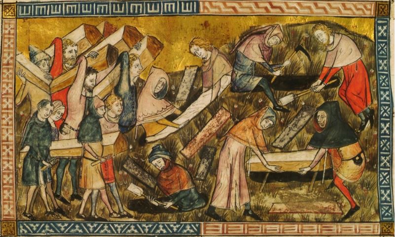
Tournai Citizens Burying the Dead During the Black Death, 14th century
During the Black Death (1347 to 1351) skeletons and death were very common in culture and art. This miniature shows the mass burial of the dead by the citizens of Tournai, Belgium. There are fifteen mourners and nine coffins all crammed into the small space, with the face of each mourner given individual attention, each conveying genuine sorrow and fear.
The Citizens of Tournai, Belgium, Burying the Dead During the Black Death of 1347-52(Detail of a miniature from The Chronicles of Gilles Li Muisis ,1272-1352)
Painting by French artist Josse Lieferinxe at the end of the 15th century
In this painting from the 1490s, St. Sebastian, one of the saints whom people prayed to for protection against the plague, kneels before God while a grave attendant is stricken with the plague as he is burying someone who died of the disease. He has a single bubo on his bent neck. You have to look closely to notice the swollen red lump (the bubo) on the neck of the man on the ground in green sleeves.
Painting by French artist Josse Lieferinxe at the end of the 15th century
Giacomo Borlone de Burchis, The Triumph of Death with The Dance of Death, 15th century
The Dance of Death (Danse Macabre), whichisa part of The Triumph of Death scene, shows Death as a crowned skeleton queen swinging scrolls in both hands. Two skeletons at her sides are killing people with a bow and an ancient arquebus. Beneath her feet is a marble coffin where the corpses of an emperor and a pope lie surrounded by poisonous animals, symbolic of a quick and merciless end. Powerful yet desperate people from diverse social classes are offering valuables and begging for mercy.
Giacomo Borlone de Burchis, The Triumph of Death with The Dance of Death, 15th century, Oratorio dei Disciplini in Clusone, Italy
Pieter Bruegel the Elder, Triumph of Death, c. 1562
The Triumph of Death by Flemish Renaissance master Pieter Bruegel the Elder also shows the Black Death. An army of skeletons wreaks havoc across a blackened, desolate landscape. Fires are burning in the distance, the sea is full of shipwrecks. Everything is dead, even the trees and the fish in a pond. This painting depicts people of all social backgrounds, from peasants and soldiers to nobles as well as a king and a cardinal. Death takes them all indiscriminately.
Pieter Bruegel the Elder, Triumph of Death, c. 1562, Museo del Prado, Madrid.
Pieta, 1576 by Titian
When Venice was struck by plague,Titian painted the Pietà as a prayer for the survival of himself and his son, Orazio. In the bottom right-hand, propped under the stone lion, is a tablet on which Titian and Orazio are seen praying to the Virgin for delivery from the plague, but in vain. Titian died “of fever” and Orazio also died during the plague. Glimmers of silvery torch and moonlight on the mosaic canopy above Christ, on the statues of Moses and the Sybil and the pale glowing body of Christ accentuate the terrible gloom.While the painting pleads for salvation, the emotional texture is of fear and horror at the closeness of death.
Pieta, 1576 by Titian
Van Dyck’s Saint Rosalie Interceding for thePlague-Stricken of Palermo, 1624.
This was painted by Van Dyck on top of a self-portrait he had sketched on a canvas. Van Dyck was in Palermo, Sicily, when a plague broke out. On July 15, 1624, the remains of Saint Rosalie—the city’s patroness, who died about 1160—were discovered on Mount Pellegrino, seen here above the harbor of Palermo. The canvas was cut on all sides, which trimmed the paint surface slightly on the left and right. Matching canvas has been added and repainted to complete the putto at the top left to the saint’s left hand. The landscape is quite worn and the upper sky is restored.
Van Dyck’s Saint Rosalie Interceding for the Plague-Stricken of Palermo, 1624.
Paulus Furst of Nuremberg, Doctor Schnabel von Rom, 1656
This etching displays a protective costume used in France and Italy in the 17th century consisting of an ankle-length overcoat, a mask, gloves, boots, a wide-brimmed hat, and another outer garment. The mask had glass openings for eyes, a curved bird-like beaked shaped face with straps to hold the beak in front of the doctor’s nose and two small nose holes serving as a respirator which held sweet or strong smelling substances (usually lavender). The beak could also hold dried flowers, herbs, spices, camphor or a vinegar sponge to keep away bad smells, known as miasma. This costume terrified people because it was a sign of imminent death.
Paulus Furst of Nuremberg, Doctor Schnabel von Rom, 1656, British Museum, London.
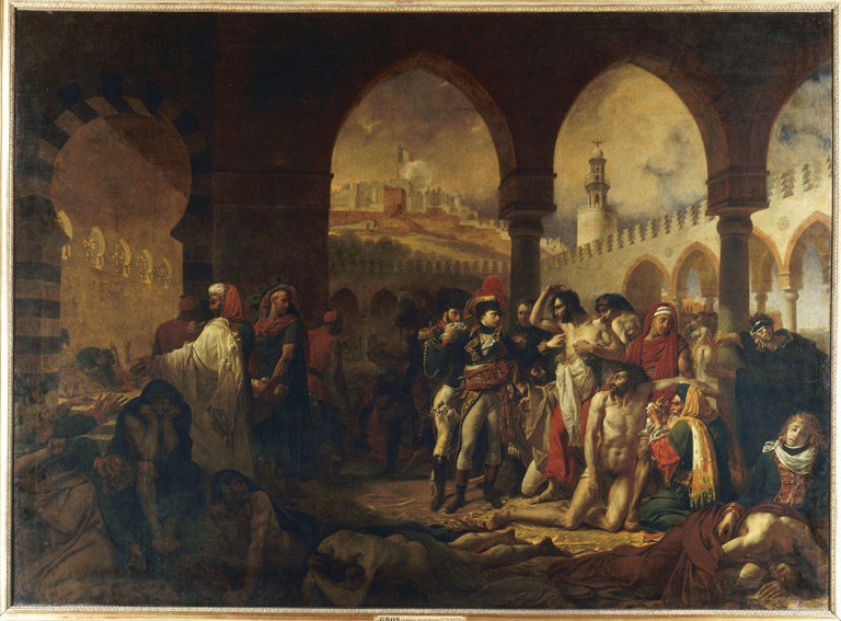
Bonaparte Visiting the Plague House at Jaffa, 1804.
The painter Antoine-Jean Gros depicts the courage of General Bonaparte visiting plague-stricken French troops in the courtyard of a Jaffa mosque in Syria, being used as a military hospital, in 1799. Bonaparte is seen touching a sore on one of the plague victims with his bare hand. One of the officers has a handkerchief over his mouth. On the left, two Arabs are handing out bread to the sick. On the right, a blind soldier is trying to approach the general-in-chief. In the foreground, in the shadows, the dying men are too weak to turn towards their leader. The painter implies that Bonaparte’s virtue and courage justify the horrors of war and gave him the luminous aura and gestures of Christ healing the lepers in religious paintings.
Bonaparte Visiting the Plague House at Jaffa, 1804.
Arnold Böcklin, Plague, 1898
Plague illustrated Arnold Böcklin’s obsession with war, pestilence, and death. Böcklin, a Symbolist has personified Death here as a winged creature, flying through the street of a medieval town. According to art historians he took inspiration from news about the plague appearing in Bombay in 1898, though there is no straightforward, visible evidence of Indian inspiration (Symbolists always used as ambiguous and universal symbols as possible).
Arnold Böcklin, Plague, 1898, Kunstmuseum Basel.
Egon Schiele, The Family, 1918
The 20th century brought the Spanish Flu, the horrific scale of which is hard to fathom. Egon Schiele was one of the great artists who died from it. The Family was unfinished at the time of Schiele’s death and initially was titled Squatting Couple. It was one of his last paintings. It shows Schiele himself with his wife Edith and their unborn child. Edith died of Spanish flu in the 6th month of her pregnancy. Three days after she died Egon did too.
Egon Schiele, The Family, 1918, Belvedere, Vienna.
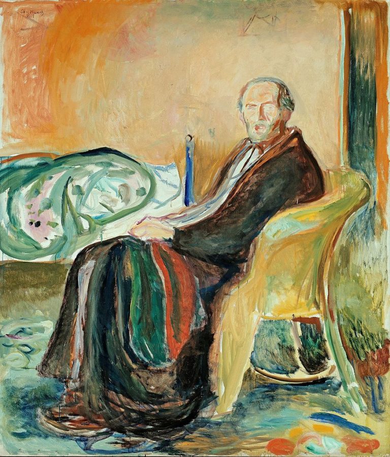
Edvard Munch, Self-Portrait after Spanish Influenza, 1919
Among other famous artists who died of the Spanish flu were Gustav Klimt, Amadeo de Souza Cardoso, and Niko Pirosmani. Edvard Munch caught it but he survived. Munch painted this work in 1919. He created a series of studies, sketches, and paintings, where in a very detailed way he depicted his closeness to death. As seen here, Munch’s hair is thin, his complexion is jaundiced, and he is wrapped in a dressing gown and blanket.
Edvard Munch, Self-Portrait After Spanish Influenza, 1919.
David Wojnarowicz, Untitled (Falling Buffalos), 1988-1989
In this photo-montage a herd of buffalos is seen falling off a cliff to their deaths. Made in the wake of the artist’s HIV-positive diagnosis, Wojnarowicz’s image draws a parallel between the AIDS crisis and the mass slaughter of buffalos in America in the 19th century. It reminds viewers of the neglect and marginalization that characterized the politics of HIV/AIDS at the time. Wojnarowicz died of HIV/AIDS in 1992.
David Wojnarowicz, Untitled (Falling Buffalos), 1988-1989.
Keith Haring, Ignorance = Fear, 1989
Keith Haring designed and executed this poster in 1989 after he was diagnosed with AIDS the previous year. The poster depicts three figures gesturing “see nothing, hear nothing, say nothing”. This implied the struggles faced by those living with AIDS and the challenges posed by individuals or groups that fail to properly acknowledge and respect the epidemic. Keith Haring died of AIDS in 1990 at the age of 31.
Keith Haring, Ignorance = Fear, 1989, Poster Collection Noirmont art production, Paris.
Untreatable plagues have been a regular feature of human existence for centuries. The medieval Black Death from 1347 to the late 17th century and the Spanish flu were some of the most devastating pandemics in human history. The paintings in this post remind us that “the plague” is not just a thing of the past but a global phenomenon that keeps recurring every few decades.
Not only did art survive the trials and tribulations of disease, it flourished. Even though art history is brimming with images of death, it is also full of learning. It’s almost as if all that pestilence served as a driving force for artists to create incredulous masterpieces aimed at affirming the importance of life. As a global community, we need to take a lesson from this, stop focusing on our differences and fight these outbreaks together. All we need is a positive outlook, the will to fight and a universal messenger like art to transmit the message everywhere.
With the current COVID-19 pandemic, we fear epidemics like never before. We don’t know yet what would be the final numbers of this global contagion, but looking back into art history, we realize that the past holds optimistic messages for modern day man. If people could endure incomprehensible contagions in those days, then so can we.
DISCLAIMER – All the information, data and imagery in this blog post is for informational and educational purpose only. While there may be copyrighted material the use of which has not always been specifically authorized by the copyright owner, I have only made it available with the sole effort to stimulate creative progress and artistic enrichment. Some images may have been taken from the links included below and I give full credit to these websites/pages, thereby in no way claiming them to be my own. I have also used these links for reference purposes and collection of data; therefore I give full credit to the respective web pages. Most of the data in this post is based on my personal experiences and opinions and I am not responsible for any material that is found in the links at the end of this post.
During the early days of the Modern Era, the classic female muse was a stereotypical image of a woman who inspired the artistic genius of male artists more on the basis of their physical appearance than anything else. But as time progressed, the later part of the Modern Period witnessed her metamorphosis into something more just a glorified female form. The so called “deity” of inspiration was no longer privy to the male artist’s gaze just for her superficial beauty.
In continuation with last week, today’s post will explore some of these emancipated women who changed the male artist’s perspective towards the female muse and redefined her identity.
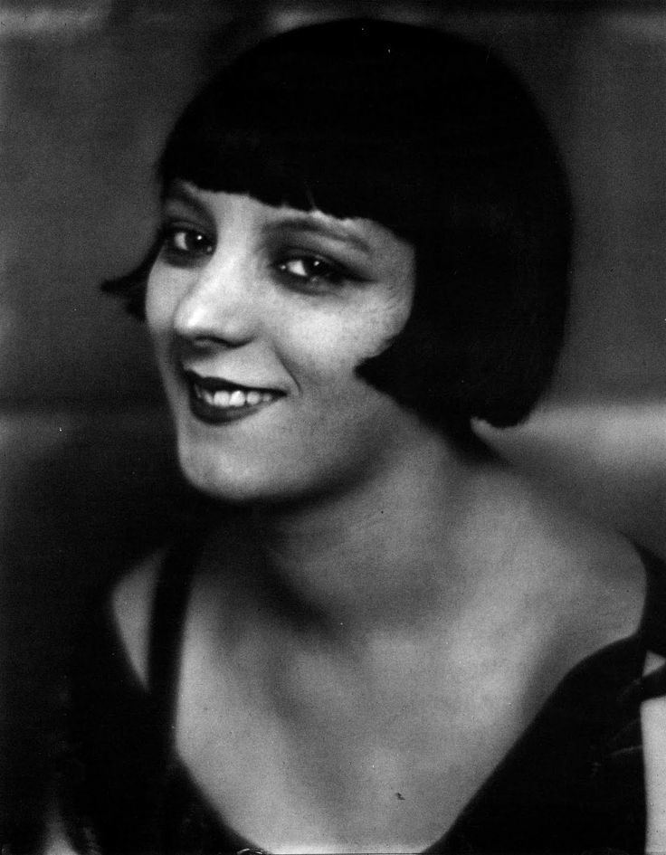
Kiki de Montparnasse (1901–1953)
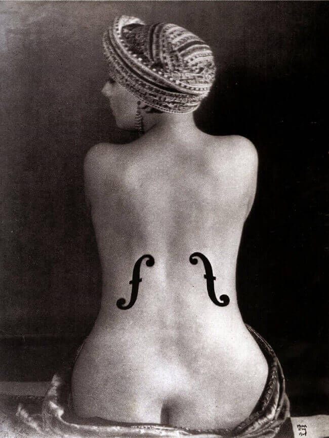
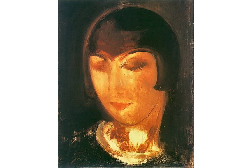
Born Alice Prin in France, Kiki de Montparnasse was a nightclub singer, painter, actress, and model. She posed for dozens of artists including Jean Cocteau, Moïse Kisling and Alexander Calderand inspired several others including Julien Mandel, Gustaw Gwozdecki, and Tsuguharu Foujita.
However, there is no doubt that she was Man Ray’s muse. Le violon d’Ingres, in which she is pictured from behind, with two violin f-holes painted on her back and Noire et Blanche are two of the most recognized works of Kiki by Man Ray.
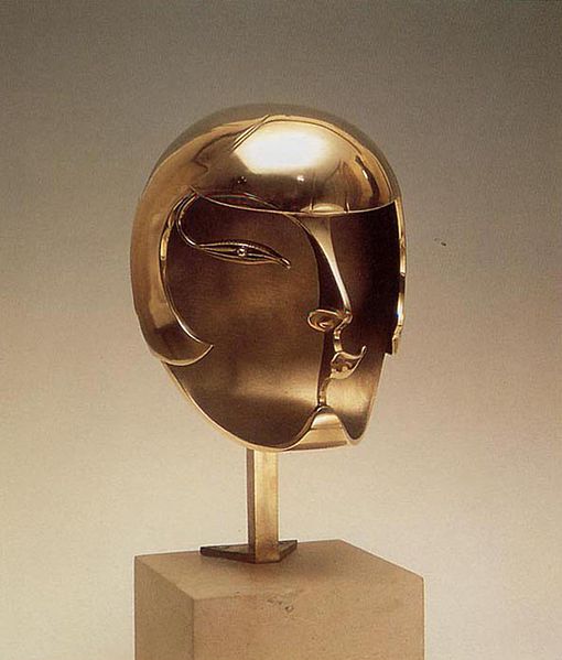
Her look was legendary: a sharply cropped black bob with straight, thick fringe, pale white skin, dark red lips and severely painted eyebrows. This iconic helmet-like hairstyle would be seen in works of art including paintings, photographs and Pablo Gargallo’s 1928 bronze Kiki de Montparnasse.
Le violon d’Ingres by Man Ray
Noire et Blanche by Man Ray
Pablo Gargallo’s 1928 bronze Kiki de Montparnasse
Gustaw Gwozdecki-Alice Prin
Kiki de Montparnasse
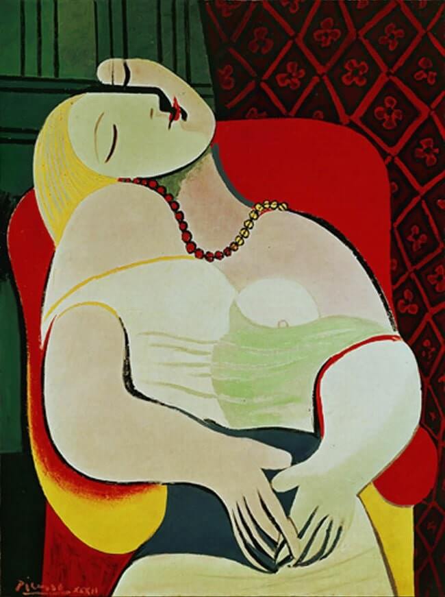
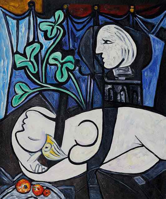
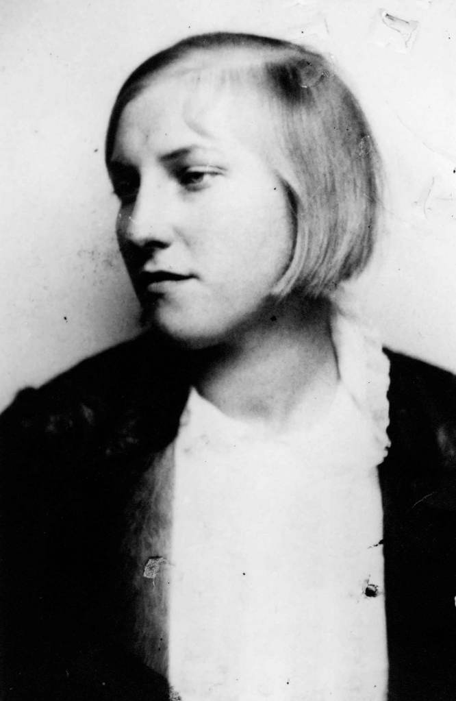
Marie-Therese Walter (1909-1977)
Marie-Thérèse Walter was the lover and model of Pablo Picasso. Some famous pieces depicting this French muse are Le Rêve and Nude, Green Leaves & Bust. Their relation fell apart after Picasso started seeing Dora Marr. While Picasso found another mistress, Marie-Thérèse never stopped loving him, and it’s believed he never stopped loving her — there is an abstract sculpture of her on his grave.
The Dream (Le Rêve), 1932 by Pablo Picasso
Nude, Green Leaves and Bust, 1932 by Picasso
Marie-Therese Walter
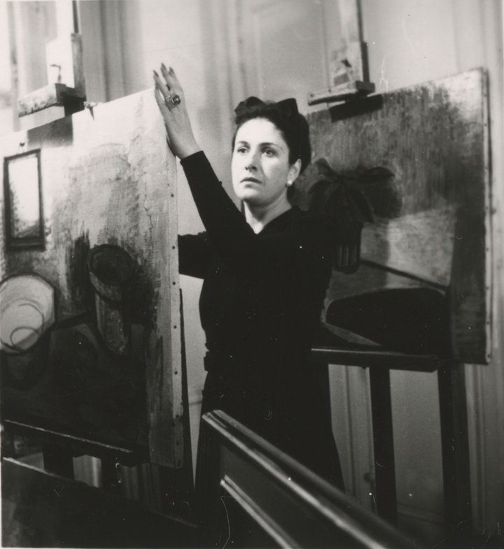
Dora Marr (1907-1997)
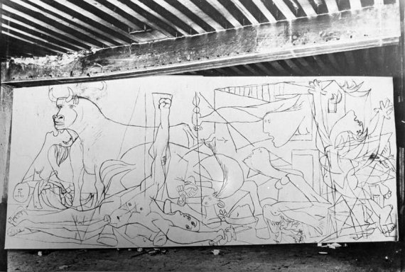
This dark-haired beauty was the muse of Pablo Picasso during the 1930s and ’40s. She has inspired several of his most famous paintings, including Guernica(1937) and The Weeping Woman(1937). Marr, a photographer, was the only person allowed to capture the successive stages of Guernica as Picasso painted it. She is also said to have worked on elements of the painting. This brilliant intellectual was also a talented painter herself.
Dora Maar
Dora Maar’s report on Guernica’s progression
Dora Maar, photograph of Guernica, May-June, 1937
Pablo Picasso, Portrait of Dora Maar (1937)
Picasso-The Weeping Woman,1937
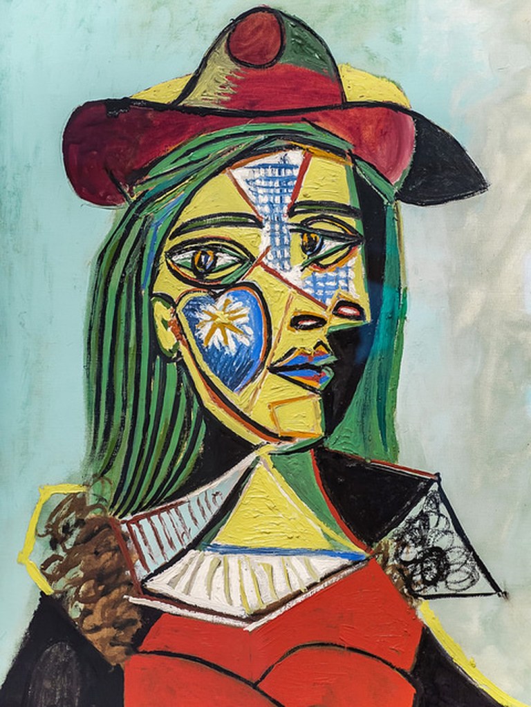
Pablo Picasso, Woman in Hat and Fur Collar, 1937
Monique Bourgeois (1921-2005)
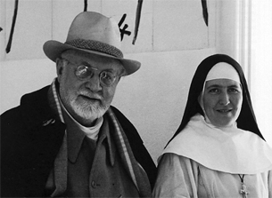
In 1941, when Matisse was recovering from treatment for cancer, Monique Bourgeois took the job of nursing him, and doubled as his model. In 1943, after they had been separated by the fortunes of war, Bourgeois entered a convent. She didn’t meet Matisse again until 1946, when she came to see him to ask him to design and execute the Chapelle du Rosaire, his last and greatest complete work.
Monique Bourgeois and Matisse
Chapelle du Rosaire
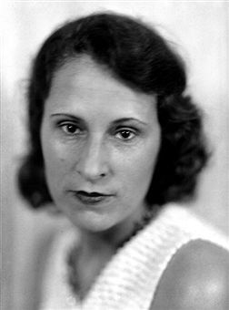
Gala Diakonova (1894-1982)
Elena Ivanovna Diakonova, otherwise known as Gala Diakonova, was a muse for her first husband Paul Éluard, Max Ernst and André Breton and finally for Salvador Dalí, also her husband. Gala posed for Dalí in works such as Portrait of Galarina, Leda Atomica, and Galatea of the Spheres. Gala appears in several other Dalí paintings and sculptures, notably The Madonna of Port Lligat (1949), Imperial Monument to the Child-Woman, Gala (1934) andThe Discovery of America by Christopher Columbus (1958–59).
Gala Diakonova
Portrait-de-femme-Dora Maar
Leda Atomica, 1949 by Salvador Dali
Galatea of the Spheres, 1952 by Salvador Dali
Salvador Dalí, Portrait of Galarina (1940–45).
Salvador Dali,Imperial Monument to the Child Woman,1929
Salvador Dali-Gala leaning out the window
The Madonna of Port Lligat, Salvadore Dali
The Discovery of America by Christopher Columbus, Dali
Helga Testorf (born c.1933 or c.1939)
The muse of the American artist Andrew Wyeth was a German model Helga Testorf. For fifteen years, he worked on The Helga Pictures, a series of more than 240 drawings and paintings of the model. Helga was Wyeth’s neighbor, and the artist depicted her in various poses indoors and out of doors, nude and clothed. Interestingly, the sessions were a secret even to their spouses, and the works were located at the home of Frolic Weymouth who was his student, neighbor, and a good friend.
Andrew Wyeth – Braids (Helga Testorf), 1979. Dry-brush watercolor.
Edie Sedgwick (1943-1971)
The iconic 1960s figure Edie Sedgwick starred in several of Andy Warhol’s underground, experimental films such as Poor Little Rich Girl and Kitchen. Sedgwick was a fixture around Warhol’s iconic Factory, and stars in two screen tests and several films, including Beauty No. 2, Ciao! Manhattan and of course Poor Little Rich Girl. Warhol also painted Sedgwick multiple times. Sedgwick’s pedigree and iconic sense of style, which included a cropped haircut, dangling earrings, fur coats, and occasionally, no pants, enthralled the rather shy Pop artist.
Portrait of Edie Sedgwick
Andy Warhol and Edie Sedgwick
Ada Del Moro Katz (born 1928)
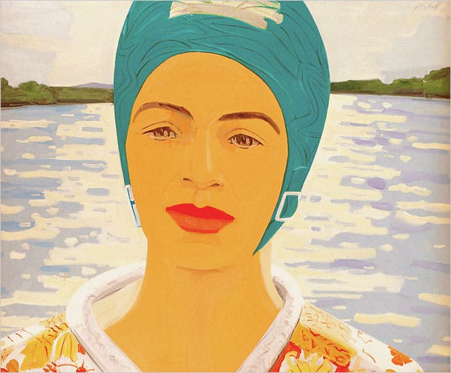
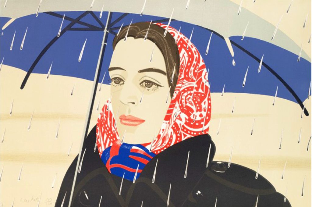
Ada Del Moro is the wife of painter Alex Katz, who has depicted her classic, dark-haired beauty in over 40 figurative works including The Black Dress (1960), Ada With Bathing Cap (1965), and Thered scarf (Ada in polo coat) (1976). Katz’s portraits of his wife tend to show her stylishly dressed and radiating positivity.
Ada Del Moro Katz
The Black Dress by Alex Katz
Ada With Bathing Cap (1965) by Alex Katz
The Red Scarf (Ada in Polo coat), Alex Katz, 1976
Katz-Blue Umbrella, 1979
Ilona Staller (born 1951)
Ilona Staller, also known as Cicciolina, married JeffKoons in 1991. He was inspired by the porn star and Italian politician to create the sexually-explicit “Made in Heaven” series, which featured both photographs and sculptures of the couple engaged in various stages of lovemaking.
“Made in Heaven” series
Jeff Koons and Ilona Staller
Sandra Bush
Not all muses are lovers. For Mickalene Thomas, her greatest inspiration has been her mother, Sandra Bush. Thomas has portrayed Bush, a former model, in several of her characteristically exuberant collage paintings as a quintessential 1970s babe complete with a massive afro and rhinestone-encrusted get-ups. In the 2012 filmHappy Birthday to a Beautiful Woman, Thomas shows a different side of Bush – an aging woman, ill with kidney disease, who narrates her own incredible life story through questions asked by Thomas, who remains off screen.
Mickalene Thomas, Dim All The Lights (2009)
It is evident that with time the female muse was no longer just a young, beautiful woman, groomed by the male artist and displayed to the world as his “find” or “trophy.” In today’s day and age, the art world has debunked and abandoned the traditional ideas of a female muse and successfully obliterated the line between an artist and the muse. Now, one can be the other or even both for that matter.
The quest for inspiration is a continuing process that changes, evolves, and matures with the artists themselves. If a male artist draws inspiration from a woman, he needs to honor not only the artist-muse relationship, but also the personal identity and public image of the woman. No matter what age, color, shape or size, she is an integral part of an artist’s creative universe. After all, in today’s “selfie” and “Me Too” age, who’s stopping a creative genius in the female form from tapping into her own inner muse? She is very much capable of romanticizing herself and does not need a man to do so.
DISCLAIMER – All the information, data and imagery in this blog post is for informational and educational purpose only. While there may be copyrighted material the use of which has not always been specifically authorized by the copyright owner, I have only made it available with the sole effort to stimulate creative progress and artistic enrichment. Some images may have been taken from the links included below and I give full credit to these websites/pages, thereby in no way claiming them to be my own. I have also used these links for reference purposes and collection of data; therefore I give full credit to the respective web pages. Most of the data in this post is based on my personal experiences and opinions and I am not responsible for any material that is found in the links at the end of this post.
“Without a muse, an artist is simply a madman shouting to the stars.” ~ Ross Baldwin.
For centuries, muses have been responsible for rekindling the creative spark in artists, inspiring them to paint and guiding them through their creative process. From mythical creatures to enchanting real life beauties, history has witnessed innumerable muses in the feminine form that have captured many an artist’s fancy. The muse has the ability to renew an artist’s passion for art, thereby helpinghim or her to create memorable masterpieces. It is the oxygen to the artistic soul without which it will breathe its last.
The word “muse” originates from Greek and Roman mythology, where it was used to describe goddesses presiding over artistic disciplines. But anything or anyone can serve as the artist’s source of inspiration. Even though many men have been known to provide inspiration, the female form continues to pose as a muse for most artists. From lovers to spouses to friends, inspiration can come in many moulds.
Looking back in history, Andrea del Sarto, an Italian painter born in 1486, was married to his muse, Lucrezia, whose features very closely resembled his ideal female figure at a time when most other painters were building their beautiful female images on the well-loved bodies of boys. Since then, artists of the likes of Rubens, Bonnard, Renoir, Charles Blackman and Brett Whiteley have painted their wives over and over again, but their wives were their subjects rather than their muses.
To commemorate Women’s Day and Women’s week, here’s the story of some of the most stunning female muses from history who have navigated artists towards becoming the architects of several great works of art. This post, which is first of a two part series, will cover the influential women who inspired art in the early part of the Modern Era.
Saskia van Uylenburgh (1612-1642)
Saskia van Uylenburgh was Rembrandt Harmensz van Rijn’s wife and muse. From drawings of Saskia lying in bed to allegorical paintings, he managed to show his love for his wife by depicting these works in tender, loving manners.
Rembrandt van Rijn, Saskia van Uylenburgh as Flora, 1641
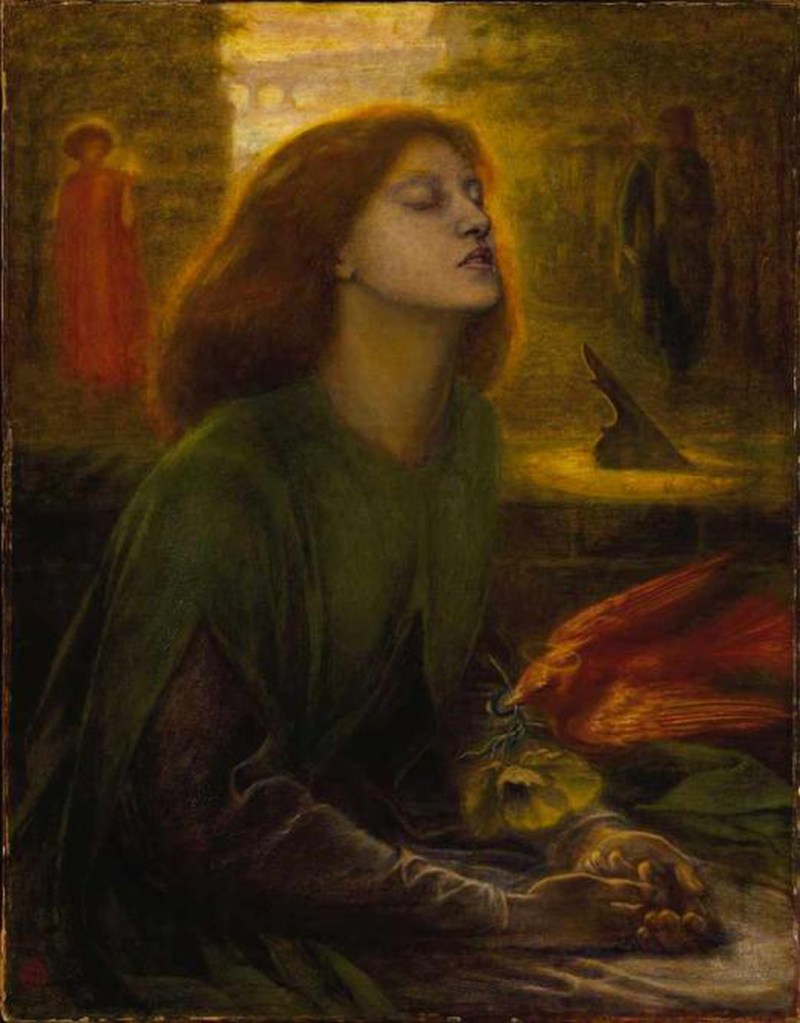
Elizabeth Siddal (1829-1862)
Elizabeth Siddal, commonly known as Lizzie, was also an artist. Inspiring many Pre-Raphaelites, including Walter Deverell, William Holman Hunt, and John Everett Millais, Lizzie truly inspired her husband,Dante Gabriel Rossetti. In one of his most famous paintings Beata Beatrix, created after Lizzie died, Rossetti modeled the character Beatrice Portinari after Lizzie as a tribute.
Dante Gabriel Rossetti’s Beata Beatrix, 1864-1870
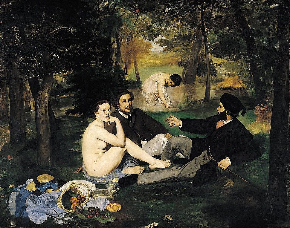
Victorine Meurent (1844–1927)
A painter herself, she modeled for several paintings by Édouard Manet. Among these, Manet’s Le Déjeuner sur L’Herbe (The Luncheon on the Grass) (1862–63) and Olympia feature a nude Victorine in a nonchalant manner, which was quite shocking for the time. His Olympia (1863) shows a nude white woman (recognizably Meurent) lying on a bed as a black servant brings her flowers. In Street Singer (1862), Meurent poses as a woman on the fringes of society, provocatively eating ripe cherries as she holds a guitar. This painting, which shows a hungry girl with dark shadows around her eyes, could represent later years of Meurent’s life when she fell into poverty, appealing in vain for funds from Manet’s widow. She also modeled for painters Edgar Degas and Alfred Stevens.
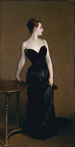
Parisian socialite and renowned beauty Amelie Gautreau was the ‘Madame X’ in John Singer Sargent’s iconic 1884 portrait of that name. The painting sparked a scandal as Gautreau’s clothing was considered “flagrantly insufficient”. She was a striking beauty famous for her unnaturally pale look which was attributed to consumption small amounts of arsenic. But it was later confirmed that she dusted herself with lavender-tinted rice powder. It is believed that in the painting Madame X, Gautreau’s exposed ear is pink because she rouged her ears to avoid “giving away the natural tone of her un-powdered, naked skin”.
Madame X by John Singer Sargent
Camille Claudel (1864-1943)
Camille Claudel was an important artist in her own right, but her work was often overshadowed by her relationship with her mentor, Auguste Rodin. Rodin made several sculptures depicting Claudel, including Portrait of Camille with a Bonnet(1886).
Camille Claudel
Francois Auguste Rene Rodin-Portrait of Camille Claudel with a Bonnet
Emilie Louise Flöge (1874-1952)
Emilie Louise Flöge was an Austrian fashion designer, and businesswoman, as well as a partner of Gustav Klimt. She is shown in his 1908 masterwork The Kiss,which portrays the couple as lovers ensconced in glimmering gold.
Klimt also depicted her in a 1902 painting titled Emilie Flöge.Flöge’s pointed features and flat virgin body are encountered often in Klimt’s pseudo-erotic paintings tantalizingly glimpsed through elaborate surface patterning.
Hers is the blank mask at the centre of his 1913 picture, The Virgin. As often with Klimt, the unconscious face is set at right angles to the neck, as if the model had been hanged. On her pedestal, swathed in fabric designed by the master, Flöge is a debased version of the muse as a fashionista.
The Kiss by Gustav Klimt
Gustav Klimt-Portrait of Emilie Louise Floge
The Virgin by Gustav Klimt
Audrey Munson (1891–1996)
Known as ‘Miss Manhattan’ and the ‘Panama-Pacific girl,’ Munson was the most popular model of her day. ‘Discovered’ when she was 15 years old, Munson first posed for sculptorIsidore Konti and became Alexander Stirling Calder’s preferred model. In 1915 Munson provoked a crisis among the censors of the American film industry when she played an artist’s muse in Inspiration – becoming the first woman to appear fully nude in a (non-pornographic) motion picture.
Audrey Munson in her role as an artist’s model in the film Inspiration, 1915. Photo via Wikimedia Commons.
Alexander Stirling Calder working on a sculpture for the Panama-Pacific International Exposition in San Francisco in 1913.
Three Graces by Isidore Konti-all three modelled after Audrey Munson
The female muse is one of the most romanticized figures in art history and in the past, male artists have predominantly hogged the creative limelight at their expense. During Renaissance and the period of Romanticism, muses were represented sensually and quite often erotically, thereby objectifying them to a large extent and reducing their role to a mere physical level.
Famous artist-muse couples like Picasso and Marie-Thérèse, Camille Claudel and Rodin are etched in art history, but we usually overlook these women as artists in their own right, not to mention human beings with their own identity. Sadly enough, they are remembered merely as models, lovers and muses.
However, with time, the once objectified female muse transformed into a strong, fierce woman who stood up for her rights and honor against the oppression of the society. Modern art is marked with such bold and emancipated figures that have made a place for themselves in the male dominated world. More about them in the second part of this post, so stay tuned!
DISCLAIMER – All the information, data and imagery in this blog post is for informational and educational purpose only. While there may be copyrighted material the use of which has not always been specifically authorized by the copyright owner, I have only made it available with the sole effort to stimulate creative progress and artistic enrichment. Some images may have been taken from the links included below and I give full credit to these websites/pages, thereby in no way claiming them to be my own. I have also used these links for reference purposes and collection of data; therefore I give full credit to the respective web pages. Most of the data in this post is based on my personal experiences and opinions and I am not responsible for any material that is found in the links at the end of this post.
A woman is a special being that possesses the miraculous power of creation itself. Being the harbinger of life, creativity comes naturally to her and she is born with it. Just as she conceives life inside her body, nurtures it and finally brings it into the world, she can also spawn beautiful ideas in the womb of her intellect, cultivate them and eventually deliver them to one and all.
This post is a celebration of feminine creativity and is especially dedicated to all my fellow women artists out there. Why? Because it’s International Women’s Day of course! So here’s wishing all those wonderful ladies that hold the power of creation in their hands, a Very Happy Women’s Day!!
A woman is a receptacle of limitless talent. Throughout history, there has been many a women artist who has created outstanding works of art, be it in the form of paintings, photographs, sculpture or motion picture. Artists like Mary Beal, Gwen John, Lee Krasner, Eileen Aigar and Frida Kahlo to name a few have made some of the most distinguished contributions towards the field of fine art in particular.
Inspite of facing constant opposition from their male counterparts, women artists have outdone themselves and stood the test of time. Today they are as integral a part of the institution of art as their fellow male artists and walk hand in hand with them, their heads held up high.
One of the greatest gifts a woman possesses is her power to express and emote better than a man. It is this faculty that a women artist harnesses successfully and uses to its fullest potential in order to emote her thoughts to her viewers. This skill allows her to redefine and extend the boundaries of art thus making a mark for herself in the male-dominated world.
On the occasion of International Women’s Day and in celebration of Women’s Week, my next few posts will tell you the story of not only few of the amazing women who have played muse to artists or have inspired art in some way or the other, but also some well known women artists themselves in the field of fine art. So let me kick off the festivities with my personal ode to commemorate this celebration of femininity.
My tribute on Women’s Day
My artwork displayed above titled “Cheers to Womanhood!” has been inspired by the fabulous womankind that has held its ground with its never-say-die attitude. It is also a mark of respect to all my fellow women artists, in recognition of the remarkable work done by them in the past and looking up to them as a source of inspiration in the future.
This piece of art symbolizes the strength of a woman on the whole and how she is capable of carrying the weight of the entire world on her shoulders. For centuries, women have been marginalized and dominated by men, especially in my country, India. But things are changing now and women are no longer the oppressed sex of the society. For the Indian woman in particular, standing up for her rights against all the atrocities and hardships of the world is a feat in itself.
The veil of modesty that she drapes around her head in the artwork does not diminish her strength or abilities in any way, but only enhances their beauty and power furthermore. The “bindi” or red dot in the centre of her forehead is yet another symbol of her brute force and not just a mark of adornment. Through the expression on her face and the look in her eyes, I have tried to convey that she’s the epitome of power and she’s here to stay.
I have created this piece using prismacolor pencils, with a hint of brush markers for the subtle details. I tried out something new for the background of the veil around the woman’s face. I rendered it with water color pencils, giving it a soft water color wash using a brush dipped in water. Then I added a second layer of color on top, but this time with chalk pastels and once again gave it a wash with my moist brush. I am happy to say that the two shades of peach and pink that I used for the background blended in quite well to create a water color effect. Then I created the print of the fabric with consecutive layers of pencil colors, fine tip markers and rubber stamping with distress ink, thereby adding intricate details to the print. The face of the woman has been done with prismacolor pencils.
This artwork is not only my tribute to the feminine spirit but also a portrait of the artist in her who has been endowed with the ability to conceive and thereafter deliver her vision. I hope you like my rendition as well as celebration of feminality and you look forward to my upcoming posts in its honor.
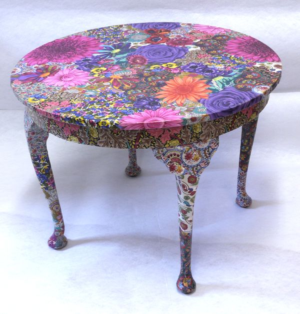
Looking to reuse, recycle and revamp the junk lying around in your home or studio? Then this post is definitely for you, for today, I am going to talk about the decorative and extremely stylish craft of Decoupage which has been in vogue for centuries now. What makes this elegant craft fabulous as well as fun is the fact that it can be done by one and all, be it adults or kids. Many a fine artist has used a decoupage medium to create a unique piece.
I personally believe that decoupage is like a magic trick that an amateur artist hides up his or her sleeve to create the illusion of a painting and ingeniously dissuade his or her viewers into falling for it. What appears to be painted is nothing but paper cleverly glued into place. That’s why I call it “crafty” decoupage!
What Is Decoupage?
“Decoupage” actually comes from the French word “decouper,” which means to cut out or cut from something else.
Decoupageis the art of decorating common objects like a small box or an item of furniture by gluing cutouts of colored paper, or paper with interesting patterns from magazines or special decoupage papers, in combination with special paint effects, gold leaf and other decorative elements. Thereafter, each layer is sealed with varnishes (often multiple coats) until the “stuck on” appearance disappears and the result looks like painting or inlay work. The traditional technique used 30 to 40 layers of varnish which were then sanded to a polished finish.
3D decoupage (sometimes also referred to simply as decoupage) is the art of creating a three-dimensional (3D) image by cutting out elements of varying sizes from a series of identical images and layering them on top of each other, usually with adhesive foam spacers between each layer to give the image more depth.
Pyramid decoupage (also called pyramage) is a process similar to 3D decoupage. In pyramid decoupage, a series of identical images are cut into progressively smaller, identical shapes which are layered and fixed with adhesive foam spacers to create 3D “pyramid” effect.
History of Découpage
Decoupage is a very old, traditional paper craft. It has a long and fascinating history that can be traced back to a variety of styles from many distant countries. Over the centuries it boasts many famous practitioners including Marie Antoinette, Madame de Pompadour, Lord Byron, Beau Brummel and more recently, Matisse and Picasso. Today, decoupage remains a popular craft with many variations.
As far back as the 12th century, Chinese peasants were creating paper cutouts in vivid colors to decorate windows, lanterns, gift boxes and other objects. This Chinese practice and expertise with scissors is thought to have come from Eastern Siberia, where cutout felt figures and designs were decorating objects in the tombs of Siberian nomads. German and Polish artisans have also been using cut paper for decoration over several centuries. Polish women and children in particular, developed enormous skill with folded colored papers which they cut freehand into geometric shapes and stylized birds, animals and flowers.
12th Century Chinese Decoupage
However, it was the late 17th century lacquer work from the Far East, mostly in the form of furniture, which we tend to associate with today’s découpage. Oriental lacquered objects became fashionable in Europe and in no time demand exceeded supply. As a result, Venetian cabinet-makers and lacquerers (called depentore) began to produce fake lacquer work to keep up with the demand. This work was known as lacca contrafatta-counterfeit lacquer. Apprentices were employed by the artisans to hand-color the prints and engravings of leading artists. The wealthy classes were using master painters to paint their furniture and decorate their walls and ceilings. Thus, it became the poor man’s alternative to painted furniture in France in the 17th century.
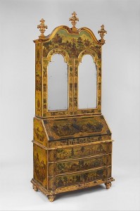
Italian secretary desk at the Metropolitan Museum of Art, New York(17 century lacca contrafatta)
In time, because of excessive demand and the fact that many people could not afford the works of the masters, an alternative form of decoration developed. Drawings from the artists of the day were cut out, glued down and covered with lacquer to resemble original paintings. From this derivation came the alternative term l’arte del povero – poor man’s arts. During the 18th and 19th centuries this art form flourished throughout Europe. It even infiltrated the court of Louis XV. Ladies with an artistic bent snipped away at pictures and pasted them onto hatboxes, wig stands, fire screens and toiletry objects, keeping themselves amused for hours. This and the general skill of lacquering were known in England as Japanning. The works of Boucher, Watteau, Fragonard, Redoute, Pillement and many other distinguished artists came to this sticky end.
English Black Japanning
In 19th century England, during the Victorian era, hand coloring and intricate cutting out gave way to the more sentimental, florid collage-style of this art form. This coincided with the introduction of Valentine cards, decorative and embossed papers and braids to embellish surfaces such as screens, lamp bases, linen boxes and much more. While these découpage pieces lacked subtlety and skill, they made up for it with a certain bold and sentimental charm.
English 19th Century Decoupage Fish Chest of Drawers
With such a long and varied history, it is not surprising that découpage is still evolving with new styles. With its colorful origins and variety of techniques the possibilities for this fascinating art form are infinite, offering scopes for endless hours of creativity as well as enjoyment.
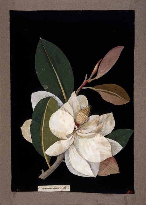
One who does decoupage is called a Decoupeur, or “cutter”. At the age of 71, Mary Delany achieved fame at the court of George III and Queen Charlotte of England thanks to the 18th-century decoupage craze. In 1771, she began to create cut-out paper artworks (decoupage) as was the fashion for ladies of the court. Her works were exceptionally detailed and botanically accurate depictions of plants. She used tissue paper and hand coloration to produce these pieces. She created 1,700 of these works, calling them her “Paper Mosaiks”, from the age of 71 to 88 when her eyesight failed her. They can still be seen in the Enlightenment Gallery at the British Museum of Art.
Mary Delany
Delany’s decoupage work
From the Mary Delany collection at the British Museum
Mary Delany collection at the British Museum
Magnolia from the Mary Delany Collection at the British Museum
Mary Delany’s “Paper Mosaiks”
Jay (Terry) Jones, a notable decoupeur from Waynesburg, Pennsylvania, holds multiple Guinness World records for his extensive decoupage collection.
Richard Basile, a well known New York art collector and entrepreneur, achieved notoriety as a decoupeur when his intricate floral decorative work was displayed at the Foire Internationale d’art contemporain festival in Paris in 2014. Basile had developed his collective works over more than a decade while working in the basement study of his parents’ New England home.
Uses of Decoupage
Traditionally, decoupage was most commonly used to decorate items of furniture and home accessories. There are many other ways that this versatile technique can be used and it is becoming increasingly popular with card makers and scrapbookers. The three-dimensional images created by decoupage add depth and interest to projects.
Just about every surface can be decoupaged, like wood, paper, fabric, glass, metal, tin, papier-mâché, terra cotta, MDF and many more. The only surface that really presents an issue is plastic, or other surfaces that are extremely slick (and possibly have a coating). The issue is that the glue doesn’t really work well with other polymers, so you would probably be able to pull whatever you Mod Podged off right after it dried. There are some options for decoupage on plastic, including keying up the surface with sandpaper or spray painting with plastic friendly spray paint first.
Materials for Decoupage
Decoupage Medium
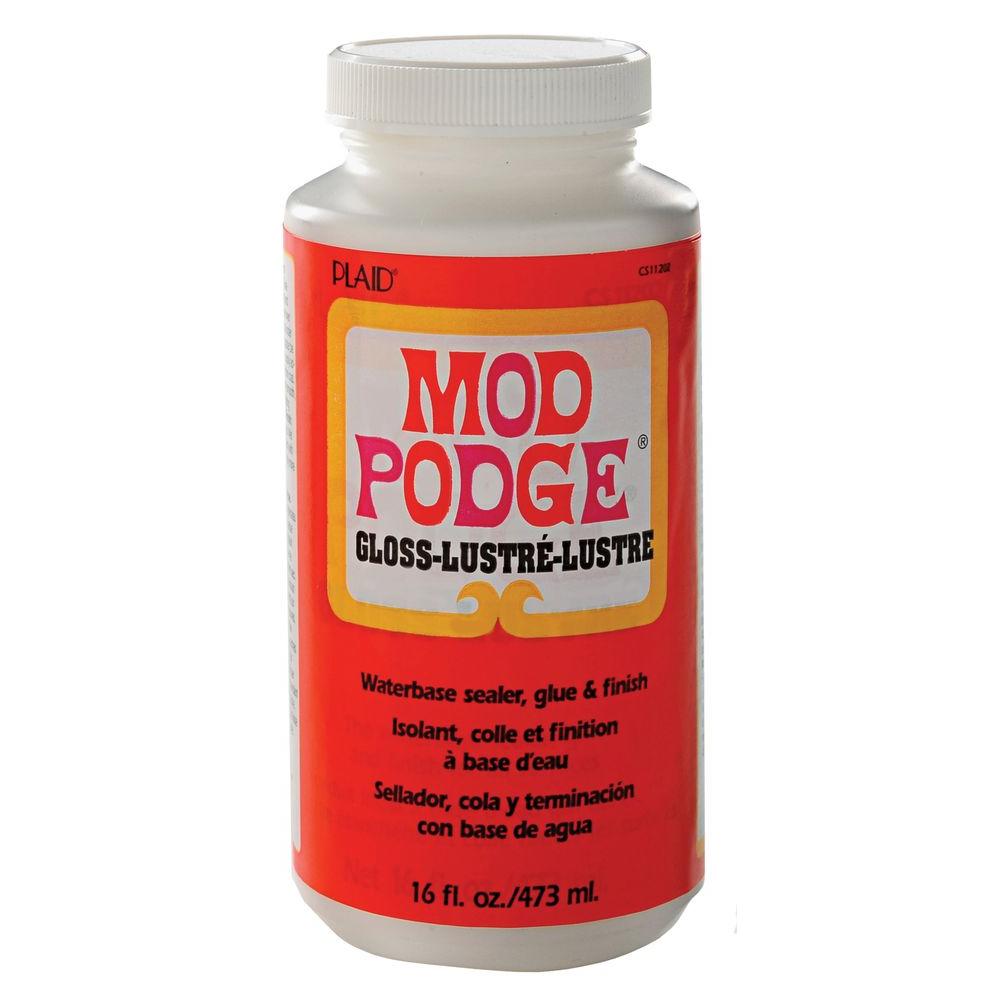
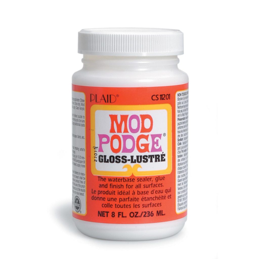
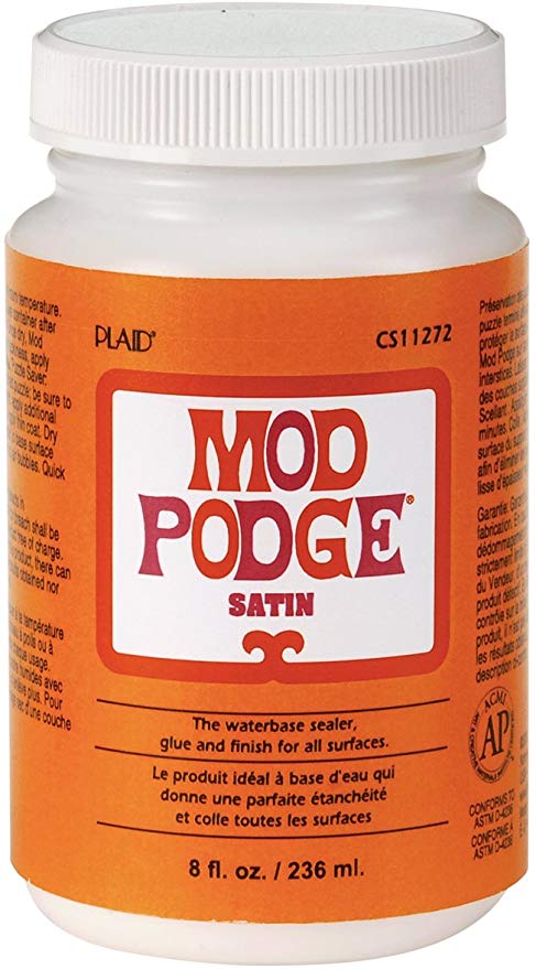
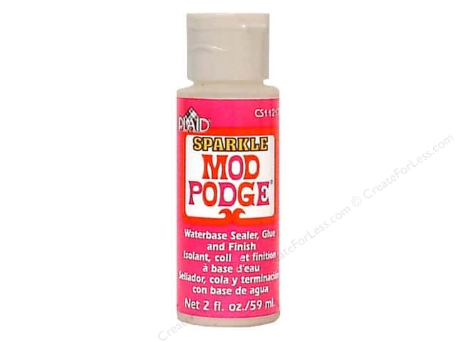
Decoupage medium is an all-in-one sealer, glue, and finish used for creating decoupaged works of art. It can be used on wood, fabric and other porous surfaces. It dries clear and holds glued-on paper cuts tight.There are many different types of decoupage glue. Almost any white glue (PVA, craft or school glue) can be diluted with water (three parts glue to one part water) to serve as decoupage medium. One can also add mica, pigment powders or even glitter to the diluted glue to achieve different effects. Mod Podge is a popular decoupage medium and is available in different sizes and with gloss or matte finishes.
Decoupage Mediums
Whether it is furniture, home decor or clothing, a decoupage medium is needed for all. There are several types of adhesives, each with their own benefits and drawbacks. The type of adhesive used can create different finishes on your product. Here are a few options:
Matte – This finish is flat rather than glossy. Using this finish will allow the decoupage to look more like paint and will create a more seamless design. Putting a matte finish will also help prevent any glare from lights that can be created when using a glossy finish, which will be more reflective.
Glossy – A glossy finish will give a shiny or lustrous effect. This is a great option when decoupaging photographs printed on glossy paper. It will not dim the photos, but add to the finish to give a professional look.
Satin – A satin finish is similar to a matte finish as it does not have a shine. This is another good product to use if you want to avoid the glare that can be caused by a more glossy finish. A satin finish is the recommended option for furniture you want to have a painted effect on. (IMAGE)
Sparkle – This finish will add a little extra sparkle and design. This is a great product if you are planning to decoupage an entire piece.
Colored Decoupage – Some decoupages come with a light tint of color. This is great for staining glass, wood, and metal. With a transparent color and the same application uses as all decoupage, it’s a great option for adding that extra bling to your design.
Decoupage for Furniture – This decoupage is great for more porous materials such as wood and fabric. When decoupaging furniture you will also want an adhesive that will not fade with wear and tear. This finish gives the strength and resistance needed for heavily used items.
Outdoor – Using outdoor decoupage will allow you to seal your project from outdoor elements causing less wear and tear than the average decoupage.
Making Your Own Decoupage – Another option could be creating your own decoupage with PVA glue and water. Though this may be a cheaper option, it is less strong and will hold for a shorter time. It will also be less water resistant.
Matte
Glossy
Satin
Sparkle
Colored
Furniture
Outdoor
Types of Decoupage Mediums
2. Paper for Decoupage
Almost any paper can be used for decoupage and the type of paper you are use depends mainly on what the project is and what is its purpose. For projects that will be used more, a stronger paper would be better and to personalize something you can use your own photos or cut out images from magazines.
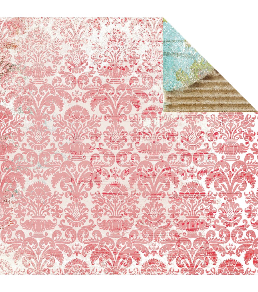
A wide variety of special papers for decoupage are available today at almost all art and craft stores. These contain a number of images that have been selected specifically to suit the purpose of decoupage and provide contemporary as well as traditional designs. In addition to decoupage papers, pre-cut or die-cut decoupage kits are also available. These are a quick and convenient way to create decoupage designs. Here are some examples of paper you can use:
Decoupage Paper – These papers are made specifically for more intricate designs and decoupaging crafts.
Tissue paper – This paper is lighter and thinner so can easily bend around corners and is less likely to have a raised surface or bubble up. Due to its semi-opaque surface, it gives more of an effect like that of a painting than other papers.
Cardstock – Cardstock comes in many designs and colors making it a great option for mod podge. A heavier cardstock can be a good option for 3D decoupage as it will look thicker on your project.
Photos – Decoupage works perfectly with personal photos. Just add decoupage glue/medium to the surface, stick your photo firmly and then add more adhesive on top to smooth the photo down. You can also use decoupage to transfer a photo to a different surface. When decoupaging with photos make sure they are from a laser printer rather than an ink-jet printer as a photo from an ink-jet printer can smudge with the decoupage application. If you use inkjet-printed images on your surface to be decoupaged, let the ink dry, and then spray it with hairspray. It sets the ink and then you can use the print. Make sure both are completely dry before applying your medium.
Fabric – A lighter fabric will work better as it will allow the decoupage to seep in and seal it. To ensure fewer wrinkles, ensure that the fabric is taught and press it onto your surface a little bit at a time. Make sure that you seal your fabric with a polyurethane and sealer.
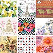
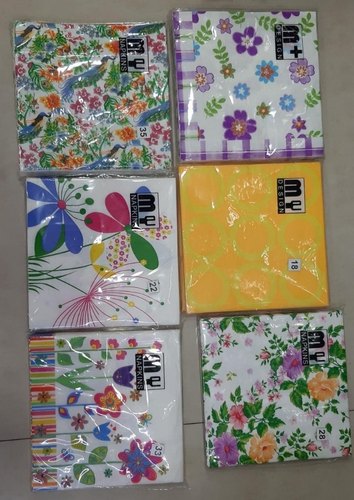
Napkins – Napkins are a great option for decoupage owing to their wide range of designs their lighter nature. Cut out the design before taking apart the layers of the napkins and then use a single layer for the decoupage.
Decoupage Paper
Decoupage Tissue Paper
Decoupage Cardstock
Decoupage with Fabric
Decoupage Napkins
3. Decoupage Adhesive Pads
Decoupage is given the three dimensional, raised effect with the help of a thick double-sided tape or self-adhesive pads. Different effects can be achieved by using different thicknesses of the adhesive pad. When layers are built up using glue without the added depth of a glue pad or tape a more subtle effect is produced. This is similar to paper piecing.
Decoupage Adhesive Foam Pads
4. Rubber Stamping and Decoupage
Rubber stamping and decoupage are complementary crafts. Decoupage can be used in rubber stamping projects and vice versa. Rubber stamping can also be used as the images for decoupage. This wide range of options makes rubber stamping and decoupage a perfect match.
Rubber Stamp for Decoupage
The above are the essential supplies needed for decoupage, but here are a few other items that might come in handy:
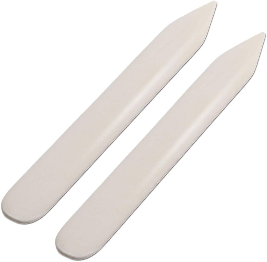
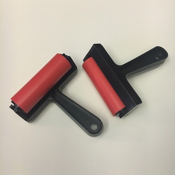
Bone folder – This can help smooth out wrinkles and remove excess glue. A tool made especially for this, called a brayer is also available.
Bone Folders
Brayers
Foam brush – This is useful for spreading the decoupage medium or glue onto the object to be decoupaged. An ordinary paintbrush or even a cotton swab can be used for this purpose but these are not as effective.
Foam Brushes
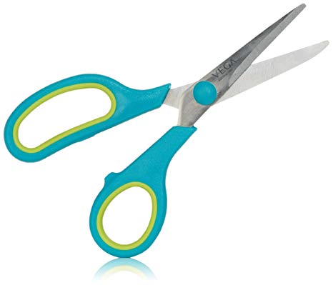
Scissors – Used to cut out the pictures and other items to be decoupaged. A pair of scissors with small blades or a utility knife can be used to cut decorative paper with a lot of intricate details.
Scissors
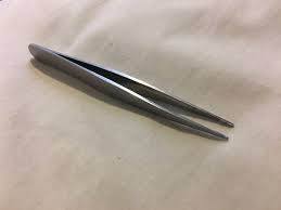
Tweezers – Tweezers are sometimes great help when it comes to positioning small pictures.
Tweezers
Damp rag – Keep one handy to wipe off excess glue and to clean up. Ensure the rag is damp and not soaking wet when using it to remove excess decoupage medium from your glued papers. A damp rag also helps to keep your hands clean while working with glue.
Damp Rag
All about Mod Podge
Since my medium of choice is Mod Podge, I feel it deserves a special mention in my post. Not only is it a medium, it is also an adhesive/sealer and provides a finish as well. Mod Podge has additional properties that make it better than the regular school or craft glue, thus increasing the longevity of decoupage crafts that are made using it.
The original inventor of Mod Podge was Jan Wetstone, an Atlanta housewife, who in 1967 invented Mod Podge while experimenting with short-cuts to decoupage in her antique shop. It proved to be one of the most enduring successes in the history of the craft industry. Jan secured two patents, one for Mod Podge and one for a molded frame-maker kit.
Jan Wetstone
Here are some of the common surfaces that can be used for decoupage with Mod Podge:
Wood
Tin
Glass
Ceramic
Metal
Fabric (including clothing and shoes)
Terra Cotta
Here’s a list of materials that can adhere to the surface using Mod Podge:
Paper
Fabric
Tissue Paper
Napkins
Stickers
Wrapping Paper
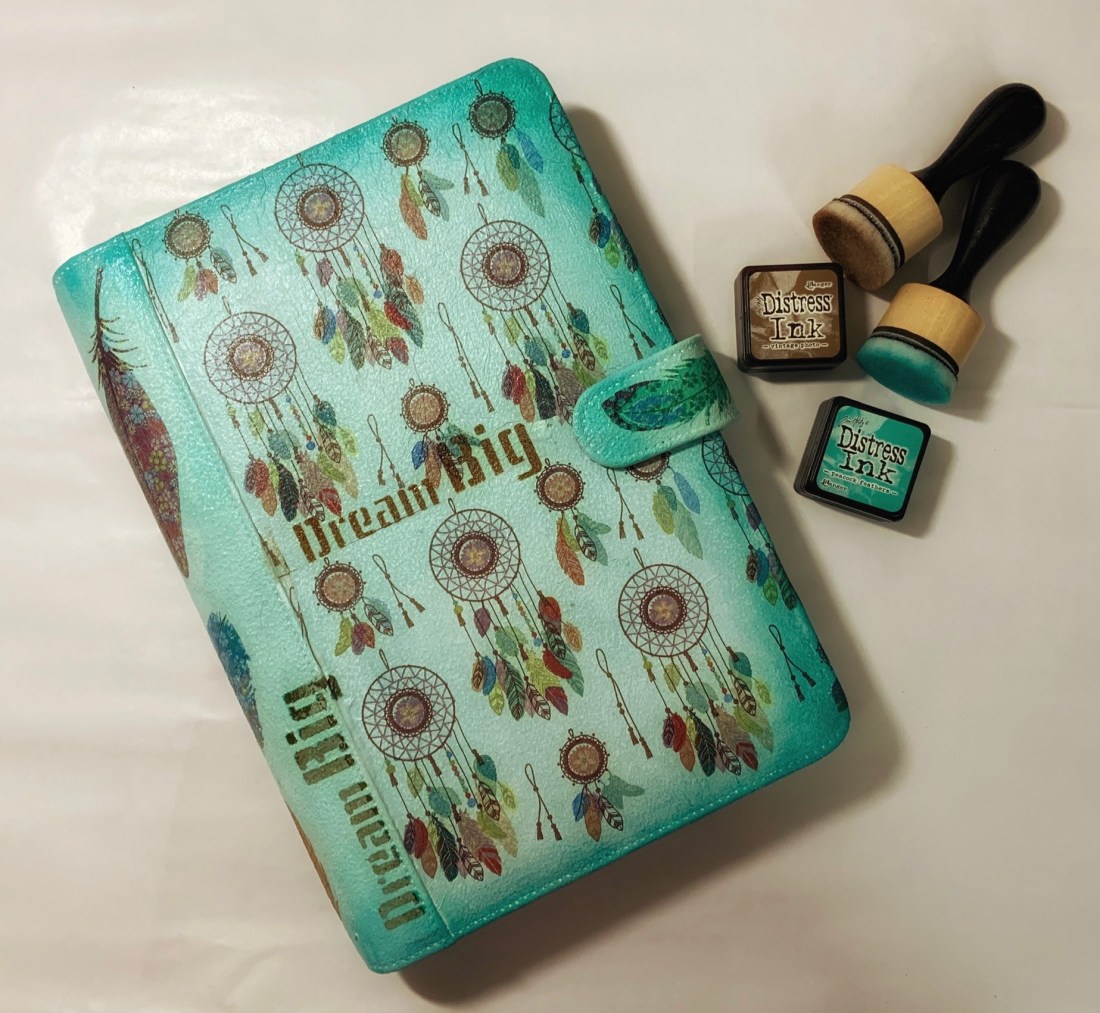
My Decoupage Project
I have this habit of scribbling down my thoughts and making “To Do” lists in my daily planner at the end of each day. Moreover, when I come across a new art form or bump into a new craft, out comes my diary and I quickly jot down what I saw so that it is preserved for posterity. Thereafter, I plan out how to go about making this new technique part of my own art. This is where my “To Do” list comes in handy.
Every year, I invest in a good planner which for all practical purposes does what it is meant to do. One fine day, I asked myself, why does an artist’s planner have to be just a plain looking executive diary? Why should it be any less artistic or creative than the art itself? So I decided to upcycle my old planner into a work of art. And what better way to do this than with the lovely craft of decoupage! Well, here it is then, the story of my daily planner and how I transformed it from an ordinary diary into the memoir of my dreams.
Since the craft of decoupage was new to me, I had to do a lot of research on what all it requires and how it is done. Having done that, I gathered all the supplies and followed the directions that I had read up. For all those who wish to do try it out, here’s how I went about it, along with a few of my personal tips and tricks that eased the process for me.
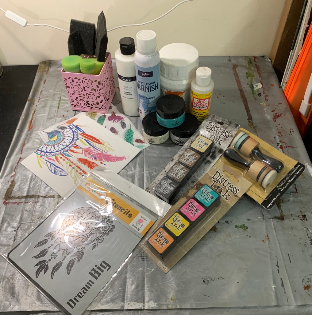
Materials I used –
Surface/Object of your choice (In my case, my faux leather planner).
Gesso to provide a base coat to the surface/object before the next layer of paint. This ensures that the paint is not patchy and the original surface does not peek here and there through the paint.
Decoupage Medium (I swear by Mod Podge!)
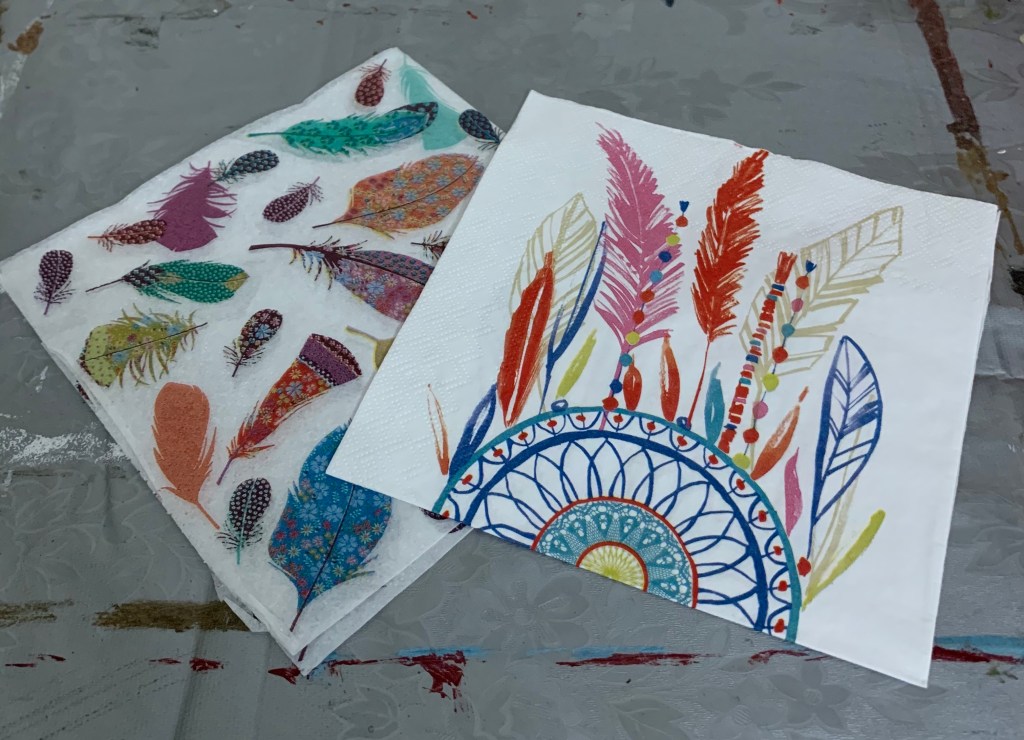
Decoupage paper (I went for decoupage napkins due to advantages I have stated above).
Acrylic/Chalk paints (I went for the latter as they are a better option for decoupaging, specifically on surfaces like leather. The former tends to peel off as an entire layer once dry). Tip –Make sure the paint you use is appropriate for the object you intend to decoupage.
Distress inks for enhancing as well as blending the painted corners and sides of my planner with the decoupaged paper (This is optional but I would recommend it for a more finished look).
Ink Blending Tool for blending in the distress ink uniformly with background.
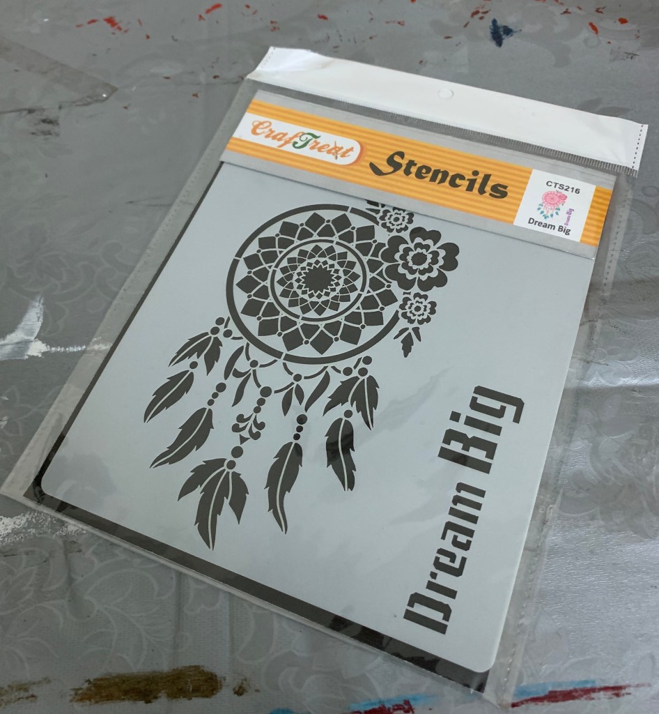
Stencils of text/patterns to add on to your design (again optional).
Gloss Varnish to give my cover a glossy shine as well as seal and protect the decoupage work. I would recommend multiple coats. (You can opt for a matte varnish if gloss is not your thing).
Tools I used –
Sponge dauber for applying the chalk paint evenly. You can use a paintbrush as well but the brush lines will be visible after the paint dries.
Scissors to cut out the decoupage napkin or specific shapes/motifs from it.
Craft/X-Acto knife and mat (optional, in case you want finely cut designs).
Foam brush for uniform application of the varnish.
My Decoupage bootie!
Gesso (This brand is only available in my country)
Decoupage Medium
Chalk Paints
Distress Inks
Glossy and Matte Varnish
Stencil I used
Decoupage Napkins
Sponge Daubers
Foam Brushes
Ink Blending Tool
Extra sponges for Ink Blending Tool
The Process –
1. The first step towards decoupaging isto make sure that the surface/object to be decoupaged is clean, dry and free from any dust or dirt. So I wiped my planner cover with a soft cloth.
2. Next, I prepared the surface. I did this by applying a basecoat of gesso onto the planner using my sponge dauber and once it was completely dry (which takes about 24 hours), I covered it with a layer of chalk paint with the help of the dauber once again. Tip – the paint should be totally dry before you start decoupaging.
3. Then I prepare the items to be Mod Podged by cutting out the decoupage napkin which was a beautiful dream catcher print, in the requisite size as well as specific shapes (in this case feathers) that I wanted to decoupage individually. This involved lot of experimentation with various patterns and prints until I came up with the perfect combination and layout for the planner. Tip – Beforeapplying mod podge, arrange the decoupage paper/cuttings/ images onto the object and decide on the final placement.
4. Next, I applied a thin coat of Mod Podge with my foam brush little by little, each time placing the decoupage napkin layer carefully on top and gently pressing it down to stick it. Working in small sections at a time, I kept lifting the paper to apply a generous layer of decoupage medium onto the planner cover. I kept alternating between applying Mod Podge and placing the napkin on top until the entire sheet was adhered well. Once this was done, I smoothed out any bumps or air bubbles that might have formed during the application. This step requires a bone folder or brayer but since I didn’t have either, I simply placed a ziplock bag on top of the stuck on paper and smoothed it out with my palm. I kept smoothing until all of the bubbles were removed. I followed the same steps for the feathers that I had cut out. Tip – I let the project dry for at least 15 – 20 minutes.
5. Once dry, I added a protective coat of Mod Podge to the planner cover using my foam brush. I allowed it to dry fully once again. Tip– Do not apply a very thick coat of Mod Podge as it tends to show up as white patches once dried.
6. The next step was to blend-in the entire design. I did this by applied distress ink (same as my base color) along the edges and corners of the planner. This gave a smoother and finished look to the entire design.
7. To further add interest to my planner I applied text using a stencil and distress ink in a different color.
8. Last but not the least, I varnished the planner cover with multiple coats of glossy varnish, taking care that each coat had dried completely before I applied the next one.
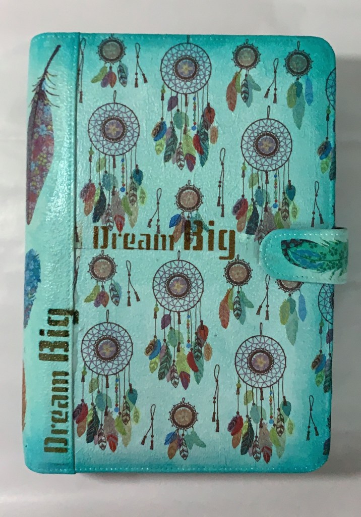
So there you have it! My very own, custom-made, DIY decoupage possession and I just love it!
The Final Product – My Decoupage Daily Planner
Decoupage truly is an art form and many a fine artist has used the craft to create some unique pieces. It is a misleadingly easy craft to execute and though decoupage items may look like painted masterpieces, in reality, they are just pre-printed images on paper seamlessly adhered to a surface with a medium. Decoupage is an act of designing items by innovatively combining different papers and different techniques. It’s all about creativity and experimentation. It is the art of cycling something you already own and personalizing it as your heart desires. I like to attribute this crafty affair with three R’s of its own – Reuse, Recycle and Revamp!
DISCLAIMER – All the information, data and imagery in this blog post is for informational and educational purpose only. While there may be copyrighted material the use of which has not always been specifically authorized by the copyright owner, I have only made it available with the sole effort to stimulate creative progress and artistic enrichment. Some images may have been taken from the links included below and I give full credit to these websites/pages, thereby in no way claiming them to be my own. I have also used these links for reference purposes and collection of data; therefore I give full credit to the respective web pages. Most of the data in this post is based on my personal experiences and opinions and I am not responsible for any material that is found in the links at the end of this post.
“Gather and hoard your inspirations as you live, then recapture them as needed in the studio” – Nita Engle (American Illustrator).
As artists, developing our artistic style is quite a demanding task and we will do whatever it takes to fine tune our skills. One of the most important aspects of creating art is the thinking process, but sometimes our aggressive brainstorming tendencies get the better of us and our struggle to attain perfection makes us over think. Very often our surroundings can play an important role in boosting our creativity. This includes our workspace or studio which can be a major contributing factor towards attaining ultimate creativity.
I have found that most artists can paint almost anywhere. Armed with an easel and their art supplies, they can create great works of art out in the garden, while on the move in a bus and even in the smallest nook or corner they can find. Once they are engrossed in the art, their surroundings fade away. But having a space we can call our own can make that much more difference. Most artists find cheap spaces like abandoned warehouses or even their own garages and attics to innovatively transform them to suit their creative requirements. Not only are they cheap, but are also spacious and provide the artist the freedom of being messy. As someone rightly said, all good art comes out of creating a mess!
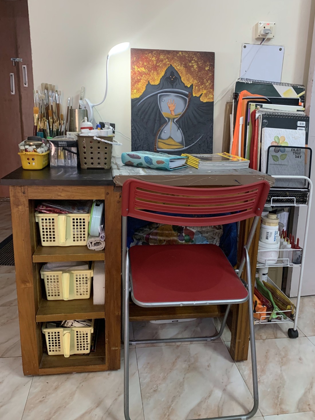
My most innovative concepts also take shape intuitively when I am where I love being the most – myArt Station. I call it my art station and not my studio because it is not an entire room that I have dedicated to my art, but just a small, comfy and cozy corner in my bedroom where I can embark on artistic pursuits, oblivious to the world around me. For me, just spending a few moments silently in my creative corner can give birth to my next innovative idea.
Even though I am an amateur artist who is not associated with any art galleries or working in a shared space, I still spend a lot of time alone in my art station. In this post, I’ll let you in on my personal creative space and how I let it grow and mature to keep up with the demands of my work.
When I had just started painting, I didn’t think I deserved a separate art area, let alone a studio. I would just set up my easel, paints and other art materials wherever I found space, even if it was on the dining table or the bed. But soon enough, I realized that not only did it take up a lot of my time setting up, but also clearing up once I was done painting ate away into those precious moments that I could have added on to actually creating the artwork itself. So the dining table and the bed were just not working for me!
Having realized that, I started looking for small spaces in my home to designate as my art area, where I had all my art supplies at my disposal anytime and every time. Eventually I cordoned off an area in my bedroom that served as my art station. Here, I can paint whenever my heart desires, without going through the hassle of setting up or worrying about cleaning the mess after I am done. I can just leave it all as it is and pick up again the next day from where I had left! I love my art station and everything in it.
Creating as Art Studio in Your Home
So what does it take to create a work space for your art? For one, it is not the size of your creative space but its feasibility with respect to your work that matters. What I mean is that not only should your work station or studio space permit you to leave things as they are while the work is in progress but also fulfill all other requirements of your creative process.
Since size is not the primary criteria, your creative space can be an area of your bedroom, like mine is, a storage area or attic that can be converted into a creative space, or even your basement or garage for that matter. You could section off part of a larger room also using a folding screen or a curtain. Once this is taken care of, you can personalize your creative space with whatever inspires you. This will make the space inviting and you will be motivated to spend more time there doing what you love doing the most – creating art!
Here are a few tips for sculpting your very own art retreat at home:
Decide on a spot – The first step towards creating the ultimate creative area for your art is chalking out the physical space. This will be your creative haven, so put in all the love and care into it.
Surround yourself with what inspires you – Fill your creative space with objects and images that inspire and motivate you to make art. You can do this by pinning or sticking them up on a display board on the wall, something like an inspiration board. Not only is it always in front of your eyes, but also every time you find something visually exciting, you can simply tack it to this board. It’s that simple!
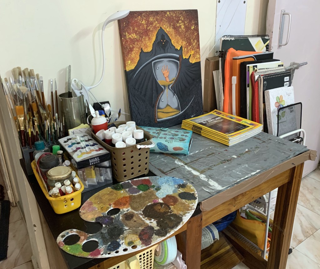
Dedicate a corner in a room of your choice for an art area. Use shelves, tables, racks etc., to separate out your art area in this room. For my art station, I got an art table custom made to my requirements with adequate shelving to hold baskets of my art materials. I got this table ergonomically designed keeping in mind the fact that I suffer from cervical spondylitis. So to ensure that my neck is not strained while I paint, the table top can be inclined vertically at various angles to suit my comfort. Another modification I made to my table was that I got the shelves made towards the left as I am left handed. Even my work area where I place my paints and color palette are towards the left. So there’s a custom made art table for all you lefties like me!
Another good option for an art space is a closet or clothing rack, if you have one to spare. All you need to do is clear some shelves to store your art supplies with a small table, chair in front of it and Voila! Your little art studio is ready!
Keep a fold-down table or chair handy. I have a couple of folding chairs which I use not just for sitting while I paint, but also for keeping my laptop, iPad and other knick knacks.
The garage,attic or basement are some more options for art studio spaces, provided you take care of the heating, cooling and humidity issues. This is crucial not just for protecting your art but also to make you comfortable while you work. Trust me, it’s no fun painting when you are sweating like a pig or freezing to death!
Get an art caddy with wheels. Even though I had this amazing custom made art table with adequate shelves to store my art supplies, after a while it was just not enough! So I invested in a cart with shelves that could be rolled on wheels. Not only did this sort out my storage woes, but also provided me with mobility and easier access to my art materials, without coming in the way of other things in my bedroom.
My ergonomic Art Table
Here are a few ways I have personalized my creative space (while some of them I have already done, others are still part of my wish list!):
A display board where I can pin up anything and everything that inspires me be it images, quotes or my random doodles and scribbles.
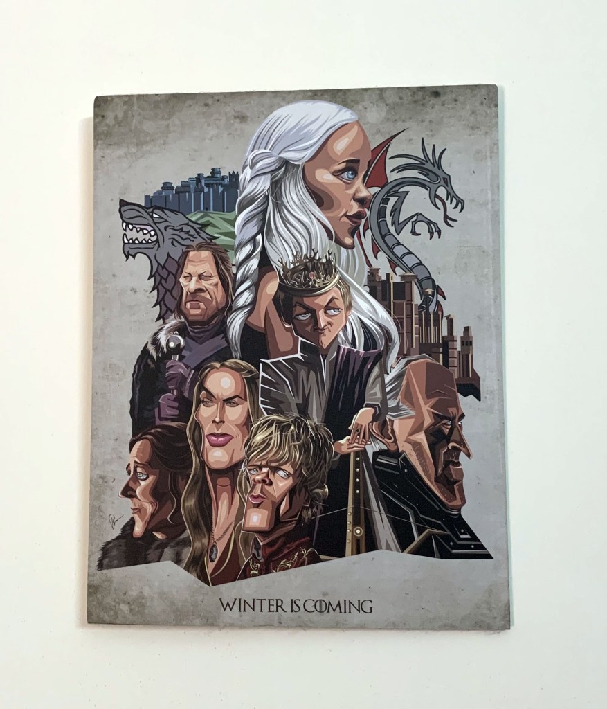
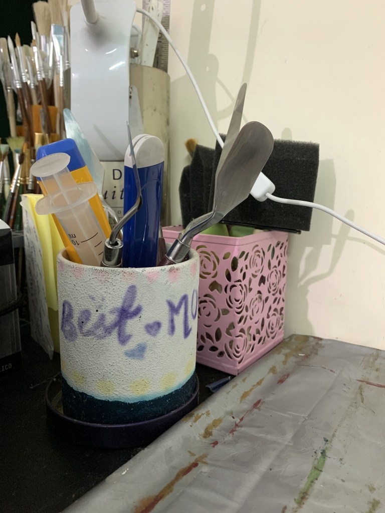
A collection of objects that I love or I am sentimentally attached to. For instance, my daughter gifted me a hand painted coffee mug on Mother’s Day and this has become a holder for my palette knives! A caricature artwork of Game of Throne characters adorns the wall just above my art table. I fell in love with it not just because I am a GOT fan, but also because it inspires me artistically.
The Gor artwork on my wall
My daughter’s Mother’s Day gift turned into a stand for my palette knives!
My personalized additions to my art station
A list of my goals and challenges. These are listed out in my planner.
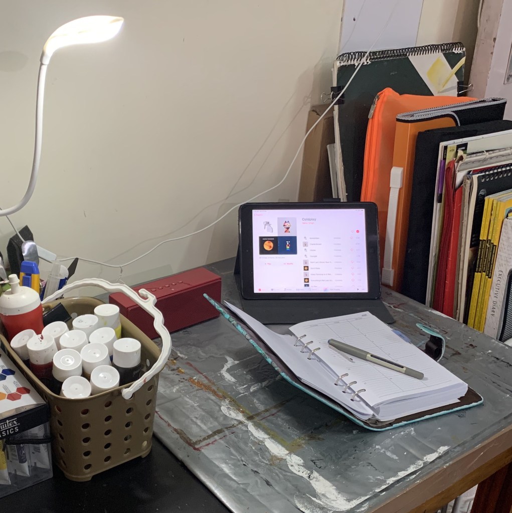
A calendar and planner to track my progress (once again part of my planner diary).
My planner and calendar diary
Images of my favorite projects and published or commissioned works which I keep in folders (I am obsessed with being organized!)
A small sound system to play my favorite music while I work (Usually my iPad and Bluetooth speaker).
My music buddies
While I’m still far from creating a gorgeous studio like the ones owned by seasoned artists, I am totally in love with this little personal corner that is solely dedicated to my art. I believe that if art is all you really live for, even the smallest space can be transformed into a creative haven. It’s about making your art a priority.
Apart from these, here’s a list of supplies and essentials that I keep in my art station:
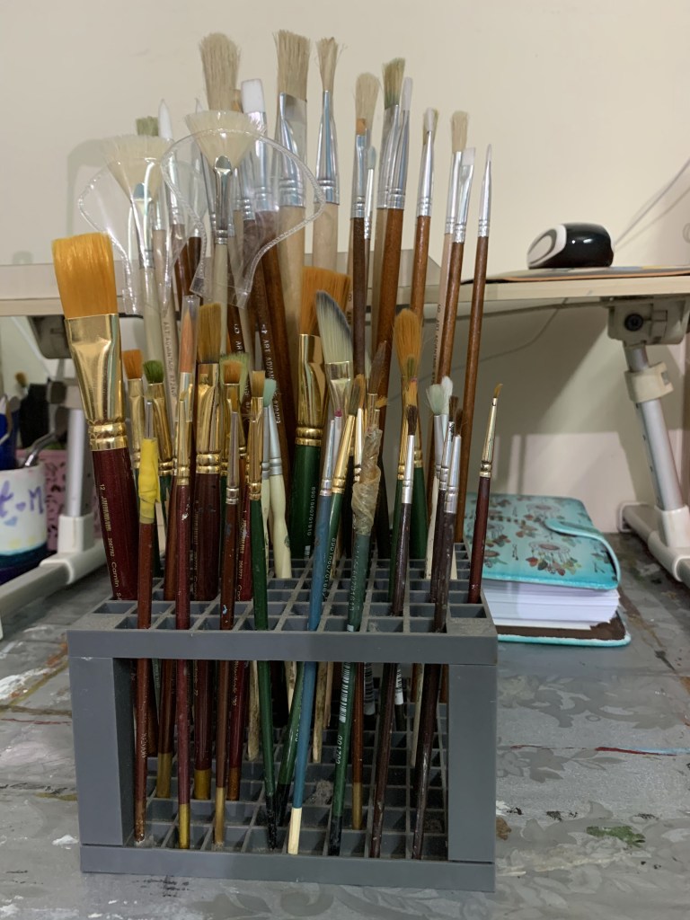
Paint Brush Holder – This is basically a functional organizer with slots of different sizes to hold my assortment of paint brushes. You can even use it to store other things like pens, markers, pencils etc. These can be found in any good art store or online stores.
Paints, Brushes, Pencil Colors, Pens, Markers – As an artist, these are obviously a must. How you store them, is entirely up to you. I like to store them separately in baskets that I keep in the shelves of my table (OCD for being organized yet again!)
My paint brush holder
Easels – I have a couple of easels, one large and the other small that I can use for bigger and smaller canvases respectively.
Seating Arrangement –Having a chair to work on is a lifesaver when my back starts to give up on me. A comfortable chair also gives me a chance to sit back and review my work critically as I paint.
My comfy chair
Laptop – I often use photographs and computer images as a reference point for my art so having my laptop at close quarters comes in handy.
My digital companion always by my side
Music – I love to have music playing in the background while I paint. So I have my iPad connected to my blue tooth speaker playing my favorite tracks to lift my spirits.
My iPad and Bluetooth speaker to play my favorite tunes
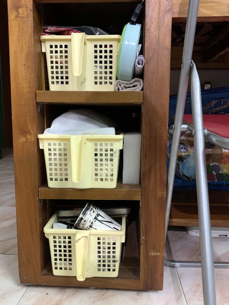
Storage – As mentioned earlier, I have sufficient storage space in the form of the inbuilt shelves of my art table, my mobile art caddy and my assortment of baskets and organizers for my art supplies. The only thing I am lacking now is an arrangement for storing my painted as well as unpainted canvases safely. So even though presently I just line them up on top of tables, stools, cupboards or practically wherever I find the space, I am working on this project!
Storage units on my table
Inbuilt shelves
My baskets for my paints etc.
My mobile art caddy
My art supplies
My storage arrangements
Art Books – I am pretty proud of my small yet valuable collection of art books. I look up to them for inspiration whenever I am struggling with an idea or a technique for a particular painting or may just read up on the great masters of art with the hope of magically imbibing some of their talent!
Inspiration Board – This one I am yet to get! I have so many pictures and photographs that I have collected from various sources like magazines, journals, newspapers etc., but most of them are lying tucked away inside some file or folder. Guess it’s time for me to dish them out and tack them up on the wall!
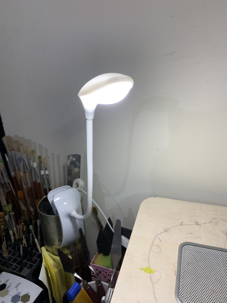
Good Lighting – Now this is THE most essential thing to have for an artist! Although natural light is the best, but owing to space constraints, I had to place my art station at a spot which does not get any. So I have to make do with a portable clip-on lamp that focuses light directly onto my canvas. It may not be as good as natural light but it gives me a good enough idea of the values of colors I am using.
My lighting arrangement
My portable clip on lamp up close
Let there be light!
As I said, the biggest advantage of having a personal space for creating your art is that you can leave things as they are while the work is in progress. This will give you extra bits of time that can be put to effective use towards creating or even fine tuning the artwork itself. These added moments will not only give you a chance to improve on your art but also help you finish it well before your intended target.
The entire process of assigning a creative space not only improves productivity, but also provides you with a feeling of joy and contentment. Your confidence levels get a major boost when you are in your personal creative space and your aspirations get renewed too.
The best part about being an artist is that you don’t need a testament to prove you are one. How you see and experience the world around you is totally up to you. Having a studio or a creative area doesn’t mean that you are limited by its physical space and neither do the things inside it determine what kind of work will sell and what will not. For us artists there are no limits. Don’t smother your creativity by walking into your studio each day thinking what you should make that will be liked or that will sell. Just have fun creating art. Very often people fail to make this small but significant commitment. Have a place to work where you can give your thoughts wings and soar away into the vast expanses of creativity.
I hope this motivates you to start looking around your house for potential areas that you could turn into your art space. Paint it a different color from the rest of the room. Add some interesting as well as functional furniture. Put some items that are close to your heart. Stock up on all your necessary supplies that you would like to keep in your art space. Maybe even christen it with a special name! Let the space speak to you and let it grow with your work.
I’d love to hear about your creative space. What are your essentials for your workspace and how have you personalized it? What are your trade secrets for storage? Do let me in on your own creative corners!
DISCLAIMER – All the information, data and imagery in this blog post is for informational and educational purpose only. While there may be copyrighted material the use of which has not always been specifically authorized by the copyright owner, I have only made it available with the sole effort to stimulate creative progress and artistic enrichment.Some images may have been taken from the links included below and I give full credit to these websites/pages, thereby in no way claiming them to be my own. I have also used these links for reference purposes and collection of data; therefore I give full credit to the respective web pages. Most of the data in this post is based on my personal experiences and opinions and I am not responsible for any material that is found in the links at the end of this post.
“The human mind works in a peculiar way: we tend to cling to the past and be overcritical about the present. That’s why modern art often comes under attack. We compare new creations with classic masterpieces and seek out the smallest flaws. Perhaps the grass used to be greener a few centuries but it doesn’t mean that talented people stopped being born in our lifetime! Here is a living illustration.” – Leonid Afremov.
I might have mentioned the name Leonid Afremov before in several of my earlier posts. Not only is he my all time favorite artist, but also my source of inspiration. I more or less idealize him when it comes to art several of my works are influenced by his style and technique. In today’s post, I will talk about what it is that got me hooked on to his work and how I have attempted to incorporate his iconic style in my own art.
Leonid Afremov was a Russian–Israeli modern impressionistic artist who worked with palette knives and oils to produce some bright and cheerful art. Over the last 25 years, he developed his own personal style and technique which differentiated him from other artists. He mainly painted landscapes, city scenes, vintage cars, seascapes, cats playing jazz and flowers. He formed distinctive pieces with bold knife cuts and color contrasts that conveyed a wide range of jubilant emotions.
Leonid Afremov
Afremov generally worked with photographs taken from his world travels, which he used as a reference point for most of his paintings. His work reflected a personal memory or emotion, focusing on a feeling rather than a story. He skillfully combined the palette knife with bright colors to produce a positive reflection of his surroundings, thus making each artwork as attractive as the next. This unusual yet unique technique of painting where he uses only oils, canvas, and the palette-knifeappealed to anyone and everyone, regardless of their age, social or ethnic background. The elegant play of the vibrant colors in Afremov’s paintings gives art lovers a nostalgic feel of luxurious autumnal cities. His pictures seem to slow down time, letting us enjoy the precious details of these brisk and luminous landscapes.
Leonid Afremov was one of the greatest and best-known modern art impressionists of our time. He was and still is highly respected among art critics and collectors. His beautiful paintings have made their way to private houses and galleries in the USA, Canada, New Zealand, Australia, Israel, France, Spain, and many other countries. This is even more admirable knowing that the artist was self-representing and all of his promoting and selling processes were only held on the Internet with very few exhibitions and very little involvement of dealers and galleries. His self-developed technique and style is unmistakable and cannot be confused with other artists. Most of his work is considered very politically neutral.
Afremov was born on 12 July 1955 in Vitebsk, Belarus and passed away on 19 August 2019 at Playa Del Carmen, Quintana Roo, Mexico due to cardiac arrest. Before the advancement of online sales and eBay, Afremov was a struggling artist. He lived in Vitebsk, Belarus until 1990. Between 1990 and 2002 he lived in Israel and from 2002 to 2010 in Boca Raton, Florida.
Afremov was born to Jewish parents Bella Afremova and Arkadiy Afremov. His father was a shoe designer and shoemaker. His mother worked in a metal factory in Vitebsk. He was born in the same town as Marc Chagall, who later became a significant role model to Afremov.
In 1973 Leonid Afremov graduated with honors from his high school in Vitebsk and was admitted to the Vitebsk Education Institute where he studied in the arts and graphics department. During his years in college, Afremov was introduced to the work of Marc Chagall, Picasso, Dali, Modigliani and the 19th century French Impressionism. His early artistic work was greatly influenced by Chagall and Modigliani. During his years in college, Afremov participated in various school exhibitions and even sold some paintings. In 1978 Afremov graduated from the Vitebsk Art School as one of their elite members. After that he took private lessons from local famous artist Barowski who was teaching art when Marc Chagall was still living in Vitebsk.
Life and career in Soviet Russia from 1976 to 1990
After graduating from college, Afremov worked as a label designer in a local beer and liquor factory. Then he briefly worked in a local theater as a set designer.
In the early 1980’s he started doing freelance work for communal farms and schools, designing and making various propaganda posters, themed rooms and walls for certain communist events and holidays. He was also doing template sculptures of Lenin from plaster. He had a very good reputation in that field and was invited back by many farms and schools. This type of work was available only during the summer and spring.
During the cold Russian winter, Afremov stayed at home painting. He was not allowed to participate in government exhibitions because of his Jewish roots and was not allowed to be a member of the local art associations. His early work was sold privately via family and friends and was not seen by many people. A lot of his work in the 1980’s was just given away for free. He did not keep records of his work then and not much of it survived.
In 1986 the Chernobyl disaster happened. Vitebsk was only a few hundred kilometers from Chernobyl, close enough for radiation to travel with the wind and rain. The ecological situation in the area worsened, with the local crops and water becoming contaminated with radioactive fallout. Small children were affected severely, including Afremov’s two year old son. At the same time Leonid Afremov was experiencing serious discrimination for his Jewish heritage. The liberal politics of Mikhail Gorbachev allowed Jewish soviet citizens to migrate to Israel in the late 1980s. Fed up with anti-semitism and problems caused by radiation, Leonid decided to move to Israel without hesitation as soon as the doors were opened.
Life and career in Israel from 1990 to 2002
A few weeks after moving to Israel, Leonid Afremov found a job in an advertisement agency making signs and posters. After working in an advertisement agency, he worked in a gallery shop where he learned to make frames, being introduced to the palette knife for the first time.
Being a recent Russian immigrant, his work was not considered to be of great value by the locals. Galleries took paintings for 50 shekels (15USD) and were reselling them for 500 to 5000 shekels. The galleries refused to sell his work for percentage commissions just because he was a Russian immigrant. He was only given the option of a pittance for each painting which took a day to make. Afremov felt exploited and discriminated by the galleries and the Israeli society just like he was by the Soviet Government. He attempted to sell his art at street fairs and exhibitions in local social clubs. However, it was difficult because of the social stigma of Russian immigrants.
During the early 1990s, Leonid Afremov was mainly working with watercolors and acrylic. He was experimenting very little with usage of the palette knife. He painted what people were buying, with very little artistic freedom. In 1994, out of extreme desperation, his 16-year-old son Dmitry tried to sell Leonid’s paintings door to door around the neighborhood, This practice proved itself very effective, and Afremov suddenly started selling many pieces he painted and was getting slightly better prices than from selling directly to galleries. Dmitry proved himself to be a good door-to-door salesman. He was selling Leonid’s paintings in the new neighborhoods where recent Russian Immigrants were living.
In 1995, Leonid acquired enough funds to open his own gallery and frame shop in Ashdod. The gallery was not popular among local Israelis; it was mainly visited by fellow Russian immigrants. The gallery was vandalized and broken into on several occasions. The local Israeli newspapers were refusing to publish advertisements for Afremov’s Gallery, and he was mainly advertising via Russian immigrant press and radio station. However, artistic freedom could not be achieved completely.
Around 1999, Leonid became friends with Russian-speaking Israeli jazz musician Leonid Ptashka, who inspired Afremov to paint a collection of portraits of popular jazz musicians and helped him secure a successful exhibition in the International Jazz Festival in Ashdod. Since then, Leonid Afremov has painted dozens of his favorite musicians.
In March 2001, Afremov’s gallery was completely vandalized. Dozens of paintings were destroyed, the artistic equipment stolen and the facility turned into rubble. Then Leonid decided it was time to move somewhere else where he would be treated with respect, eventually moving to the USA in January 2002.
Life and career in USA from 2002 to 2010
Leonid Afremov prepared for his move to USA very carefully. For several months he did not sell any paintings and sent everything he painted to his sister in Brooklyn. When he arrived in the US in January 2002, he had more than one hundred paintings at his disposal. Along with his son, he visited several galleries in New York. Some of these liked and purchased his paintings, however they only picked up Judaic themes and musician portraits. This forced Afremov to paint only limited themes and subjects in order to make a living.
Leonid had good opportunities in New York but the cold climate affected his health. He was constantly struggling with arthritis and muscular pain caused by drastic temperature changes. Thus he moved to Fort Lauderdale in April 2002. In Florida, Afremov faced the same changeless like in New York, selling only certain themes and subjects that the galleries wanted and were able to sell.
In 2004, after graduating from high school, Leonid’s son Boris was introduced to eBay by his friends. They tried to auction some of Leonid’s paintings with positive results. Paintings were sold for hundreds and sometimes thousands of dollars and everything sold without exception. For the first time Afremov was given the opportunity to paint what he really wanted. This was when his real artistic journey began. He started painting what he really wanted from his personal inspirations and was finally able to explore his artistic vision and abilities all the way.
The exposure on eBay gave him opportunities for commission orders and access to different galleries. However, because of past bitter experiences with galleries, Leonid preferred to sell directly to the collector. Thanks to the internet exposure, Afremov participated in various local TV shows around the USA.
In 2007 with the help of his sons Leonid launched his own personal site where he began selling giclees, prints and original painting, eventually moving all the business and attention to his personal site. Two years later Leonid underwent heart bypass procedures. The doctors recommended Leonid to stay away from managing a business, keep a calm lifestyle and ultimately retire. It was then that his sons Boris and Dmitry started handling his sales, customer service and shipping.
Recent life and career in Mexico
In 2005 Leonid Afremov vacationed in Playa del Carmen and Cancun for the first time. Thereafter he visited the Mexican Caribbean 2 to 3 times in a year and completely fell in love with the place. Eventually in March 2010 Leonid decided to take on early retirement recommended by his doctors and moved to Playa del Carmen, a popular resort town near Cancun. By now his children were so involved in his business that they had to move to Mexico as well and managed his virtual gallery and shipping office in Playa del Carmen. The Afremovs also have locations in Cancun and Cozumel where they sell art during the busy tourist season in the winter. Leonid found Caribbean Mexico very relaxing and stress free. In 2011 Leonid sponsored the construction of his own personal ranch near Puerto Morelos where he spent much of his time.
Afremov’s Artistic Philosophy
Leonid Afremov kept majority of his art politically neutral. His paintings are not offensive to anyone nor send any hidden messages. They usually reflect certain personal memories and emotions. Afremov tried to draw the viewer’s attention towards a certain feeling rather than tell a story through his painting. He wanted his viewers to see the world through his eyes. The neutral attributes of Afremov’s art make the paintings appealing to almost all strata of society. He travelled quite extensively and took many photographs of different scenes that he later painted. Almost every painting he painted has a very personal inspiration. His art can be reflected as very positive through the bright colors he used. In fact, it was declared very relaxing and calming by notable psychologists and psychiatrists who make use of his painting in various psychological and psychiatric therapy procedures. Afremov’s paintings were published not only in art magazines but also in various medical and health magazines as examples of stress reducing paintings.
Afremov loved cats and other animals, hence painted many with cats, dogs, horses, tigers and even giraffes. The only political paintings he did were of bull-fighting, where he tried to show the viewer the cruel nature of the sport and discourage people from liking it.
After reading Leonid Afremov’s bio, one can understand how he attained success. Struggling for his individuality and artistic freedom, he managed to create his own style based on the experiences of the most outstanding artists. While Afremov’s early works were influenced by the masterpieces of older painters, his later artworks are very unique and recognizable.
According to Mr. Afremov, art is not something elite, understandable for a small circle of intellectuals only. He didn’t want to put any complicated hidden messages into his work – on the contrary, he wants his paintings to be intuitively close to everyone. When one looks at those autumn parks, lantern-lit alleys and vibrant cityscapes, the idea is rather clear. The artist invites his viewers to the world of simple beauty all around, but we are all too busy to stop for a moment and enjoy it. If an artist can open his viewers’ eyes to that, then his creations are not in vain.
Afremov proved that elegance and delicacy are elements of art that are still alive. While many artists try to shock the public with something slangy, this painter respected traditions. He didn’t follow them automatically but took the best from every style. Modern art need not be incomprehensible. It can be meaningful and clear – that’s the idea behind his paintings.
Here’s a collection of his paintings that are my personal favorites:
Afremov’s paintings
Afremov’s Technique
Using his unique knife painting technique and unmistakable style, Afremov created paintings that seem to explode in millions of bright colors. Focusing primarily on land and seascapes, he formed distinctive pieces with bold knife cuts and colour contrasts that conveyed a range of jubilant emotions. His artistic philosophy rests on the idea that art is not only for elite, but rather something that everyone should have the opportunity to appreciate. His pieces maintain a characteristic ebb and flow, with colours and textures woven together to form an emotive gradient that captures one’s attention, first with bright colours and then with the technique.
Joyful and radiant, Afremov’s animated artwork achieve an emotional connection that personally touches those who respond to his talent. Afremov had the ability to touch a wide audience by focusing on keeping his artwork simple and politically neutral. The artist’s work doesn’t aim to offend anyone or reveal any deeper messages, but seeks to speak for itself by reflecting memories and emotions that are universally relateable.
My Art Inspired by Afremov
Besides being greatly influenced by the distinct and trademark style of Afremov, I was also drawn towards the vibrant color palette that he uses for his paintings. I believe it is these two features about his art that appeal to me the most. It is my constant endeavor to incorporate his technique as well as his exuberant colors and textures into my work. Having said that, I try to cautious not to mimic or clone his style and produce identical replicas of his work. My objective is only to apply the best of his skills to further enhance mine.
Keeping this in mind, I have attempted to add my own little twist to his palette knife technique. Instead of applying paint in thick daubs with a palette knife, I tried doing so with a paint brush, while keeping the thickness of the paint intact. Even though the effects were not the same as those achieved by Afremov with his method, what I got was pretty close, yet different enough. In order to polish up my technique, I first experimented with a couple of Afremov’s paintings themselves as part of a process of their recreation, but in my own unique way.
Quite often I mix my paints with modeling paste or a similar thickening agent in order to attain specific textural effects in my artworks. This is another special touch that I have added to further enhance my version of Afremov’s style of painting, thereby aiming to acquire similar results. It was a learning experience that has paved the path towards developing my individualistic signature style which I applied to several of my paintings later on.
Here are some visuals of the works I did with my favorite artist’s paintings in order to fine tune my process followed by artworks that were inspired by his technique. Hope you all enjoy looking at them as much as I enjoyed painting them!
My Early Experiments with Afremov’s paintings (Recreations)
My artworks inspired by Afremov
DISCLAIMER – All the information, data and imagery in this blog post is for informational and educational purpose only. While there may be copyrighted material the use of which has not always been specifically authorized by the copyright owner, I have only made it available with the sole effort to stimulate creative progress and artistic enrichment.Some images may have been taken from the links included below and I give full credit to these websites/pages, thereby in no way claiming them to be my own. I have also used these links for reference purposes and collection of data; therefore I give full credit to the respective web pages. Most of the data in this post is based on my personal experiences and opinions and I am not responsible for any material that is found in the links at the end of this post.