
If there is one subject that has always foxed me, it’s what I am going to call a painting once it’s done. What could be that perfect name that would not only make my piece stand out in its full glory but also convey the message behind it in just a few words?
This name that captures the essence of the artwork is what we call its title. It is the artist’s poetic license that allows him or her to communicate the message behind his or her creation.”
I for one give a lot of thought to my titles because I feel they are as important as the artworks themselves. In my opinion, the title of a painting is an extension of the same creative process that goes into making the painting in the first place. I believe that my viewers will be able to extract a much more powerful experience from a piece of art if it has a title that complements it.
A good title is one that gives an insight into the artist’s creative thought process and what inspires him or her. It is the key to the artist’s unique way of thinking and his power of expression. If thought out well, the name of a painting can be extremely evocative and can be resonant of the artist’s personal feelings and interpretation of the subject depicted.
It is for this reason that in most cases, ideas for titles pop up as a result of the artist’s personal reaction to a particular situation or an emotional experience he or she may be going through. But this poses the risk of influencing the viewers and depriving them of their own personal reaction to the art piece, so it’s best to be true to the core concept of the artwork without affecting the viewer’s experience.
A good title also adds an element of mystery to the work and does not completely reveal the artist’s personal feeling about it. This gives viewers the liberty of forming their own opinion about the piece. It should just provide clues to the subject matter and allow the viewer to see the artwork from a perspective that is different from what the artist originally intended. I feel that the title can add this value to a painting.
A title plays a crucial role not only for the viewer, but also for the artists. It is a portal into the creative mind of the artist and also helps in navigating viewers through his thought process by approaching it from his own personal perspective. It is a testimonial, a symbolic representation, a gateway or a metaphor for the subject in question.
Titled Vs “Untitled”
When an artist titles his work, it gives him or her the chance to express in a few words what he or she means to convey through it. However, many artists feel that this can deprive their viewers from building an individual opinion about their art, thereby preventing them from interpreting it independently as per their own personal perspective. They feel that it stops viewers from extracting an intimate experience from the artwork. Hence, they prefer to leave it to the viewers to make their own interpretation by christening the painting with the term “Untitled.”
There are several other reasons why some artists have reservations about titling their work. Many world renowned masters of art have resorted to keeping major pieces of their work untitled. Some want to let a work speak for itself and not impose a label on the image while others don’t want to influence the viewer. Very often, an artwork really doesn’t need a title. This is particularly true for smaller sketches, studies, and preparatory works, many of which are simply intended as teaching aids or have the ability to stand on their own as works of art.
I somehow disagree with the idea of not baptizing a painting, especially if you are trying to sell your art. Not having a name for it kind of puts off your customer. Most art enthusiasts and collectors look for a name as it will give them a better insight about what they are going to be investing in. Having a title not only imparts an identity to your beautiful creation but also appeals to the interest of your buyer. And if you’re posting your work on the internet, the term “untitled” will not get you very far when it comes to search engine optimization (SEO). The probability of finding an “Untitled” painting of yours through a search engine is almost next to nil as compared to one that has a name. Moreover, yours is not the only “Untitled” composition that will come up in the search results so it’ll be like looking for a needle in a haystack!
How to title paintings according to the type of art
Your choice of title for your art piece shows what it means to you and gives the viewer some idea about approaching the piece.
If you are struggling with naming your art, a bit of research really helps. One way to approach naming your painting is to identify what category of art it fit into. Here’s how you can christen your work based on this criteria:
- Portraits are usually titled by the subject’s name and sometimes a date, or occupation.
- Still life works are a different kettle of fish and can be pretty tricky to title. A lot of thought needs to go into your composition before you give it a name, for instance, does it have a story to tell? Is it based on a theme or does it symbolize something? More creative your still life setups, more innovative and interesting are the possibilities for titles. Natural arrangements have a better story to tell than artificial ones which makes for better titles too. Creating a deliberate mood or theme, will be helpful when it comes to choosing a title integrated with the work. For less developed still life works or studies, your title can be simple and descriptive. Consider using time of the day, season, or mood as part of the title. Once you have identified these, it becomes easier to name it.
- Landscapes can be named according to the location, the time of the day, the season and the mood you wish to project to your viewers. Mentioning the location is very important as not all your viewers may be familiar with the scene. Even the most famous and well known locations in the world may be unfamiliar to natives of your own land or those visiting from other countries. Adding a personal touch or connection along with the location can make the title that much more interesting. For example, doesn’t “Grandma’s favorite Orchids” sound better than just “Orchids?” Often the title can pick up on irony, contrast, or drama in the scene. I wish I had known all this before, otherwise I wouldn’t have simply named my floral still life just “Flora in a Pot” and my composition of fruits just “Fruit Platter!” Sounds boring right? How about “Summer Blooms” and “Fruits of my Labor?” Don’t you think they add an element of interest as well as a bit of drama to these pieces?
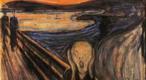
- Abstracts can be totally non-objective in nature so your title may be the only way to communicate to your viewer what your painting is all about, why you created it, or the concept behind the work. For most abstract pieces, the title is the only key to the art other than the piece itself. However, if your abstract artwork is superficial with no intention to convey any specific message or deeper meaning, make sure your title communicates this to your viewer. For example, “Composition II in Red, Blue, and Yellow” by Piet Mondrian conveys to the viewer not to look for any hidden meaning. On the other hand, if your work is based on a specific concept, give the viewer a hint through your title. Titles such as “The Scream” by Edvard Munch help the viewer understand the artist’s perception.

“Composition II in Red, Blue, and Yellow” by Piet Mondrian 
“The Scream” by Edvard Munch
Types of Titles
There are five main kinds of titles: Sentimental, Numerical, Abstract, Factual and Mysterious.
- Sentimental titles are an attempt to express the emotional state of either the artist or the subject. Once again, Edvard Munch’s “The Scream” can fit into this category as it aptly brings out his sentiments.
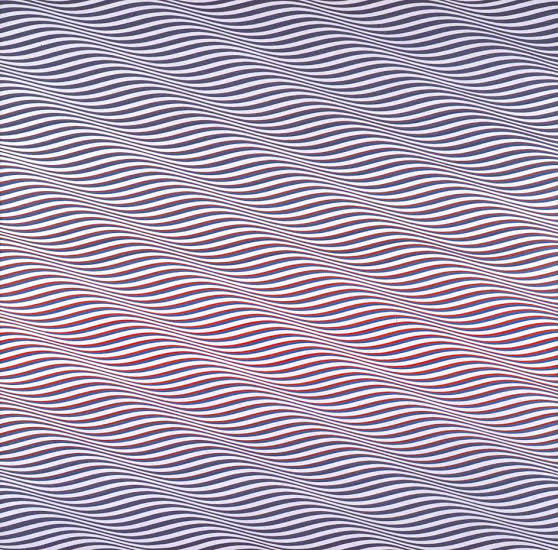
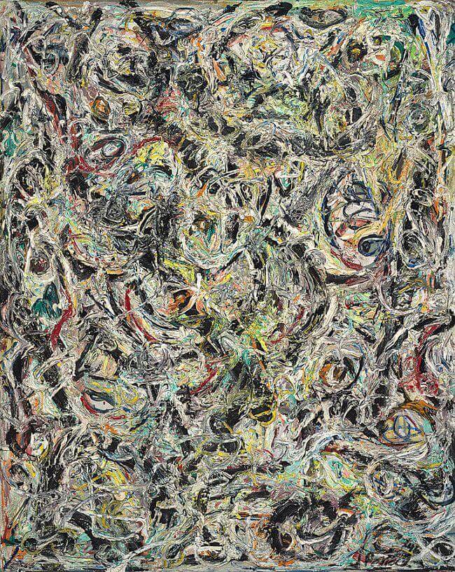
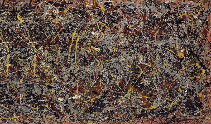
2. Numerical titles involve the use of numbers, especially if a series of work belonging to a common theme or concept are to be named. Many artists prefer to use numbers. Jackson Pollock gave his pictures conventional titles but changed to numbers. He commented: “…look passively and try to receive what the painting has to offer and not bring a subject matter or preconceived idea of what they are to be looking for.”
3. Abstract titles are appropriate if you don’t wish to give away the meaning behind your painting and wish to leave it up to your viewers to make their own interpretations. They can also be used if your piece does not follow any specific theme or concept. They are used to express something that is appreciated in the intellectual and mental sense, an intangible expression concerning or relating to the work. An example of an abstract title is “Composition II in Red, Blue, and Yellow” by Piet Mondrian.

4. Factual titles are used for naming artworks that depict real life scenes or events. For such titles, the date and location should be at the forefront of your title. You can always add a sentimental or mysterious component to this type of title too. “A Real Allegory of a Seven Year Phase in my Artistic and Moral Life” by Gustave Courbet, 1855 is one such label.

5. Mysterious titles are difficult or possibly even impossible to understand as they impart an element of mystery to the art they are naming. They are deliberately enigmatic and do not explain the artist’s feeling clearly, nor do they identify the concept behind the work. They can be used for art that is obscure and inexplicable. J.M.W. Turner is an example of such an artist who used ironic, compound titles — e.g., The Fighting ‘Temeraire,’ tugged to her last berth to be broken up, 1838.

When to come up with a title
Some artists have no trouble naming their artworks as the title is simply an extension of their creative expression. Several of them don’t think about titles until their artworks are finished and they see what their paintings evoke. Other artists have something clearly in mind as they create, and form titles along that idea. Most artists probably start thinking about a title somewhere in the middle stages of a painting, as their imagery takes shape. As is always true in art, there are no definite rules for titling a painting.
Most artists paint first and title last. Somewhere down the line, a title just pops out of the blue. A few of them work backwards and come up with a title first, working their piece around it. This latter approach works particularly well for eccentric art. The right title makes a difference as to how a work is seen and understood. There are three ways one can title their art:
- Before starting the piece
Some artists can come up with a title for their work as soon as they’ve seen what they want to paint or an idea pops up in their heads. This helps keep their brain focused on what the piece is about. - While working on the piece
Many artists get clues about what to call their artwork while working on it. They may not decide for certain until it’s finished but a lot of pieces get a working title at the very least while they are works in progress. - After the piece is done
For most artists, the point at which people start to thinking about a title is the observation and reflection stage which comes when they have finished the artwork.
Should the title be long or short?
In my personal opinion, the length of your title depends on what and how much you want to give away about your painting through its name. Be that as it may, it is advisable to have a title that’s not just one word. A little extra thought in naming your masterpiece will go a long way when it comes to connecting with your viewers! I for one remember artists who tend to use long titles, even though I can never quite remember the titles themselves!
On the contrary, short titles are simple and easier to remember than longer ones. However, their lack of ingenuity can make them less unique. A little complexity can add individuality and uniqueness to the name.
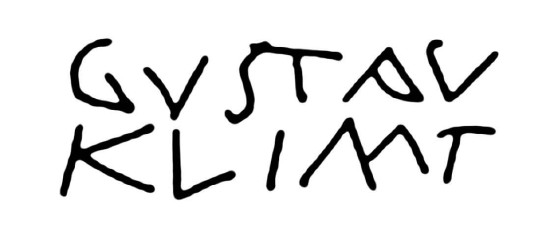
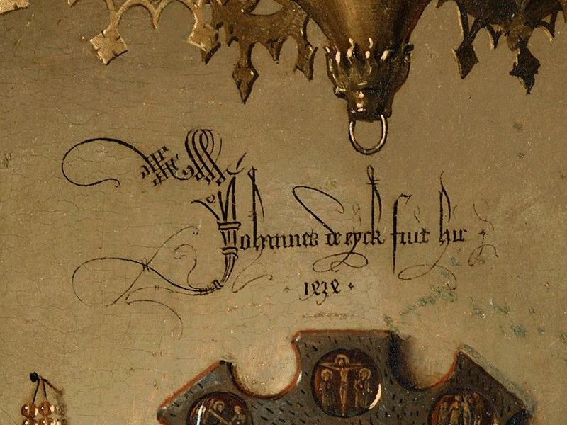
How to write the name of a painting
The following details need to be taken care of when naming your artwork:
- The artist’s name and the title of the painting need to be part of the text.
- The title should be in italics. Use title case, capitalizing the first word and all nouns, pronouns, verbs, and adverbs.
- The year the painting was completed should be in parentheses.
Some pointers on how to title your painting
Artists generally run through a series of title possibilities for each and every artwork before narrowing down on the perfect one. They carefully consider the ramifications of the probable titles and how they might add to or take away from their artwork. Titles highlight the visual aspect of the painting, provide knowledge and insight about the work as well as provide a glimpse into the artist’s mind-set. Here are a few points to consider while choosing a title:
1. Observe your artwork closely and carefully. What is the first thing about it that catches your eye? What is that you trying to depict? Is there a deeper meaning behind it? Does it convey a moral message? Is it based on any particular theme or concept?
2. Make a list of words that describe the piece in terms of colors, shapes, lighting effects, time of the day and season.
3. What thought or image inspired you to put down this work onto your canvas? What emotions or feelings did it invoke in you?
4. What exactly is the subject that you have painted? Is it nature, flowers, fruits, blue skies? List them out.
5. Now look at your painting as the viewer and not the artist and pick out from the list you have made above things that stand out the most and are most relevant to the piece in front of you. This can be a bit tricky, as those bright red roses in the vase may be your personal favorite, but the vase itself may just stand out a bit more.
6. Turn to your trusted literary friend, the Thesaurus to look for synonyms for the key words that describe your work best in the list you have made. This may open doors to new levels of creativity. You can even add a mysterious or sentimental element to make the title a wee bit dramatic.
7. Keep it short and sweet, giving your viewers the freedom and liberty to see the piece from their own perspectives and draw out the rest of its meaning or intent. This subtle ambiguity will make both the artwork as well as its title a memorable experience for your viewers.
8. Do not try to restate exactly what the painting is already communicating. Think of the title as an additional part of the art that provides something new. Choose a title that is slightly different than your art and offers something new and refreshing.
9. Identify the key feeling you experience through your artwork or want to convey. Then choose words or phrases for a title that conjure up those same feelings in you. Don’t be literal in your description of the artwork.
10. Whether literal or abstract, your title should be as expansive as possible so that your viewers have room for their own interpretation. Allowing them to find their own meaning in your work is not just generous, but also increases the likelihood that someone will connect to it personally and may even end up buying your art!
To summarize –
- Avoid stereotypical and cheesy names, unless you intend being paradoxical or satirical. Be original.
- Be precise and honest to soul of the piece.
- Don’t be pompous and showy.
- Provide your viewer only what is required, that is, enough to identify your piece.
- Short and sweet is the best. Let your art do the talking.
- Appreciate and value your work far more than just naming it “Untitled.”
How I title my work
It has been quite a challenge for me to come up with titles that not only do justice to my art but also elicit the emotional response I want from my viewers. Like most artists, I like to get my viewers emotionally involved in the art experience by just looking at my visual narrative and not getting influenced by the verbal one.
I like to come up with names that convey the power behind my pieces. I generally title my works based on the first thing that comes to my mind when I see them. I use color, shapes, form, textures and movement to resonate with the viewer on the subconscious and emotional level. I try to make my titles as compelling and thought-provoking as the artworks they are meant to name.
My titles usually take shape after the artwork is complete. On a general basis, most of my titles are a spin off from the theme or concept I have based my artwork on or the message or emotion I wish to convey through it. However, some may also arise from the very source that inspired the painting, or from the form the painting ultimately takes.
I genrally ave my favorite music playing in the background when I’m working with my art so if a song title or lyrics relates to what I’m currently working on, it goes down in my list of probable names for the piece. Why just music? It can be anything – lines from a movie, quotes from a book, poetry, mythology, feelings, emotions, you name it! My list of inspirations is endless!! All I need to do it is adapt it in my own unique way and make it my own! The dictionary and thesaurus have also been my dependable pals for developing titles, and I use them constantly to brainstorm through my lists and come up with the perfect names for my art.
Based on the above mentioned pointers and cues, here’s how I would classify the titles of my art:
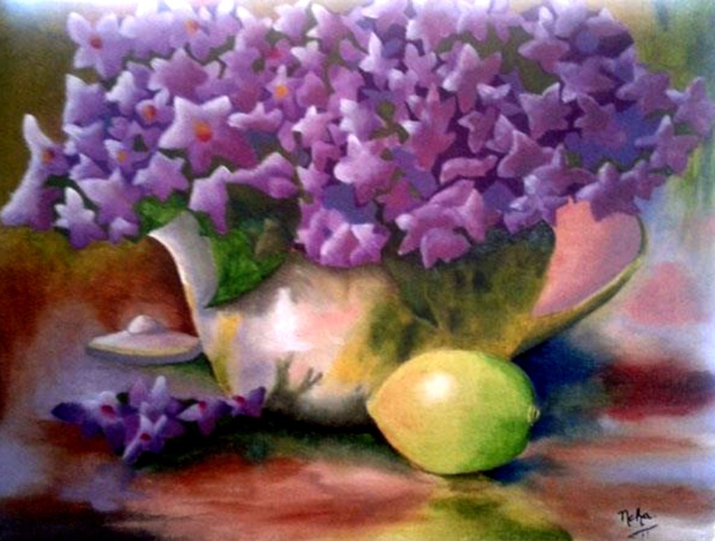
1.Still Life – These include my earlier paintings, namely, “Flora in a Pot” and “Fruit Platter” which are not originals and were done by me as part of my learning process. I had to name them as part of the brief given to me for assignments during my art classes, hence I do not know the name of the original artists or their original titles. As I mentioned earlier in this post, the titles I chose for them were pretty dry and non-poetic and I wish I had thought of something more interesting and attractive.

Flora in a Pot (Not original – artist unknown) 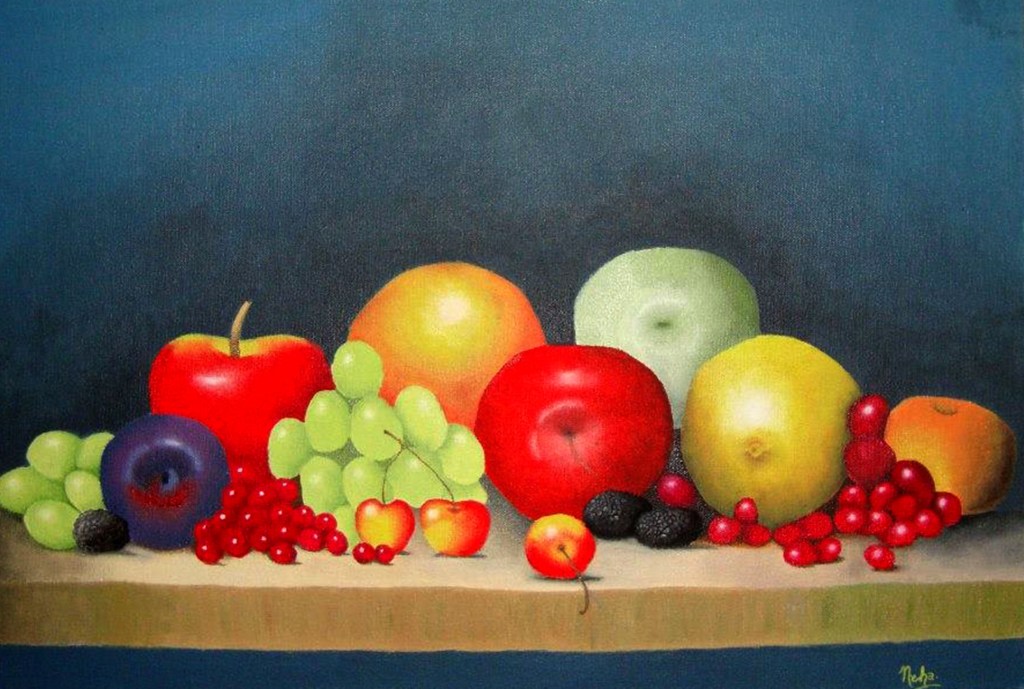
Fruit Platter (Not original – artist unknown)
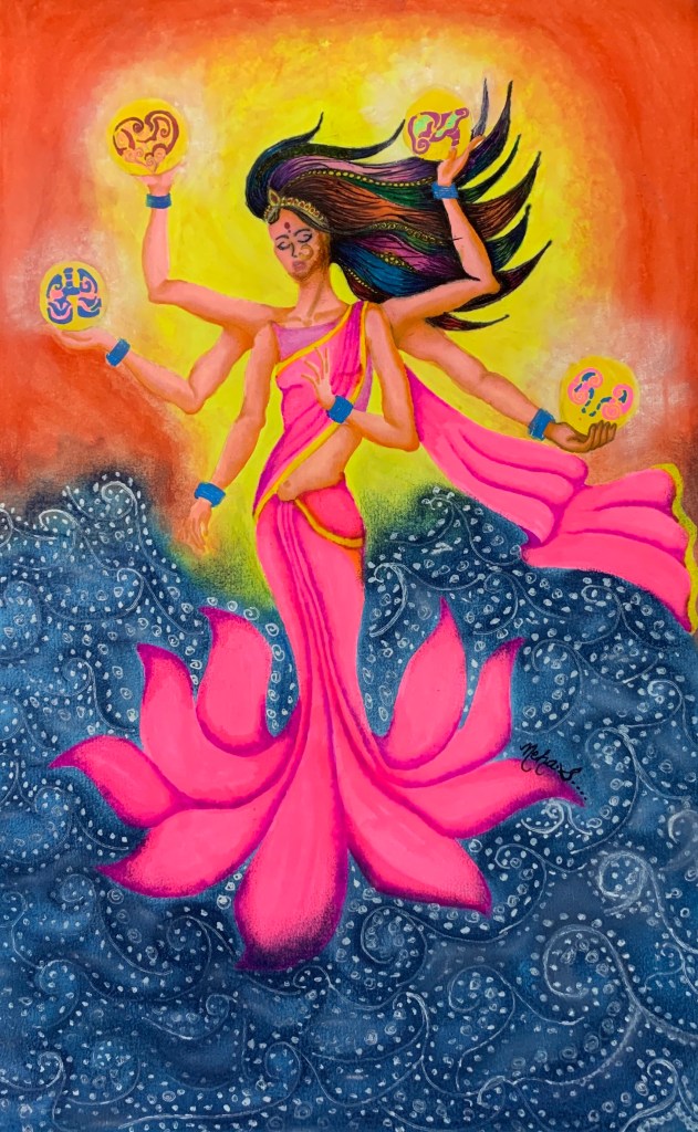
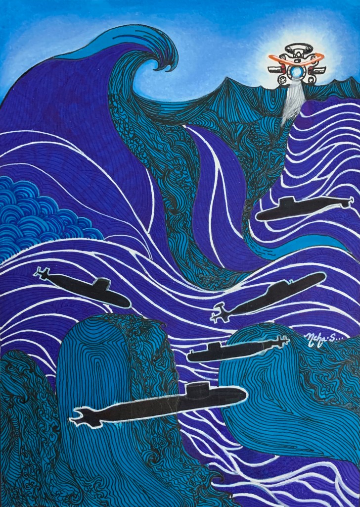
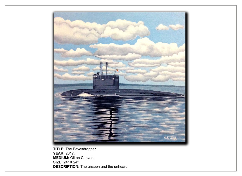
2. Landscapes – My imitations of “She Left” and “Winter Lake by Leonid Afremov fall into this category. Two of my original creations – Deep Sea Dweller and Eavesdropper also come under this category even though they are technically seascapes.
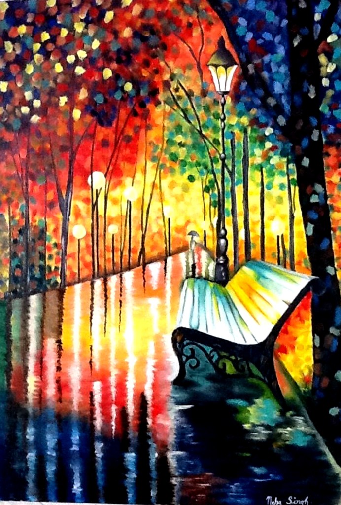
My rendition of Afremov’s “She Left” 
My rendition of Afremov’s “Winter Lake” 
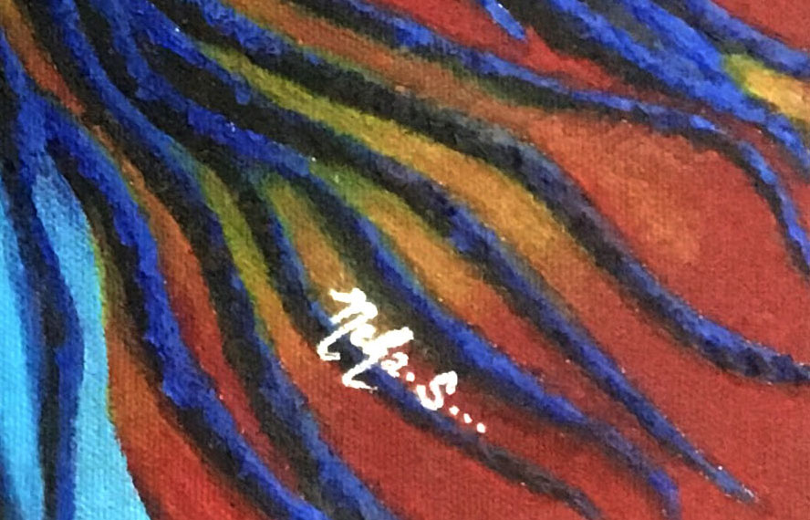
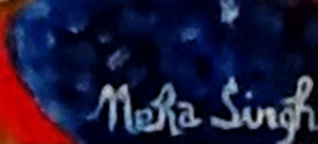
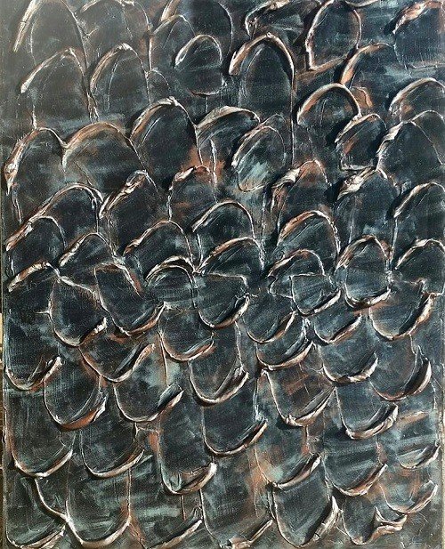
Deep Sea Dweller 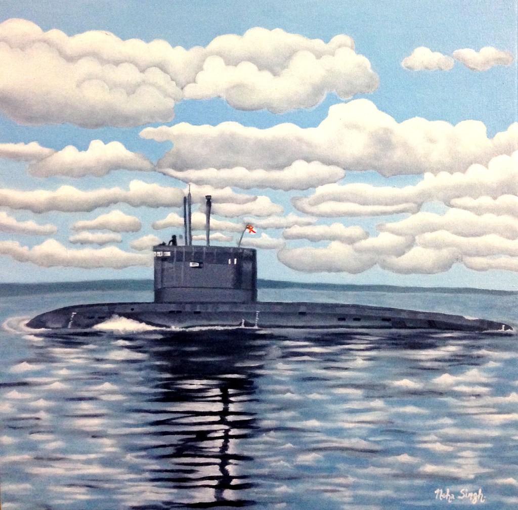
Eavesdropper
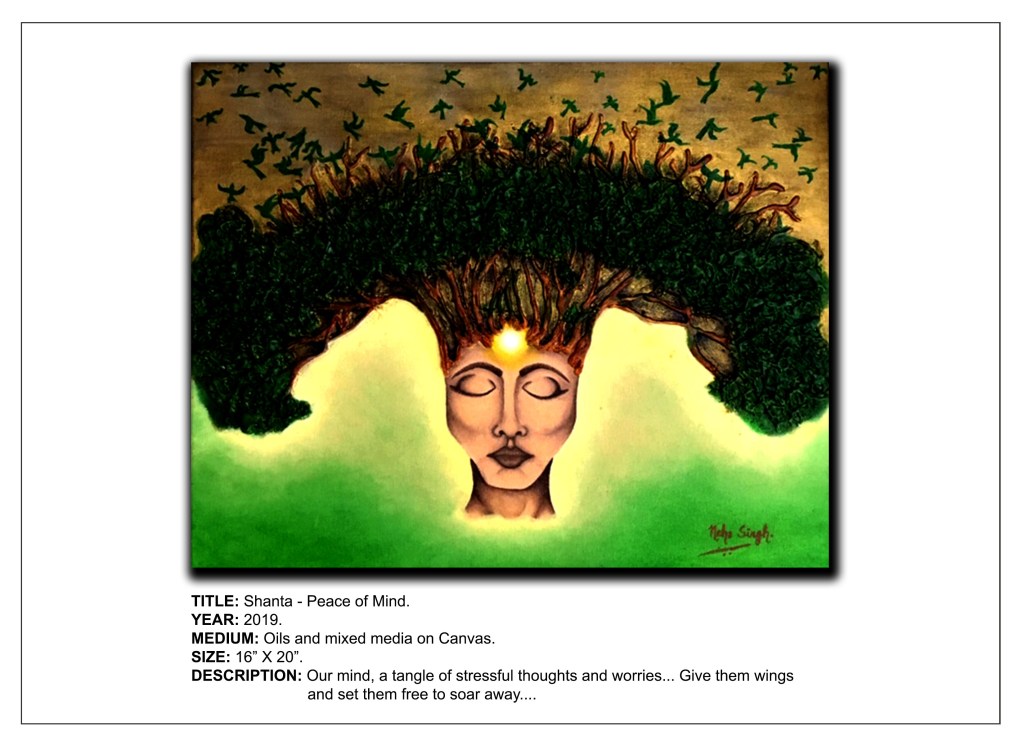
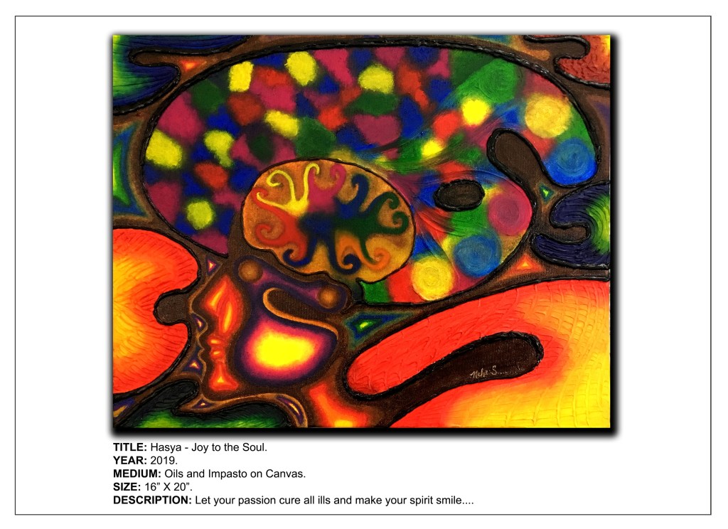
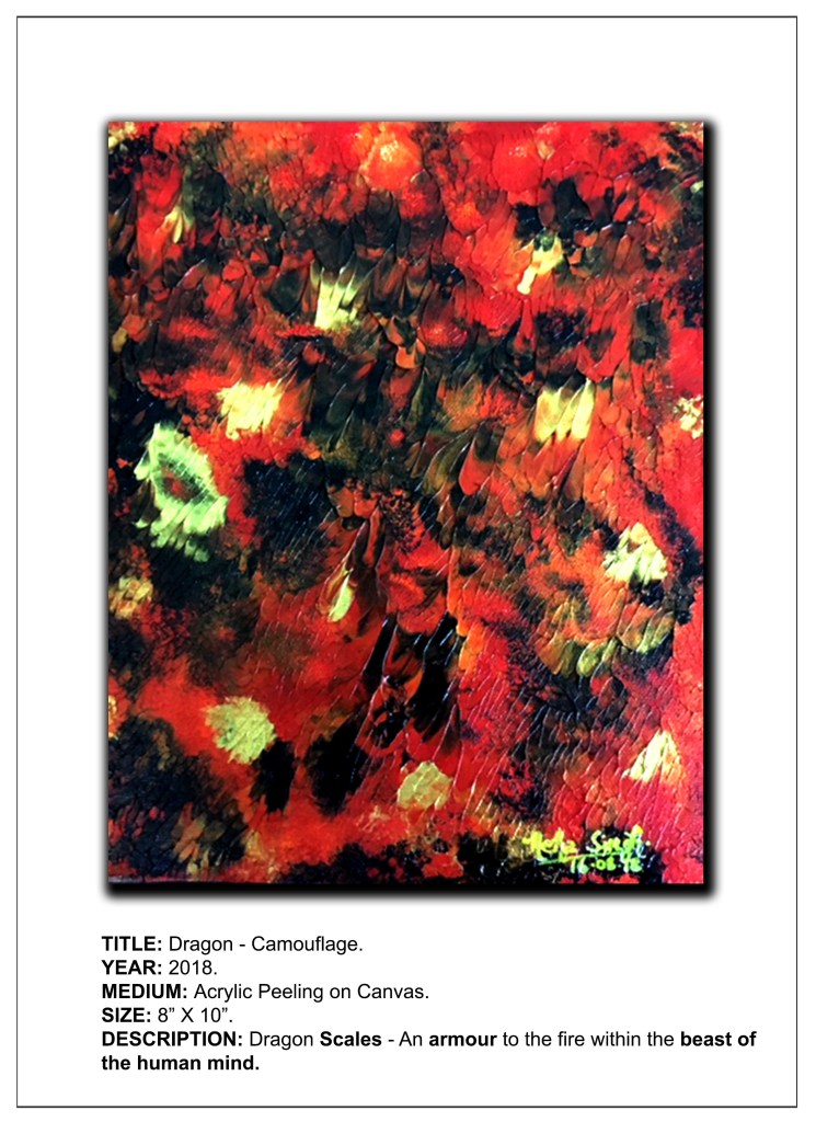
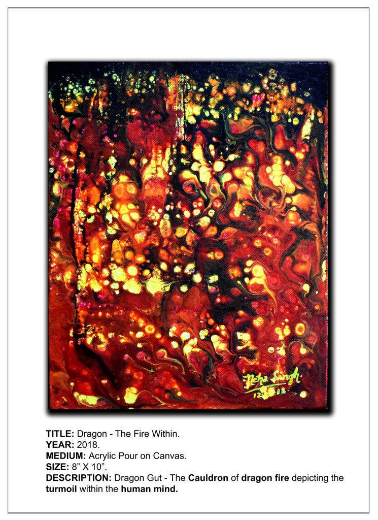
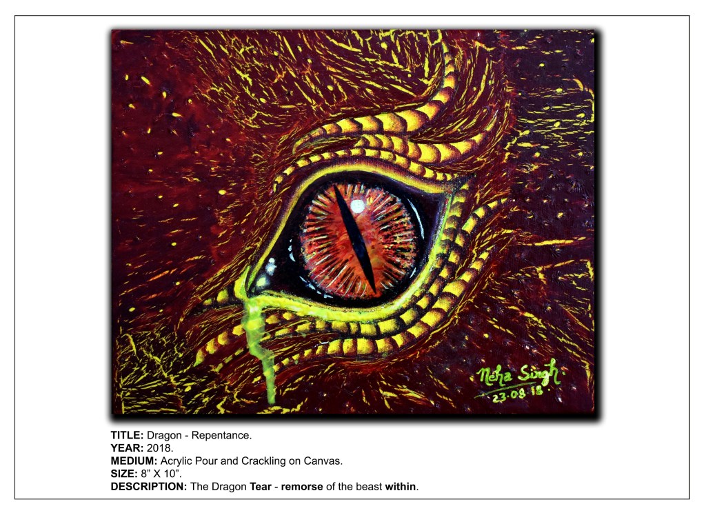
3. Abstracts – I have several abstract works, especially from my Dragon Series (Dragon-Camouflage, Dragon-The Fire Within, Dragon-Wrath, Dragon-Repentance and Dragon-Liberation), that I have tried to name carefully so as to maintain equilibrium between how much I reveal about the piece and how much liberty I give to my viewers in order to make their own interpretations. Another piece that fits here is from the Navrasa Series, namely, Hasya – Joy to the Soul.

Dragon – Camouflage 
Dragon – The Fire Within 
Dragon – Wrath 
Dragon – Repentance 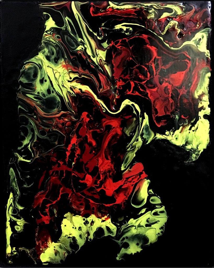
Dragon – Liberation 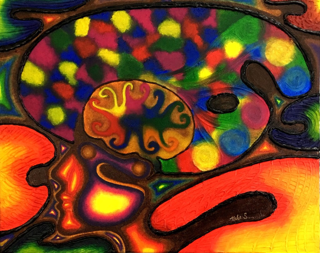
Hasya – Joy to the Soul
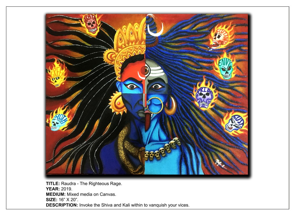
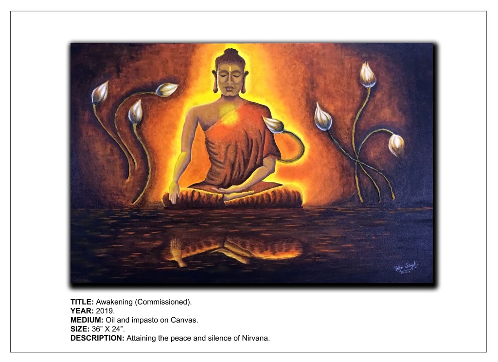
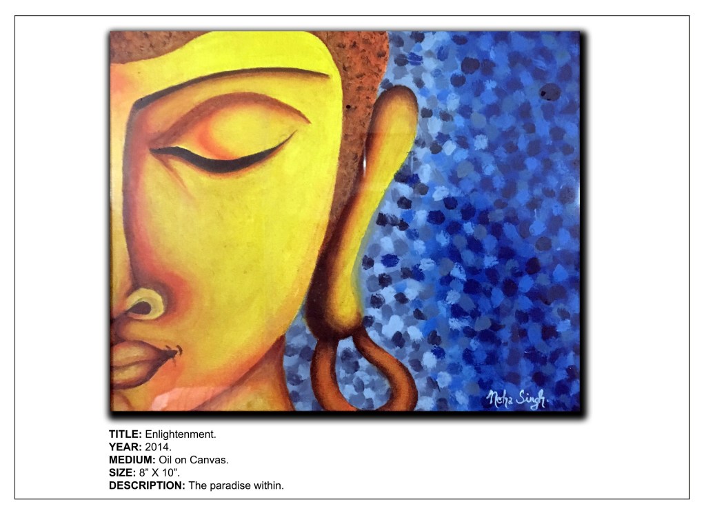
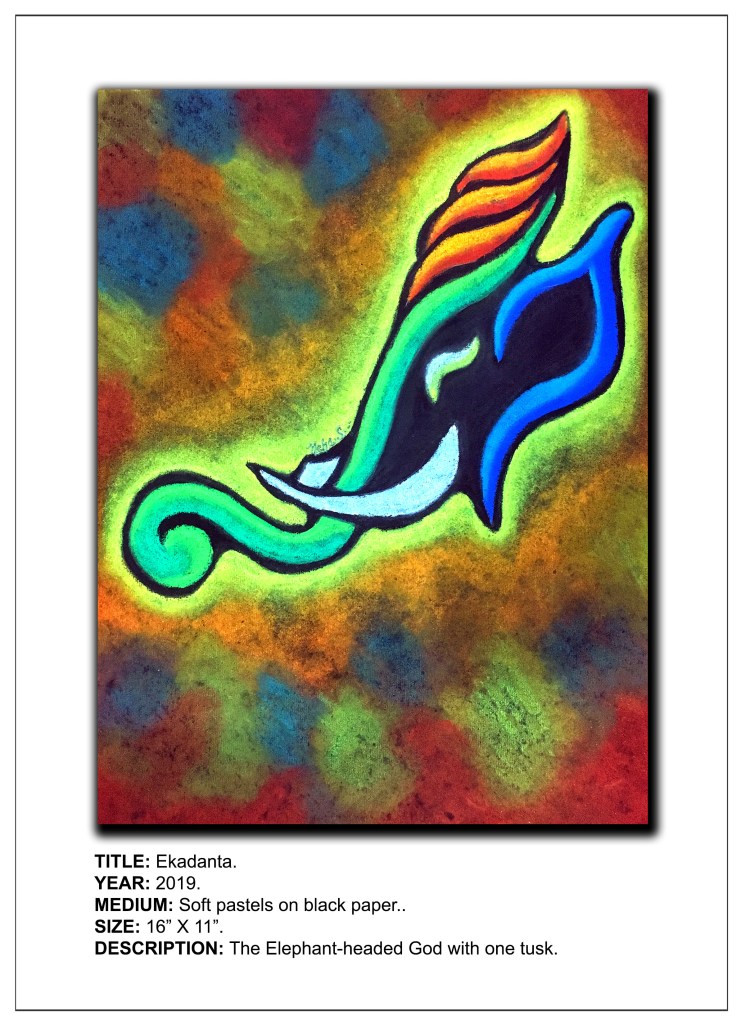
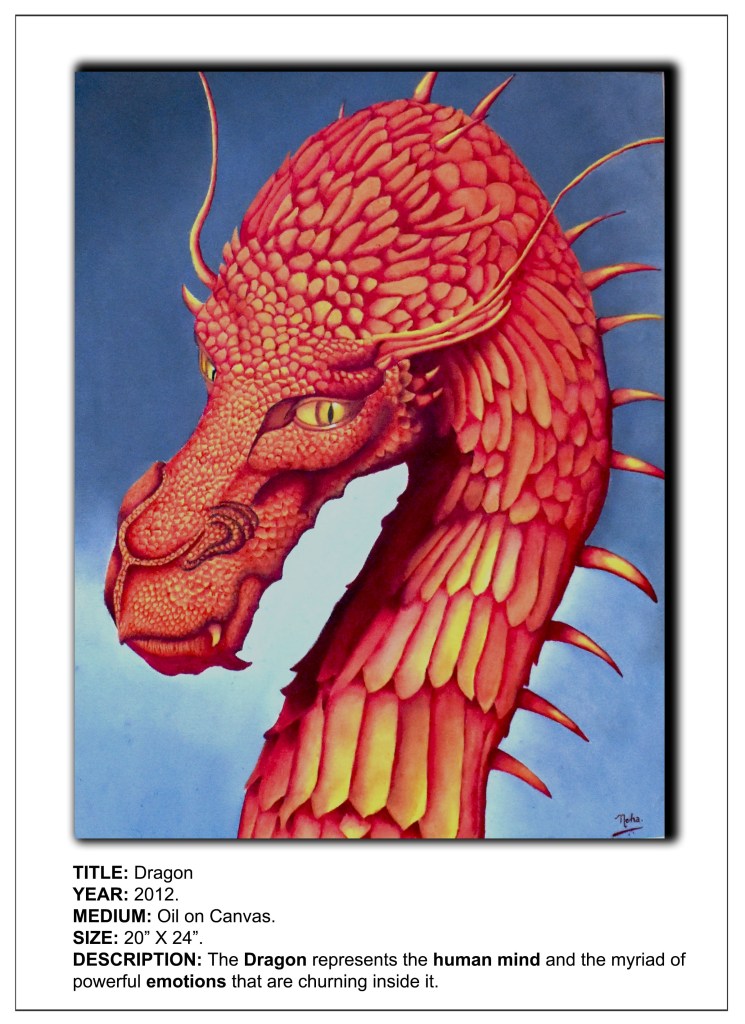
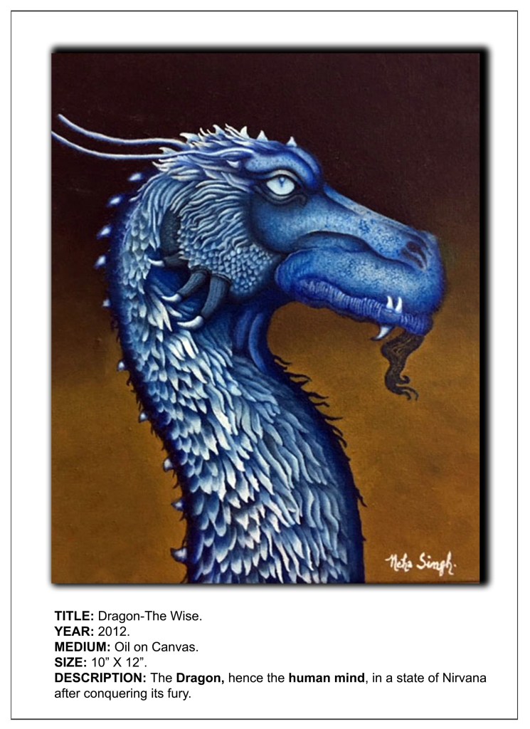
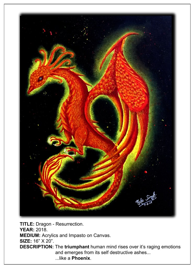
4. Portraits – I have done several portraits, but mostly of dragons, being the dragon lover that I am! I have a couple of renditions of the Buddha as well as of the Hindu deities, Ganesha and Krishna too, which I have named Dragon, Dragon(The Wise), Dragon(The Furious), Dragon(Fury), Dragon – Resurrection, Awakening, Enlightenment, Ekdanta and Mormukutdhari respectively.


5. Sentimental – My art is a vehicle through which I transfer my sentiments to my audience, so most of my paintings mirror my emotions. I believe that almost all my pieces emote and express what I am feeling myself or attempt to invoke and extract some sentiment from my viewers. So definitely, my entire Dragon Series as well as the Navrasa Series have sentimental titles.


6. Numerical – I am yet to use any numbers as part of the naming process for my art.
7. Factual – Not too sure which titles of mine fit in here. To be very honest, haven’t really tried my hands on this type of art yet, but it’s never too late to start!
8. Mysterious – I guess I could include Deep Sea Dweller and Eavesdropper here as they carry that mystic element with them.

Names can increase the popularity of your art in a big way, so if you think that you have created something magnanimous, then go that extra mile to give it that extraordinary title it truly deserves. Assigning your art good titles is as much a part of the creative process as creating the art itself. Many world famous paintings have become masterpieces not just because of the visual, but also the verbal element. As an artist your journey to fame will cross many important milestones, one of them being how you name your art. So choose your titles judiciously, for once you have done so, your artwork will forever be limited within its boundaries and thereafter be defined by it.
Remember, good titles will highlight your work, so brainstorm and let the sparks fly till you ace the “name game!”
DISCLAIMER – All the information, data and imagery in this blog post is for informational and educational purpose only. While there may be copyrighted material the use of which has not always been specifically authorized by the copyright owner, I have only made it available with the sole effort to stimulate creative progress and artistic enrichment. Some images may have been taken from the links included below and I give full credit to these websites/pages, thereby in no way claiming them to be my own. I have also used these links for reference purposes and collection of data; therefore I give full credit to the respective web pages. Most of the data in this post is based on my personal experiences and opinions and I am not responsible for any material that is found in the links at the end of this post.
Sources and Photo Credits –
https://www.easy-oil-painting-techniques.org/title-your-painting.html
https://www.liveabout.com/how-to-title-art-1122628
https://www.ideelart.com/magazine/composition-with-red-blue-and-yellow