Heard of the phrase “Art for Art’s Sake?” It is a simple expression for the philosophy that “true” art is divorced from any didactic, moral, or utilitarian function. The basic idea is that art is by definition aesthetical and thus can have no other purpose. In addition, art’s role is not to educate or to enlighten someone. It exists just for itself.
Oscar Wilde is considered the father of aesthetics. The phrase l’art pour l’art (“art for art’s sake”) was coined by the philosopher Victor Cousin, in 1818. According to him and several other philosophers of the century, social and political themes are irrelevant and should not be used in art making unless they render the final product “beautiful”.
This approach to art was elucidated in the 19th century by the Aesthetic Movement that promoted pure beauty and aesthetic values by accentuating visual and sensual qualities of art rather than practical, socio-political, moral or narrative considerations. So art from this movement didn’t give emphasis to deeper meaning.
History and Origin
The aesthetic movement flourished in Britain in the 1870s and 1880s. In painting it was exemplified by J.M. Whistler, Albert Moore and certain works by Frederic, Lord Leighton. Japanese art and culture was an important influence, especially on Whistler and aesthetic design. Aestheticism shared certain affinities with the French Symbolist movement, fostered the Arts and Crafts Movement, and sponsored Art Nouveau. From 1875 the ideals of aestheticism were commercialized by the Liberty store in London, which later also popularized Art Nouveau.
Nocturne: Blue and Silver – Chelsea 1871 James Abbott McNeill Whistler 1834-1903 Bequeathed by Miss Rachel and Miss Jean Alexander 1972 http://www.tate.org.uk/art/work/T01571
Symphony in White, No. 2: The Little White Girl 1864 James Abbott McNeill Whistler 1834-1903 Bequeathed by Arthur Studd 1919 http://www.tate.org.uk/art/work/N03418
An Athlete Wrestling with a Python 1877 Frederic, Lord Leighton 1830-1896 Presented by the Trustees of the Chantrey Bequest 1877 http://www.tate.org.uk/art/work/N01754
The Bath of Psyche exhibited 1890 Frederic, Lord Leighton 1830-1896 Presented by the Trustees of the Chantrey Bequest 1890 http://www.tate.org.uk/art/work/N01574
Frederic, Lord Leighton
The movement began in reaction to prevailing utilitarian social philosophies and to what was perceived as the ugliness and philistinism of the industrial age. In England, the artists of the Pre-Raphaelite Brotherhood, from 1848, had sown the seeds of Aestheticism, and the work of Dante Gabriel Rossetti, Edward Burne-Jones, and Algernon Charles Swinburne exhibited it and expressed a yearning for ideal beauty through conscious medievalism. The painter James McNeill Whistler raised the movement’s ideal of the cultivation of refined sensibility to perhaps its highest point.
The roots of Aestheticism can be traced back to the 1860’s; however, it was not until the 1880’s that the movement gained noticeable popularity. The Aesthetic movement is often associated with the French term “fin de siècle,” or the “end of the century,” which refers to the closing of an existing era and implies the beginning of a new one. It is often used to describe late 19th century Britain, a time when the ideals of the Victorian Age were losing precedence and being replaced by Aesthetic values. The Aesthetic movement denounced the sober morality and middle-class values that characterized the Victorian Age and embraced beauty as the chief pursuit of both art and life.
The Aesthetic Movement provided a challenge to the Victorian public when it declared that art was divorced from any moral or narrative content. In an era when art was supposed to tell a story, the idea that a simple expression of mood or something merely beautiful to look at could be considered a work of art was radical. In its assertion that a work of art can be divorced from narrative, the ideas of the Aesthetic Movement paved the road towards Modern Art.The movement is often considered to have ended with Oscar Wilde’s trials, which began in 1895.
Modern Day Aestheticism
Although aestheticism emerged more than 150 years ago, it’s still active today and very powerful too. Every time an art movement rejects pure aesthetical approach towards art, supporters of aestheticism raise their voices, questioning the quality of such art. So, aestheticism is not some art movement that existed in history and disappeared into oblivion – it’s still alive.
There are no specific names from the world of contemporary art today that would fit into the genre of aestheticism because artists usually tend to distance themselves from this movement. Apparently majority of contemporary artists reject basic principles and ideas of aestheticism.
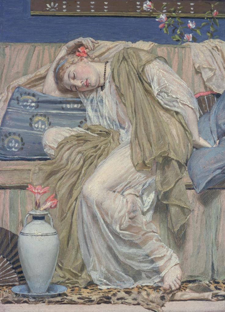
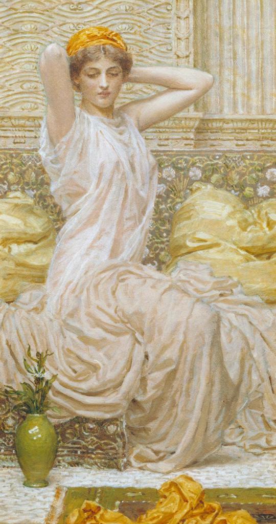
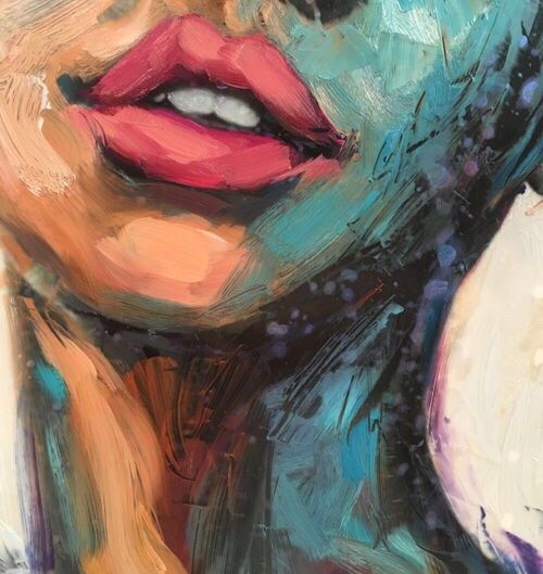
Still, the movement is quite vivid, particularly its intellectual side. If we take a look at the contemporary art scene, we will see that the vast majority of pieces that are popular could not be labeled as products of aestheticism. In my personal opinion there are enough artists who create art with the sole purpose of making something beautiful without any deeper meaning behind it. Here are a few of my favorite art pieces which I feel fit the bill of aesthetic art. I hope you all will appreciate them for their sheer beauty as much as I do!
DISCLAIMER – All the information, data and imagery in this blog post is for informational and educational purpose only. While there may be copyrighted material the use of which has not always been specifically authorized by the copyright owner, I have only made it available with the sole effort to stimulate creative progress and artistic enrichment. Some images may have been taken from the links included below and I give full credit to these websites/pages, thereby in no way claiming them to be my own. I have also used these links for reference purposes and collection of data; therefore I give full credit to the respective web pages. Most of the data in this post is based on my personal experiences and opinions and I am not responsible for any material that is found in the links at the end of this post.
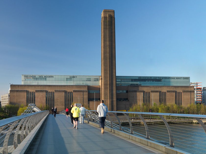
Here I am again, with another “volume” of my art related travels in the UK. This edition, the third in the series, is dedicated to another museum of art in London, but one which is home to more unconventional forms of art and sculpture. I am referring tothe Mecca of modern art in London. So, after soaking in the glory of the National Art Gallery, I headed for the iconic Tate Modern,
When Tate first opened its doors to the public in 1897 it had
just one site, displaying a small collection of British artworks. In December
1992 the Tate Trustees announced their intention to create a separate gallery
for international modern and contemporary art in London.
The former Bankside Power Station was selected as the new
gallery site in 1994. It consisted of a stunning turbine hall, 35 meters high
and 152 meters long, with the boiler house alongside it and a single central
chimney. The following year, Swiss
architects Herzog & De Meuron were appointed to convert the building
into a gallery. That their proposal retained much of the original character of
the building was a key factor in this decision.
In 1996 the design plans were unveiled and the huge machinery
was removed and the building was stripped back to its original steel structure
and brickwork. The turbine hall became a dramatic entrance and display area and
the boiler house became the galleries. In 2009 Tate embarked on a major project
to develop Tate Modern. Working again with Herzog & de Meuron, the
transformed Tate Modern makes use of the power station’s spectacular redundant
oil tanks, increasing gallery space and providing much improved visitor
facilities.
The Tate Modern has seven floors. The first four are
the free galleries. Art works are arranged by theme. Within each gallery
floor there are multiple rooms containing the works of individual artists. The structure of the building is art in itself and can
be viewed best from the bridges between the two gallery spaces.I started my tour from the first
floor and work my way up. Then I crossed over to the other side of the museum
and work my way down.
Tate Modern
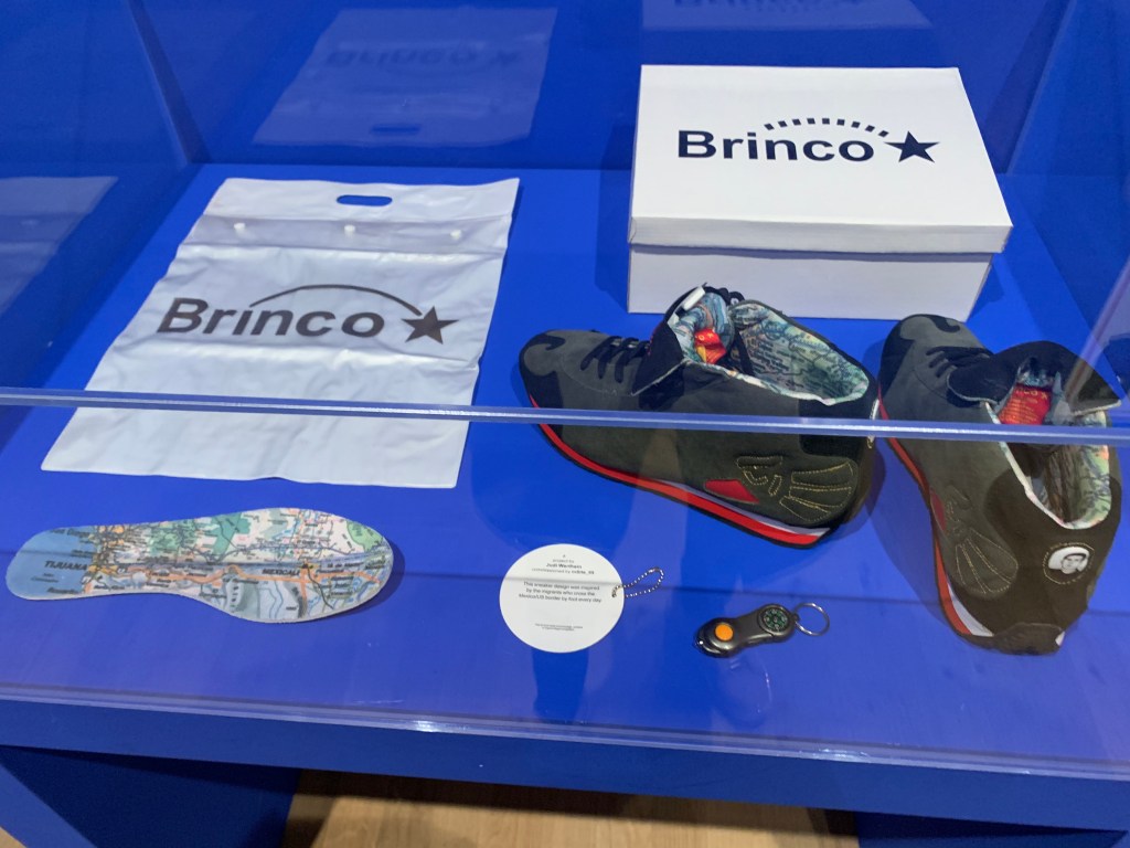
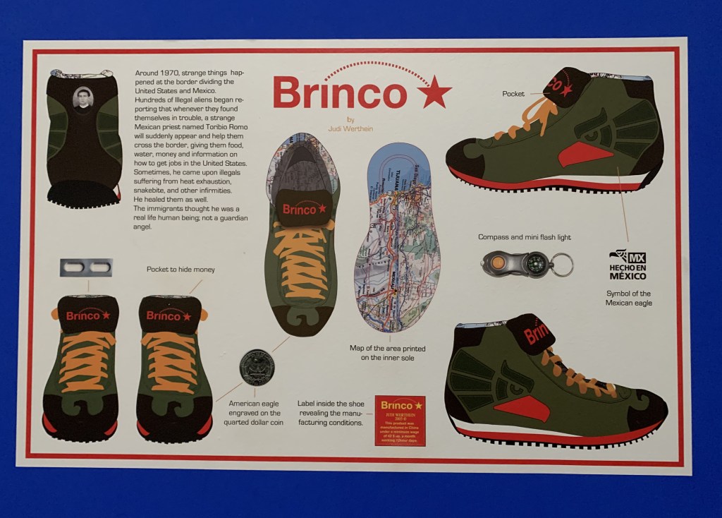
The first display I saw was quite unique. Argentinean artist Werthein set up a trainer brand, Brinco (‘jump’ in Spanish) in 2005 and distributed them free of charge to people attempting to cross the border illegally in Tijuana, Mexico. The trainer’s design includes eagle motifs inspired by American and Mexican national symbols, and an image of Saint Toribio Romo, the patron saint of Mexican migrants. The shoes also feature a torch, a compass and pockets to hide money and medicine. Printed on a removable insole is a map of the border area around Tijuana. The display includes responses to the project, such as media reports, online reactions and threatening messages received by the artist.
Brinco
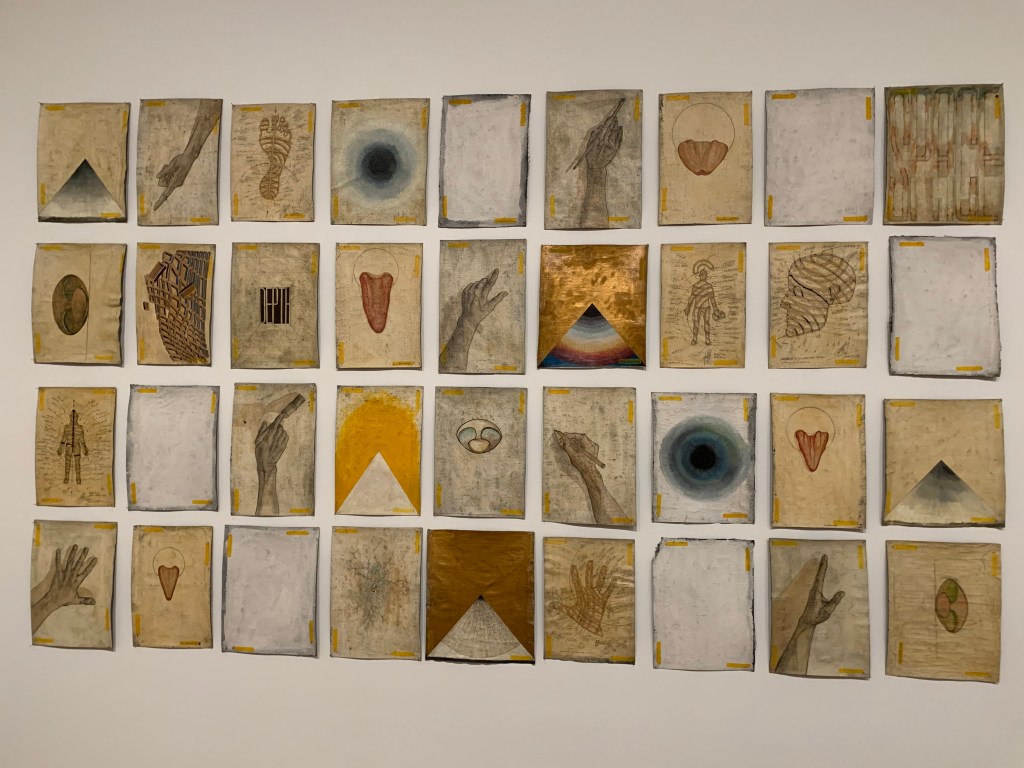
The next display was titled 36 Possibilities Realized Simultaneously by Paul Neagu. It consists of thirty-six individual drawings on canvas in a range of media including oil paint, pencil, ink and gesso. The drawings reflect a variety of styles. Possibilities Realized Simultaneously is a ‘collaborative work’ made by the Generative Art Group which Neagu founded in 1971. The group had five members: Neagu himself and four fictitious characters. Each character worked in his own distinctive style, allowing Neagu to explore different aspects of his artistic practice.
36 Possibilities Realized Simultaneously
Romanian-born Neagu started to make ‘tactile’ and ‘palpable’ objects which are articulated constructions whose hinged or moving parts were originally intended to be physically manipulated by the spectator. They often incorporate boxes or compartments containing various tactile substances, such as fabrics or leather. The Great Tactile Table is one of these figurative tactile objects. These works comprise figures in the form of numerous individual boxes into which spectators could dip their fingers and feel various substances and textures. The compartmentalized structure refers to the cellular composition of the human body. It is also a metaphor for larger systems, such as society, which consist of individual yet interrelated parts.
The Great Tactile Table
Other exhibits in the ‘palpable objects’ series include the Ceramic Skull in which rectangular shapes are stacked in tiers to form the shape of a human skull. This head, formed of cellular elements addresses the nature of the human body and experience. It is an apparent whole, yet divisible into a number of discrete parts, sensations and experiences. The second one is Full Hand, a sculpture of a hand made up of ten horizontal rows of carved wood connected with spikes that run vertically through the construction. The cellular structure of the hands relates to Neagu’s interest in the human body as a microcosmic model for larger systems.
Ceramic Skull
Full Hand
One more interesting artwork of Neagu’s is Jump. The leaping man shown here recalls Neagu’s video Hyphen Ramp which shows the artist repeatedly jumping against the gallery wall. The phrase ‘impulses and vectors’ appears to the right of this figure. ‘Impulses’, for Neagu, refer to the body’s actions and movements. ‘Vectors’ are more regular systems or structures, such as the grid-like divisions filling the shape of the leaping man. The artist has described his performance work as an attempt to reach a state of ‘fusion between impulses and vectors.’
Jump
The next installation I liked, simply called Untitled 2001 is the brainchild of Polish artist Edward Krasiński consists of twelve mirrors of equal size suspended from the ceiling, and Krasinski’s signature blue Scotch tape. A continuous strip of tape is stuck horizontally onto the walls of the room at a height of 130cm from the floor. The verso of each mirror, which is black, also has a strip of blue scotch tape stuck to it. The mirrors, all facing in the same direction, reflect the surrounding architecture, the black backs of the other mirrors with their blue strips, and the continuous blue strip on the wall. This creates the illusion of a space that both recedes and advances depending on the viewpoint of the visitor.
Untitled 2001
I lovedIrina Nakhova’s spatial experiments created within her apartment in 1980s Moscow which have been displayed at Tate under the title Room No. 2. For this, Nakhova removed the furniture from the 4 x 4 m² living room of her apartment, covered the surfaces with white paper and layered them with grey and black shapes. Exhibited here, Room No. 2 was the second of four ‘total installations’ that she made in the apartment.
Room No. 2.
Nakhova’s 1989 painting Simultaneous Contrast experiments with the shift between two-dimensional and three-dimensional space. Borrowing details from a 1930s Soviet album of photographs, Nakhova produced abstract forms from material linked with the Soviet system.
Simultaneous Contrast
One of the works showcased in the next room was by the French-American artist Niki de Saint Phalle. Titled Shooting painting, it involved the artist or the audience shooting at the canvas. The base of the painting is a wooden board covered in a layer of grey plaster reinforced with wire mesh. It was then layered with textured white plaster, concealing small bags of liquid paint. When the bags of paint were hit by bullets, the paint cascaded down the plaster surface.
Shooting painting
I fell in love with a large scale collage called La Moscos created by the artist Mark Bradford. It includes materials found by the artist on the streets around his studio in Los Angeles, USA. Visually suggestive of aerial maps of sprawling, urban areas, the collage is constructed entirely from paper fragments which, the artist believes, ‘act as memory of things pasted and things past. You can peel away the layers of papers and it’s like reading the streets through the signs’. The work takes its title from a derogatory slang term for migrant day laborers in the San Francisco Bay Area, reflecting the artist’s long-standing interest in the sub-cultures of the inner city.
La Moscos
Another canvas that I identified with was Charles Atlas Landscape. This is the work of American artist Edward Ruscha. In this painting, Ruscha plays with the shape of the canvas. Painted representations of metal bars appear to ‘push’ the sides of the canvas stretcher, apparently making them curve outwards. Ruscha has suggested that this painting is also a ‘portrait of a He-Man exploring the fury of muscle power’. Charles Atlas was an Italian-American bodybuilder. His exercise program spawned an advertising campaign featuring his name and likeness.
Charles Atlas Landscape
One subject painted frequently by Ruscha throughout his career is the American Flag. With his earlier flags, from the 1980s, he chose the subject because of their status as common objects and instantly recognizable symbols. He returned to the subject several years later with the painting tilted Our Flag 2017, where the flag is torn and damaged, showing the passage of time. This may also be interpreted as a comment on the divisive nature of recent political events. Of this work Ruscha has said ‘any flag that flies for 250 years is bound to get a little ragged and tattered, especially if we help it along.’
Our Flag 2017
I
am always drawn towards big canvases and compositions, especially ones that
make good use of space. One such artwork at Tate that appealed to me was InkSplash II 2012 by El
Anatsui. Theartist
was born in Ghana but lives and works in Nigeria.Ink Splash II 2012 is a large wall piece in which Anatsui
has connected several interwoven strips of flattened aluminum bottle tops using
copper wire. This horizontal composition has a metallic shimmer dominated by a
silver tonal palette in which blue and yellow splashes evoke gestural
brushstrokes – presumably the ‘ink splashes’ of the title. The large blue areas
lead the gaze from the upper left corner to the bottom right, pushing out
smaller yellow splashes, which are spread out and almost blurred across the
silvery surface. As if it were real paint escaping from a canvas, a blue patch
of woven metal spills from the bottom of the work onto the gallery floor.
The materials Anatsui uses – copper wire and bottle tops –
are part of that encounter and a reminder that the artist’s work involves
change and regeneration. Moving away from common definitions of so-called
recycled art or junk art, yet using objects found locally, Anatsui has found an
aesthetic that attempts to speak directly to the experiences of individuals and
communities immersed in that encounter.
InkSplash II 2012
When you think of the word collage, you would probably think
of a
collection of pictures that
are put together to make a single picture.
In the world of fine art, it refers to a work made with various small objects
sometimes with paint, sometimes without. The word can also be used to mean a collection of different
things. It is generally a piece of art made by sticking various materials such
as photographs and pieces of paper or fabric on to a backing.
The
reason why I’m talking about collages is because the ones I came across at Tate
were not only unique but also surpassed all boundaries defining the word
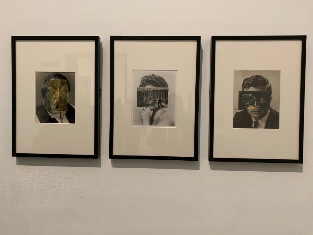
collage. Mask XI 2005, Mask XIII 2006
and Mask XIV 2006 by the British artist John Stezaker are a
deceptive threesome of collages in which he hascovered
an old publicity portrait of a film star with a postcard. The postcard becomes
a mask over the face, but rather than just concealing, it opens a window into
another space. This pair of images activates our innate tendency to interpret
faces in patterns and imagery. The scene in the postcard could be seen to
reflect the interior state of the figure. Alternatively, by replacing eyes with
blankness or holes, it might be showing us death beneath the features of a
living being.
Mask XI 2005, Mask XIII 2006 and Mask XIV 2006
Another unconventional set of collages exhibited at Tate
appealed to me not just for their uniqueness but also because they were by an
artist from my homeland, India. Mild
Terrors II 1991-6 by CK Rajan is one of a group of ten collage works in Tate’s
collection from his larger series Mild
Terrors II. The works in Mild
Terrors II were made in the artist’s native India using images cut
out from newspapers and glossy magazines. In these collages Rajan has
transposed images of body parts and consumer goods onto local Indian landscapes
and urban scenes depicting both historic buildings and newer housing
developments.
Rajan used both color and black and white newspaper images
for these collages. He would generally start with a background image pasted
onto white A4-sized paper and then add fragmentary images of body parts, often
female, to the background scene. The disembodiment heightens the sense of the
impact this rapid change might have on the ordinary Indian. Rajan’s works
relate more to the surrealist collages of European artists like Max Ernst or
the pop art experiments of artists such as Richard Hamilton and Martha Rosler.
Mild Terrors II 1991-6
When I saw the work of another Indian artist on display at
Tate, my happiness knew no bounds. This was Mrinalini Mukherjee, an Indian
sculptor and the artworks exhibited were Ritu
Raja 1977 and Jauba 2000.
She
transformed a common everyday material, natural rope, into incredulous
sculptures. Her early works such as the
wall-mounted Ritu
Raja 1977 were made from rope woven from hemp
in two shades, the natural colors of the material accentuating the sensual
forms. The title in Bengali refers to a ‘king of seasons’, usually the fertile
spring.
Ritu Raja 1977
She created Jauba (Hibiscus) 2000 by knotting yarn made from dyed hemp fiber over a vertical metal armature, with the bulk of its woven detail on the front. The yarn has been dyed red, green and black and is woven into pleated organic forms which drape the frame like a robe. ‘Jauba’ means hibiscus in the artist’s native language Bengali. Visually, the sculpture resembles a botanical, floral form, roughly symmetrical, which droops slightly towards the floor due to the weight of the material.
Jauba (Hibiscus) 2000
Untitled 1964….That
was the title of an artwork by the Japanese
avant-garde artist Yuko Nasaka, who is known for her involvement with the
Gutai Art Association. If you are not aware of this association, it wasformed
in 1954 in Osaka by Yoshihara Jiro, Kanayma Akira, Murakami Saburo, Shiraga
Kazuo and Shozo Shimamoto. The word has been translated into English as
‘embodiment’ or ‘concrete’.
Like other members of the group, Nasaka placed a great
emphasis on the process of making an artwork. For this work, she placed each
plaster panel onto a mechanical turntable inspired by a potter’s wheel. As it
rotated, she carved patterns into the material using a palette knife. The
recurring image of the circle suggests a timeless sense of harmony, while the
dark-blue silver lacquer that she applied afterwards conveys a more industrial
quality.
Untitled 1964
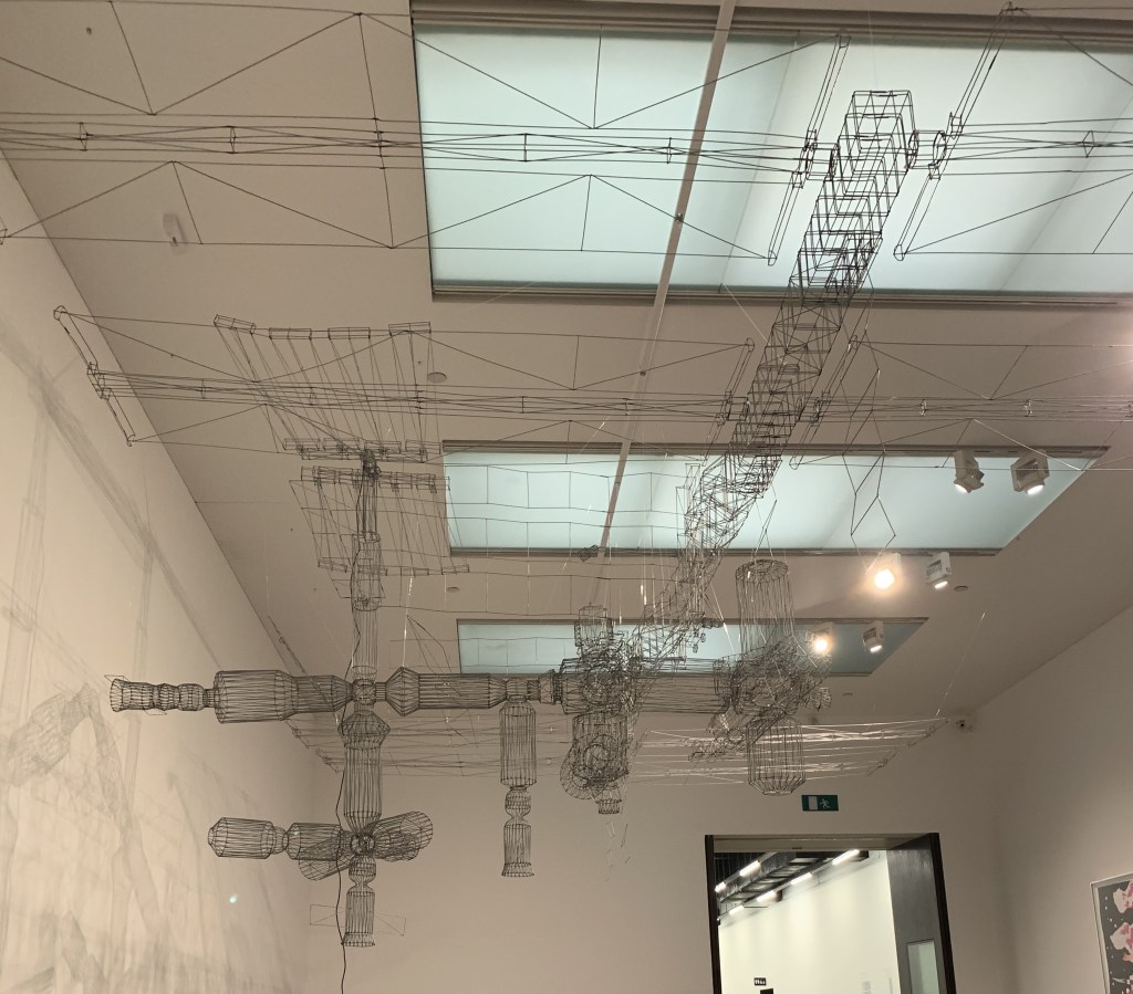
Ever seen a model of the International Space Station made from hundreds of metal coat hangers? Ten Minute Transmission 2003 is just that. This installation by James Rosenquist and the duo Allora & Calzadilla serves as the elaborate antenna for a radio that attempts to make contact with the real ISS as it passes overhead. The artists want to draw attention to what international means: Despite its name, the ISS is controlled by a handful of powerful nations in the global north; this poses a big political question about who gets to be represented in the extraterrestrial realm.
Ten Minute Transmission 2003
The thing that I loved the most about the
Tate Modern is the size. I never felt I couldn’t see the art because of space
constraints or the crowd. Each gallery was spacious enough to ensure that the
art was easily visible to all viewers and no one’s view was blocked by another
viewer. As I mentioned earlier, the
availability of large spaces inside the museum made it convenient for larger scale
works of art to be exhibited.
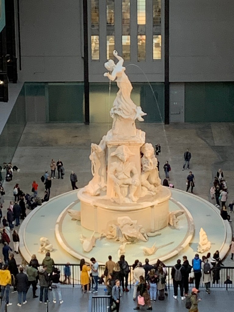
The Turbine Hall at Tate happens to house one such monumental sculpture called Fons Americanus. It is a 13-meter tall working fountain inspired by the Victoria Memorial opposite Buckingham Palace and has been commissioned by the African-American artist Kara Walker as part of the annual Hyundai Commission at Tate.
Rather than a celebration of the British
Empire, Walker’s fountain explores the interconnected histories of Africa,
America and Europe. She uses water as a key theme, referring to the
transatlantic slave trade and the ambitions, fates and tragedies of people from
these three continents. Fantasy, fact and fiction meet at an epic scale.
This commission has been made using an
environmentally-conscious production process and has been built from recyclable
or reusable cork, wood and metal. The surface covering is made from a non-toxic
acrylic and cement composite that can be used for sculpting or casting. It
avoids the use of large quantities of non-recyclable materials and harmful
substances often found in the production of exhibitions and installations.
Fons Americanus
Although I’m not a great fan of modern art as most of the time I don’t get the message modern artists wish to convey through their work, but I can appreciate it for the sheer resolve, so even though I couldn’t relate with many of the pieces exhibited at Tate, I’m full of admiration for the effort put in by the artists in question.
The ones that I did relate to, I have
shared with you all, but I believe art is totally subjective. What clicks with
me may not click with you and vice versa. So in order to form your own opinion
about modern art, a visit to Tate Modern is a must.
Tate turned out to be a real eye
opener for me and gave me a peek into a world full of infinite possibilities
when it comes to creating great pieces of art. I hope you all will be as
inspired as me after this little glimpse of Tate that I have shared with you
all.
DISCLAIMER – All the information,
data and imagery in this blog post is for informational and educational purpose
only. While there may be
copyrighted material the use of which has not always been specifically
authorized by the copyright owner, I have
only made it available with the sole effort to stimulate artistic progress and
enrichment.Most of the photos included in this post are my personal
copies which I clicked during my trip to the UK. However, some images may have
been taken from the links included below and I give full credit to these
websites/pages, thereby in no way claiming them to be my own. I have also used
these links for reference purposes and collection of data for this post,
therefore I give full credit to the respective web pages for their data. Most
of the data in this post is based on my personal experiences and opinions and I
am not responsible for any material that is found in the links at the end of
this post.