Back with a Bang! – Part 4

Mother Nature is the original artist and her creations are the purest forms of art. Everything from the sky, the earth, the sea, the rocks, the stones, the soil, the fallen leaves and even the spider’s web in nature provides us with phenomenal inspiration.

An artist can impersonate Mother Nature by reproducing her as she appears in reality or can just take visual cues from her varied forms. When the artist studies, observes and gets influenced by natural forms and phenomena, then nature becomes his or her most treasured muse. Nature not only provides inspiration, but also many of the mediums that artists use to create their masterpieces such as wood, charcoal, clay, graphite, and water. 

Nature is all around us and that means so is art. But in order to get inspired by nature, one needs to spend time with her. In today’s digital world of virtual realities, we seem to have disconnected ourselves from the natural world. For an artist, this can prove detrimental.

I too found myself guilty of this crime. So, I decided to unplug myself, turn off the idiot box and my laptop and go outside to tune into my surroundings. I decided to feel the wind’s brushstrokes on my cheek, catch a glimpse of the rainbow, get an earful of a gurgling brook, smell the roses and get a taste of Mother Nature’s harvests.

So here I am, with the last edition of my 4 part series about art in the UK. This one is an ode to nature, the ultimate artist and her various sights and sounds that I had the pleasure of experiencing in this beautiful country.  So read on and feast your eyes on some stunning imagery!

The Stonehenge

“To be the agent whose touch changes nature from a wild force to a work of art is inspiration of the highest order.” – Robert Rodale.

I wanted to observe Nature and apply every little element of hers to my art. And what better way to do this than to go back to our roots, our origins and our history! The perfect opportunity to do this came along in the form of a trip to the historic Stonehenge. Not only is it a marvel of man’s creative genius, but also the perfect example of his unbreakable bond with nature. So when I was offered a chance to see these ‘prehistoric stones’, I jumped on it. I wouldn’t let it go for anything in the world!

How did these massive rock formations get there? Who put them there and for what? These are some of the questions that keep popping up in my head every time I think about the historic Stonehenge. When I caught its first glimpse, I was in sheer awe…to be able to build a structure like that in those days in the absence of tools and technology was pretty awesome. Moreover, the fact that historians and archaeologists are still puzzled about the origins of these concentric rings of gigantic stones, further adds to their mystery and enigma.

So how was it built? Apparently, the Stonehenge took Neolithic builders an estimated 1,500 years to build using roughly 100 massive upright stones placed in a circular layout. Its construction is quite baffling because, while the sandstone slabs of its outer ring hail from local quarries, scientists have traced the bluestones that make up its inner ring all the way to the Preseli Hills in Wales, some 200 miles from where Stonehenge sits on Salisbury Plain.

How, then, did prehistoric builders without sophisticated tools or engineering haul these boulders, which weigh up to 4 tons, over such a great distance? Was it with sledges and rollers made out of tree trunks to roll them down Preseli Hills and rafts to float them up toward Salisbury Plain, or supersized wicker baskets, or maybe even a combination of ball bearings, long grooved planks and teams of oxen? Who can say for sure?

How about glaciers? Perhaps Stonehenge’s mammoth slabs were snatched from the Preseli Hills by glaciers during one of the Ice Ages and deposited a stone’s throw away from Salisbury Plain. Although I’m wondering how forces of nature could possibly have delivered the exact number of stones needed to complete the circle.

But what was their purpose?  Was it a burial ground, a ceremonial site, a religious pilgrimage destination, a final resting place for royalty or a memorial erected to honor and perhaps spiritually connect with distant ancestors? Could it be an astronomical calendar, with different points corresponding to astrological phenomena such as solstices, equinoxes and eclipses? Or was it a place of healing, maybe because bluestones were thought to have curative powers?

So many questions but no concrete answers. That’s Stonehenge for you!

I never thought I would be so mesmerized by a pile of stones, but the iconic site proved to be monumental for me. Not only was I fascinated by the history and mystery surrounding it, but also by the pure architectural genius behind its construction. Personally for me, the Stonehenge has become a major source of inspiration and I would love to put it down on canvas in a way that justifies it element of mystery. How? That’s another question I’ll leave unanswered! At least for the time being….

Scotland

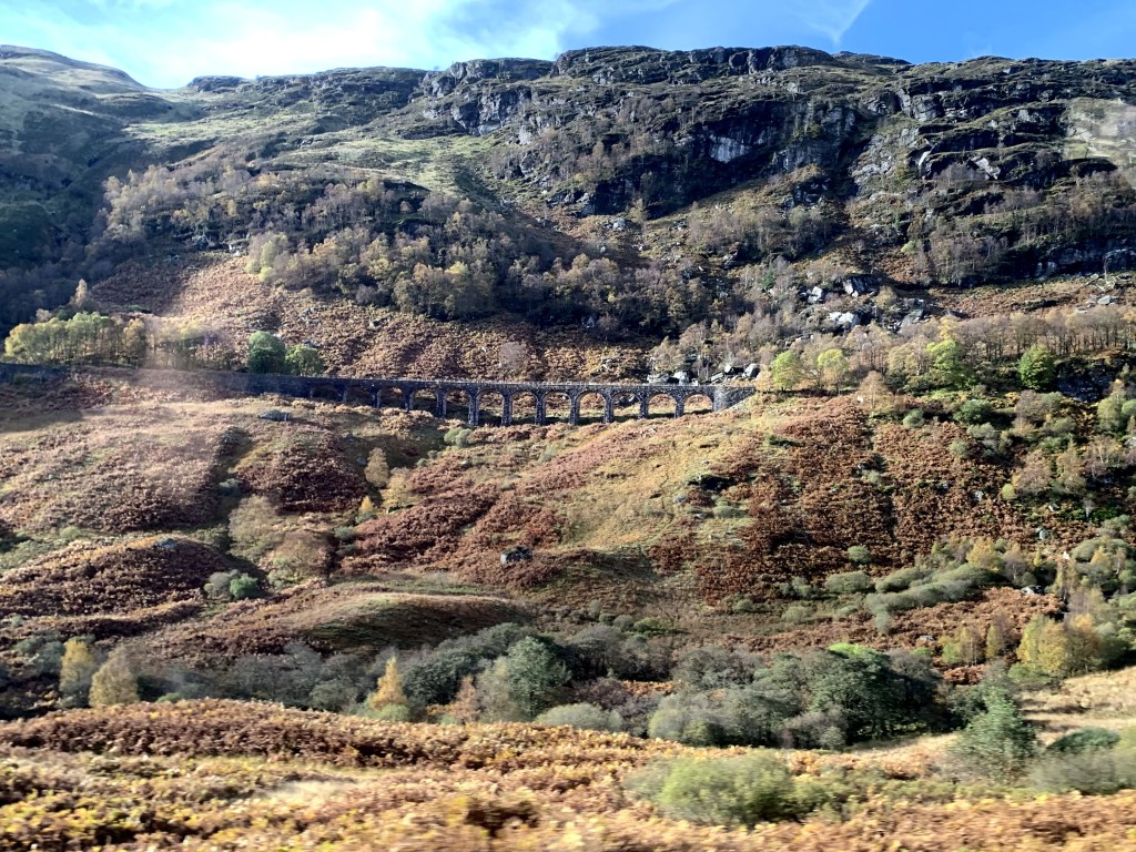
Having done with the awe-inspiring artistic locales of London, I moved on to my next destination, the breathtakingly beautiful Scotland. Here, I fell in love with art all over again. Not just man, but Mother Nature has also been at her creative best in this mesmerizing land and has provided ample opportunities for artists like me to take inspiration from. The majestic architecture of the castles in Edinburgh left me speechless and in awe of this country of kilts, tartans and bagpipes.

Here too, I wanted to experience Scotland from a different perspective…that of an artist. So I set off to explore the captivating Scottish landscape, soaking in its vibrant sights and colors for inspiration. Today, I’ll share with you all everything that has inspired me to pick up my paint brushes and just create art on my canvas.
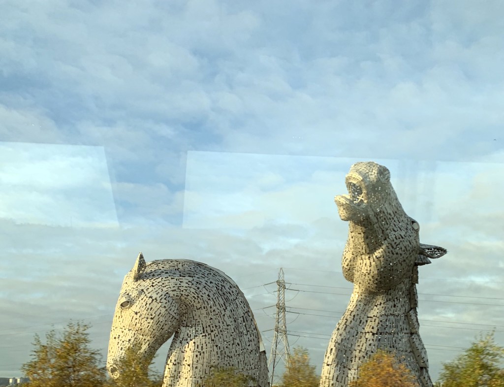
The Kelpies

During my two day trip to Scotland, I got to see a great mix of architecture, art, sculpture, historical monuments and so much more. On the second day, I took a day long bus tour and our bus driver-cum-tour-guide kept us entertained with his constant prattle about the history of Scotland. Every now and then he would point out to something or the other of significance. Just as I was about to doze off, suddenly out of nowhere, two gigantic, glinting horse heads, stretching almost a hundred feet high, appeared  in front of me.

These magnificent sculptures are called Kelpies. They are a pair of 30m-high horse-head sculptures weighing around 300 tons each and were designed by Scottish figurative sculptor Andy Scott. The Kelpies are inspired by the heavy Clydesdale horses which powered much of Scotland’s industry and economy, pulling wagons and ploughs but also barges and coal ships.

Their name however derives from mythical creatures of old Celtic tales. According to these, they are shape-shifting water spirits, often appearing as horses and sometimes as humans who live in the lochs and rivers of Scotland, luring innocent souls into their realm – they are said to have the strength and endurance of more than ten horses. 

It is believed that if you get curious and decide to stroke the horse’s mane, you might find yourself wanting to mount it and go for a ride. But once you are on the horse’s back you cannot get off, and the horse runs deep into the water, taking you forever from the land. So, if you ever find a wild horse standing alone by the water in Scotland, leaving it alone would be a good idea!

Once again these alluring creatures have motivated me to capture their magic with the help of my brushes and paints. I can hardly wait!  

The Kelpies

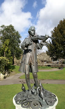
The Parade Garden Sculptures

The bus tour took us through the Highlands and all the way to Loch Ness. Once again, I got to see some stunning architectural marvels and sculptures. But what stuck with me were these dainty little sculptures surrounded by lush green manicured grass at the Parade Gardens. The gardens are particularly noted for their displays of traditional carpet and sculptural bedding.Another interesting sculpture at the Parade Gardens is  that of young Mozart depicted playing his violin (after the famous Salzburg statue) standing on a raised, pierced and scrolled bronze base, adorned with three doves, two squirrels and a mouse at Mozart’s feet.     

Mother Nature, the ultimate artist

Man has drawn inspiration from nature right from the prehistoric times. Whether it’s cavemen drawing animals on walls, the great masters of art of the recent past or the contemporary artists of the present, nature has undoubtedly been one of the most endearing inspirations for them all. Even in today’s technology-driven world, nothing can invoke creative excellence quite like nature does.

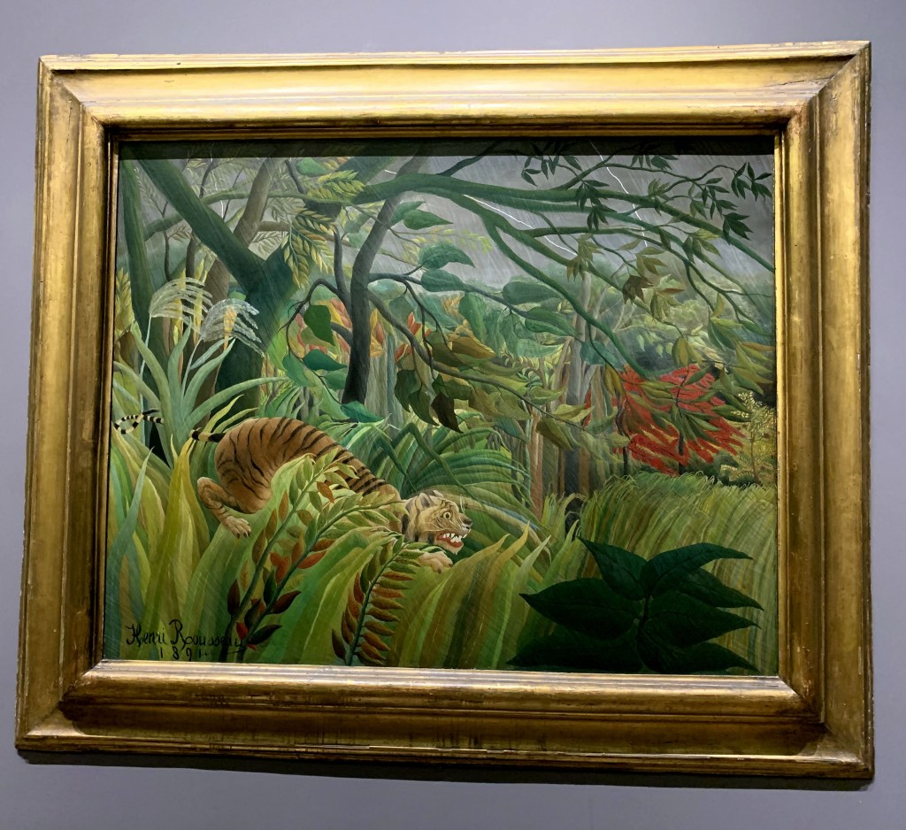
Since time in memoriam, artists have been intoxicated by the beauty of nature. From Van Gogh’s famous “Irises” to Rousseau’s “Tiger in a Tropical Storm (Surprised!)”, the countless avatars of Mother Nature will continue to fascinate and inspire some of the most celebrated works of art in the world.

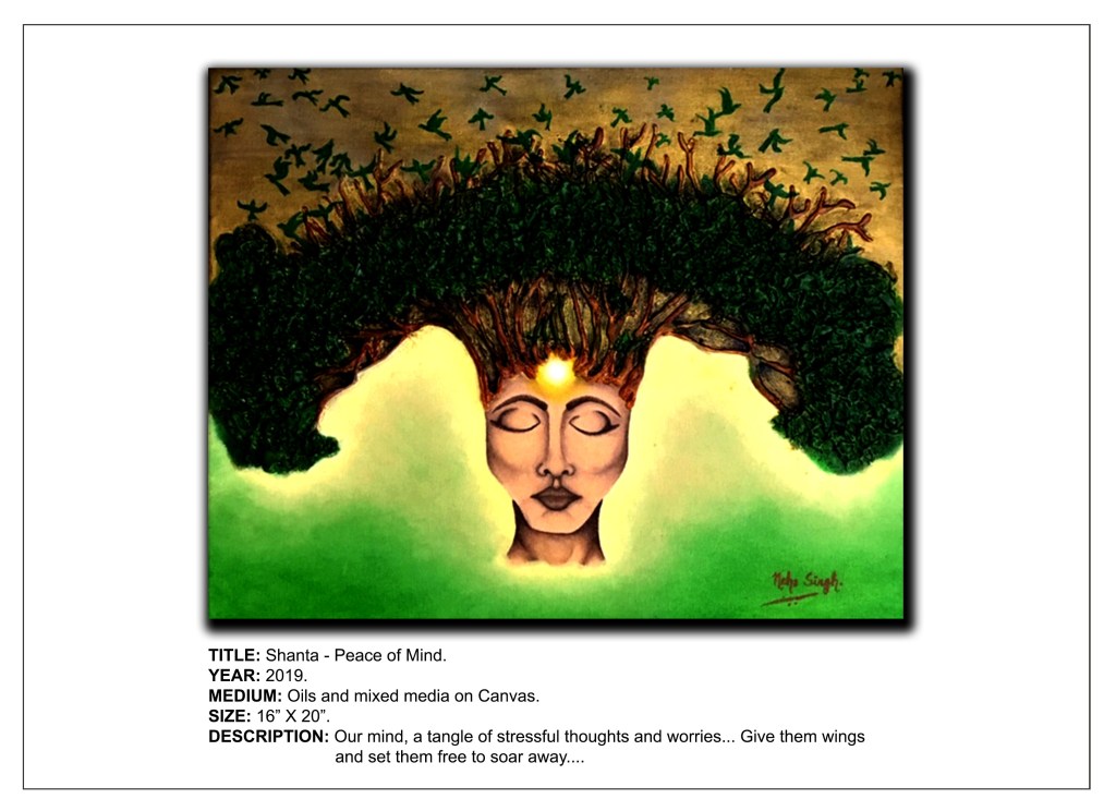
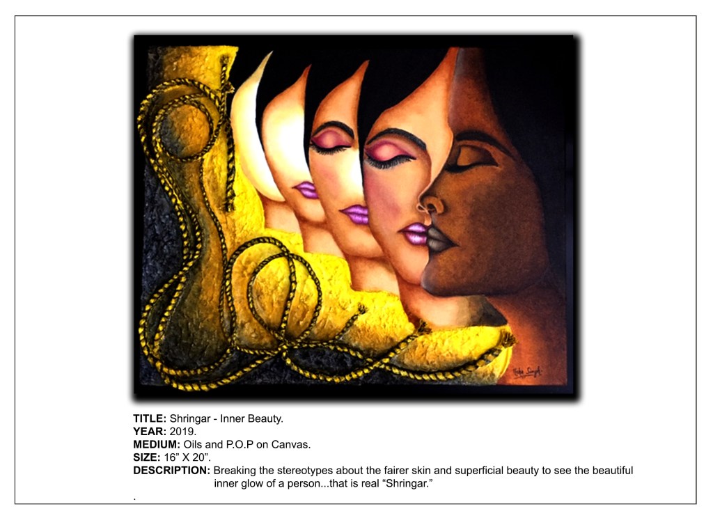
I find that I see inspiration all around me. There is always something or the other in my surroundings that catches my eye and makes me ponder how I can incorporate it into my art. It can be absolutely anything, be it the texture of a tree’s bark, the colors of autumn leaves or the varied shapes of rocks and pebbles. The minute I spot something of interest, out comes my phone and its image is captured by the lens and preserved for posterity. Who can say what portals of creativity they may open in my mind? Only time will tell!

During my travels in the UK, I came across such inspiring sights of nature that I was brimming with excitement. I also saw such a spectacular blend of nature and man-made structures that it seemed to open newer gateways to infinite possibilities of artistic innovation for me. I felt as if I had hit the Jackpot! It gives me great pleasure to share some of the precious jewels out of my stash of photos that I had clicked.

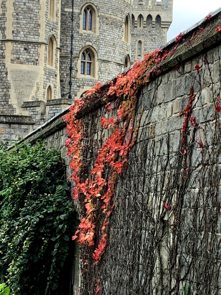
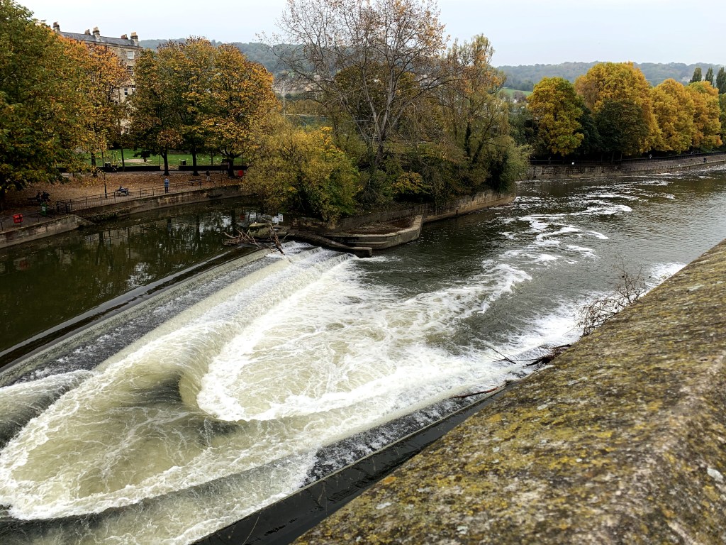
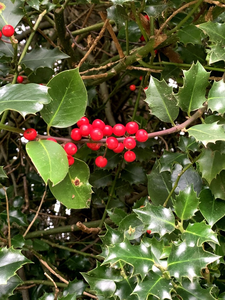
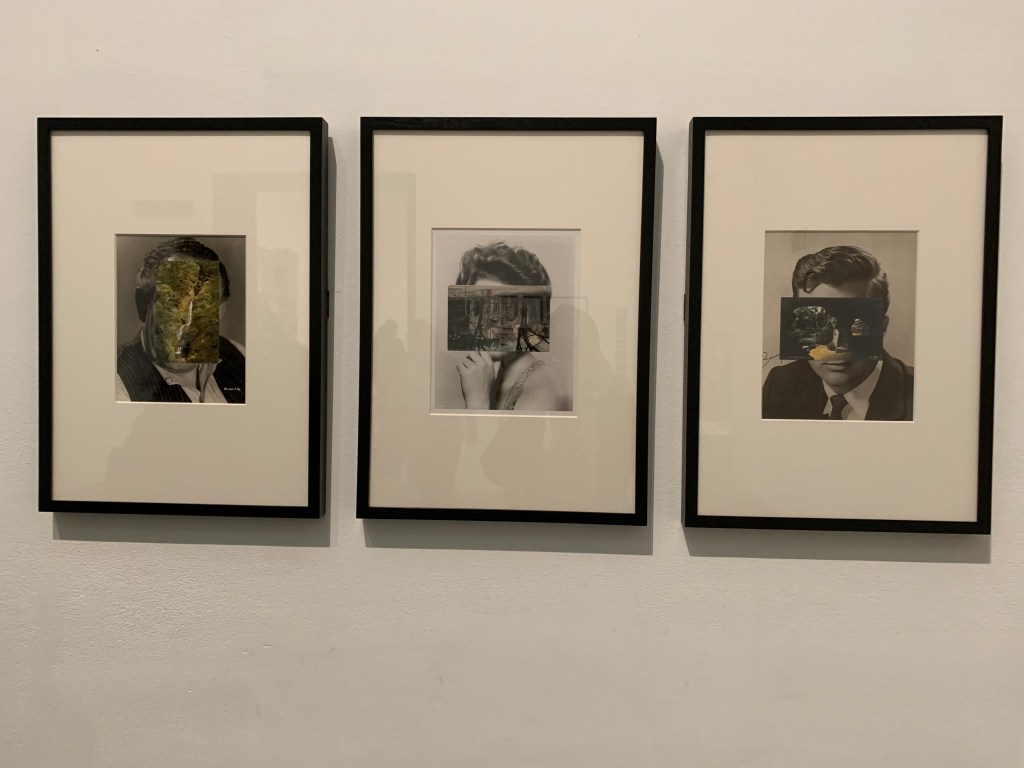
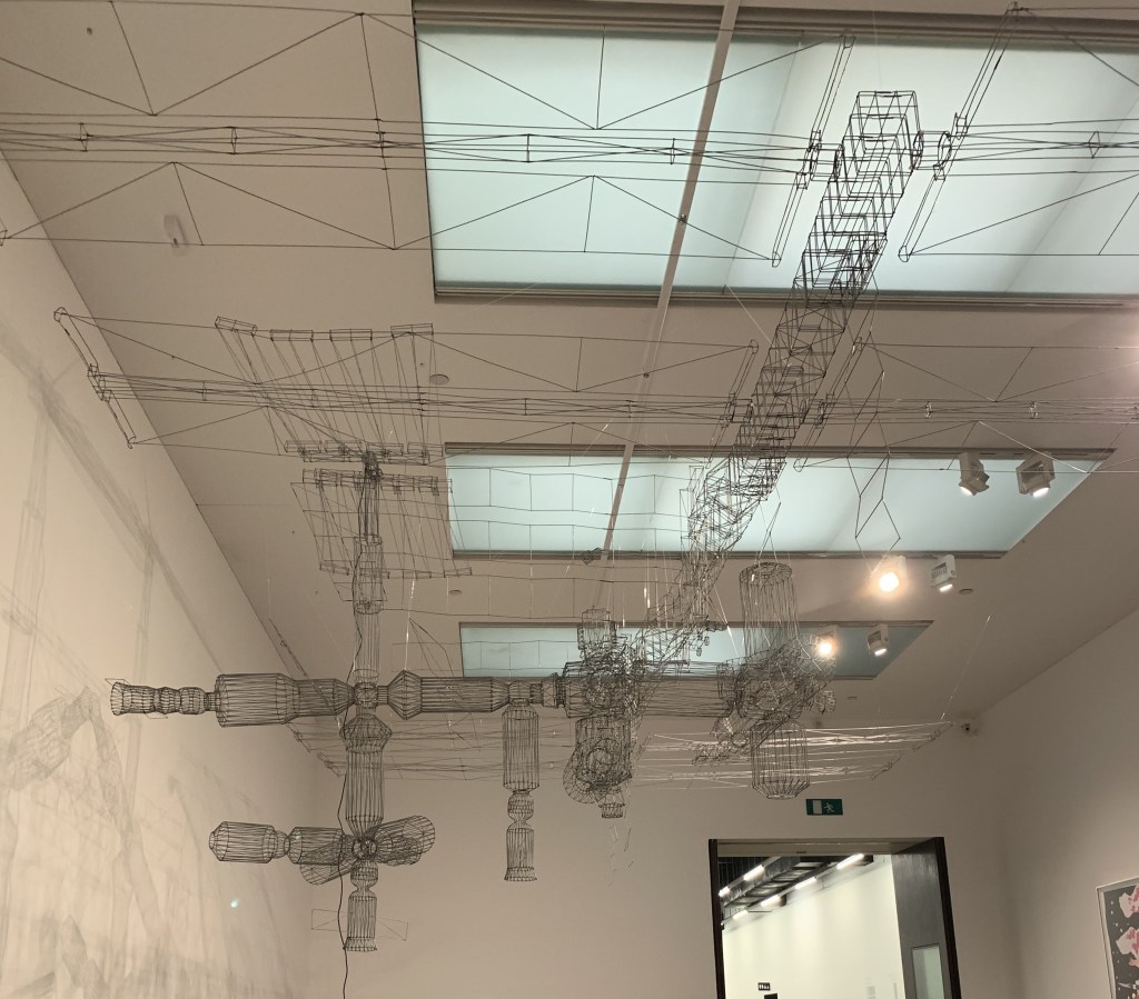
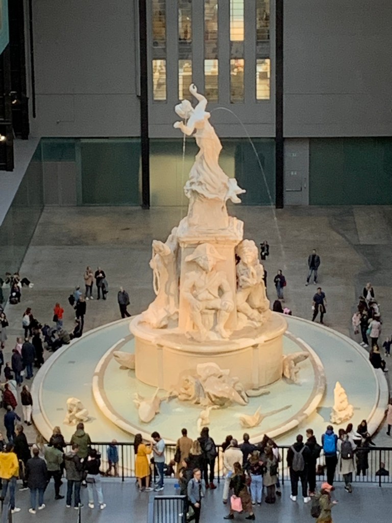
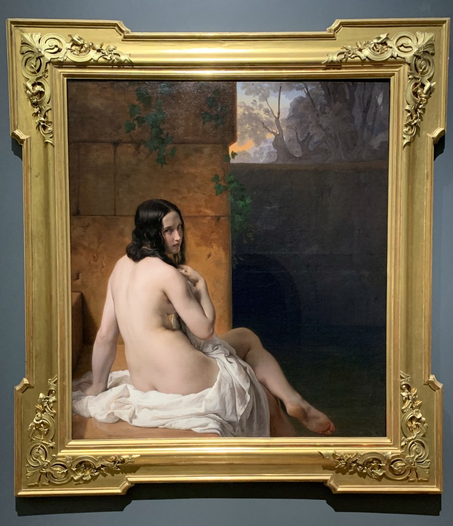
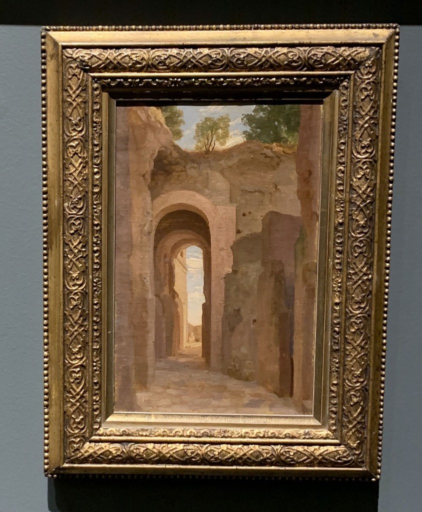
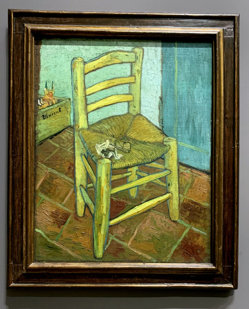
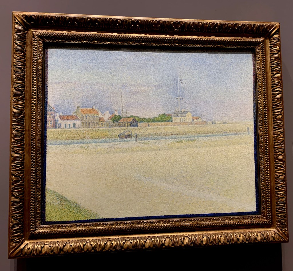
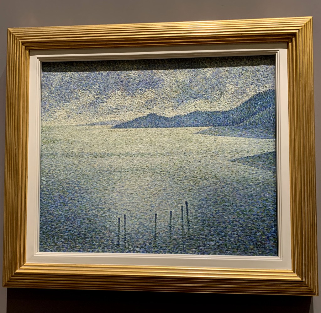
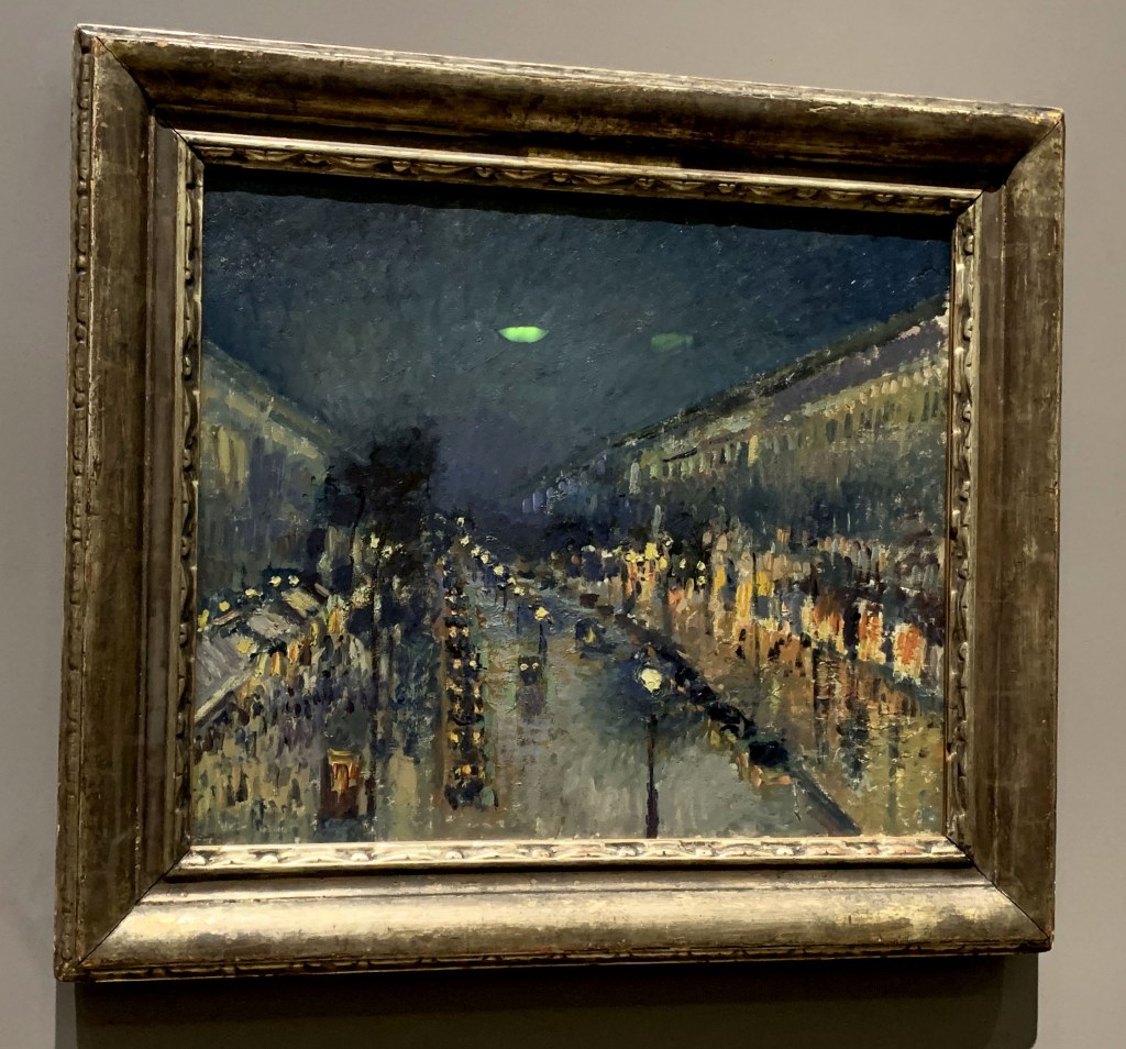
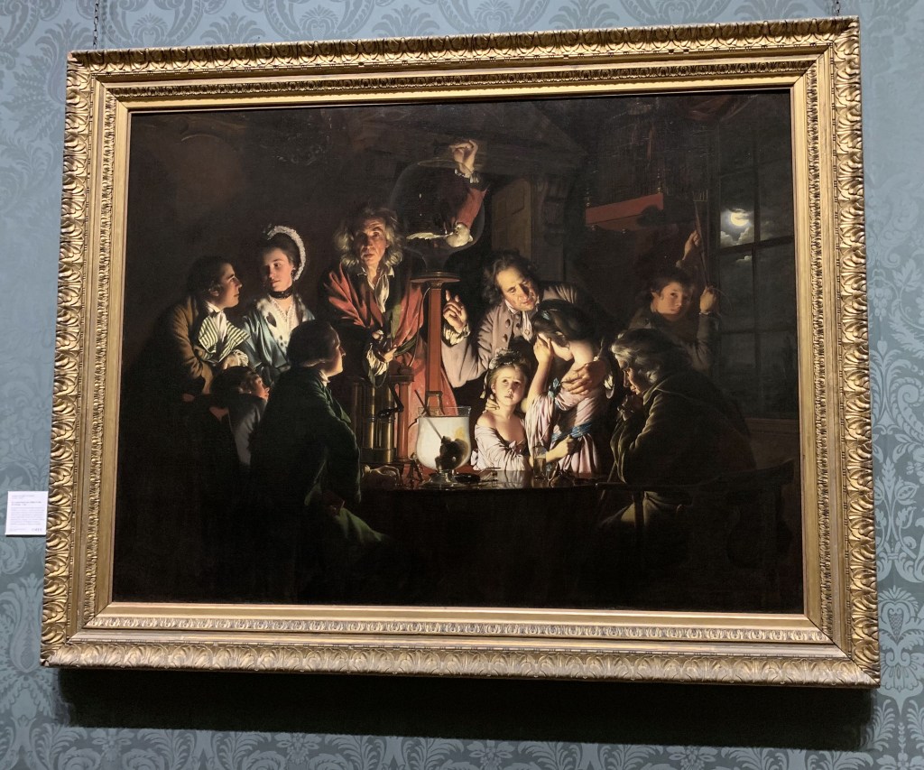
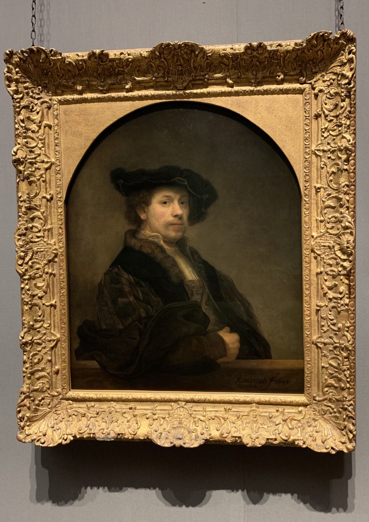
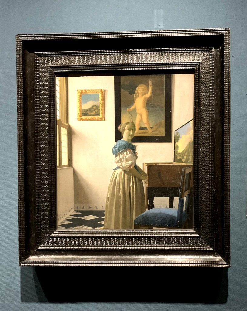
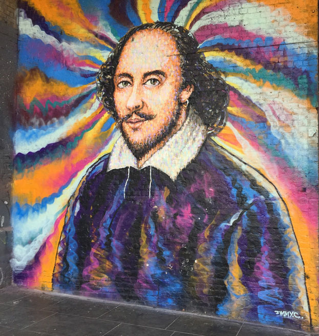
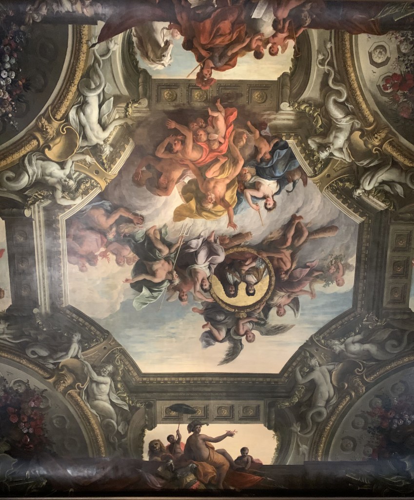
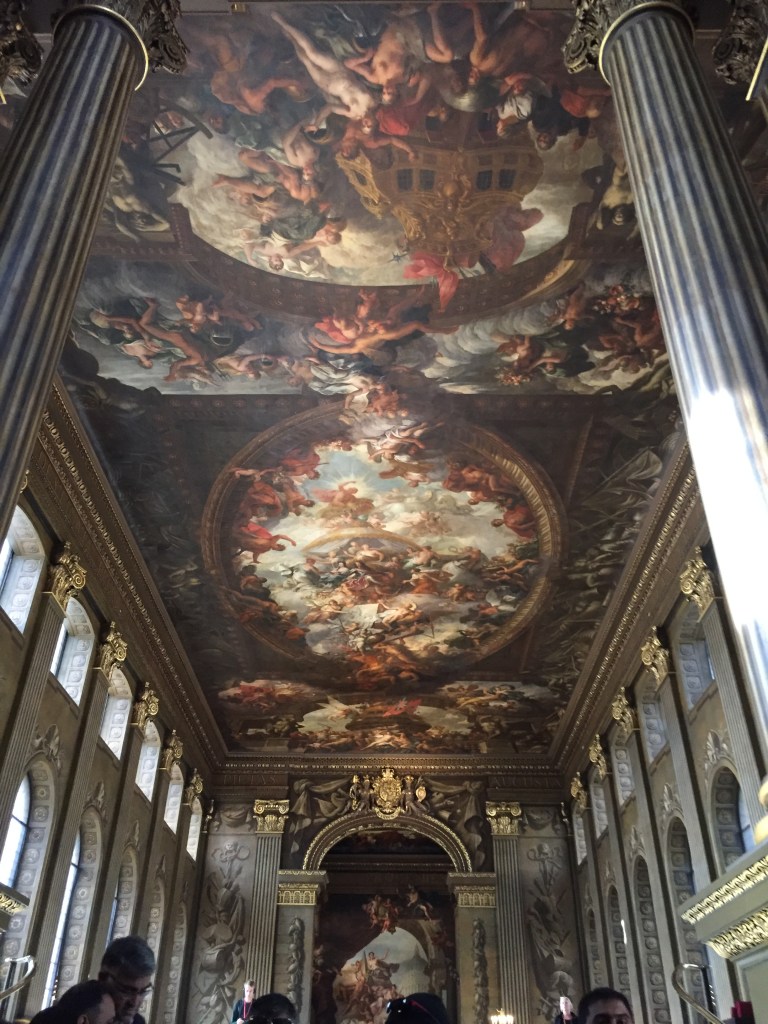
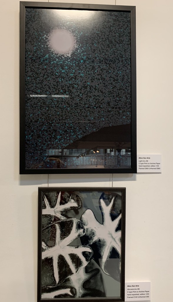
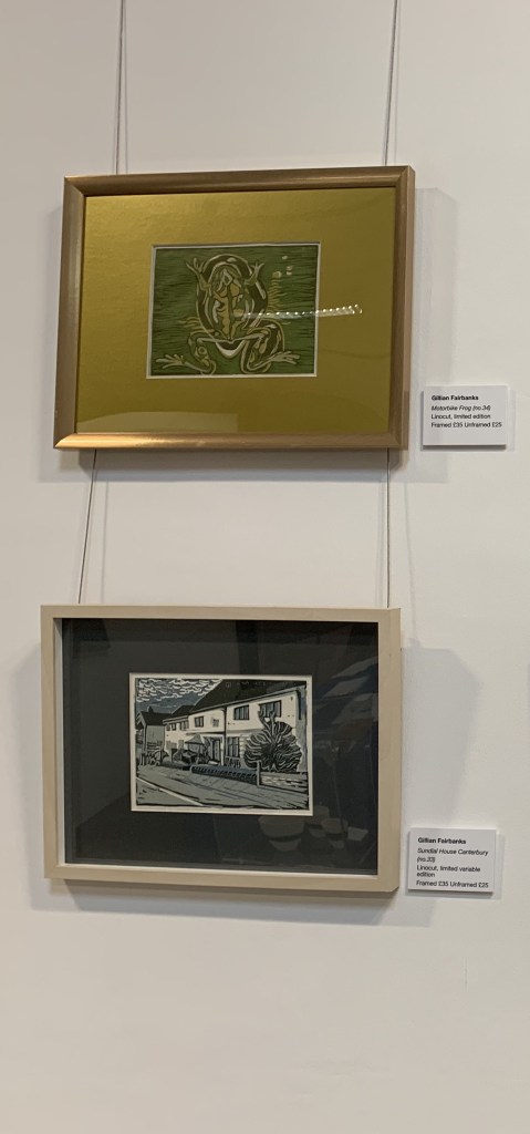
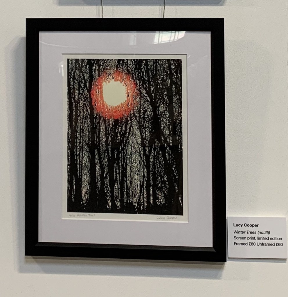
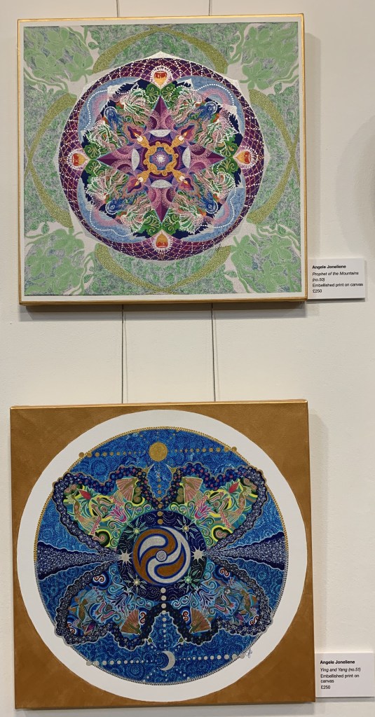
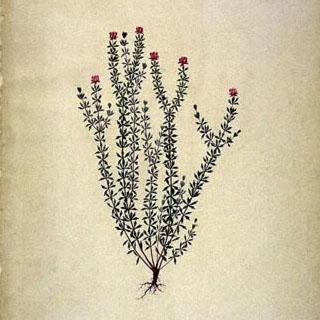
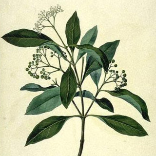
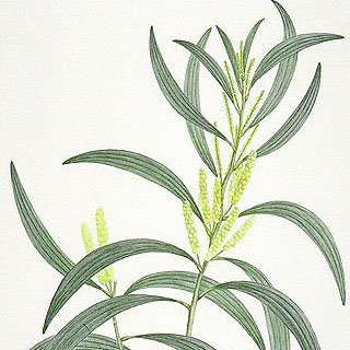
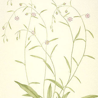
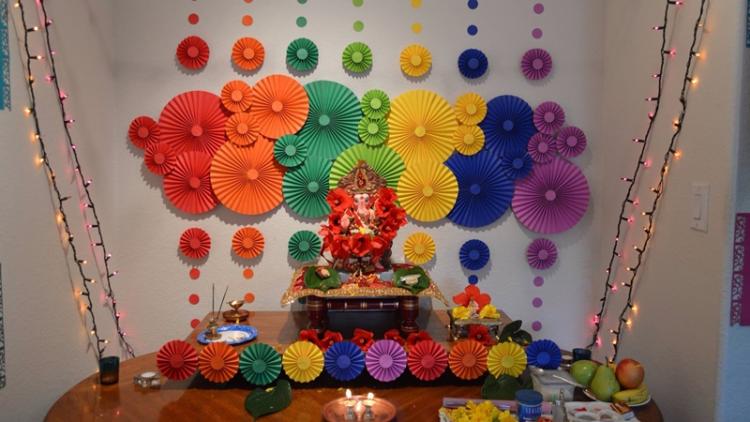
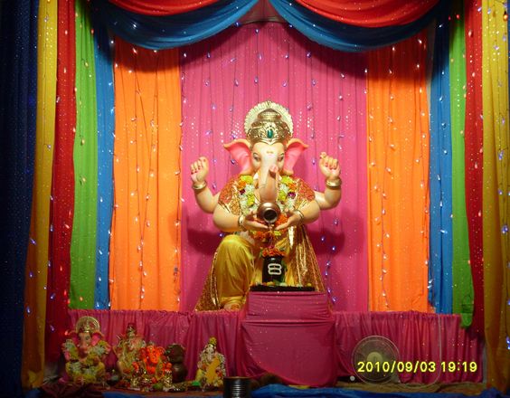
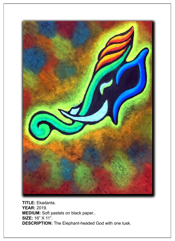
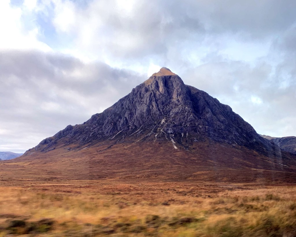
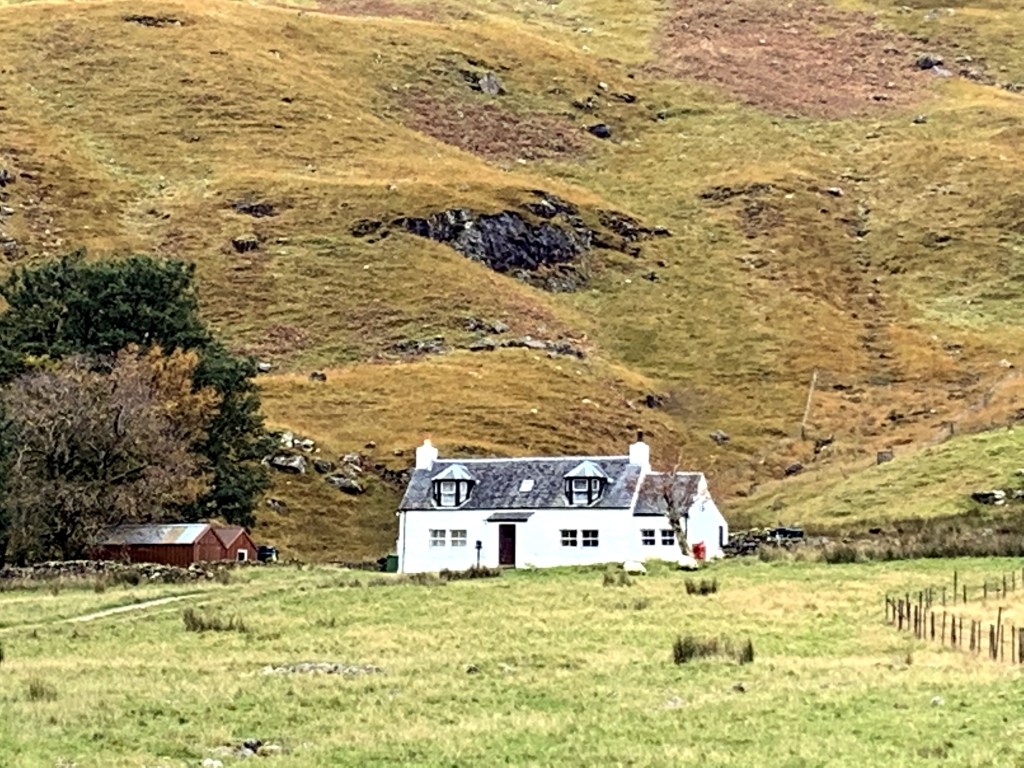
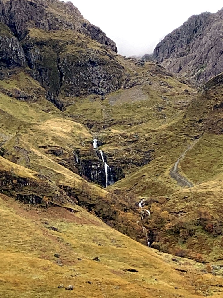
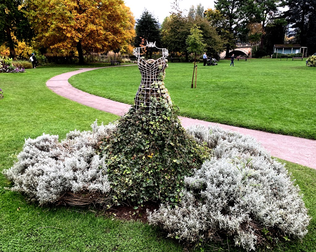
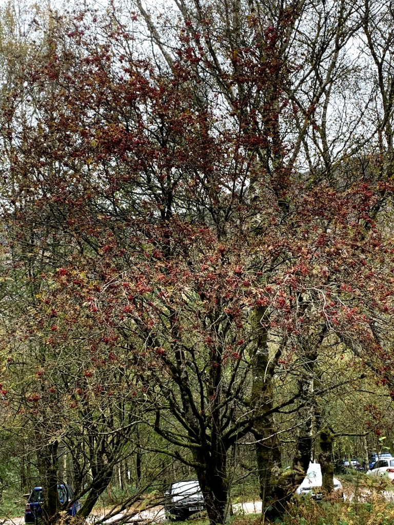
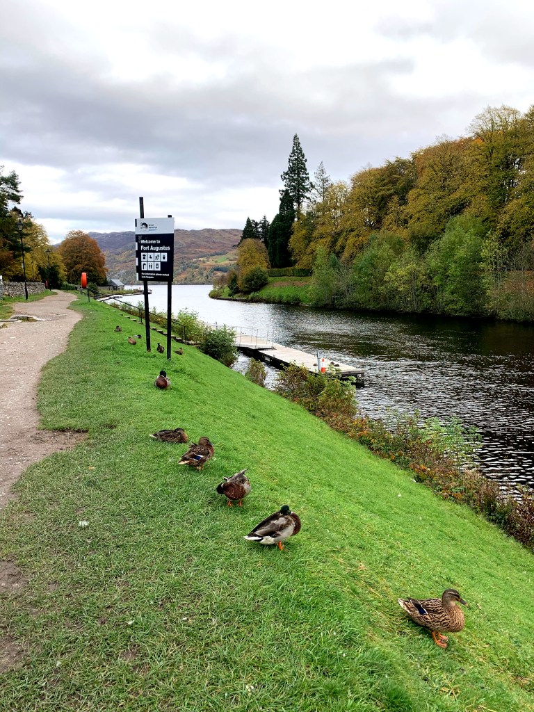
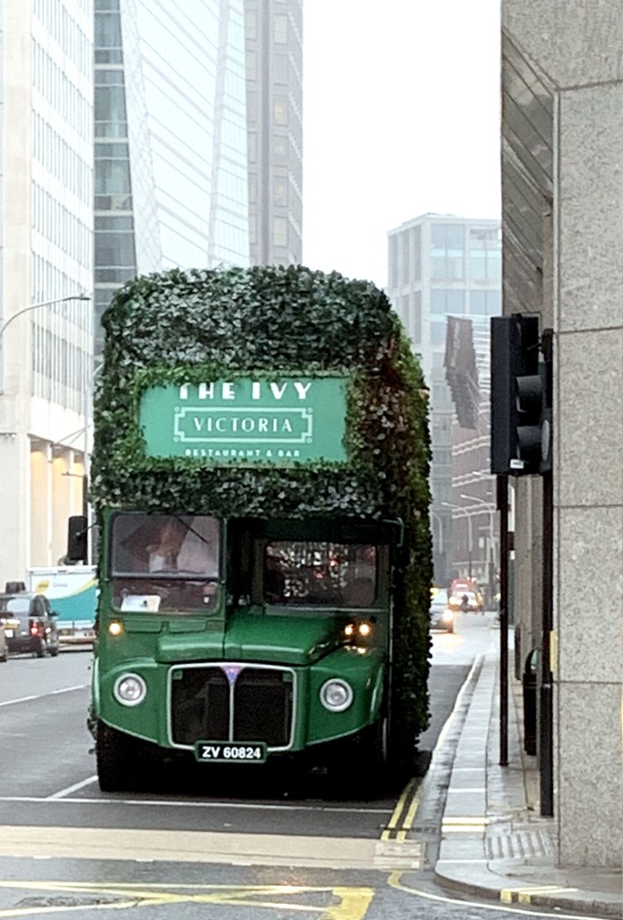
Other Inspiring Sights

Here are a few visuals of other scenes that caught my attention and have inspired me to reproduce them in some way the other onto my canvas.

With this, I end my series of my UK art travelogue, if I may call it that. I intend putting all these inspiring visuals to good use in my future explorations and I promise to share them with you all as and when I do so. But till I do, I will be getting back to my pending Navrasa Series, so until next time, Ciao!

DISCLAIMER – All the information, data and imagery in this blog post is for informational and educational purpose only. While there may be copyrighted material the use of which has not always been specifically authorized by the copyright owner, I have only made it available with the sole effort to stimulate artistic progress and enrichment. Most of the photos included in this post are my personal copies which I clicked during my trip to the UK. However, some images may have been taken from the links included below and I give full credit to these websites/pages, thereby in no way claiming them to be my own. I have also used these links for reference purposes and collection of data for this post, therefore I give full credit to the respective web pages for their data. Most of the data in this post is based on my personal experiences and opinions and I am not responsible for any material that is found in the links at the end of this post.

Sources and Credits –

https://www.history.com/topics/british-history/stonehenge

https://www.cotswolds.info/places/bath/sculptures.shtml

https://en.wikipedia.org/wiki/The_Kelpies

Back with a Bang! – Part 3

Here I am again, with another “volume” of my art related travels in the UK. This edition, the third in the series, is dedicated to another museum of art in London, but one which is home to more unconventional forms of art and sculpture. I am referring to the Mecca of modern art in London. So, after soaking in the glory of the National Art Gallery, I headed for the iconic Tate Modern,

When Tate first opened its doors to the public in 1897 it had just one site, displaying a small collection of British artworks. In December 1992 the Tate Trustees announced their intention to create a separate gallery for international modern and contemporary art in London.

The former Bankside Power Station was selected as the new gallery site in 1994. It consisted of a stunning turbine hall, 35 meters high and 152 meters long, with the boiler house alongside it and a single central chimney. The following year, Swiss architects Herzog & De Meuron were appointed to convert the building into a gallery. That their proposal retained much of the original character of the building was a key factor in this decision.

In 1996 the design plans were unveiled and the huge machinery was removed and the building was stripped back to its original steel structure and brickwork. The turbine hall became a dramatic entrance and display area and the boiler house became the galleries. In 2009 Tate embarked on a major project to develop Tate Modern. Working again with Herzog & de Meuron, the transformed Tate Modern makes use of the power station’s spectacular redundant oil tanks, increasing gallery space and providing much improved visitor facilities.

The Tate Modern has seven floors. The first four are the free galleries. Art works are arranged by theme. Within each gallery floor there are multiple rooms containing the works of individual artists. The structure of the building is art in itself and can be viewed best from the bridges between the two gallery spaces. I started my tour from the first floor and work my way up. Then I crossed over to the other side of the museum and work my way down.

The first display I saw was quite unique. Argentinean artist Werthein set up a trainer brand, Brinco (‘jump’ in Spanish) in 2005 and distributed them free of charge to people attempting to cross the border illegally in Tijuana, Mexico. The trainer’s design includes eagle motifs inspired by American and Mexican national symbols, and an image of Saint Toribio Romo, the patron saint of Mexican migrants. The shoes also feature a torch, a compass and pockets to hide money and medicine. Printed on a removable insole is a map of the border area around Tijuana. The display includes responses to the project, such as media reports, online reactions and threatening messages received by the artist.

The next display was titled 36 Possibilities Realized Simultaneously by Paul Neagu. It consists of thirty-six individual drawings on canvas in a range of media including oil paint, pencil, ink and gesso. The drawings reflect a variety of styles.  Possibilities Realized Simultaneously is a ‘collaborative work’ made by the Generative Art Group which Neagu founded in 1971. The group had five members: Neagu himself and four fictitious characters. Each character worked in his own distinctive style, allowing Neagu to explore different aspects of his artistic practice.

36 Possibilities Realized Simultaneously

Romanian-born Neagu started to make ‘tactile’ and ‘palpable’ objects which are articulated constructions whose hinged or moving parts were originally intended to be physically manipulated by the spectator. They often incorporate boxes or compartments containing various tactile substances, such as fabrics or leather. The Great Tactile Table is one of these figurative tactile objects. These works comprise figures in the form of numerous individual boxes into which spectators could dip their fingers and feel various substances and textures. The compartmentalized structure refers to the cellular composition of the human body. It is also a metaphor for larger systems, such as society, which consist of individual yet interrelated parts.

The Great Tactile Table

Other exhibits in the ‘palpable objects’ series include the Ceramic Skull in which rectangular shapes are stacked in tiers to form the shape of a human skull. This head, formed of cellular elements addresses the nature of the human body and experience. It is an apparent whole, yet divisible into a number of discrete parts, sensations and experiences. The second one is Full Hand, a sculpture of a hand made up of ten horizontal rows of carved wood connected with spikes that run vertically through the construction. The cellular structure of the hands relates to Neagu’s interest in the human body as a microcosmic model for larger systems.

One more interesting artwork of Neagu’s is Jump. The leaping man shown here recalls Neagu’s video Hyphen Ramp which shows the artist repeatedly jumping against the gallery wall. The phrase ‘impulses and vectors’ appears to the right of this figure. ‘Impulses’, for Neagu, refer to the body’s actions and movements. ‘Vectors’ are more regular systems or structures, such as the grid-like divisions filling the shape of the leaping man. The artist has described his performance work as an attempt to reach a state of ‘fusion between impulses and vectors.’

Jump

The next installation I liked, simply called Untitled 2001 is the brainchild of Polish artist Edward Krasiński consists of twelve mirrors of equal size suspended from the ceiling, and Krasinski’s signature blue Scotch tape. A continuous strip of tape is stuck horizontally onto the walls of the room at a height of 130cm from the floor.  The verso of each mirror, which is black, also has a strip of blue scotch tape stuck to it. The mirrors, all facing in the same direction, reflect the surrounding architecture, the black backs of the other mirrors with their blue strips, and the continuous blue strip on the wall. This creates the illusion of a space that both recedes and advances depending on the viewpoint of the visitor. 

I loved Irina Nakhova’s spatial experiments created within her apartment in 1980s Moscow which have been displayed at Tate under the title Room No. 2. For this, Nakhova removed the furniture from the 4 x 4 m² living room of her apartment, covered the surfaces with white paper and layered them with grey and black shapes. Exhibited here, Room No. 2 was the second of four ‘total installations’ that she made in the apartment.

Nakhova’s 1989 painting Simultaneous Contrast experiments with the shift between two-dimensional and three-dimensional space. Borrowing details from a 1930s Soviet album of photographs, Nakhova produced abstract forms from material linked with the Soviet system.

Simultaneous Contrast

One of the works showcased in the next room was by the French-American artist Niki de Saint Phalle. Titled Shooting painting, it involved the artist or the audience shooting at the canvas.  The base of the painting is a wooden board covered in a layer of grey plaster reinforced with wire mesh. It was then layered with textured white plaster, concealing small bags of liquid paint. When the bags of paint were hit by bullets, the paint cascaded down the plaster surface.

Shooting painting

I fell in love with a large scale collage called La Moscos created by the artist Mark Bradford. It includes materials found by the artist on the streets around his studio in Los Angeles, USA. Visually suggestive of aerial maps of sprawling, urban areas, the collage is constructed entirely from paper fragments which, the artist believes, ‘act as memory of things pasted and things past. You can peel away the layers of papers and it’s like reading the streets through the signs’. The work takes its title from a derogatory slang term for migrant day laborers in the San Francisco Bay Area, reflecting the artist’s long-standing interest in the sub-cultures of the inner city.

La Moscos

Another canvas that I identified with was Charles Atlas Landscape. This is the work of American artist Edward Ruscha. In this painting, Ruscha plays with the shape of the canvas. Painted representations of metal bars appear to ‘push’ the sides of the canvas stretcher, apparently making them curve outwards. Ruscha has suggested that this painting is also a ‘portrait of a He-Man exploring the fury of muscle power’. Charles Atlas was an Italian-American bodybuilder. His exercise program spawned an advertising campaign featuring his name and likeness.

Charles Atlas Landscape

One subject painted frequently by Ruscha throughout his career is the American Flag. With his earlier flags, from the 1980s, he chose the subject because of their status as common objects and instantly recognizable symbols. He returned to the subject several years later with the painting tilted Our Flag 2017, where the flag is torn and damaged, showing the passage of time. This may also be interpreted as a comment on the divisive nature of recent political events. Of this work Ruscha has said ‘any flag that flies for 250 years is bound to get a little ragged and tattered, especially if we help it along.’

Our Flag 2017

I am always drawn towards big canvases and compositions, especially ones that make good use of space. One such artwork at Tate that appealed to me was Ink Splash II 2012 by El Anatsui. The artist was born in Ghana but lives and works in Nigeria. Ink Splash II 2012 is a large wall piece in which Anatsui has connected several interwoven strips of flattened aluminum bottle tops using copper wire. This horizontal composition has a metallic shimmer dominated by a silver tonal palette in which blue and yellow splashes evoke gestural brushstrokes – presumably the ‘ink splashes’ of the title. The large blue areas lead the gaze from the upper left corner to the bottom right, pushing out smaller yellow splashes, which are spread out and almost blurred across the silvery surface. As if it were real paint escaping from a canvas, a blue patch of woven metal spills from the bottom of the work onto the gallery floor.

The materials Anatsui uses – copper wire and bottle tops – are part of that encounter and a reminder that the artist’s work involves change and regeneration. Moving away from common definitions of so-called recycled art or junk art, yet using objects found locally, Anatsui has found an aesthetic that attempts to speak directly to the experiences of individuals and communities immersed in that encounter.

Ink Splash II 2012

When you think of the word collage, you would probably think of a collection of pictures that are put together to make a single picture. In the world of fine art, it refers to a work made with various small objects sometimes with paint, sometimes without. The word can also be used to mean a collection of different things. It is generally a piece of art made by sticking various materials such as photographs and pieces of paper or fabric on to a backing.

The reason why I’m talking about collages is because the ones I came across at Tate were not only unique but also surpassed all boundaries defining the word collage. Mask XI 2005, Mask XIII 2006 and Mask XIV 2006 by the British artist John Stezaker are a deceptive threesome of collages in which he has covered an old publicity portrait of a film star with a postcard. The postcard becomes a mask over the face, but rather than just concealing, it opens a window into another space. This pair of images activates our innate tendency to interpret faces in patterns and imagery. The scene in the postcard could be seen to reflect the interior state of the figure. Alternatively, by replacing eyes with blankness or holes, it might be showing us death beneath the features of a living being.

Mask XI 2005, Mask XIII 2006 and Mask XIV 2006

Another unconventional set of collages exhibited at Tate appealed to me not just for their uniqueness but also because they were by an artist from my homeland, India. Mild Terrors II 1991-6 by CK Rajan is one of a group of ten collage works in Tate’s collection from his larger series Mild Terrors II. The works in Mild Terrors II were made in the artist’s native India using images cut out from newspapers and glossy magazines. In these collages Rajan has transposed images of body parts and consumer goods onto local Indian landscapes and urban scenes depicting both historic buildings and newer housing developments.

Rajan used both color and black and white newspaper images for these collages. He would generally start with a background image pasted onto white A4-sized paper and then add fragmentary images of body parts, often female, to the background scene. The disembodiment heightens the sense of the impact this rapid change might have on the ordinary Indian. Rajan’s works relate more to the surrealist collages of European artists like Max Ernst or the pop art experiments of artists such as Richard Hamilton and Martha Rosler.

Mild Terrors II 1991-6

When I saw the work of another Indian artist on display at Tate, my happiness knew no bounds. This was Mrinalini Mukherjee, an Indian sculptor and the artworks exhibited were Ritu Raja 1977 and Jauba 2000.   

She transformed a common everyday material, natural rope, into incredulous sculptures. Her early works such as the wall-mounted Ritu Raja 1977 were made from rope woven from hemp in two shades, the natural colors of the material accentuating the sensual forms. The title in Bengali refers to a ‘king of seasons’, usually the fertile spring. 

Ritu Raja 1977

 She created Jauba (Hibiscus) 2000 by knotting yarn made from dyed hemp fiber over a vertical metal armature, with the bulk of its woven detail on the front.  The yarn has been dyed red, green and black and is woven into pleated organic forms which drape the frame like a robe. ‘Jauba’ means hibiscus in the artist’s native language Bengali. Visually, the sculpture resembles a botanical, floral form, roughly symmetrical, which droops slightly towards the floor due to the weight of the material.

Jauba (Hibiscus) 2000

Untitled 1964….That was the title of an artwork by the Japanese avant-garde artist Yuko Nasaka, who is known for her involvement with the Gutai Art Association. If you are not aware of this association, it was formed in 1954 in Osaka by Yoshihara Jiro, Kanayma Akira, Murakami Saburo, Shiraga Kazuo and Shozo Shimamoto. The word has been translated into English as ‘embodiment’ or ‘concrete’. 

Like other members of the group, Nasaka placed a great emphasis on the process of making an artwork. For this work, she placed each plaster panel onto a mechanical turntable inspired by a potter’s wheel. As it rotated, she carved patterns into the material using a palette knife. The recurring image of the circle suggests a timeless sense of harmony, while the dark-blue silver lacquer that she applied afterwards conveys a more industrial quality.

Untitled 1964

Ever seen a model of the International Space Station made from hundreds of metal coat hangers? Ten Minute Transmission 2003 is just that. This installation by James Rosenquist and the duo Allora & Calzadilla serves as the elaborate antenna for a radio that attempts to make contact with the real ISS as it passes overhead. The artists want to draw attention to what international means: Despite its name, the ISS is controlled by a handful of powerful nations in the global north; this poses a big political question about who gets to be represented in the extraterrestrial realm.

The thing that I loved the most about the Tate Modern is the size. I never felt I couldn’t see the art because of space constraints or the crowd. Each gallery was spacious enough to ensure that the art was easily visible to all viewers and no one’s view was blocked by another viewer.  As I mentioned earlier, the availability of large spaces inside the museum made it convenient for larger scale works of art to be exhibited.

The Turbine Hall at Tate happens to house one such monumental sculpture called Fons Americanus. It is a 13-meter tall working fountain inspired by the Victoria Memorial opposite Buckingham Palace and has been commissioned by the African-American artist Kara Walker as part of the annual Hyundai Commission at Tate.

Rather than a celebration of the British Empire, Walker’s fountain explores the interconnected histories of Africa, America and Europe. She uses water as a key theme, referring to the transatlantic slave trade and the ambitions, fates and tragedies of people from these three continents. Fantasy, fact and fiction meet at an epic scale.

This commission has been made using an environmentally-conscious production process and has been built from recyclable or reusable cork, wood and metal. The surface covering is made from a non-toxic acrylic and cement composite that can be used for sculpting or casting. It avoids the use of large quantities of non-recyclable materials and harmful substances often found in the production of exhibitions and installations.

Fons Americanus

Although I’m not a great fan of modern art as most of the time I don’t get the message modern artists wish to convey through their work, but  I can appreciate it for the sheer resolve, so even though I couldn’t relate with many of the pieces exhibited at Tate, I’m full of admiration for the effort put in by the artists in question.

The ones that I did relate to, I have shared with you all, but I believe art is totally subjective. What clicks with me may not click with you and vice versa. So in order to form your own opinion about modern art, a visit to Tate Modern is a must.

Tate turned out to be a real eye opener for me and gave me a peek into a world full of infinite possibilities when it comes to creating great pieces of art. I hope you all will be as inspired as me after this little glimpse of Tate that I have shared with you all.

DISCLAIMER – All the information, data and imagery in this blog post is for informational and educational purpose only. While there may be copyrighted material the use of which has not always been specifically authorized by the copyright owner, I have only made it available with the sole effort to stimulate artistic progress and enrichment. Most of the photos included in this post are my personal copies which I clicked during my trip to the UK. However, some images may have been taken from the links included below and I give full credit to these websites/pages, thereby in no way claiming them to be my own. I have also used these links for reference purposes and collection of data for this post, therefore I give full credit to the respective web pages for their data. Most of the data in this post is based on my personal experiences and opinions and I am not responsible for any material that is found in the links at the end of this post.

Sources and Credits –

https://www.tate.org.uk/

https://www.macegroup.com/projects/tate-modern

The Secret London Guide To Tate Modern

Back with a Bang! – Part 2

“Art is an adventure that never ends.”

This is my favorite quote and one that I truly believe in too. For me, art is a never ending journey, exploring unchartered territories and seeking out new levels of creativity. There’s so much to explore and so much more to learn every step of the way that I can’t help but wandering off.

The best way to experience such exquisite artistic pleasures is to scout for them wherever you go. And that’s exactly what I did while on my holiday in the UK. I came across many unconventional works of art, some of which I shared with you all in the first part of this post. But as I had mentioned earlier, that was just the tip of the iceberg! There’s so much more to traverse through in this colossal glacier of visual aesthetics.

So let me navigate you through one of the most iconic art adventures of my life, the wonderful hallways of the National Art Gallery in London. This historical museum is so monumental in size that it deserves a blog post of its own so this one is dedicated solely to it.     

National Gallery of Art

The National Gallery houses one of the finest collections of paintings in the world. It is home to over 2,300 paintings dating from the mid-13th century to 1900, including artworks of masters like Monet, Van Gogh and plenty more. Being in London, it was a golden opportunity for me to see all the original masterpieces with my own eyes, so I grabbed it instantly and made the most of it!

I began with Claude Monet, a leading French Impressionist landscape painter. Two of his paintings that appealed to me, among others were The Thames below Westminster and Bathers at La Grenouillere. Monet was more interested in broad effects than details and displayed fleeting visual effects or impressions of his subjects. 

Next I came across a painting titled Still Life with Apples and Pomegranate by Gustave Courbet, a French realist painter.  Courbet’s use of line and of light and shade to emphasize the color and shapes of the apples is a traditional feature of realism. The vibrant color palette which almost made the fruits come to life was immensely captivating for me.

Another French painter, Antione Berjon’s famous work Still Life with Flowers called out to me merely because of the casual arrangement of the basket and precisely textured peaches and petals, with the orange nasturtium ready to fall , thus giving a sense of movement to this still life.

The next artwork that caught my attention was Susanna at her Bath by Fransesco Hayez, the leading artist of mid-19th-century Milan. This painting combines two of his favorite subject matters – an Old Testament story and a voluptuous female nude. I was greatly impressed by the beautifully brought out form of the female body and her facial expression.

Susanna at her Bath

Another captivating composition for me was a newly acquired French piece titled The Sky at Sunrise. The glowing sky is set between dark hills and threatening storm clouds, the strip of dense grey clouds at the top echoing the blue silhouette of land at the bottom. Distinctive jigsaw-shaped clouds are depicted in layers white hovering over grey, blue sky beyond fading to rose and peach at the horizon.

The Sky at Sunrise

I have always been particularly enamored by artworks that have a mysterious element associated with them. One such work of art that appealed to me was Archway on the Palatine by Frederic, Lord Leighton. For me on a personal level, the element of mystery lies in the question what lies beyond this archway, which is what, fascinated me the most about this artwork.

Archway on the Palatine

And then I came across one of my favorite artists (I’m sure of most of you as well!)….none other than Vincent Van Gogh. Do you know that his first major accomplishment as an artist was one titled Head of a Peasant Woman? Depicted here is a young woman with large dark eyes and an evenly lit face that is broad and open.

Next to this one was Van Gogh’s Chair. This painting of a simple and functional chair with his pipe and tobacco on it and placed on a bare floor of terracotta tiles is one of Van Gogh’s most iconic images. 

 The third in the Van Gogh collection is Long Grass with Butterflies.  Van Gogh painted this in the gardens of the asylum where he noted, ‘the grass grows tall and unkempt.’ The grass is painted with distinct brushstrokes of varying length.

Other iconic Van Gogh paintings that I had the good fortune of viewing were Sunflowers – that shows his signature expressive style, A Wheatfield, with Cypresses – a group of dark trees in the middle of bright yellow bands of wheat, contrasting with blue hills and sky and last but not the least, Two Crabs – a painting in which the artist has used parallel brushstrokes to sculpt the creature’s form on an exuberant sea-like surface.  

Then I stumbled upon the great Pablo Picasso and my excitement knew no bounds! I was pleasantly surprised when I saw a totally different side of the artist in a painting titled Motherhood (La Maternite).  Apparently, he explored afresh the subject of Madonna and child in this painting.

Motherhood (La Maternite)

A tiger crouching in the shadow of thick jungle foliage, it’s back arched and teeth bared….is it in recoil from the flash of lightning, or is it waiting to ambush its prey? These are the questions that aroused my curiosity when I saw the next painting titled “Surprised!” by Henri Rousseau. The foliage is a mix of domestic house plants and tropical varieties, which he had seen at the Botanical Gardens in Paris.

“Surprised!”

The next painting was quite interesting as it reminded me of pointilism, a technique of painting in which small, distinct dots of color are applied in patterns to form an image. This was The Channel of Gravelines, Grand Fort-Philippe by Georges Seurat. He covered the canvas with a shimmering mosaic of dots and strokes of unblended paint to create subtle gradations of luminous tone. He also added a painted border of colored dots.

The Channel of Gravelines, Grand Fort-Philippe

Inspired by Seurat’s new and startling pointillist painting technique, Belgian artist Théo van Rysselberghe created a composition he called Coastal Scene. This cool, elegant painting explores the quality of light on water. The clouds are hardly reflected in the water: it seems as if the light has slipped under them to illuminate the vast, still stretch of almost tideless sea.

Coastal Scene

The next painting made my heart leap with joy as it reminded me of my all time favorite artist Leonid Afremov. This piece, called The Boulevard Montmartre at Night was painted by Camille Pissarro. Pissarro was especially fascinated by the different types of artificial light, which are reflected on the wet pavements. Pissarro applied the paint as a patchwork of abstract dashes and daubs. I felt Afremov‘s scenes are quite similar to Pissaro’s, in terms of the artificial lighting of the street lamps and reflections on wet paths.

The Boulevard Montmartre at Night

And then came the Self Portrait of Paul Cezanne, for whom Matisse and Picasso are said to have remarked that he “is the father of us all”. Cézanne stares at us calmly and dispassionately, his face devoid of overt expression. The wallpaper he poses before is not merely a decorative backdrop, but has an important structural role in the composition.

Self Portrait of Paul Cezanne

I also saw one of the most dramatic paintings I have ever seen. It’s called An Experiment on a Bird in the Air Pump by Joseph Wright ‘of Derby.’ The painting depicts a lecturer demonstrating the creation of a vacuum to a family. A white cockatoo is imprisoned in a glass flask from which the air is being extracted by a pump. Wright focuses on the viewers‘varied reactions – from the girl unable to watch to the lovers with eyes only for each other. It was this wonderful display of expressions and emotions that I found most fascinating about the artwork.

An Experiment on a Bird in the Air Pump

Another painting added to my list was Cenotaph to the Memory of Sir Joshua Reynolds by John Constable. This depicts a memorial to the painter Sir Joshua Reynolds built by Sir George Beaumont situated at the end of an avenue of lime trees, flanked by busts of Michelangelo and Raphael in front. Constable’s introduction of a startled stag in the picture gives a sense of the wildness to the setting, and according to me further adds to mystical quality of the artwork.

Cenotaph to the Memory of Sir Joshua Reynolds

When it comes to self portraits, I am quite the fan. So the Self Portrait of Rembrandt at the Age of 34 was a visual treat for me. The wall or parapet at the bottom of the painting deepens the perspective, making it seem less like a flat picture and more like a window onto reality. The way that Rembrandt’s elbow and the swirl of his cloak extend forwards over the wall creates the illusion that they share the same space as the viewer.

Rembrandt’s second Self Portrait at the Age of 63 just made my day.  In this one, Rembrandt is preoccupied with depicting the textures and colors of his own ageing face. The sagging fold beneath his right eye is made with the swirl of a heavily loaded brush. The blemishes on his forehead are formed of blotches of coagulated paint.

Then I saw a painting with a painting within. This was Johannes Vermeer’s A Young Woman standing at a Virginal. In most of his paintings, including this one, he seems to invite us to question the virtue or diligence of the women concerned, but then rarely gives us enough clues to help us come to a firm conclusion. The small landscape on the wall of the painting is what I am referring to when I mention painting within a painting.

A Young Woman standing at a Virginal

I had the singular pleasure of viewing perhaps one of the most famous and intriguing paintings in the world, The Arnolfini Portrait by Jan van Eyck. This portrait probably shows Giovani Arnolfini, a wealthy Italian merchant and his wife. Arnolfini’s hand is raised, apparently in greeting. On the back wall, a large convex mirror reflects two figures in the doorway, one of whom also raises his arm. Could the man in mirror be van Eyck himself, with his servant, coming on a visit?

The Arnolfini Portrait

As I walked from one room to the other in the gallery, I noticed that there were these tiny easels placed here and there with unfinished or partially done paintings on them. Soon it dawned upon me that these were works of present day aspiring artists who would come there to try their hands on sketching and painting the famous masterpieces. What a cool idea! If only I had the time, I would have set up my own art supplies there and done the same!

But I must say, in half a day I managed to cover a whole lot of artists at the National Gallery and that too with my dear husband patiently by my side, going through each and every painting with me without making a sound!  To be honest, we didn’t have enough time left to be able to cover each and every section of the museum and moreover I had seen almost everything I wanted to see, so I went home happy and enlightened.  I just loved the National Art Gallery…it was a perfect day for to me!

If you remember, in the first part of this post, I had mentioned that I would cover the remainder of my art related travels in the second part but now I realize I will have to do a part 3 (possibly even a part 4, the grand finale or showstopper of the series!) to do justice to them all. So keep following this space until next week!

DISCLAIMER – All the information, data and imagery in this blog post is for informational and educational purpose only. While there may be copyrighted material the use of which has not always been specifically authorized by the copyright owner, I have only made it available with the sole effort to stimulate artistic progress and enrichment.Most of the photos included in this post are my personal copies which I clicked during my trip to the UK. However, some images may have been taken from the links included below and I give full credit to these websites/pages, thereby in no way claiming them to be my own. I have also used these links for reference purposes and collection of data for this post, therefore I give full credit to the respective web pages for their data. Most of the data in this post is based on my personal experiences and opinions and I am not responsible for any material that is found in the links at the end of this post.

Sources and Credits – https://www.nationalgallery.org.uk/

Back with a Bang! – Part 1

Hey followers of The Art Dungeon!! So, after a fortnight of hectic travelling and holidaying, I am back to my favorite job in the whole wide world! Any hunches??? Yesssss!!  If you guessed art and blogging about it, then you are bang on!! Good job guys!!  

So, as promised, I’m back after a fortnight of fervent sightseeing and am loaded with tons of exciting art-related experiences and learning. I feel so enlightened and inspired after this trip that it’s almost as if I have been reborn as an artist! I am practically brimming with excitement and can’t wait to share my treasure trove with you all. So I will be break off from my presently ongoing Navrasa series and do a blog post about this expedition of mine. I shall return to the above mentioned series thereafter.

But there’s so much to tell that I can’t possibly fit it into one post, so I will do so in two parts. Let’s begin then with Part 1!   

Even though I was constantly on the move with not a minute to spare during my holiday, art was always on my mind wherever I went. I would find inspiration in each and every nook, corner and alley of all the lovely sights and sounds I came across during my travels.

Where did I go you ask? I had the good fortune to visit the breathtakingly beautiful, diverse, historic, romantic, captivating, addictive and extremely inspiring group of islands anchored in the middle of the North Atlantic that go by the name of the United Kingdom. Whoa! That’s a lot of adjectives in one sentence, don’t you think? But that’s the effect this enchanting country had on me. It left me craving for more, especially the artist in me!

Tower of London Commission

 My sojourn began in the pulsating tunnels of the underground “Tube” of the very cosmopolitan, yet historic London. The bustling underground, which is forever buzzing with human activity, provided me with ample amount of inspiration in the form of wall art and graffiti. These awe- inspiring pieces of art not only gave me a flavor of the country’s character but also filled me with a feeling of wondrous admiration for this glorious land.

I found my first inspiration splashed all along the walls leading to one such underground station, the Tower Hill Station near the historic Tower of London. A series of 30 paintings of the Tower of London by Stephen B. Whatley have been reproduced permanently on steel vitreous enamel panels lining throughout Tower Hill Underpass, the main portal entrance to the Tower of London, from Tower Hill Station. The originals, all oils on canvas, were exhibited in the Banqueting Hall of HM Tower of London, for an official reception marking the completion of major refurbishments to the Tower of London and its environs – including Tower Hill Underpass. 

 This is a permanent public art exhibit on display daily in London. The entire series of works depicts the history and iconic locations of the Tower of London and its environs. The vibrantly colorful imagery in these artworks depicts the architectural magnificence of the complex towering walls and moat of the Tower of London in varying silhouettes of the White Tower, Bloody Tower and Traitors’ Gate, The Wakefield and St. Thomas’s Towers.

The artist has skillfully illustrated the interiors in his work The Chapel Royal of St. Peter Ad Vincular. Apart from this there are several portraits of the likes of Henry III, Charles II, Sir Thomas More, Elizabeth I and Anne Boleyn(1507-1536), all rendered by Whatley in his signature expressionistic style.

There is also a painting displaying a Panoramic View of The Tower from The Thames and yet another one depicting William The Conqueror’s Invasion and Battle – Inspired by the Bayeux Tapestry.

But my personal favorites are two renditions of The Crown Jewels (that are on display inside the Tower of London), The Queen’s Guardsman and The Yeoman Warder. The former two, as the name suggests, are vibrant and dynamic paintings of The Royal ceremonial crowns, orb, scepter and rings while the latter are portraits of the Royal Guard and the Yeoman or “Beefeaters” as they are commonly called.

As I was walking through this astoundingly beautiful display, I came across two more paintings that left me totally speechless and spell bound. The first, called The 15th Century Murder of the Two Princes at The Tower, depicts the violent and mysterious deaths of the only two sons of King Edward IV. What struck me most about this piece, besides the bold color palette, was the use of indistinct and smudgy brush strokes which further added to the mystery and drama.

The second, titled Tower Ravens, shows the group of captive ravens that reside at the Tower of London. Their presence is traditionally believed to protect The Crown and the tower. A superstition holds that “if the Tower of London ravens are lost or fly away, the Crown will fall and Britain with it.” There are seven ravens at the Tower today — the required six, plus one spare!

The Shakespeare Mural

My next inspiration greeted me in the form of none other than The Bard of Avon himself. Yes! I’m talking about Shakespeare!! No I didn’t run into his ghost!! While making my way into the lively Borough Market at the Southbank of Southwark, London, I crossed a railway arch emblazoned with this strikingly colorful mural of William Shakespeare.

This mural was sprayed painted on a brick wall in a tunnel on Clink Street located next to the Borough Market, which is very near the historic Globe Theatre in Southwark, south east London. This portrait of the famous English playwright was painted by the Australian street artist, James Cochran, a.k.a Jimmy C, who is also known for his mural of David Bowie in Brixton.

Coincidentally, the portrait of Shakespeare is just yards from the Bankside playhouses where the Bard worked and in the very heart of Shakespeare territory, with the Globe and the Rose Theatre nearby as well as Southwark Cathedral where Shakespeare’s brother is buried.  Once again the colorful rendition of this artwork attracted me not to mention the fact that I had never seen such a unique and contemporary version of the Bard and that too on the street!

The Painted Hall

One of the tours I took while in the UK included a trip to Greenwich with an opportunity to visit the Greenwich Maritime Observatory and the Royal Naval College there. While the former was an experience of a lifetime, the latter turned out to be much more than an academic tour as it satiated my artistic taste buds as well, much to my delight!

It was here that I came across The Painted Hall, which is one of the most spectacular and striking Baroque spaces in Europe. Designed by Sir Christopher Wren and Nicholas Hawksmoor, it is often described as the “finest dining hall in Europe”. It features spectacular wall and ceiling decorations by the British artist Sir James Thornhill, who lavished 19 years on this, his masterwork (1707 to 1726).

The accessions to the throne of William III and Mary II in 1688 and George I in 1714, form the central narrative of a scheme which also triumphalises Britain’s maritime and trading successes. The artist drew on a cast of around 200 figures to tell a story of political change, scientific and cultural achievements, naval endeavors, and commercial enterprise against a series of magnificent backdrops. The characters he included are allegorical, mythological, historical and contemporary.

The grandeur of the composition, which covers 40,000 square feet, reflects the importance of the space the paintings adorn: the hall of a new Royal Hospital for men invalided out of the Navy.
The Painted Hall itself was originally intended as a grand dining room for the Naval pensioners, but it soon became a ceremonial space open to paying visitors and reserved for special functions.

The Painted Hall is a sequence of three distinct but connected spaces: first, we encounter the soaring domed Vestibule, then the long, brightly lit Lower Hall and finally the Upper Hall whose west wall provides the highly theatrical finale.

The Lower Hall ceiling, which measures 15 by 30 metres
celebrates the ‘Triumph of Peace and Liberty over Tyranny’. At the centre of the composition are the figures of King William and Queen Mary surrounded by various mythological and allegorical figures. The king is shown with his foot on a figure representing ‘arbitrary power and tyranny’ – which appears to be a thinly veiled depiction of Louis XIV.

The Upper Hall ceiling honours Queen Anne and her consort Prince George of Denmark, next to personifications of the continents Europe, Asia, America and Africa and the coats of arms of England, Scotland, France and Ireland.

The west wall celebrates the arrival of the Hanoverians (‘a new race of men from Heaven’ as its motto declares) with George I at the centre of a large family group portrait. Other figures and objects reinforce messages of peace, stability and prosperity underpinned by naval might.

Thornhill used a variety of techniques such as chiaroscuro (contrast of light and dark), fictional light sources and foreshortening to enliven his paintings. His use of illusionistic architecture and steep perspective was inspired by Roman high baroque painting.The Painted Hall was extraordinarily impressive for me as I found it to be a powerful amalgamation of painting and architecture. In my opinion the extravagant yet thoughtful scheme of events portrayed by Thornhill paints a powerful and fascinating picture of 
Britain’s position in the world according at the beginning of the 18th century. Moreover, The Painted Hall overawed and delighted me for its sheer grandeur and magnificence.

Blackheath Art Society Exhibition

The Blackheath Art Society in South East London was launched in 1947 by distinguished artists and educators with links to Goldsmiths College, Camberwell School of Art and the Royal Academy. Many current members who work as artists or designers and in art education studied at these colleges and at other prestigious art institutions in the UK and abroad. The Blackheath Art Society holds exhibitions locally each year and also meets for sketching and photography trips, visits to art galleries, museums and places of interest.

One such exhibition organized by the society was underway at the Old Royal Naval College and I had the good fortune of being at the right place at the right time to be able to witness it! This exhibition featured a mixture of paintings, drawings, prints and photographs in various mediums ranging from oils to acrylics, watercolors, inks, charcoal, pastels, gouache, color pencils and mixed media. To see such an expansive and versatile range of art by the some of the most prominent contemporary artists was indeed an experience of a lifetime.

Besides these conventional mediums, I was also exposed to new contemporary techniques and unique surfaces that can used to create some pretty amazing works of art. Among these were a couple of pieces by Alice Gur-Arie, who has created astounding prints on archive paper and then hand repainted them. Alice is an award nominated mixed media artist who takes photographs around the world and repaints them by hand digitally into contemporary, limited edition, fine art images. Treating the photograph as a canvas, images are repainted by hand digitally with a “brush”, sometimes in layers, sometimes pixel by pixel. 

There were some interesting linocut prints by Gillian Fairbanks that particularly caught my attention. Other eye catching prints included a screen print titled Winter Trees by Lucy Cooper and Inkjet print called Poppies by Patricia Colman. Another engaging form of art that I identified with there was the mandala like artwork by Angele Joneliene.

I discovered yet another unique medium in the form of an artwork by Chris Francis. This was assemblagean artistic form or medium usually created on a defined substrate that consists of three-dimensional elements projecting out of or from the substrate. It is similar to collage, a two-dimensional medium.

Chris Francis

Tower of London Arms as Art

Ever found an inspiration for art where you least expect it to be? That’s exactly what happened with me when I was walking through the armory section of the museum in the Tower of London. This exhibit, known as Arms as Art, consists of four items – The Raven Gun, Jewelled Pistol, Tiffany Revolver and the Jewelled Gun. Not only were these fire arms studded with diamonds and paneled with gold, but the supposed trajectories of their bullets had been carved out with crystals as well! It made a pretty cool exhibit I must say!!

Art Inspirations at Natural History Museum

Of all the places in London, one would least expect to find inspiration for art at the Natural History Museum. But I sure did! One such exhibit was that of different species of butterflies and moths preserved for posterity in a glass casing. This for me has become a befitting source of inspiration and who knows, may even transform into a muse for my future art explorations!

Another exhibit at the museum that was exceptionally stimulating for my artistic genes was that of aquatic flora and planktons, once again encased in glass. The fluidity of the display is the perfect subject for a watercolor composition, don’t you think?

And just when I thought I was through, I bumped into Pandora’s Box of artistry! The Natural History Museum holds all of the surviving botanical artwork from Captain James Cook’s first Pacific voyage. There are original botanical drawings and engravings prepared by Sydney Parkinson aboard the Endeavour, as well as those completed after his death by artists back in England under the patronage of  Sir Joseph Banks.

The illustrations have been systematically organized as per the location where each species was seen during HMS Victory’s travels, which included Australia, Brazil, Java, Madeira, New Zealand, Tahiti and all the way to Tierra del Fuego at the southernmost tip of South America.

One can also explore the collection by the artists, namely, Sydney Parkinson, a Scottish natural history artist, Frederick Polydore Nodder, an English natural history artist, brothers John and James Frederick Miller and John Cleveley the Younger.

Another method of arrangement is by the engraver, who engraved the copper plates for the species collected. There were three of these, the first being Daniel Mackenzie, the principal engraver who  produced over 250 of the 738 copper plates . The second was Gabriel Smith, one of Banks’s most productive engravers, having created 118 copper plates. Last but not the least was Gerald Sibelius, a Dutch artist and one of the longest-serving engravers for Banks’s project, producing a total of 195 copper plates.

Lions of Windsor

One of my guided sightseeing tours took me to Windsor Castle where I had a close encounter of the feline kind, only in the arty sort of way. Scattered all over the streets of Windsor town were these stunningly magnificent life size sculptures of lions, painted in styles ranging from mosaics to street art.

This majestic pride of 46 colourful lions, aimed at raising money for local charities in commemoration of the 200th anniversary of Queen Victoria’s birth and each one was individually-decorated by talented artists and designers. Some of these are designer Dame Zandra Rhodes, decorative artist Kaffe Fassett MBE, and French artist Lyora Pissarro, who is the great grand-daughter of Camille Pissarro. Other notable names include Craig Wheatley, ex-Creative Director of Christian Lacroix, and Martin Brown, the illustrator of the Horrible Histories book series.

Most of the lions in Windsor town centre were clustered quite closely together. There were a couple that were a bit further out but all were within easy walking distance, including those in Eton which is just across the bridge on the other side of the Thames. Some were also displayed in shop windows or were only put out within shop opening hours. Another majestic member of the pride was Robert Oxley’s dazzling super-sized lion, Leonidas, which had been adorned with the artist’s signature dripping paint style, and was on display outside Windsor gallery.

These lion sculptures were on display till October 27 with the aim to highlight the plight of lions, which are now more endangered than polar bears, with only 15,000 left in the wild. Thereafter, most of them are to be auctioned off at the international auction house, Christie’s to raise funds for local and wildlife charities.

Phew! That’s a lot of art inspiration in for city, don’t you think? But trust me this is just the tip of the iceberg!! I have loads in store for all you art lovers in the second part of this post so stay tuned until next time!

DISCLAIMER – All the information, data and imagery in this blog post is for informational and educational purpose only. While there may be copyrighted material the use of which has not always been specifically authorized by the copyright owner, I have only made it available with the sole objective to stimulate artistic progress and enrichment.Most of the photos included in this post are my personal copies which I clicked during my trip to the UK. However, some images may have been taken from the links included below and I give full credit to these websites/pages, thereby in no way claiming them to be my own. I have also used these links for reference purposes and collection of data for this post, therefore I give full credit to the respective web pages for their data. Most of the data in this post is based on my personal experiences and opinions and I am not responsible for any material that is found in the links at the end of this post.

Sources and Photo Credits –

https://www.standard.co.uk/go/london/arts/lions-of-windsor-2019-artists-public-art-trail-lion-sculptures-a4146891.html

https://www.nhm.ac.uk/discover/endeavour/#location

https://www.ornc.org/event/the-blackheath-art-society-autumnwinter-exhibition#DwGMTOLUUzbcAOsf.97

http://blackheathartsociety.org.uk/exhibitions/4594441597

https://www.london-se1.co.uk/news/view/8973

https://www.mirror.co.uk/news/uk-news/bowie-shakespeare-street-artist-gives-9161097

https://londonist.com/london/books-and-poetry/that-shakespeare-bloke-gets-everywhere

https://www.ornc.org/history-of-the-painted-hall#mx431i3X6tBPpUoW.97

BRB!!

Hey people! Wanted to let the followers of The Art Dungeon know that I am taking a short hiatus as I am travelling for the next two weeks. While I won’t be able to put up new blog posts, I will continue to explore art during my sojourns and promise to share my learning and experiences in future posts.

So, look out for more exciting stuff from me in a couple of weeks! Till then, keep getting inspired, keep creating art and happy exploring!!

“Shanta” – Peace begins with You

Greetings from The Art Dungeon!

Before I embark on today’s blog post, I want you all to sit back and relax your bodies, minds as well as souls. When you become absolutely still and quiet, you will be at peace. When you are at peace, you become so full that you are empty.

Didn’t quite make sense? Let me explain. I am referring to the second rasa in my Navrasa Series, namely, “Shanta” Rasa, which will take you into a world of deep calm and tranquility. So let’s get the ball rolling and commence our journey!

“Shanta” means to be peaceful, tranquil or contented. It represents a state of calm and untroubled steadiness. Shanta exhibits complete harmony between the mind, body and universe. It is what Buddha felt when he was enlightened, thus leading him to salvation or nirvana which freed him from the cycle of life and death. It does not require an absence of activity or emotion; rather it is the stability that comes with the true experience of peace, which can be carried anywhere, while doing anything. It holds in itself non-violence, as well as equanimity (balanced peace).

Equanimity is the ground for wisdom and freedom and is the protector of compassion and love. While some may think of equanimity as neutrality or aloofness, mature equanimity produces a radiance and warmth of being. The Buddha described a mind filled with equanimity as “abundant, exalted, and immeasurable, without hostility and without ill-will”.

Shanta is a rasa that is simple in its physicality but profound in the feelings it can evokes. All of these feelings together constitute Shanta. Buddha centralized the role of suffering in transformation. For Him Shanta represented the space of Enlightenment and He is one of the most beautiful archetypes of this rasa. Vishnu’s archetypal physicality of reclining on the ocean nuances surrender a bit differently as a restful but aware observer of the universe. For Him ‘suffering’ does not exist because He has no expectations.

Acting in surrender is central to Shanta and all other feelings go towards creating this state of submission. Surrender is an active, committed and empowered feeling where one has the ultimate realization about life being transitory and impermanent.

Shanta is the state of freedom from everything, be it worldly desires or actions. Its foundation is patience, service-mindedness, philosophical knowledge, self-control, pure spirits and freedom from all kinds of bondage. Its key note is non-violence or “Ahimsa”. If Shanta rasa has to be depicted through facial expressions, it is expressed by keeping the face in a peaceful expression or with the eyes turned upside as if doing penance and also by half closing the eyes.

The purpose of recreating this rasa is to depict the attainment of detachment from everything (or “Moksha”) and salvation. This is the representation of contentment or aesthetic bliss. It is experienced through the attainment of knowledge or the realization of truth, practiced through self-control & meditation and generates feelings of calmness, purity etc.

As this rasa represents serenity and peace, it is a state of calm and unruffled repose that is marked simply by the lack of all emotion. Sages in India meditate for entire lifetimes to attain this state of being. Shanta rasa is symbolic of the clearest form of aesthetic bliss and has been described as “as-good-as but never-equal-to the bliss of Self-realization experienced by yogis”. In music, it is often represented through a steady and slow tempo.

Shanta is a clear and cloudless state.
Shanta is untroubled steadiness.
Shanta is the key to eternity.

As mentioned in my earlier blog post, Indian art is based on the ancient aesthetic theory of rasa which, by extension, refers to   the ‘essence’ and emotional qualities crafted into a work of art (or a performance) by the maker and to the response the contemplation or perception of the artwork evokes in the viewer, in other words, it is a viewer-response theory. That is the reason why in Indian paintings and sculpture a narrative mode predominates – a narrative gradually unfolds over the area of a painting or the length of a wall or even building.

The aesthetic application of Shanta rasa has been caught in the woodcraft of Saharanpur, a city situated at the Ganga Yamuna doab region of Western Uttar Pradesh, one of the famous Indian states for craft. The significance of this rasa is based on the visual perceptions of the individuals. Some motifs found in nature are eye-pleasing such as when a person sees the moon at night, he or she feels calm and peaceful. Shanta rasa is a reflection of the still mood so the application of auspicious and sacred motifs in woodcraft conveys the message of calmness and softness. These motifs create a spiritual atmosphere in nature. Auspicious motifs and geometrical structures also increase a calm and peaceful environment for the spectators such as Kalasha, Swastika and jali work with different geometrical shapes and forms.

In Indian art, the rasas become apparent, for example in the colour in which a certain deity is depicted which hints at the predominant character trait associated with this deity, or in the colour of the aura of a person. For instance, a black aura indicates a frightened person, and a red aura indicates that the character is angry. The god Krishna, who is the archetypal lover and hero, is always depicted with a blue-black complexion and yellow garments.  The color of Shanta rasa is white.

So how did I depict Shanta rasa? For me, this rasa defines the ultimate desire that we all are striving for and that is the desire to attain Peace of Mind, which is also the title of my second painting of this series.

As I had mentioned earlier, one of the core elements of Shanta rasa is non-violence. But like peace, violence also takes shape in the mind. As our mind jumps from one thought to another, its gets lost in the chaos created by doubt and fear emerging from continuous speculation and contemplation on these thoughts. Our narcissistic nature (believe me, we all are to some extent!) and our ego cannot accept any suggestions or situations that go against us and the fearful demons of ambiguity and worry  give birth to some very violent ideas.

These ideas that happen unconsciously and against our will, are facets that we dislike in ourselves as well as in others. Thoughts spill over into words and actions and lead to stresses and strains both physically as well as emotionally. The random comings and goings of stressful thoughts wreak havoc in our consciousness.  Our thoughts and impulses are the result of impersonal conditions but by taking them personally, we become uneasy which leads to upheaval in our minds.

 Another cause for mental turmoil is our tendency to judge people by their actions and not for who they really are. This particularly applies to our loved ones. If their actions do not agree with us, we overlook their true nature which eventually takes a toll on our relationship with them. Consequently, it strains our emotional faculties further, thus adding on to the stress. There comes a time when our mind becomes a mangled array of stressful thoughts and worries. That is when we start to yearn for peace and order.

With all the advancement of science, no remedy has yet been found for lack of inner peace and tranquility. Often, even when we are in good financial condition or good health, we lack peace of mind, which only proves that peace of mind does not depend on external conditions or on any scientific or technical progress.

But how does one attain this Inner peace? How do we acquire that peace of mind that we are desperately looking for all around us? The solution to this dilemma lies within us, not in external means.

 “There is nothing permanent but change.” This famous quote by Heraclitus holds good in this context as well. We need to realize that everything changes and we can’t hold on to anything, so the mind needs to stop clinging on to its emotional baggage and learn to let go. Letting go brings equanimity; greater the letting go, deeper the equanimity. Once equanimity is achieved, peace and tranquility follow.

To depict the mental commotion, I have personified them in the form of the branches of a tree that keep growing and spreading until they start encroaching on our intellect. I found the perfect medium in the form of a hot glue gun to execute this effect. The thermoplastic property of the molten adhesive worked like magic! I went on to personify the thoughts as well with….you guessed it! Birds!! This being a mixed media artwork, I have used a combination of acrylics as well as oil paints, the former for the branches, birds and sky and latter for the face and its backdrop. Once again, I chose to break the norm and opt for a color palette of greens instead of the conventional white that is used to portray Shanta rasa.

So remember, worries are like flightless birds entrapped in the cage of the mind….give them wings, set them free to soar away and find that inner peace you have been searching for far and wide.

“Shringar” – The Rasa of Beauty

In my previous post, I had introduced the concept of emotions, in particular the Navrasas, or the nine emotions in the performing as well as fine arts. I had discussed in great detail how these rasas are depicted aesthetically through art as well. I had also provided a brief synopsis of how I have attempted to interpret them in my own artworks, with the promise that I would elaborate on each one of them in upcoming posts. 

So here I am, to fulfill my promise with the first Rasa – “Shringar.”

The word Shringara in Sanskrit means love, romance, decoration and beauty, attractive and aesthetic sense. Shringar can give rise to all kinds of love, be it romantic love, the love between siblings or the affection towards a pet. Devotional love and parental love are also forms of this rasa.

Songs about the childhood of Krishna and Rama tell us that little Krishna was playful and sometimes naughty, whereas Rama was more serious. By seeing Krishna and Rama as children, we think of God every time we see a child, and that increases our devotional love.


Shringar takes shape as a rasa at the onset of puberty. It is the predominant rasa during adolescence. Teenagers go through changes in their bodies, physically, emotionally as well as chemically. They want more attention, more love and more care. They feel something is missing and may feel uneasy or depressed if the one they love does not notice them. To gain this love and affection, they want to look beautiful and that’s where Shringar fits in as a means of adornment or beautification to please and attract the beloved.  

In Indian mythology, Lord Krishna’s Raas Leela is full of Shringar Rasa. The Raas Leela or Raas dance is part of the traditional story of Krishna where he dances with Radha and her friends. The term, raas, which stands for rasa, means “aesthetics” and leela means “act,” “play” or “dance, thus can be broadly defined as“Dance of Divine Love”.

Shringar also implies that there is inherent beauty everywhere and that everything can be loved. It denotes love and attraction. It is the ultimate Rasa, the king or queen of emotions, so to speak that possesses the power to heal anything.  It helps us let go of ego and connects us to the divine. Flowers, fragrances, perfumes, colors add Shringar to life.  Sringar rasa is depicted by light green color.

Shringar basically is superficial, but when we fall in love, our body becomes overwhelmed and Shringar gets a deeper meaning on a more emotional and spiritual level. Not just our mind and spirit, but our body also becomes overwhelmed with this feeling of infinite affection towards that which we find beautiful or attractive.

When we see an attractive person but our ego comes in the way, then the mind steals small glances and the emotion is short lived. On the other hand, when we let go of ego, our mind becomes flirtatious and indulges in fantasizing about our beloved’s beauty, so much so that nobody else in the world seems as beautiful. To maintain this illusion, the mind makes many small changes in the perceived appearance of the person, but, when the effect fades, it sees the person more realistically.


If we see our beloved as an object of desire and the scent of our dear one excites us, then lust takes over and love becomes more physical. On the other hand, when the beauty of our beloved and his or her eyes intoxicate us, we forget about ourselves and our love becomes spiritual or divine. Shringar rasa in its divine form can sustain the feelings of love for many years, even more than a lifetime. In India when partners are profoundly pleased with each other, they may promise to marry again in their next life.

It is this emotion of beauty and love that I have tried to illustrate in the first artwork of the Navrasa Series, titled, Shringar – Inner Beauty. You all must have heard of the saying “beauty lies in the eyes of the beholder”. But the sad irony is that in today’s so called modern society, almost everyone believes in the conventional ideas of external beauty. The entire concept has been endorsed by the flourishing fashion and cosmetics industries to such an extent, that we can no longer see beauty beyond the face of a person. This also applies to skin color, specifically in India, where fairer skin is considered more attractive than its darker, or for that matter, even duskier counterparts.

Another proverb that further contradicts the idea of true beauty is, “beauty is only skin deep.” This phrase can be interpreted in several ways, the most widely accepted one being that external beauty has no effect on the internal qualities of a person.  This can mean that while someone may be beautiful on the outside, their character need not necessarily be attractive. It can also be interpreted in the opposite sense, that is, just because a person is not beautiful on the outside, it doesn’t mean he or she doesn’t have a heart of gold. In other words, it is not superficial looks, but the intrinsic goodness of one’s soul that make him or her attractive.

I strongly believe in the second interpretation. Being compassionate and having a good character are more important than good looks. Not only speaking of doing good things but having your actions match your words is beauty. Having a gentle and kind heart is beauty. In other words, Inner beauty is true beauty.

To express this belief of mine onto the canvas, I have taken the help of a woman’s face, which has been the epitome of external beauty for centuries. However, I have rendered the first face in a darker tone. By doing so, my attempt is to convey the message that not being fair skinned doesn’t make her any less attractive physically as well as intrinsically. One needs to look beyond her looks and skin tone, deep down into her soul and find that inherent goodness, which is the real essence of her beauty.  For all you know, she may have such a beautiful soul that its beauty radiates outwards from within in the form of the most resplendent glow. This beautiful, radiant essence is true inner beauty.

I have gradually eliminated the facial features in each of the faces to convey that we need to surpass these mortal physical features. Simultaneously I have lightened the skin tone, thereby trying to bring out that inner glow which is visible only when one learns to disregard the superficial visage. When we begin to appreciate the real beauty within, we experience the feeling called love.  

I have also attempted to convey the message that physical beauty fades with age, but the glow of good character and kindheartedness lasts eternally.

It is becoming clearer and clearer with each passing day that the socially construed notion of physical attractiveness, is something all women strive to achieve and maintain. In fact, they are so obsessed with looking beautiful that the fashion and makeup industries are thriving at their expense. Women give so much importance to looking good with the help of clothes, makeup and other accessories that these have become the stereotypes defining beauty today. To add to it all, the obsession with the fairer skin makes them resort to using fairness creams with the hope of lightening their complexion a shade or two.

The entwined ropes in the artwork symbolize these stereotypical bonds of superficial beauty and “fairer skin” that most women are entangled in. We need to break these shackles as they are mere illusions that prevent us from seeing the real picture. As long as we continue to live in this make believe world of “cosmetic charm”, we will not be able to see beyond the physical attributes of people who are truly beautiful deep down. After all, Shringar transforms into a divine feeling only when we let go of the ego that makes us worry about how we look instead of what kind of a people we are.

Coming to the medium and techniques….apart from my beloved oil paints, I have experimented with Plaster of Paris (POP) in order to impart texture to the background. I prepared a paste of POP and PVA glue in a ratio of 1:1 as I intended embedding strands of rope within the paste while it was still semi dry. Yes, I used real rope, which I gessoed and painted over later! While the POP provided the requisite coarseness to the texture, the PVA glue helped bind the ropes to the surface of the canvas. But it did have its disadvantages…the ropes lost their realism as they got covered with the POP paste in several places and I had to painstakingly repaint the twists in the cords to make it look like real rope again. On hindsight, the better option would have been to just stick the rope on top of the POP background after it had dried completely. It would have saved me a lot of work!

I had mentioned before that Shringar rasa is typically represented with light green color. But then, I did not want to restrict myself to one hue. Also, since my entire artwork was based on skin color, I had to vary my color palette and explore the more earthy tones. In a way, I too broke a stereotype!

Shringar rasa is generally depicted in Indian poetry, dance and music, so it was quite a challenge for me to portray it unconventionally in my art.  I have tried my level best to make it as simple and comprehensible as possible, so that anyone viewing it would easily understand what this “king of rasas” is all about. Would love to know if I was successful in invoking any emotions in you through this painting!

Sources and Photo Credits –

https://www.speakingtree.in/blog/9rasas-as-9-emotions-in-human-beings

http://drvidyahattangadi.com/the-navrasa-of-life/

https://en.wikipedia.org/wiki/Rasa_lila

https://pixels.com/featured/sringara-lila-satchitananda-das-saccidananda-das.html

https://pixels.com/featured/rasa-lila-satchitananda-das-saccidananda-das.html

https://fineartamerica.com/featured/shringar-lila-vrindavan-das.html?product=art-print

The Art of Emotions

Ever wonder what evokes feelings inside us? Feelings of love surprise, anger, sadness, fear, courage, aversion or peace? These feelings, that are born deep down inside the core of our bodies, namely our soul, are what we call Emotions. They are the ways we express our reactions towards various activities and happenings in our lives. They make life lively, rich, colorful and interesting, even though some of those colors may be bright and others darker.

The artist in me would describe emotions as the light and dark hues, shades and colors that paint the ultimate mortal canvas that is life.  As a designer, I would say they form the warp and weft of the fabric called life. Infact, I believe life and emotions have a symbiotic relationship and one cannot exist without the other. Can you imagine life without emotions? If they didn’t exist, how different would we be from robots and machines?

Emotions can be both positive as well as negative depending upon our perspective towards life and how we perceive situations. They are also displayed in varying degrees from person to person, depending upon his or her intensity of reaction to a particular situation. In psychology and philosophy, emotion is defined as a metaphysical experience displayed in the form of a psychological expression of our mental state as well as the biological reactions of our body.

Emotions form the foundation of Indian classical dance and music, theatre, art and literature and are recognized as the 9 Rasas among these traditional Indian performing arts. Popularly known as the Navrasa, they are translated into the nine emotions, moods or sentiments that figure in the daily lives of every human being. However, Rasa, a Sanskrit word, has multiple meanings as it can denote emotions as well as taste or flavor. The word Navrasa is also of Sanskrit origin, where Nav means nine and Rasa means taste or essence.

Not just the performing arts, the fine arts too (specifically drawing, painting and sculpting), have been a medium of expression for the Rasas.  Evoking the rasas in the audience through their art work is the primary objective of every artist, hence artworks are created solely with this aim.

 Come to think of it, every artist’s work evokes a certain emotion or a combination of emotions.  Rasa exists in each and every object, event or action. Not just that, everything that we do has Rasa. Depending on the individualistic nature of an object or person, some rasas hold a place of higher importance than others and at the same time may be extrinsic or innate. Rasa is the true “essence” of life itself.  

The nine emotions included in Navarasa are Shringara (love/beauty), Hasya(laughter), Karuna (sorrow), Raudra (anger), Veera ( heroism/courage), Bhayanaka (terror/fear), Vibhatsya (disgust),  Adbutha (surprise/wonder), and Shantha (peace or tranquility).

The “Color Spectrum” of Emotions

In the performing arts, specifically Indian classical dance forms, the “emotional color spectrum” consists of seven colors, just like the rainbow. Each emotion is designated a different color – rage(red), greed(orange), fear(yellow), will power(green), hope (blue), compassion(indigo), and love(violet). However, it also represents the absence of color (black), which is death, and the combination of colors (white) which is life. Similarly each rasa is also depicted with a different color, as listed below:

  1. Shringara – Green.
  2. Hasya – White.
  3. Karuna – Grey.
  4. Rudra – Red.
  5. Veera – Orange.
  6. Bhayanaka – Black.
  7. Vibhatsya – Blue.
  8. Adbhuta – yellow.
  9. Shanta – White.

These guidelines are being followed as a general rule to portray the rasas in Indian classical dance forms, but for us artists, the sky is the limit. So, don’t let it stop you from thinking out of the box and innovating!

Depiction of Navrasas in Art

The early 20th Century saw the rise of an art movement called “Expressionism,” in which the artist wanted to express an emotional experience rather than depict a scene realistically. Some artists would attempt to capture what they were feeling at the time of making the artwork and it would eventually reflect in their final finished piece. Others would create an image with the hope of awakening an emotional response in the viewer. 

One of the best ways to depict an emotion is through facial expressions. And this is the element most artists have adopted while illustrating emotions in their art. Some artists have used eyes to achieve the same goal. As they say, eyes are the mirror to the soul! Apart from these, several other approaches have been taken by artists in order to depict emotion in their art, for instance hands and even the entire body. Infact, the subject’s hands have become a fundamental element for expressing emotion. Some of the greatest masters of modern art like Matisse, Picasso, Lichtenstein and Chagall have displayed emotion in their art.

But how do artists illustrate the Navrasas in their art? The most common way is through facial expressions, as is seen in the work of an Indian artist and a leading illustrator in Tamil magazines, Maniam Selvan. In one of his paintings, he depicts the rasas with joy at the centre, surrounded by love, sorrow, anger, courage, fear, disgust, wonder and peace.

The Navrasas by Maniam Selvan

He has also rendered the rasas individually in the form of facial expressions on a woman’s face.

Artist P.S. Jalaja’s work titled “Shringaram”, which is part of her ‘Navarasa’ series of works, is a close-up of a homogenous crowd in the grip of a telling emotion, rasa. Working further on her favorite motif of crowd, she has transformed her canvas into a cauldron of intensely individual emotions transferred to a think-alike mob. These personally political ‘navarasa’ series of paintings are remarkable for their social currency, satirical undertone and tremendous local appeal and are not easily conceivable.

Artist Annie Ravi has depicted the rasas in the form of a self-portrait, inspired by the nine Indian sutras of dramatics, the colors of pop art and expressions from Japanese manga characters.

Navrasa by Annie Ravi

Apart from this, Navrasas have also been displayed as facial expressions in Kerala murals paintings and Indian sculptures.Here’s some more imagery depicting the rasas in art.

Now that we have talked about direct portrayal of the Navrasas through art, how do you think artists expressing emotions indirectly in their work?

Let’s consider some examples:

  • Henri Matisse’s famous artwork “Dance II” can be interpreted as a display of joy.
  • Roy Lichtenstein’s “Frighten Girl”, is suggestive in itself owing to the title, for the look of fear in the subject’s eyes speaks volumes.
  • “The Weeping Woman” by Pablo Picasso seems to be an attempt to express sadness.
  • Marc Chagall’s “Birthday”, expresses love, which is seemingly evident in the gait and stance of the couple.
  • “Grrrrrrrrrrr!!”  by Roy Lichtenstein, is evidently displaying anger, but then again, it could also generate a feeling of fear in the viewer.
  • Francis Bacon’s, “Study after Velazquez’s Portrait of Pope Innocent X”, can be interpreted as anger as well pain.
  •  “The Promenade” is also a creation by Marc Chagall that depicts happiness.
  • Grant Wood’s, “American Gothic”, is a painting that I personally find difficult to interpret owing to the grim and serious looks on the faces of the subjects. But these two are expressions and thus emotions, in themselves.

These are the most universally accepted interpretations of the emotions portrayed in the above paintings, but then again, there is no hard and fast rule. For all you know, your emotional response to any of these paintings can be totally different from mine, so, to each his own!

My Interpretation of Navrasas

In the next few posts, I will take you on a journey into the world of these nine emotions or rasas that not only govern Indian performing arts and fine arts, but also constitute the very cosmos of human expression. So, join me as I plunge into the fascinating world of Navrasas! 

I will introduce you to each rasa individually and describe how I have interpreted it in my art. My approach to every rasa has been a combination of direct as well as indirect portrayal. In some of my pieces, I have used the conventional elements in terms of the face and eyes, but I have attempted to use them symbolically to either convey or to evoke an emotion with a moral or social message attached to it. At the same time, I have also tried to depict certain emotions indirectly without the aid of these elements.I have also not followed the conventional norms of the emotional color spectrum alone. Instead, I have chosen to use other colors as well, in combination with these.

Just to give you a sneak peak into my world of Navrasas, here are some of the artworks from my upcoming Navrasa series:

Want to know more about them? Then, keep following my blog and read the upcoming posts!

Sources and Photo Credits

https://www.thehindu.com/news/cities/Kochi/keralas-decadence-in-jalajas-navarasa-series/article5617231.ece

https://dpstinkyfinga.wordpress.com/2014/09/09/the-navarasa-of-indian-sculpture/

https://artsology.com/artemotion.php

https://www.hinduismtoday.com/modules/smartsection/item.php?itemid=5938

http://drvidyahattangadi.com/the-navrasa-of-life/

https://thinkrasa.wordpress.com/

https://www.gallerist.in/pop-art-paintings/navrasa

http://archive.kashiartgallery.com/gallery/currentExhibition.htm

Done and Dusted! – Part 2

Hey all! In my last blog post, I introduced you to my passion for the dry medium and talked about soft pastels in particular. This post is a continuation of the last one, but this time around I will talk about yet another one of my dry medium favorites, Color Pencils.

Like most people, I too was initiated into the world of color pencils as a kid in school. This is when one just starts to learn the basics of art and coloring. For this very reason, color pencils, or any other dry medium for that matter, is the best choice, as not only does it provide ample amount of opportunities to explore freely, but is also one of the perfect non-messy mediums for kids to start with. So if you are obsessively compulsive about cleanliness, then color pencils are just right for you!

 Having said that, color pencils are advantageous for adult artists as well. First and foremost, they are extremely lightweight and portable. They don’t require any elaborate set-ups like brushes, solvent, mixing palettes and the works. One can always carry them when on the move and voila! You are good to go!! Some other reasons why I prefer colored pencils are:

  1. They are perfect for rendering the finer and more intricate details in your artwork.
  2. They’re clean, don’t smudge (unlike soft pastels) and leave behind no mess to clean.
  3. They are ready to use whenever and wherever you want!

Another very important aspect that attracted me towards color pencils was my need for a medium capable of producing the same, detailed effects as I was achieving with oils. I found this medium to be color pencils.

Like before, I do not want to get into the technicalities of how to use color pencils and where to find good ones, as there’s enough on the net already. So let’s keep things simple. I strongly believe that art is a learning process involving lots of trial and error. So, today, I am going to share with you my personal experience with this lovely medium as well as my exploration with it, the one that worked for me.

So if you are game, then hop on board!

In the first part of this blog post, I had introduced you all to the colorful festive season that forms a quintessential part of Indian culture. This time around, yet another festival became the source of my inspiration, namely “Janmashtami”, or “Krishna Janmashtami”. This one is celebrated annually in several parts of India as the birth anniversary of Lord Krishna.

There’s a very interesting story behind Janmashtami. According to Hindu mythology, the city of Mathura was reeling under the torment of king Kansa. But it was prophecised by the heavens that his evil ways would be laid to rest by his sister Devaki’s 8th child. On hearing this, Kansa sent his sister and her husband Vasudeva to prison. When Devaki was pregnant with her 8th child, Kansa got anxious. Krishna was in fact the eighth child of Devaki and also avatar of Lord Vishnu. When Devaki was going into labour, Vishnu appeared to Vasudeva, revealed this truth and also that he would kill Kansa.

On that dark and thunderous night, Vishnu unlocked the prison doors, put all the guards to sleep and told Vasudeva what to do. As per his instructions, Vasudeva left the palace with a wicker basket on his head, carrying his divine son. He crossed the Yamuna into the village of Gokul and exchanged the baby with the new born baby girl of Gokul’s head Nanda and his wife Yashoda. Thus, Krishna grew up in Gokul and eventually succeeded in putting an end to his maternal uncle’s tyranny.

Hindus celebrate Janmashtami by fasting, singing, praying together, preparing and sharing special food, night vigils and visiting temples. The actual celebration of Krishna Janmashtami takes place during the midnight because Lord Krishna was born on a dark, stormy and windy night. So, at around midnight, an idol of Krishna is bathed in water and milk by devotees, then dressed in new clothes and worshipped. Sweets are first offered to the God and then distributed as prasada.  

Many communities organize dance-drama events called “Rasa Lila” or “Krishna Lila”, depicting events from the life of Lord Krishna. At home, the story of his birth and other childhood anecdotes are depicted in the form of a colorful visual display called a “jhanki.” I am sharing below an image of one such jhanki that I display every year in my home.

There are several colorful legends that narrate incidents from the life of Lord Krishna. As a child, he was known for his pranks such as stealing butter and there are several images that show him dancing joyously with a ball of butter in his hands. As an adult, he is most commonly depicted as a dancer or a lover, often playing his flute and enchanting young women who are totally smitten by him. It was this vibrant imagery of Krishna that turned him into my muse for an artwork I call, “Mormukutdhari”, one among his many sobriques, which literally means the one who wears a peacock feather in his crown.

My muse…Krishna.

Now there’s another enchanting tale behind this name. Legend has it that Krishna played such a melodious tune on his flute that it mesmerized the peacocks and they danced in ecstasy. The king of the peacocks approached Krishna and requested him to join them. Krishna – who can never refuse a devotee’s appeal, accepted. When the dance ended, the king of the peacocks approached Sri Krishna with great humility and offered his plumage as a mark of gratitude. Sri Krishna lovingly picked up the peacock’s offering and placed a few on his crown. It was thus that he came to be called “Mormukutdhari.”

One aspect that has remained unchanged through time is depicting Krishna in blue. But this doesn’t mean his skin color was actually blue. It was his aura that was perceived to be blue. Anything that is vast and beyond our perception generally tends to be blue, like the ocean or the sky. Based on this, he has been shown with a blue body which is a symbol of his all inclusiveness too. This blue energy or aura surrounding his body also made him irresistibly attractive. It is for this very reason that I too have used the brightest hues of blue to render my Krishna. Not only does it make him look charmingly endearing, but also brings out his divinity.

I have used the form of a peacock feather to create a backdrop for Krishna’s face. The true beauty of a peacock feather is revealed when it scatters its multi-colored brilliance. It is this beauty that I have attempted to display through my artwork by rendering the peacock feather in a kaleidoscope of bright hues. My main objective in doing so is to compliment the blue I have used in the image of Krishna’s face, at the same time enhancing it further and making it stand out.

Coming to the medium, this was my maiden exploration with Prismacolor pencils, which I used for the face of Krishna and I have to say, I am a diehard fan of these pencils now! They are simply awesome!! Not only are they smooth as butter, but also blend to perfection. They produced effects that I would have achieved with my all time favorite oil paints.

For the peacock feather background, I had another trick up my sleeve. Instead of using prismacolor pencils, I chose to use soft pastels and I am glad to say, I have no regrets. They were as good at bringing out the majestic radiance of the peacock feather as the prismacolor pencils were at achieving the endearing charm of Krishna’s face. All in all, this was an experiment that combined two mediums and I am thrilled that this one went in my favour!

A Word of Caution – Although I successfully managed to create an artwork using both soft pastels and pencil colors, I faced a major hiccup when it came to using fixative for the soft pastel part. The problem was that fixative posed the risk of damaging the portion I had rendered with pencils colors, namely Krishna’s face. To solve this issue, I had to trace out a precisely accurate stencil of the face on a transparency sheet to cover and protect it from the fixative spray. To my relief,  it worked and all was well!    

 Now that I have shared my experiences with both soft pastels and pencil colors, I think it would be only fair to compare the two in terms of their strengths and weaknesses. Who knows? If a particular aspect is the weakness of one medium, the same feature may become the strength of the other! So, shall we?

To make it more comprehensible, I have listed it down in a comparative tabular form for you as below:

S.NO FEATURE SOFT PASTELS PENCIL COLORS
1. Solid, broad strokes Strength Weakness
2. Accurate lines Strength Strength
3. Minute detailing Weakness Strength
4. Wide range of shades Strength Strength
5. Minimal or no set up required Strength Strength
6. No drying time Strength Strength
7. No additives or solvents needed Strength Strength
8. Ability to combine with oils, water colors, acrylics Strength Weakness
9. Brittleness and dust Weakness Strength
10. Toxicity Weakness Strength
11. Versatility with paper Weakness Strength
12. Portability Strength Strength
13. Use of fixative Weakness Strength
14. Effect on hands Weakness Strength
15. Preservability Weakness Strength

I have formulated the above table after careful consideration of both mediums and the inferences displayed there are purely my personal opinion. If you do not agree with something, it’s perfectly fine as each and every artist has his or her own comfort zone as far as a particular medium is concerned.

I hope this comparative study helps you in deciding which dry medium suits your needs best and I hope you are ready to get started on your very own dry media art!

Done and Dusted! – Part 1

Heard enough about oil paintings? How about we talk about something different for a change? Let me tell you about my long lost love for dry media, specifically soft pastels and pencil colors.

But Hey! Hang on! When I say soft pastels, I don’t mean the adjective “pastel”, which means a pale color. I am talking about the beautifully vibrant and portable medium called Pastels, which has been used for centuries by artists to create colorful art without the aid of water, solvent, brushes or palettes. In general, Pastels is a wider term used to include different types of dry media like Oil pastel, Charcoal, Pencils, Conté, Sanguine etc.

So, let’s begin with Soft Pastels. It is essentially a dry medium that requires neither a liquid to facilitate its application nor any specific tools like brushes (unless you are doing “under-painting”, but that’s a topic for another post on another day!) That’s why I fell in love with it! So put away your palettes, brushes and paints and let’s talk pastel art!!

Before I dish out my “dry media art” as I like to call it, let me give you a little background as to what got me hooked to this wonderful medium. My first tryst with soft pastels was during the regular art lessons I took in school. It was like love at first sight. Since then, their vibrancy and fluidity have always fascinated me. (Don’t get me wrong when I use the word fluidity. I use it merely as a metaphor for their portable nature and ease of application and blending).

However, as I kept exploring different mediums, I came to love oils and began to dabble in them more and more. Eventually, oils took over as my favorite medium and my first love got lost in their glistening shine.

So, how did my fervor for soft pastels get revived? Being an Indian, the commencement of the colorful festive season in my country is not only joyous, but also extremely inspiring for me. The vivid and vibrant imagery of the Indian deities motivated me so much that I was dying to etch them in posterity. That’s when I recalled my passion for soft pastels. It was the perfect medium to capture the richness of all those beautiful colors!! So I rummaged through my art closet, dished out my box of pastels and we were all set to court our ideal muse!

One such muse that inspired me was Lord Ganesha, the “Elephant” headed God. And the timing was just right too, what with the festival of “Ganesh Chaturthi” around the corner. Ganesh Chaturthi is a ten-day Hindu festival in honour of Ganesha’s birthday. It is celebrated on a grand scale in most parts of India, marked by the setting up of colorful “pandals” (temporary shrines), where devotees worship the Lord’s idols for ten days and pray for wisdom, prosperity and good fortune. The festival finally concludes with the “visarjan” (immersion) of the idols into a local river or water body.

The idols, the rituals and the festivities are all brimming with bright and dazzling hues, which are what I have attempted to translate into my artwork titled “Ekdanta” (another name for Ganesha, literally meaning the one-toothed or one-tusked God). I felt soft pastels were THE medium I needed to bring out this rich brilliance of colors associated with the festival and hence Lord Ganesha. I have the used the conventional technique of layering and smudging with my fingers to create this colorful rendition of Ganesha. In order to enhance the brightness of the colors even more, I chose a black paper, which is regular craft paper (or chart paper, as we call it in my country).

My rendition of Ganesha in soft pastels.

 Now, I am pretty sure there’s enough on the net about what soft pastels are, so I am not going to bore you all with the nitty gritties. I am also not going to indulge in the technicalities of the medium as I am sure you will find innumerable lessons and tutorials on how to apply soft pastels.

 One interesting fact that I would like to point out though is that an artwork made using pastels is also called a pastel (although some people may like to call it a pastel drawing or pastel painting as well). How cool is that?!

Besides their wide range of colors and blending ability, the other pros that led me to make soft pastels the medium of choice for this artwork are:

  1.  They can create solid, broad strokes as well as accurate lines and marks.
  2. Pastels aren’t mixed like oils, watercolors or acrylic paints. One has to be precise with specific color values or skillfully layer them to blend evenly so as to give an illusion of being merged. This requires a wide assortment of pastel shades which is not a problem with this medium.
  3.  A pastel painting requires little set up, there is no need for solvents, and there are no brushes to clean. Hence, it is the perfect medium to employ when time is of essence.
  4. Pastels make artists connect on a more intimate level with their artwork as they use their fingers to paint instead of brushes. This also gives them the power to understand and control their strokes better than they would with a brush.
  5. Owing to their portable nature, they provide a greater allowance for spontaneity.
  6. No mixing medium/solvent or palette is needed for mixing the colors. 
  7. There is a limitless spectrum of pastel colors from the very lightest to the very darkest in as many brands, textures and categories by different manufacturers. 
  8. Because of the lack of additives (such as oil in oil paint) pastel paintings do not yellow or crack and can last a very long time.
  9. Soft pastel does not need to dry like other paints. They can be used to draw as well as paint, hence they are ideal for busy people who can’t afford to wait for a paint layer to dry. Also, they don’t require any prepping up like priming a canvas or setting up a palette.
  10. Last but not the least, they can be combined with other mediums like oils, watercolors, acrylics, etc.

While soft pastels have several pros, just like any other medium, they have their cons too:

  1. Pastels are dusty and crumbly and the particular dust constantly falls off the painting.  
  2.  Although most of the trusted pastel brands claim that they do not use metals, lead, or cadmiums, but breathing in lots of dust is never a good idea as too much of it can turn out to be toxic.
  3. Pastels do not work as well on smooth paper as they do on toothed sheets. Tooth is a slight texture in the paper which will holds the pastel in place, since they are loose pigments. Smooth paper lacks texture or has minimal texture, hence does not hold soft pastels well and is not recommended for pastel painting.
  4. Pastels are a very predictable medium in terms of color mixing and the final outcome. Once laid down on the paper there’s isn’t much scope for change.
  5. Since the artist uses his or her fingers to smudge and blend the pastels, it can cause them to become rough and dry.
  6. In order to prevent the painting form smudging, a fixative is required which darkens the color values besides fixing the colors. This may alter the final look of the artwork.

Despite these disadvantages, soft pastels continue to be my favorite dry medium as these drawbacks can easily be taken care of with the help of the following precautions:

  • Wear a mask to prevent breathing in the dust particles and moisturize your hands with a cream after using soft pastels to protect them from dryness.
  • Avoid blowing the dust with your mouth so as to not inhale what floats in the air.
  • Use an easel or an inclined table when working with pastels so that the dust can slide down to the bottom.
  • A moist towel at the bottom of the easel or table can absorb the falling dust.
  • It is not compulsory to use a fixative at the end of the painting. One can use it sparingly between layers in order to ensure that the colors adhere better and also to intensify them further.
  •  Always frame a pastel painting behind glass, with a space between the art work and glass to avoid smudging due to any residual particles left over even after using the fixative.
  • If you want to preserve your pastel painting in an unframed form, keep it flat, with a sheet of glassine paper or butter paper over it to prevent smudging. Tape the glassine paper to the edges of the painting to make sure it does not move and smudge the pastel. Then store this painting in a sturdy folder or keep it flat in a drawer.

But don’t get bogged down by all these precautions. The trick to creating a successful pastel artwork is to put your hair down and let your pastels do the talking. So turn up the music and just go with the flow – until it’s done and dusted!!