“Gather and hoard your inspirations as you live, then recapture them as needed in the studio” – Nita Engle (American Illustrator).
As artists, developing our artistic style is quite a demanding task and we will do whatever it takes to fine tune our skills. One of the most important aspects of creating art is the thinking process, but sometimes our aggressive brainstorming tendencies get the better of us and our struggle to attain perfection makes us over think. Very often our surroundings can play an important role in boosting our creativity. This includes our workspace or studio which can be a major contributing factor towards attaining ultimate creativity.
I have found that most artists can paint almost anywhere. Armed with an easel and their art supplies, they can create great works of art out in the garden, while on the move in a bus and even in the smallest nook or corner they can find. Once they are engrossed in the art, their surroundings fade away. But having a space we can call our own can make that much more difference. Most artists find cheap spaces like abandoned warehouses or even their own garages and attics to innovatively transform them to suit their creative requirements. Not only are they cheap, but are also spacious and provide the artist the freedom of being messy. As someone rightly said, all good art comes out of creating a mess!
My most innovative concepts also take shape intuitively when I am where I love being the most – my Art Station. I call it my art station and not my studio because it is not an entire room that I have dedicated to my art, but just a small, comfy and cozy corner in my bedroom where I can embark on artistic pursuits, oblivious to the world around me. For me, just spending a few moments silently in my creative corner can give birth to my next innovative idea.
Even though I am an amateur artist who is not associated with any art galleries or working in a shared space, I still spend a lot of time alone in my art station. In this post, I’ll let you in on my personal creative space and how I let it grow and mature to keep up with the demands of my work.
When I had just started painting, I didn’t think I deserved a separate art area, let alone a studio. I would just set up my easel, paints and other art materials wherever I found space, even if it was on the dining table or the bed. But soon enough, I realized that not only did it take up a lot of my time setting up, but also clearing up once I was done painting ate away into those precious moments that I could have added on to actually creating the artwork itself. So the dining table and the bed were just not working for me!
Having realized that, I started looking for small spaces in my home to designate as my art area, where I had all my art supplies at my disposal anytime and every time. Eventually I cordoned off an area in my bedroom that served as my art station. Here, I can paint whenever my heart desires, without going through the hassle of setting up or worrying about cleaning the mess after I am done. I can just leave it all as it is and pick up again the next day from where I had left! I love my art station and everything in it.
Creating as Art Studio in Your Home
So what does it take to create a work space for your art? For one, it is not the size of your creative space but its feasibility with respect to your work that matters. What I mean is that not only should your work station or studio space permit you to leave things as they are while the work is in progress but also fulfill all other requirements of your creative process.
Since size is not the primary criteria, your creative space can be an area of your bedroom, like mine is, a storage area or attic that can be converted into a creative space, or even your basement or garage for that matter. You could section off part of a larger room also using a folding screen or a curtain. Once this is taken care of, you can personalize your creative space with whatever inspires you. This will make the space inviting and you will be motivated to spend more time there doing what you love doing the most – creating art!
Here are a few tips for sculpting your very own art retreat at home:
- Decide on a spot – The first step towards creating the ultimate creative area for your art is chalking out the physical space. This will be your creative haven, so put in all the love and care into it.
- Surround yourself with what inspires you – Fill your creative space with objects and images that inspire and motivate you to make art. You can do this by pinning or sticking them up on a display board on the wall, something like an inspiration board. Not only is it always in front of your eyes, but also every time you find something visually exciting, you can simply tack it to this board. It’s that simple!
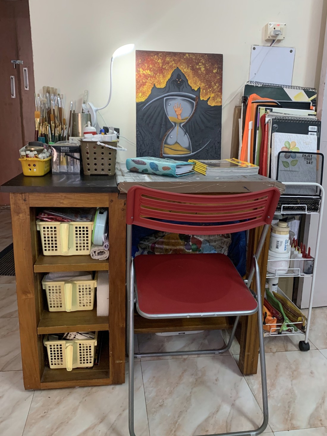
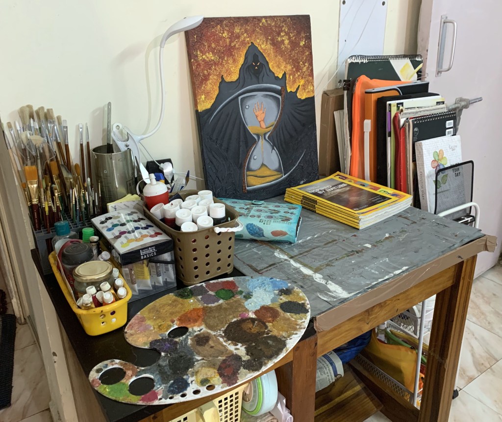
- Dedicate a corner in a room of your choice for an art area. Use shelves, tables, racks etc., to separate out your art area in this room. For my art station, I got an art table custom made to my requirements with adequate shelving to hold baskets of my art materials. I got this table ergonomically designed keeping in mind the fact that I suffer from cervical spondylitis. So to ensure that my neck is not strained while I paint, the table top can be inclined vertically at various angles to suit my comfort. Another modification I made to my table was that I got the shelves made towards the left as I am left handed. Even my work area where I place my paints and color palette are towards the left. So there’s a custom made art table for all you lefties like me!
- Another good option for an art space is a closet or clothing rack, if you have one to spare. All you need to do is clear some shelves to store your art supplies with a small table, chair in front of it and Voila! Your little art studio is ready!
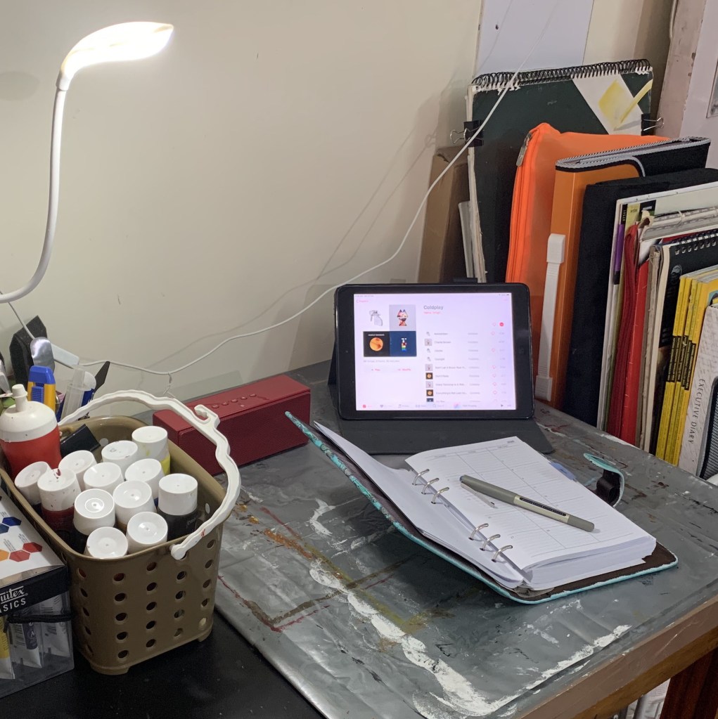
- Keep a fold-down table or chair handy. I have a couple of folding chairs which I use not just for sitting while I paint, but also for keeping my laptop, iPad and other knick knacks.
- The garage, attic or basement are some more options for art studio spaces, provided you take care of the heating, cooling and humidity issues. This is crucial not just for protecting your art but also to make you comfortable while you work. Trust me, it’s no fun painting when you are sweating like a pig or freezing to death!
- Get an art caddy with wheels. Even though I had this amazing custom made art table with adequate shelves to store my art supplies, after a while it was just not enough! So I invested in a cart with shelves that could be rolled on wheels. Not only did this sort out my storage woes, but also provided me with mobility and easier access to my art materials, without coming in the way of other things in my bedroom.


Here are a few ways I have personalized my creative space (while some of them I have already done, others are still part of my wish list!):
- A display board where I can pin up anything and everything that inspires me be it images, quotes or my random doodles and scribbles.
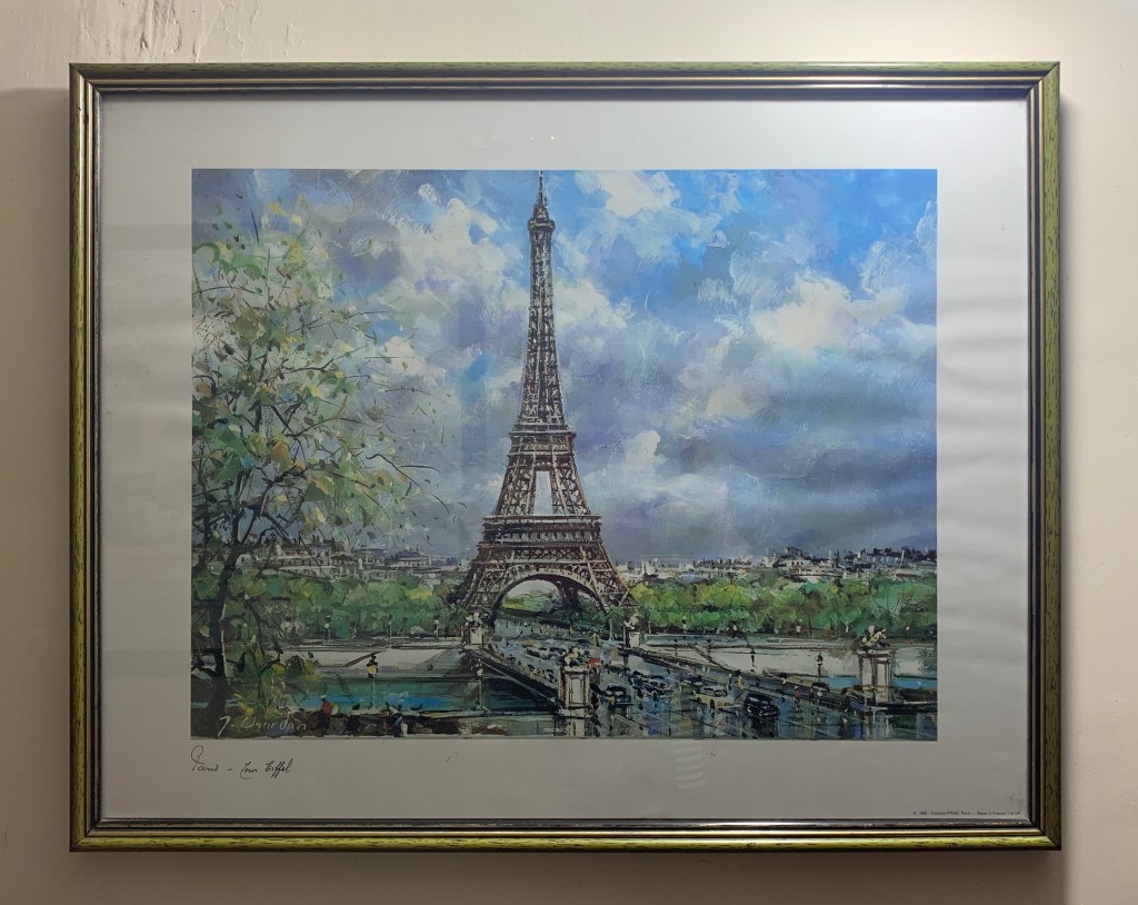
- A collection of objects that I love or I am sentimentally attached to. For instance, my daughter gifted me a hand painted coffee mug on Mother’s Day and this has become a holder for my palette knives! A caricature artwork of Game of Throne characters adorns the wall just above my art table. I fell in love with it not just because I am a GOT fan, but also because it inspires me artistically.
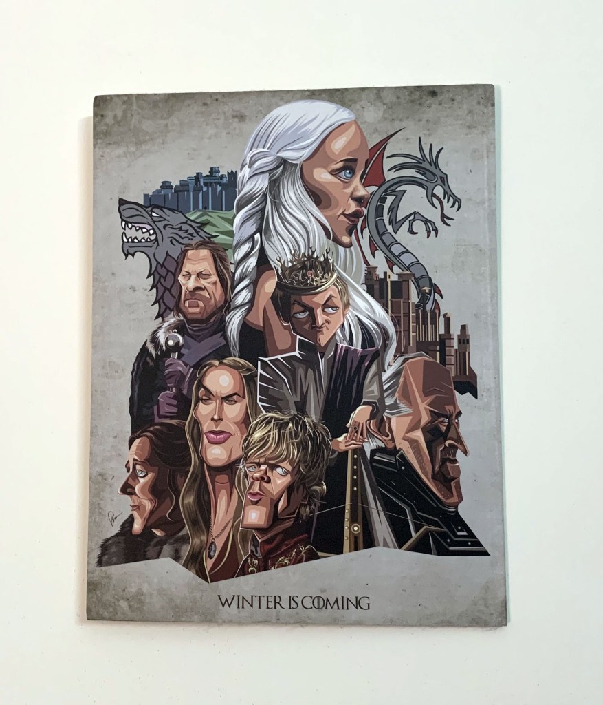
The Gor artwork on my wall 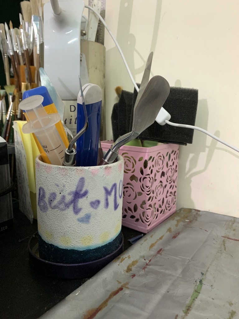
My daughter’s Mother’s Day gift turned into a stand for my palette knives!
- A list of my goals and challenges. These are listed out in my planner.
- A calendar and planner to track my progress (once again part of my planner diary).

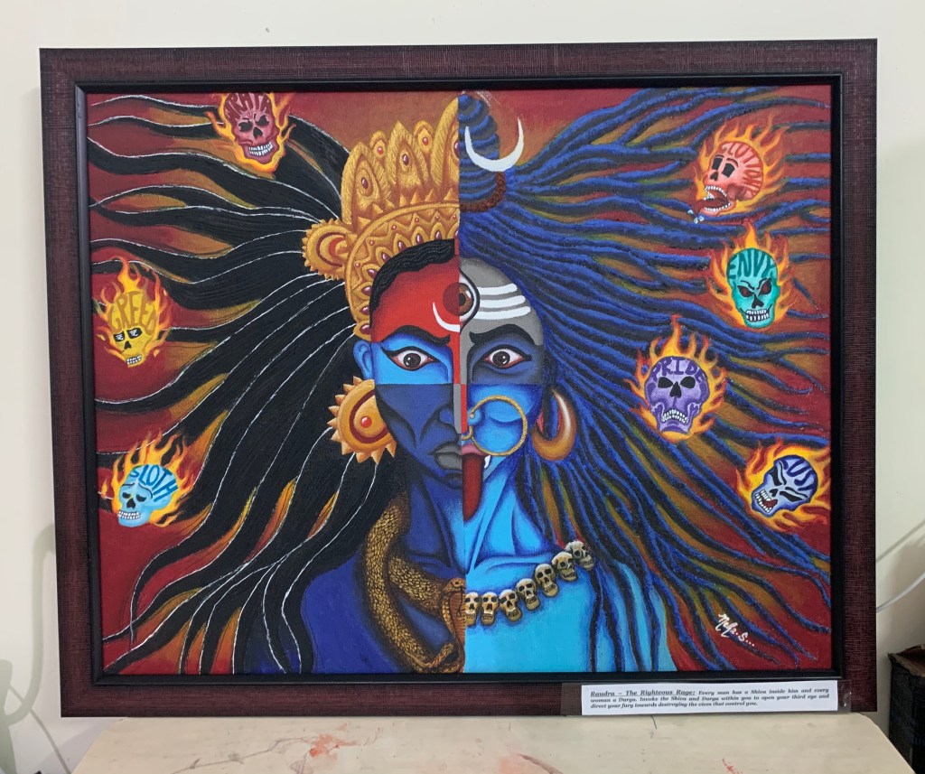
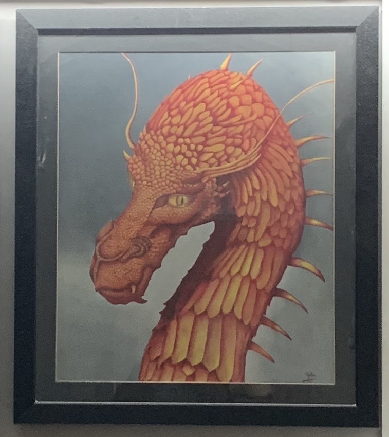
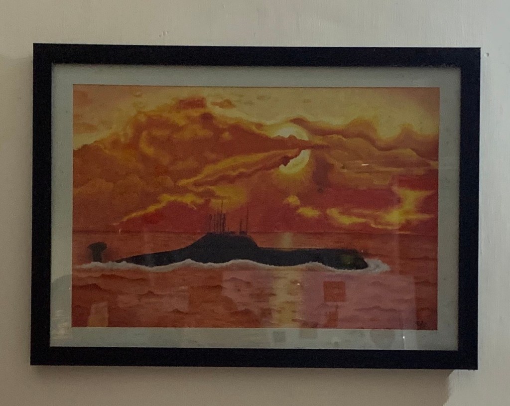
- Images of my favorite projects and published or commissioned works which I keep in folders (I am obsessed with being organized!)
- A small sound system to play my favorite music while I work (Usually my iPad and Bluetooth speaker).
While I’m still far from creating a gorgeous studio like the ones owned by seasoned artists, I am totally in love with this little personal corner that is solely dedicated to my art. I believe that if art is all you really live for, even the smallest space can be transformed into a creative haven. It’s about making your art a priority.
Apart from these, here’s a list of supplies and essentials that I keep in my art station:
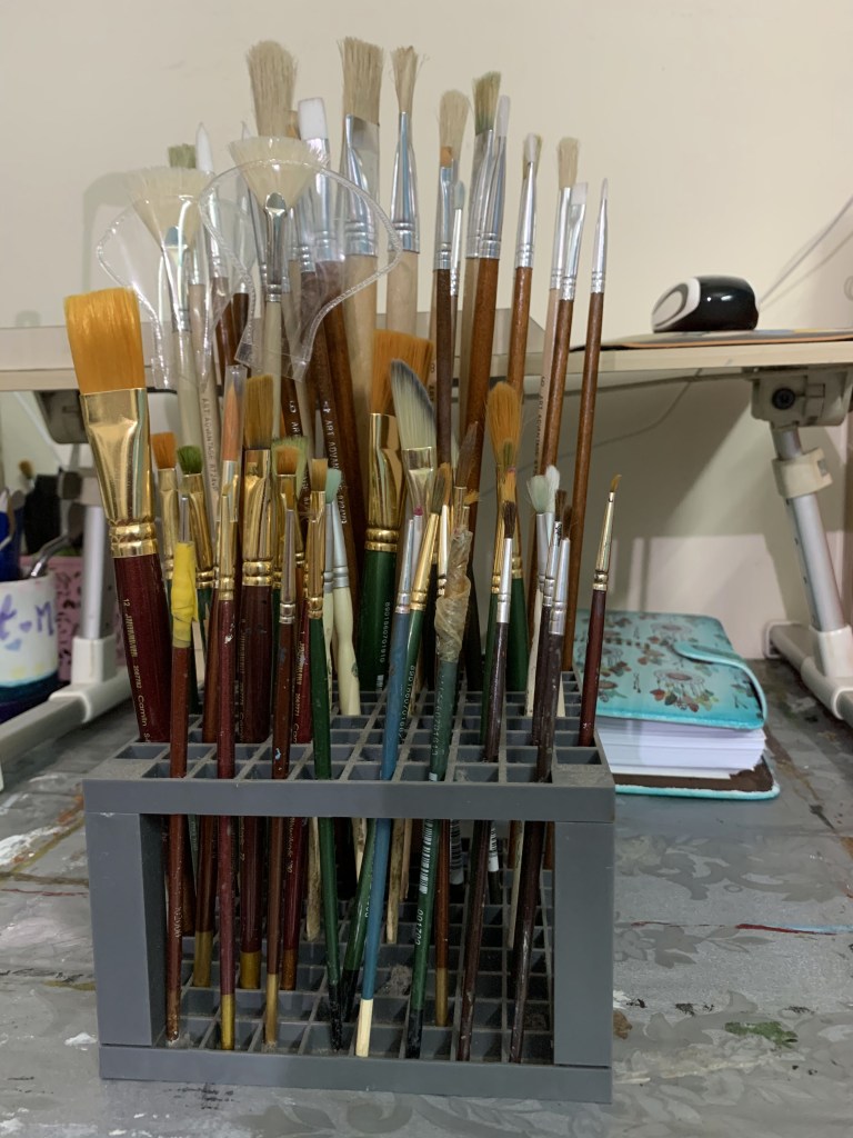
- Paint Brush Holder – This is basically a functional organizer with slots of different sizes to hold my assortment of paint brushes. You can even use it to store other things like pens, markers, pencils etc. These can be found in any good art store or online stores.
- Paints, Brushes, Pencil Colors, Pens, Markers – As an artist, these are obviously a must. How you store them, is entirely up to you. I like to store them separately in baskets that I keep in the shelves of my table (OCD for being organized yet again!)
- Easels – I have a couple of easels, one large and the other small that I can use for bigger and smaller canvases respectively.
- Seating Arrangement – Having a chair to work on is a lifesaver when my back starts to give up on me. A comfortable chair also gives me a chance to sit back and review my work critically as I paint.


- Laptop – I often use photographs and computer images as a reference point for my art so having my laptop at close quarters comes in handy.

- Music – I love to have music playing in the background while I paint. So I have my iPad connected to my blue tooth speaker playing my favorite tracks to lift my spirits.

- Storage – As mentioned earlier, I have sufficient storage space in the form of the inbuilt shelves of my art table, my mobile art caddy and my assortment of baskets and organizers for my art supplies. The only thing I am lacking now is an arrangement for storing my painted as well as unpainted canvases safely. So even though presently I just line them up on top of tables, stools, cupboards or practically wherever I find the space, I am working on this project!
Storage units on my table 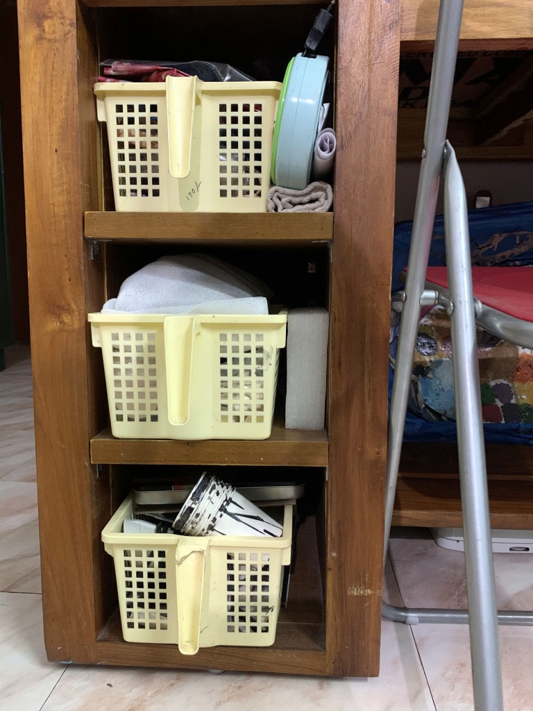
Inbuilt shelves 
My baskets for my paints etc. 
My mobile art caddy 
My art supplies
- Art Books – I am pretty proud of my small yet valuable collection of art books. I look up to them for inspiration whenever I am struggling with an idea or a technique for a particular painting or may just read up on the great masters of art with the hope of magically imbibing some of their talent!
- Inspiration Board – This one I am yet to get! I have so many pictures and photographs that I have collected from various sources like magazines, journals, newspapers etc., but most of them are lying tucked away inside some file or folder. Guess it’s time for me to dish them out and tack them up on the wall!
- Good Lighting – Now this is THE most essential thing to have for an artist! Although natural light is the best, but owing to space constraints, I had to place my art station at a spot which does not get any. So I have to make do with a portable clip-on lamp that focuses light directly onto my canvas. It may not be as good as natural light but it gives me a good enough idea of the values of colors I am using.

My lighting arrangement 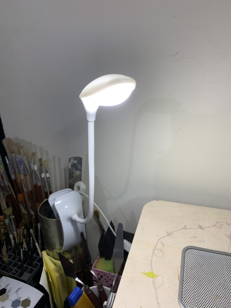
My portable clip on lamp up close
As I said, the biggest advantage of having a personal space for creating your art is that you can leave things as they are while the work is in progress. This will give you extra bits of time that can be put to effective use towards creating or even fine tuning the artwork itself. These added moments will not only give you a chance to improve on your art but also help you finish it well before your intended target.
The entire process of assigning a creative space not only improves productivity, but also provides you with a feeling of joy and contentment. Your confidence levels get a major boost when you are in your personal creative space and your aspirations get renewed too.
The best part about being an artist is that you don’t need a testament to prove you are one. How you see and experience the world around you is totally up to you. Having a studio or a creative area doesn’t mean that you are limited by its physical space and neither do the things inside it determine what kind of work will sell and what will not. For us artists there are no limits. Don’t smother your creativity by walking into your studio each day thinking what you should make that will be liked or that will sell. Just have fun creating art. Very often people fail to make this small but significant commitment. Have a place to work where you can give your thoughts wings and soar away into the vast expanses of creativity.
I hope this motivates you to start looking around your house for potential areas that you could turn into your art space. Paint it a different color from the rest of the room. Add some interesting as well as functional furniture. Put some items that are close to your heart. Stock up on all your necessary supplies that you would like to keep in your art space. Maybe even christen it with a special name! Let the space speak to you and let it grow with your work.
I’d love to hear about your creative space. What are your essentials for your workspace and how have you personalized it? What are your trade secrets for storage? Do let me in on your own creative corners!
DISCLAIMER – All the information, data and imagery in this blog post is for informational and educational purpose only. While there may be copyrighted material the use of which has not always been specifically authorized by the copyright owner, I have only made it available with the sole effort to stimulate creative progress and artistic enrichment. Some images may have been taken from the links included below and I give full credit to these websites/pages, thereby in no way claiming them to be my own. I have also used these links for reference purposes and collection of data; therefore I give full credit to the respective web pages. Most of the data in this post is based on my personal experiences and opinions and I am not responsible for any material that is found in the links at the end of this post.
Sources and Photo Credits –
http://www.art-quotes.com/getquotes.php?catid=292#.Xk9xLSgzbIU
https://www.artworkarchive.com/blog/art-quotes-to-guide-your-studio-practice