
In my previous post, I had introduced the concept of emotions, in particular the Navrasas, or the nine emotions in the performing as well as fine arts. I had discussed in great detail how these rasas are depicted aesthetically through art as well. I had also provided a brief synopsis of how I have attempted to interpret them in my own artworks, with the promise that I would elaborate on each one of them in upcoming posts.
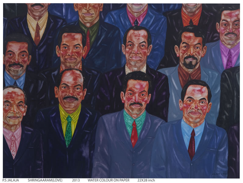
So here I am, to fulfill my promise with the first Rasa – “Shringar.”
The word Shringara in Sanskrit means love, romance, decoration and beauty, attractive and aesthetic sense. Shringar can give rise to all kinds of love, be it romantic love, the love between siblings or the affection towards a pet. Devotional love and parental love are also forms of this rasa.
Songs about the childhood of Krishna and Rama tell us that little Krishna was playful and sometimes naughty, whereas Rama was more serious. By seeing Krishna and Rama as children, we think of God every time we see a child, and that increases our devotional love.
Shringar takes shape as a rasa at the onset of puberty. It is the predominant rasa during adolescence. Teenagers go through changes in their bodies, physically, emotionally as well as chemically. They want more attention, more love and more care. They feel something is missing and may feel uneasy or depressed if the one they love does not notice them. To gain this love and affection, they want to look beautiful and that’s where Shringar fits in as a means of adornment or beautification to please and attract the beloved.
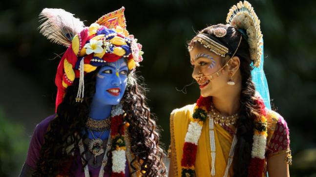
In Indian mythology, Lord Krishna’s Raas Leela is full of Shringar Rasa. The Raas Leela or Raas dance is part of the traditional story of Krishna where he dances with Radha and her friends. The term, raas, which stands for rasa, means “aesthetics” and leela means “act,” “play” or “dance, thus can be broadly defined as“Dance of Divine Love”.

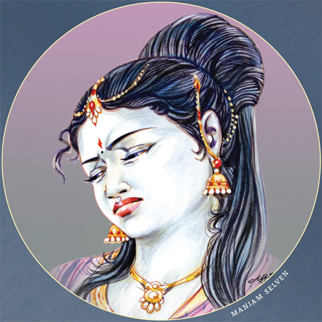
Shringar for the beloved 
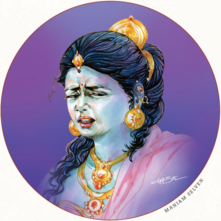
Raas Lila 
Divine Love 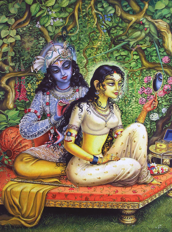
Radha’s Shringar for Krishna
Shringar also implies that there is inherent beauty everywhere and that everything can be loved. It denotes love and attraction. It is the ultimate Rasa, the king or queen of emotions, so to speak that possesses the power to heal anything. It helps us let go of ego and connects us to the divine. Flowers, fragrances, perfumes, colors add Shringar to life. Sringar rasa is depicted by light green color.
Shringar basically is superficial, but when we fall in love, our body becomes overwhelmed and Shringar gets a deeper meaning on a more emotional and spiritual level. Not just our mind and spirit, but our body also becomes overwhelmed with this feeling of infinite affection towards that which we find beautiful or attractive.
When we see an attractive person but our ego comes in the way, then the mind steals small glances and the emotion is short lived. On the other hand, when we let go of ego, our mind becomes flirtatious and indulges in fantasizing about our beloved’s beauty, so much so that nobody else in the world seems as beautiful. To maintain this illusion, the mind makes many small changes in the perceived appearance of the person, but, when the effect fades, it sees the person more realistically.
If we see our beloved as an object of desire and the scent of our dear one
excites us, then lust takes over and love becomes more physical. On the other
hand, when the beauty of our beloved and his or her eyes intoxicate us, we forget
about ourselves and our love becomes spiritual or divine. Shringar rasa in its
divine form can sustain the feelings of love for many years, even more than a
lifetime. In India when partners are profoundly pleased with each other, they
may promise to marry again in their next life.
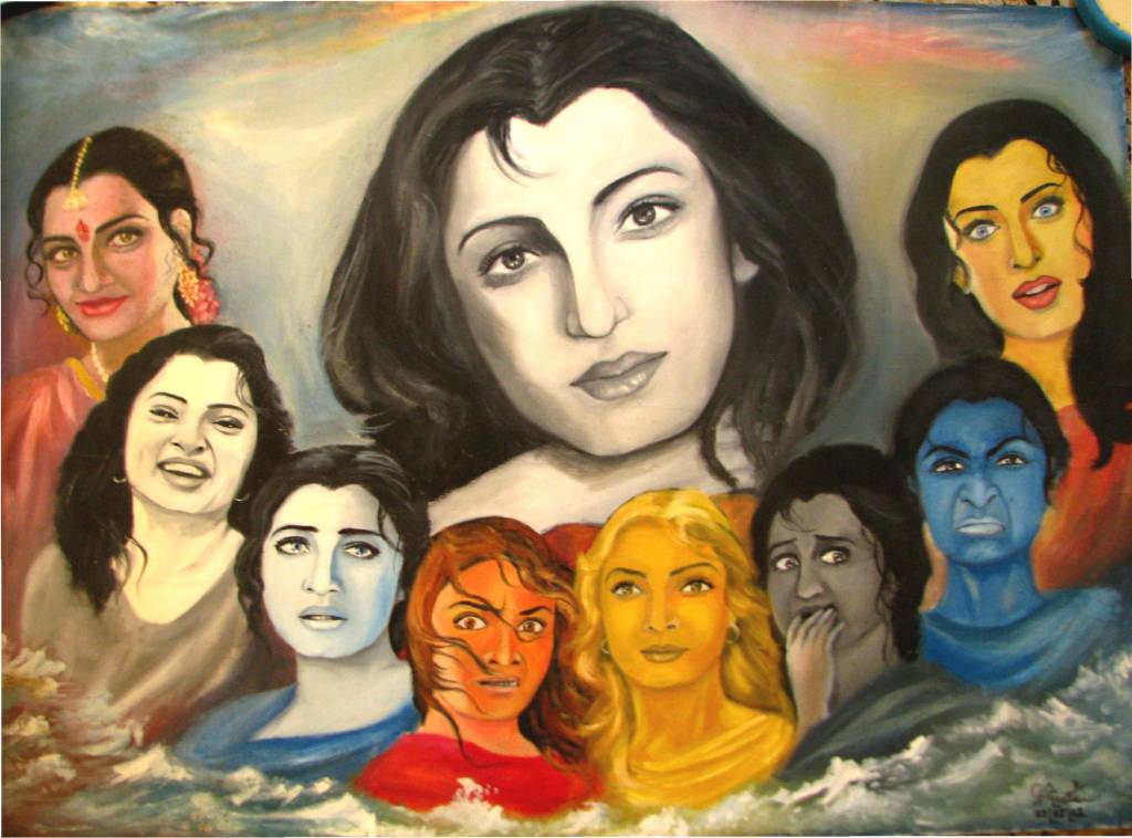
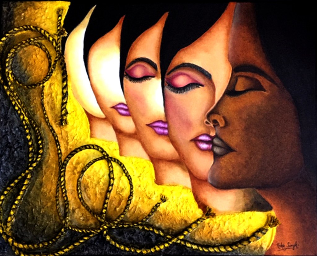
It is this emotion of beauty and love that I have tried to illustrate in the first artwork of the Navrasa Series, titled, Shringar – Inner Beauty. You all must have heard of the saying “beauty lies in the eyes of the beholder”. But the sad irony is that in today’s so called modern society, almost everyone believes in the conventional ideas of external beauty. The entire concept has been endorsed by the flourishing fashion and cosmetics industries to such an extent, that we can no longer see beauty beyond the face of a person. This also applies to skin color, specifically in India, where fairer skin is considered more attractive than its darker, or for that matter, even duskier counterparts.
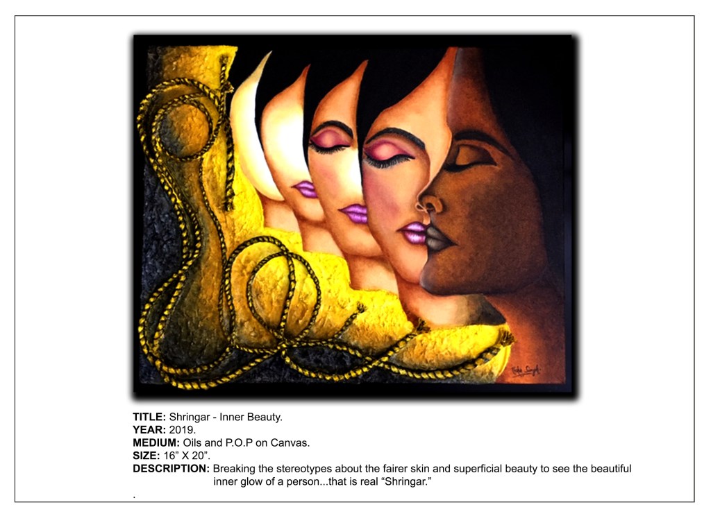
Another proverb that further contradicts the idea of true beauty is, “beauty is only skin deep.” This phrase can be interpreted in several ways, the most widely accepted one being that external beauty has no effect on the internal qualities of a person. This can mean that while someone may be beautiful on the outside, their character need not necessarily be attractive. It can also be interpreted in the opposite sense, that is, just because a person is not beautiful on the outside, it doesn’t mean he or she doesn’t have a heart of gold. In other words, it is not superficial looks, but the intrinsic goodness of one’s soul that make him or her attractive.
I strongly believe in the second interpretation. Being compassionate and having a good character are more important than good looks. Not only speaking of doing good things but having your actions match your words is beauty. Having a gentle and kind heart is beauty. In other words, Inner beauty is true beauty.
To express this belief of mine onto the canvas, I have taken the help of a woman’s face, which has been the epitome of external beauty for centuries. However, I have rendered the first face in a darker tone. By doing so, my attempt is to convey the message that not being fair skinned doesn’t make her any less attractive physically as well as intrinsically. One needs to look beyond her looks and skin tone, deep down into her soul and find that inherent goodness, which is the real essence of her beauty. For all you know, she may have such a beautiful soul that its beauty radiates outwards from within in the form of the most resplendent glow. This beautiful, radiant essence is true inner beauty.
I have gradually eliminated the facial features in each of the faces to convey that we need to surpass these mortal physical features. Simultaneously I have lightened the skin tone, thereby trying to bring out that inner glow which is visible only when one learns to disregard the superficial visage. When we begin to appreciate the real beauty within, we experience the feeling called love.
I have also attempted to convey the message that physical beauty fades with age, but the glow of good character and kindheartedness lasts eternally.
It is becoming clearer and clearer with each passing day that the socially construed notion of physical attractiveness, is something all women strive to achieve and maintain. In fact, they are so obsessed with looking beautiful that the fashion and makeup industries are thriving at their expense. Women give so much importance to looking good with the help of clothes, makeup and other accessories that these have become the stereotypes defining beauty today. To add to it all, the obsession with the fairer skin makes them resort to using fairness creams with the hope of lightening their complexion a shade or two.
The entwined ropes in the artwork symbolize these stereotypical bonds of superficial beauty and “fairer skin” that most women are entangled in. We need to break these shackles as they are mere illusions that prevent us from seeing the real picture. As long as we continue to live in this make believe world of “cosmetic charm”, we will not be able to see beyond the physical attributes of people who are truly beautiful deep down. After all, Shringar transforms into a divine feeling only when we let go of the ego that makes us worry about how we look instead of what kind of a people we are.
Coming to the medium and techniques….apart from my beloved oil paints, I have experimented with Plaster of Paris (POP) in order to impart texture to the background. I prepared a paste of POP and PVA glue in a ratio of 1:1 as I intended embedding strands of rope within the paste while it was still semi dry. Yes, I used real rope, which I gessoed and painted over later! While the POP provided the requisite coarseness to the texture, the PVA glue helped bind the ropes to the surface of the canvas. But it did have its disadvantages…the ropes lost their realism as they got covered with the POP paste in several places and I had to painstakingly repaint the twists in the cords to make it look like real rope again. On hindsight, the better option would have been to just stick the rope on top of the POP background after it had dried completely. It would have saved me a lot of work!
I had mentioned before that Shringar rasa is typically represented with light green color. But then, I did not want to restrict myself to one hue. Also, since my entire artwork was based on skin color, I had to vary my color palette and explore the more earthy tones. In a way, I too broke a stereotype!
Shringar rasa is generally depicted in Indian poetry, dance and music, so it was quite a challenge for me to portray it unconventionally in my art. I have tried my level best to make it as simple and comprehensible as possible, so that anyone viewing it would easily understand what this “king of rasas” is all about. Would love to know if I was successful in invoking any emotions in you through this painting!
Sources and Photo Credits –
https://www.speakingtree.in/blog/9rasas-as-9-emotions-in-human-beings
http://drvidyahattangadi.com/the-navrasa-of-life/
https://en.wikipedia.org/wiki/Rasa_lila
https://pixels.com/featured/sringara-lila-satchitananda-das-saccidananda-das.html
https://pixels.com/featured/rasa-lila-satchitananda-das-saccidananda-das.html
https://fineartamerica.com/featured/shringar-lila-vrindavan-das.html?product=art-print